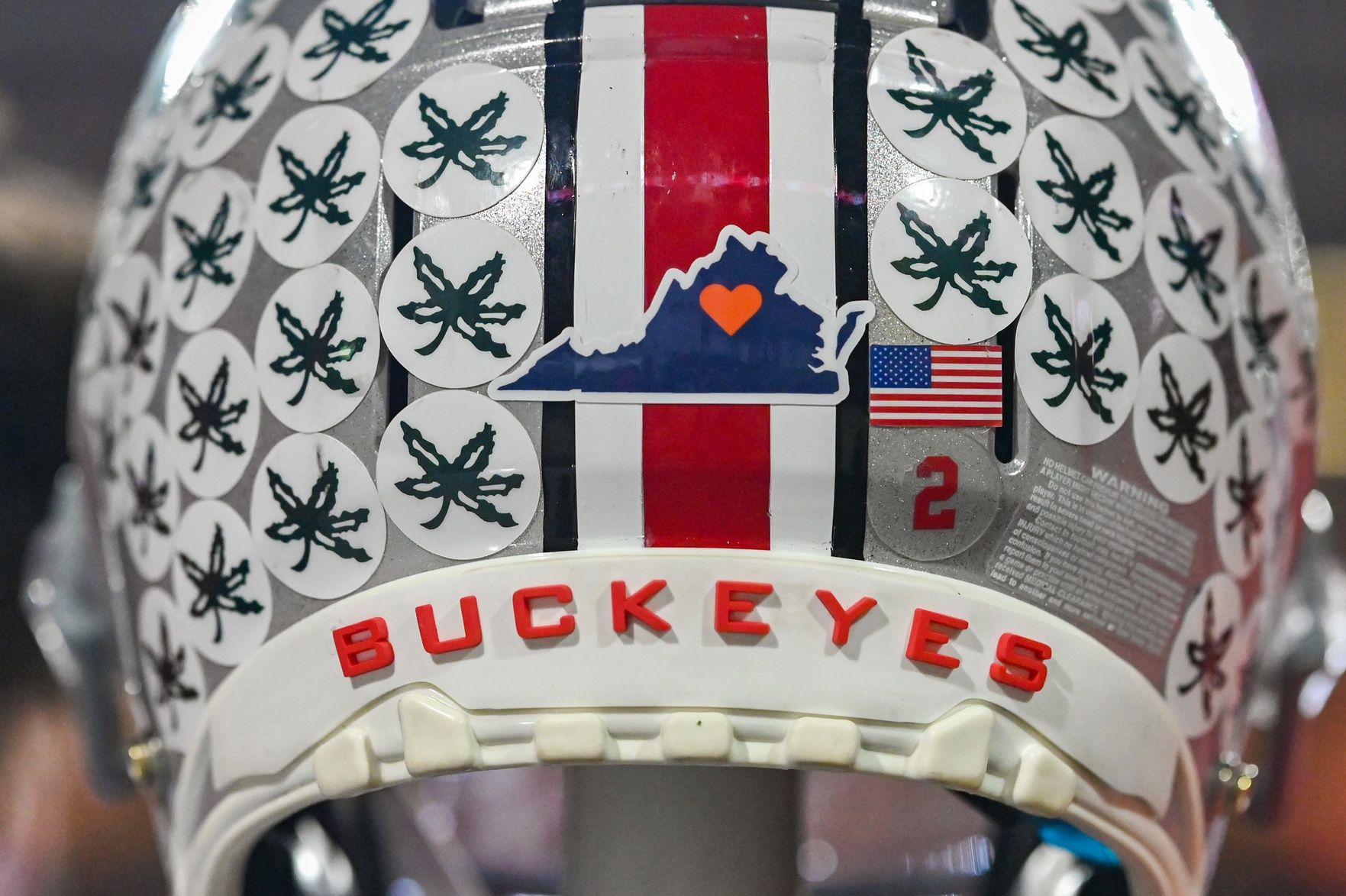
In the high-stakes world of collegiate athletics, a brand is far more than a logo or a color scheme. It is an intricate tapestry of history, emotion, and visual shorthand that communicates values to millions of fans and stakeholders. Few symbols in the sporting world are as instantly recognizable or as strategically potent as the “stickers” found on the Ohio State University football helmets. Known officially as “Buckeye Leaves,” these small decals are not mere decorations; they represent a masterclass in brand identity, meritocracy-based marketing, and the psychology of visual recognition.

Understanding what these stickers are requires looking past the adhesive and vinyl to see them as a sophisticated branding tool. For Ohio State, the Buckeye Leaf is a “merit badge” that translates individual and collective performance into a visible, cumulative narrative of success.
The Visual Language of Achievement: How Buckeye Leaves Define the Ohio State Brand
The Ohio State brand is anchored in tradition, but its visual identity is dynamic. While the iconic silver helmet and the scarlet-and-gray color palette provide the foundation, the Buckeye Leaves provide the story. To understand the brand power of these stickers, one must first understand their origin and the consistency with which they have been deployed.
Origins of a Visual Legacy
The tradition began in 1968, the brainchild of legendary coach Woody Hayes and trainer Ernie Biggs. At its inception, the goal was simple: provide a tangible reward for players who performed well on the field. From a brand strategy perspective, this was a revolutionary move. It transformed the athlete’s equipment into a living leaderboard. In the decades since, the design of the leaf has remained remarkably consistent—a small, green, multi-pointed leaf of the Ohio Buckeye tree. This consistency is the bedrock of brand equity. By refusing to modernize or “rebrand” the leaf into something sleeker or more digital-forward, Ohio State has preserved a sense of timelessness that links current superstars to the legends of the late 60s.
The Power of Symbolic Recognition
In branding, symbols serve as shortcuts for complex ideas. The Buckeye Leaf is a symbol of “The Ohio State Way.” When a viewer sees a helmet nearly covered in green stickers, the brand message is clear: This is an elite performer. This visual shorthand allows the university to market its players as personifications of the program’s excellence. It creates a “brand within a brand,” where the cumulative effect of the stickers becomes more iconic than any single logo. The stickers act as a form of social proof, signaling to opponents, recruiters, and fans that the wearer has met the rigorous standards of the organization.
Meritocracy as a Branding Tool: The Psychology of the Reward System
A brand is only as strong as the culture it represents. Ohio State’s helmet stickers are an external manifestation of an internal corporate culture built on meritocracy. In the corporate world, this is akin to “gamification”—the use of game-design elements in non-game contexts to improve engagement and productivity.
Visual Reinforcement of Brand Values
Every organization claims to value hard work and excellence, but few visualize it as effectively as Ohio State. The criteria for earning a Buckeye Leaf are specific: a win, a personal milestone, a big play, or an exceptional grade in a game film review. By tying the brand’s visual identity to specific Key Performance Indicators (KPIs), the program ensures that the brand remains grounded in reality. You cannot “buy” your way onto the helmet; you must earn it. This reinforces the brand promise of “excellence in all we do.” For the players—the internal stakeholders—the stickers serve as a constant psychological nudge to align their performance with the brand’s high standards.
Creating Internal Competition and Loyalty
Internal branding is often overlooked, but it is the engine that drives external perception. The helmet stickers create a healthy level of internal competition. When a freshman sees a senior’s helmet fully “pelted” with leaves, it creates an aspirational goal. This tiered reward system fosters a deep sense of loyalty and “buy-in.” In branding terms, this is “employee advocacy.” When the players take pride in their stickers, they become the most effective ambassadors for the brand. This internal alignment ensures that the external brand image—one of relentless pursuit of victory—is authentic and sustainable.
Consistency and Evolution: Maintaining a Multi-Generational Identity
One of the greatest challenges in brand management is balancing the need for tradition with the necessity of remaining relevant to a younger audience. Ohio State has navigated this balance by treating the Buckeye Leaf as a sacred asset that evolves only in how it is talked about, not how it looks.
The Minimalist vs. Maximalist Aesthetic
The aesthetic of the Ohio State helmet is unique because it shifts throughout the season. At the start of the year, the brand is “minimalist”—clean, silver, and uncluttered. As the season progresses, it becomes “maximalist,” as the stickers begin to overlap and crowd the surface. This progression is a brilliant branding narrative. It tells the story of a journey. Fans don’t just see a helmet; they see a season’s worth of labor. This evolution keeps the visual identity fresh without requiring a redesign. It is a “living logo” that adapts to the performance of the team, making every game a new chapter in the brand’s story.
Protecting the Intellectual Property of the Leaf
The Buckeye Leaf has become so synonymous with Ohio State that it is a protected piece of intellectual property. The university’s brand managers are careful to control how the leaf is used in marketing materials, apparel, and digital media. This scarcity adds value. Because the stickers are only available to those on the team, they represent an “exclusive club.” In marketing, exclusivity is a powerful driver of desire. By limiting the “authentic” stickers to the players while selling “replica” versions to fans, Ohio State leverages the prestige of the mark to drive revenue across multiple channels.
The Marketing Impact: Building a Global Sports Powerhouse
The ultimate goal of a brand strategy is to create a distinct position in the marketplace that drives growth and loyalty. The Buckeye Leaves have helped Ohio State establish itself as one of the most valuable brands in all of sports, transcending the regional boundaries of the Midwest.
Merchandising and Consumer Recognition
The Buckeye Leaf has been successfully extended into a massive merchandising empire. From hats and jerseys to jewelry and home decor, the leaf is a versatile graphic element that fans use to signal their tribal affiliation. The “sticker” concept has also been adopted by other programs, but Ohio State remains the “gold standard” of the practice. In a crowded marketplace of red and white athletic programs, the green Buckeye Leaf provides a unique visual differentiator. When a consumer sees that specific leaf, they don’t think of generic nature or the state of Ohio; they think of Ohio State Football. This is the pinnacle of brand recognition.
The “Helmet Pride” Effect in Modern Sports Branding
In the modern era of “Name, Image, and Likeness” (NIL), the Ohio State brand provides a platform for athletes to build their own personal brands. An athlete with a helmet full of stickers is more “marketable” because they have been visually validated by the Ohio State brand. This creates a symbiotic relationship: the university provides the prestigious “vessel” (the helmet and stickers), and the player provides the “content” (the performance). This synergy increases the overall valuation of the program, attracting top-tier talent, high-value recruits, and lucrative broadcast deals. The stickers are the “trust marks” that tell sponsors and fans alike that this organization is a winner.

Conclusion: The Sticker as a Strategic Asset
What are the stickers on Ohio State’s helmets? To the casual observer, they are a tradition. To the player, they are a reward. But to a brand strategist, they are a masterstroke of corporate identity. They represent a rare instance where history, psychology, and marketing converge to create something that is greater than the sum of its parts.
By utilizing a merit-based reward system that manifests visually, Ohio State has created a brand that is both authentic and aspirational. The Buckeye Leaves remind us that the most powerful brands are not those that are shouted through advertisements, but those that are earned through consistent performance and symbolized by icons that everyone—from the players on the field to the fans in the rafters—can believe in. In the competitive landscape of modern sports and business, the Buckeye Leaf remains a testament to the enduring power of a well-managed brand.
aViewFromTheCave is a participant in the Amazon Services LLC Associates Program, an affiliate advertising program designed to provide a means for sites to earn advertising fees by advertising and linking to Amazon.com. Amazon, the Amazon logo, AmazonSupply, and the AmazonSupply logo are trademarks of Amazon.com, Inc. or its affiliates. As an Amazon Associate we earn affiliate commissions from qualifying purchases.