
In the architectural drafting of a brand, every line, angle, and curve carries a psychological weight that influences consumer perception before a single word of copy is read. While the casual observer might simply see a box or a diamond, brand strategists and visual designers recognize these as quadrilaterals—the foundational four-sided polygons that underpin the world’s most recognizable corporate identities. To understand what shapes with four sides are called is to unlock the fundamental vocabulary of visual communication.
From a mathematical perspective, these shapes are collectively known as quadrilaterals. However, in the realm of brand strategy, they are categorized into specific types—squares, rectangles, rhombuses, trapezoids, and parallelograms—each serving a distinct purpose in conveying a company’s values, stability, and industry positioning.
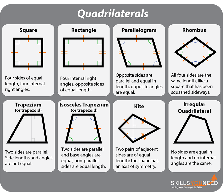
The Taxonomy of Quadrilaterals in Visual Strategy
To master the art of branding, one must first master the geometry of the quadrilateral. While “four-sided shape” is the generic descriptor, the nuances between a perfect square and a dynamic parallelogram can represent the difference between a brand that feels traditional and one that feels disruptive.
The Square: The Pillar of Stability and Trust
The square is perhaps the most ubiquitous quadrilateral in the corporate world. Defined by four equal sides and four right angles, it represents equality, stability, and structure. Brands like Microsoft, LEGO, and Gap utilize the square to project a sense of reliability. Because the square is balanced on all sides, it suggests a “fair and square” approach to business. In personal branding, using square elements in a logo or website layout conveys that the professional is grounded, organized, and dependable.
The Rectangle: The Canvas of Information
The rectangle is the most common shape in our physical and digital world, from smartphones and credit cards to skyscrapers and business cards. In branding, the rectangle is the ultimate vessel for information. It allows for horizontal or vertical expansion, making it ideal for wordmarks. Think of the National Geographic logo—a simple yellow rectangular frame. This “window” suggests a view into the world, framing the brand’s content as prestigious and expansive.
Parallelograms and Rhombuses: Speed and Innovation
When a quadrilateral leans, its psychological impact shifts from stability to movement. Parallelograms are frequently used in the tech and logistics sectors to imply speed, progress, and forward momentum. By tilting the vertical axes, a designer transforms a static box into a dynamic vector. The rhombus (or diamond), often associated with luxury and precision, provides a more unique silhouette that stands out against the more common square-based identities.
Symbolism and Brand Perception: The Psychology of Four Corners
Why do some of the world’s most successful brands choose four-sided shapes over circles or triangles? The answer lies in the subconscious associations we have with geometry. Every corner of a quadrilateral acts as an anchor point for human perception, creating a sense of “enclosure” and “security.”
Trust, Stability, and Order
Humanity has spent centuries building rectangular rooms and square foundations. Consequently, we associate 4-sided shapes with the “safe” confines of a home or the structured environment of an office. For financial institutions and insurance companies, this association is invaluable. A quadrangular logo suggests that a customer’s money or data is “boxed in” and protected from external threats. This is why many digital security firms utilize square-based motifs; it provides a visual shorthand for a firewall or a vault.
Professionalism and Authority
Circles are often seen as feminine, soft, and inclusive. Triangles are perceived as aggressive, directional, and masculine. Quadrilaterals occupy the middle ground of professional authority. They are the shapes of the “establishment.” When a brand wants to appear as an industry leader or a “cornerstone” of the market, the four-sided shape is the logical choice. It communicates that the brand is not a fleeting trend but a permanent structure within the economic landscape.
Innovation Through Irregular Quadrilaterals
While perfect squares denote tradition, irregular quadrilaterals—such as trapezoids or kites—can signal a brand’s desire to break the mold. By subtly altering the angles of a four-sided shape, a brand can suggest that they are “thinking outside the box” while still maintaining the professional boundaries that customers expect. This “controlled disruption” is a hallmark of modern tech branding, where firms want to appear innovative yet financially stable.
Case Studies: Global Brands Built on Four Corners

Examining how global entities utilize quadrilaterals provides a masterclass in brand execution. These companies do not use four-sided shapes by accident; they use them to reinforce specific market positions.
Microsoft and the Power of the Grid
The Microsoft logo is one of the most famous iterations of the square. Composed of four smaller squares forming a larger one, it represents the company’s diverse product portfolio (Windows, Office, Xbox, and Surface) held together by a unified corporate vision. The use of the square here is functional and structural, echoing the “windows” through which users interact with the digital world. It suggests a system that is modular, scalable, and foundational to modern computing.
National Geographic: The Window to the World
The National Geographic “Yellow Border” is a masterstroke of rectangular branding. It is not just a logo; it is a frame. By using a simple, hollow rectangle, the brand positions itself as a curator of the world’s wonders. The shape suggests that the brand is a lens through which we view nature and history. The verticality of the rectangle provides a sense of height and majesty, reinforcing the brand’s status as an authority in exploration.
American Express: The Centurion Box
The American Express logo utilizes a square with a distinct blue gradient. In the world of finance, the square communicates the “solid” nature of the institution. For a company that deals in credit and global travel, the four corners of the logo represent a global reach that is anchored in reliability. The square provides a “home” for the wordmark, ensuring that the brand feels self-contained and powerful.
Designing with Intention: Implementing 4-Sided Shapes in Modern Marketing
For business owners and designers, choosing a quadrilateral is only the first step. The implementation of these shapes across various touchpoints determines how the brand strategy is felt by the end-user.
Grid Systems and Layout Design
The dominance of 4-sided shapes extends beyond the logo and into the very layout of a brand’s digital presence. Modern web design is built on a “grid” of rectangles. This “bento box” style of UI design—popularized by Apple and others—organizes information into discrete quadrangular containers. This makes complex data sets easier to digest and creates a sense of visual harmony. A brand that utilizes a clean, rectangular grid on its website is seen as more professional and user-friendly than one with a cluttered or organic layout.
Mobile-First Icons and Geometric Minimalism
As branding has shifted toward mobile screens, the “app icon”—a rounded-corner square—has become the primary point of contact between brands and consumers. This “squircle” (a mathematical cross between a square and a circle) combines the stability of a quadrilateral with the friendliness of a curve. Brands must now consider how their visual identity fits into these 1:1 ratio quadrangular spaces. A logo that is too wide or too tall may lose its impact when forced into a four-sided icon format.
Color and Texture within the Quadrilateral
A shape is a vessel for color. A black square might feel heavy and authoritative (luxury branding like Chanel or YSL), while a bright green square feels like a “go” signal (productivity apps or environmental tech). Strategic use of gradients within a 4-sided shape can add depth, making the brand feel more “3D” and modern. By adding a slight bevel or drop shadow to a rectangle, a designer can make a button or a call-to-action feel “pressable,” bridging the gap between brand identity and user experience.
The Future of Geometric Branding: Beyond the Basic Box
As we move into an era of augmented reality and fluid digital interfaces, the definition of “shapes with 4 sides” is evolving. The box is no longer static; it is responsive.
Responsive Shapes and Digital Fluidity
In modern brand systems, quadrilaterals are often designed to be fluid. A rectangular search bar might expand into a square modal or contract into a icon. This adaptability is key for modern branding. The “shape” of the brand must be able to change its aspect ratio without losing its core identity. This requires a shift from “logo-centric” branding to “systemic” branding, where the geometry is a living part of the user interface.
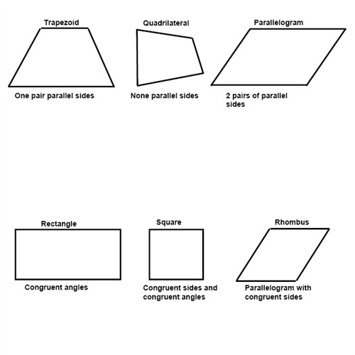
The Sustainability of Symmetry
As brands look to simplify their visual footprints in an overcrowded market, the quadrilateral remains the most “sustainable” shape. It prints efficiently, scales easily, and works across every medium from a favicon to a billboard. While trends in typography and color may change, the fundamental power of the four-sided shape—the quadrilateral—remains the bedrock of professional brand strategy.
In conclusion, when we ask “what are shapes with 4 sides called,” we are asking about the very building blocks of the commercial world. Whether it is a square representing honesty, a rectangle representing a window of opportunity, or a tilted parallelogram representing the future of tech, these quadrilaterals are the silent ambassadors of a brand’s intent. By understanding their names and their psychological nuances, businesses can build identities that are not just visually pleasing, but strategically sound.
aViewFromTheCave is a participant in the Amazon Services LLC Associates Program, an affiliate advertising program designed to provide a means for sites to earn advertising fees by advertising and linking to Amazon.com. Amazon, the Amazon logo, AmazonSupply, and the AmazonSupply logo are trademarks of Amazon.com, Inc. or its affiliates. As an Amazon Associate we earn affiliate commissions from qualifying purchases.