
In the rapidly evolving landscape of artificial intelligence and machine learning, evaluating the performance of models is as crucial as building them. Among the plethora of metrics and visualizations available to data scientists, the Receiver Operating Characteristic (ROC) curve stands out as a singularly powerful and insightful tool, particularly for binary classification problems. Originating from radar signal detection theory during World War II, ROC curves have transcended their military roots to become a cornerstone in fields ranging from medicine and finance to cybersecurity and predictive analytics.
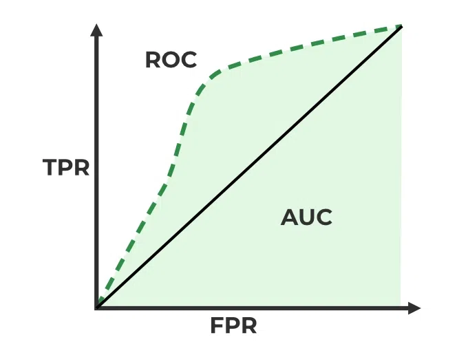
At its core, an ROC curve is a graphical plot that illustrates the diagnostic ability of a binary classifier system as its discrimination threshold is varied. It plots two parameters: the True Positive Rate (TPR) on the y-axis against the False Positive Rate (FPR) on the x-axis. While these terms might initially sound technical, understanding them unlocks a profound comprehension of how well a model distinguishes between classes, making the ROC curve an indispensable asset in any data scientist’s toolkit. This article will delve into the mechanics, interpretation, and practical applications of ROC curves, offering a comprehensive guide for anyone looking to master model evaluation.

The Fundamentals: Demystifying Classification Metrics
Before diving into the construction and interpretation of an ROC curve, it’s essential to establish a solid understanding of the fundamental metrics that underpin it. Binary classification models are designed to predict one of two outcomes (e.g., ‘spam’ vs. ‘not spam’, ‘disease’ vs. ‘no disease’, ‘fraud’ vs. ‘legit’). The evaluation of these models relies on understanding how many of these predictions were correct or incorrect, relative to the actual outcomes.
Binary Classification Basics: True Positives, False Positives, True Negatives, False Negatives
When a classification model makes a prediction, there are four possible outcomes relative to the actual class:
- True Positive (TP): The model correctly predicted the positive class. (e.g., It predicted ‘spam’ and the email was indeed spam).
- True Negative (TN): The model correctly predicted the negative class. (e.g., It predicted ‘not spam’ and the email was indeed not spam).
- False Positive (FP): The model incorrectly predicted the positive class. This is also known as a Type I error. (e.g., It predicted ‘spam’ but the email was actually legitimate).
- False Negative (FN): The model incorrectly predicted the negative class. This is also known as a Type II error. (e.g., It predicted ‘not spam’ but the email was actually spam).
These four metrics form the basis of a confusion matrix, which provides a complete breakdown of a classifier’s performance across all classes.
Sensitivity (Recall/True Positive Rate) and Specificity (True Negative Rate)
From these four basic outcomes, we derive the two critical rates plotted on an ROC curve:
-
True Positive Rate (TPR): Also known as Sensitivity or Recall, TPR measures the proportion of actual positive cases that were correctly identified by the model.
$$ TPR = frac{TP}{TP + FN} $$
A high TPR indicates that the model is good at catching positive instances. -
False Positive Rate (FPR): This measures the proportion of actual negative cases that were incorrectly identified as positive by the model.
$$ FPR = frac{FP}{FP + TN} $$
A low FPR means the model doesn’t frequently flag negative instances as positive, minimizing false alarms.
It’s also worth noting Specificity, which is simply (1 – FPR). Specificity measures the proportion of actual negative cases that were correctly identified as negative.
The Critical Role of Thresholds
Most classification models, especially those based on probabilistic approaches (like logistic regression, support vector machines, or neural networks), don’t simply output a ‘yes’ or ‘no’ prediction. Instead, they output a probability score (e.g., 0.75 that an email is spam). To convert this probability into a binary class prediction, a decision threshold is applied.
For example, if the threshold is set to 0.5, any email with a spam probability ≥ 0.5 is classified as spam, and anything below 0.5 is classified as not spam. Changing this threshold directly impacts the number of TPs, FPs, TNs, and FNs, and consequently, the TPR and FPR.
- Lowering the threshold: This makes the model more sensitive to predicting the positive class. More positive predictions mean higher TPR, but also typically higher FPR.
- Raising the threshold: This makes the model more conservative in predicting the positive class. Fewer positive predictions mean lower FPR, but also typically lower TPR.
The ROC curve exploits this relationship by plotting TPR against FPR across all possible threshold values.
Constructing an ROC Curve: A Visual Representation of Performance
The true genius of the ROC curve lies in its ability to encapsulate the trade-off between sensitivity and specificity at various decision thresholds. It provides a visual summary of the classifier’s performance across its entire operating range.
Plotting the Rates: TPR vs. FPR
To construct an ROC curve:
- Train your binary classification model on your dataset.
- Obtain the predicted probabilities for the positive class for each instance in your test set.
- For each unique probability score output by the model (or a sufficiently fine-grained set of thresholds from 0 to 1):
- Apply that probability as the decision threshold.
- Calculate the resulting True Positive Rate (TPR) and False Positive Rate (FPR).
- Plot each (FPR, TPR) pair on a 2D graph, with FPR on the x-axis and TPR on the y-axis.
- Connect these points, typically interpolating to create a smooth curve.
The resulting curve shows how the TPR changes as the FPR changes, giving a comprehensive picture of the model’s ability to discriminate between positive and negative classes across all possible thresholds.
Varying the Decision Threshold: How the Curve is Generated
Imagine we have a model that outputs probabilities. If we set the threshold very high (e.g., 0.99), only the most confident positive predictions will be classified as positive. This will likely result in a very low FPR (few false alarms) but also a very low TPR (missing many true positives). This point would be near the origin (0,0) on the ROC curve.
Conversely, if we set the threshold very low (e.g., 0.01), almost everything will be classified as positive. This will result in a very high TPR (catching almost all true positives) but also a very high FPR (many false alarms). This point would be near the top-right corner (1,1) on the ROC curve.
As we sweep the threshold from 1 down to 0, the (FPR, TPR) pairs trace out the ROC curve. A good classifier will have a curve that rises steeply towards the top-left corner, indicating high TPR with low FPR.
Interpreting the Diagonal Line: The Random Classifier
A crucial reference point on any ROC curve plot is the diagonal line running from (0,0) to (1,1). This line represents the performance of a random classifier – a model that makes predictions purely by chance. For such a classifier, the TPR is roughly equal to the FPR across all thresholds. In other words, its ability to correctly identify positive instances is no better than its tendency to incorrectly identify negative instances as positive.

Any legitimate classification model should perform better than this diagonal line. A model whose ROC curve falls below this diagonal is worse than random, suggesting either a flawed model or an incorrect interpretation of its outputs.
Beyond Visuals: Quantifying Performance with AUC (Area Under the Curve)
While the visual representation of an ROC curve offers intuitive insights, comparing multiple curves or summarizing a single curve’s performance requires a quantitative measure. This is where the Area Under the Curve (AUC) comes into play.
What is AUC? A Single Scalar Value for Model Evaluation
AUC quantifies the entire 2D area underneath the ROC curve. It provides a single scalar value that summarizes the classifier’s performance across all possible classification thresholds. The AUC value ranges from 0 to 1.
- An AUC of 1.0 represents a perfect classifier that can distinguish between all positive and negative cases without error. Its ROC curve would pass through (0,1), meaning 100% TPR and 0% FPR.
- An AUC of 0.5 represents a classifier that performs no better than random guessing, falling along the diagonal line.
- An AUC less than 0.5 indicates a classifier performing worse than random, which is highly unusual and often points to a bug in the model or inverted probability outputs.
Interpreting AUC Values: From 0.5 to 1.0
The AUC value can be interpreted as the probability that the classifier will rank a randomly chosen positive instance higher than a randomly chosen negative instance.
- AUC = 1.0: Perfect separation.
- AUC = 0.9 – 1.0: Excellent model.
- AUC = 0.8 – 0.9: Very good model.
- AUC = 0.7 – 0.8: Good model.
- AUC = 0.6 – 0.7: Decent model, but potentially room for improvement.
- AUC = 0.5 – 0.6: Poor model, barely better than random.
A higher AUC generally indicates a better overall model performance, as it implies a better trade-off between TPR and FPR across various thresholds.
Why AUC is Robust: Insensitivity to Class Imbalance
One of the significant advantages of AUC over other metrics like accuracy is its robustness to class imbalance. Accuracy can be misleading in datasets where one class vastly outnumbers the other. For example, if 99% of emails are not spam, a model that always predicts ‘not spam’ will achieve 99% accuracy but be useless.
AUC, however, considers how well the model separates the classes independently of their prevalence. It only cares about the ranking of positive instances relative to negative instances. This makes AUC a particularly valuable metric in scenarios like fraud detection, rare disease diagnosis, or anomaly detection, where the positive class is inherently rare.
Comparing Models and Advanced Considerations
ROC curves and AUC are not just for evaluating a single model; they are powerful tools for comparing the performance of multiple models and making informed decisions about which one to deploy.
Using ROC Curves for Model Selection
When evaluating several different classification algorithms (e.g., Logistic Regression, Random Forest, Gradient Boosting) on the same dataset, plotting their respective ROC curves on the same graph allows for a direct visual comparison. The model whose curve is “higher” and closer to the top-left corner is generally the superior one. Quantitatively, the model with the highest AUC value is considered the best overall performer across all thresholds.
It’s important to note that while a higher AUC is generally preferred, the “best” model might also depend on the specific business context. If minimizing False Positives (e.g., preventing legitimate customers from being flagged as fraudulent) is paramount, you might choose a model or a threshold that operates at a lower FPR, even if its overall AUC is slightly lower than another model’s.
Limitations and When Not to Rely Solely on ROC/AUC
While incredibly useful, ROC curves and AUC are not a silver bullet for all evaluation challenges:
- Highly Imbalanced Datasets: While AUC is robust to imbalance, in extreme cases (e.g., 1:1000 class ratio), the focus might shift to the positive class’s ability to be identified. In such scenarios, Precision-Recall (PR) curves might offer more insightful visualizations, as they specifically focus on the positive predictive value and recall, which are more sensitive to the performance on the minority class. A model can have a good AUC but still struggle with precision/recall for a very rare positive class.
- Cost-Sensitive Analysis: ROC curves do not inherently incorporate the costs associated with different types of errors (false positives vs. false negatives). If a false negative is significantly more costly than a false positive (e.g., missing a dangerous disease vs. a benign alert), additional cost-sensitive metrics or a careful selection of the operating threshold based on business context become crucial.
- Multi-Class Classification: ROC curves are inherently designed for binary classification. While extensions exist (e.g., ‘one-vs-rest’ or ‘one-vs-one’ approaches to create multiple binary ROC curves, or micro/macro averaging of AUC), interpreting these can be more complex than for binary cases.
Multi-class Classification and Micro/Macro Averaging
For multi-class problems, you can adapt ROC analysis by treating it as a series of binary problems.
- One-vs-Rest (OvR): For each class, you create a binary classifier that distinguishes that class from all other classes. You then compute an ROC curve for each of these binary classifiers.
- Macro-average AUC: Calculates the AUC for each class’s OvR curve and then averages them, treating all classes equally.
- Micro-average AUC: Aggregates the contributions of all classes to compute the overall TPR and FPR, then calculates the AUC on this global curve. This metric tends to be more influenced by the performance on more frequent classes.
Real-World Applications and Best Practices
The utility of ROC curves and AUC extends across numerous industries, providing critical insights for decision-makers and data scientists alike.
Examples in Healthcare, Finance, and Cybersecurity
- Healthcare: Diagnosing diseases (e.g., cancer detection from medical images). A high TPR (sensitivity) is crucial to avoid missing true cases, while a manageable FPR helps avoid unnecessary follow-up procedures. ROC curves help clinicians and researchers select diagnostic tests with optimal thresholds.
- Finance: Fraud detection, credit scoring, and predicting loan defaults. Models are built to classify transactions or applicants as fraudulent/non-fraudulent or high-risk/low-risk. ROC curves assist in choosing models that maximize the detection of fraud while minimizing false alarms that inconvenience legitimate customers.
- Cybersecurity: Intrusion detection systems. Identifying malicious activity (positive class) while minimizing false positives that could overwhelm security analysts with alerts.
- Marketing: Predicting customer churn or purchase intent. ROC curves help optimize models to identify customers likely to leave or buy, allowing targeted interventions.
Practical Tips for Data Scientists
- Always plot the curve: Don’t just rely on the AUC score. The visual shape of the ROC curve can reveal important nuances about a model’s performance that a single number cannot. A curve that performs well only at very high FPRs might not be practical, even if its AUC is decent.
- Consider the business context: The “best” threshold is rarely 0.5. Depending on the cost of false positives versus false negatives, you might want to operate at a specific point on the ROC curve that balances these trade-offs according to business objectives.
- Cross-validation: When evaluating models and computing AUC, always use robust techniques like k-fold cross-validation to get a more reliable estimate of performance and avoid overfitting to your specific test set.
- Don’t forget other metrics: While powerful, ROC/AUC should not be the only metrics considered. Depending on the problem, precision, recall, F1-score, accuracy, or specific business metrics might be equally or more relevant.
- Be aware of imbalances: For extremely imbalanced datasets, investigate Precision-Recall curves in addition to ROC curves.
Conclusion
ROC curves are a testament to the power of visualization in understanding complex model behaviors. They provide an intuitive, comprehensive, and robust way to assess the discriminative power of binary classification models across all possible operating points. By plotting the True Positive Rate against the False Positive Rate, and by quantifying this performance with the Area Under the Curve (AUC), data scientists gain invaluable insights into the trade-offs inherent in model predictions. Whether for selecting the best model among several candidates, fine-tuning decision thresholds, or simply gaining a deeper understanding of a model’s capabilities, ROC curves remain an indispensable tool in the arsenal of anyone working with machine learning and predictive analytics. Mastering their interpretation is a hallmark of an insightful and effective practitioner in the tech domain.
aViewFromTheCave is a participant in the Amazon Services LLC Associates Program, an affiliate advertising program designed to provide a means for sites to earn advertising fees by advertising and linking to Amazon.com. Amazon, the Amazon logo, AmazonSupply, and the AmazonSupply logo are trademarks of Amazon.com, Inc. or its affiliates. As an Amazon Associate we earn affiliate commissions from qualifying purchases.