
June, the gateway to summer, is a month brimming with vibrant energy, transition, and a distinct psychological profile that brands can strategically harness through color. Far from being a mere aesthetic choice, the “colors of June” represent a powerful lexicon for brand communication, influencing perception, emotion, and consumer behavior. Understanding and applying these hues effectively can significantly elevate a brand’s resonance during this pivotal seasonal shift, aligning visual identity with cultural currents and consumer sentiment.
The concept of June colors transcends a simple palette; it embodies the spirit of the month itself. It’s a blend of burgeoning warmth, natural abundance, celebration, and often, significant social and personal milestones. For brands operating in a competitive landscape, mastering this seasonal chromatic language is not just about staying relevant—it’s about forging deeper connections and standing out.
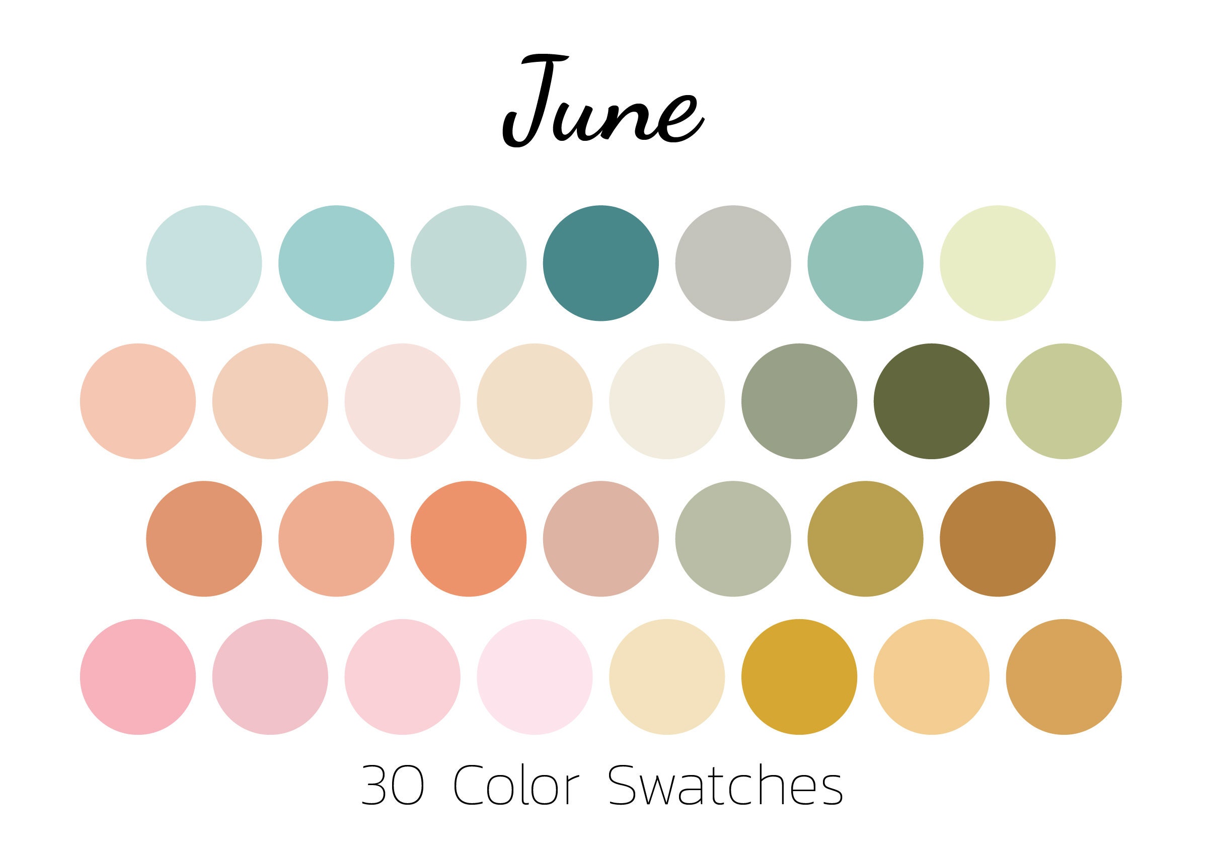
The Psychology of June Palettes in Branding
Colors are not seen in a vacuum; they carry inherent psychological associations that are amplified or nuanced by seasonal and cultural contexts. In June, these associations often revolve around optimism, growth, celebration, and freedom. Brands that tap into these deep-seated feelings through their color choices can create campaigns that feel authentic, timely, and deeply engaging.
Evoking Summer’s Essence
June marks the official arrival of summer in many parts of the world, and its color palette naturally leans towards warmth, light, and natural vibrancy. Think of the sun-drenched days, the lush greenery, and the inviting blue skies. Brands often gravitate towards:
- Bright and Sunny Yellows: Symbolizing joy, optimism, and energy, yellows can instantly communicate warmth and a carefree spirit. From soft pastels reminiscent of morning sunlight to bold, energetic citrus tones, yellow is a powerful June ambassador for brands in hospitality, food and beverage, or fashion.
- Refreshing Blues and Teals: Reflecting clear skies, sparkling waters, and refreshing breezes, blues evoke calmness, reliability, and tranquility. Lighter blues suggest openness and expanse, while deeper teals can add sophistication and a connection to aquatic themes. These are perfect for brands focusing on travel, outdoor recreation, or health and wellness.
- Lush Greens: As nature bursts into full bloom, various shades of green—from vibrant lime to deep forest—represent growth, freshness, sustainability, and vitality. Brands with an eco-conscious message, those in gardening, or even food companies emphasizing natural ingredients, find greens indispensable for their June messaging.
- Warm Oranges and Corals: These colors bridge the gap between sunny yellow and passionate red, adding an element of playfulness, enthusiasm, and tropical flair. They can signal adventure, warmth, and accessibility, making them excellent for summer product launches, event promotions, or travel brands.
By strategically deploying these core summer hues, brands can evoke the sensory experience of June, creating an immediate emotional connection with their audience.
Celebrating Diversity and Inclusion
Beyond the natural world, June holds significant cultural weight, notably as Pride Month. This brings a distinct set of colors to the forefront, offering brands a powerful opportunity to demonstrate their values and commitment to diversity, equity, and inclusion.
- Rainbow Spectrum (Pride Colors): The iconic rainbow flag colors—red, orange, yellow, green, blue, and violet—represent life, healing, sunlight, nature, harmony, and spirit. For brands, integrating these colors, or even adopting rainbow motifs, during June is a clear statement of support for the LGBTQ+ community. This goes beyond mere aesthetics; it’s a critical component of brand reputation, social responsibility, and connecting with a diverse consumer base that values authentic advocacy.
- Inclusive Palettes: Beyond explicit Pride colors, June also invites brands to consider broader inclusive palettes that avoid stereotypes and embrace a wide range of human experiences. This might involve using a more diverse range of skin tones in imagery, or designing marketing materials that feel universally welcoming rather than narrowly targeted. The underlying principle is to ensure that the chosen “June colors” reflect a brand’s commitment to representing all.
Authenticity is paramount when leveraging colors for diversity and inclusion. Brands must ensure their visual messaging is backed by genuine actions and policies, as consumers are increasingly adept at discerning performative allyship from true commitment.
Leveraging June’s Hues for Brand Resonance
The power of June colors lies in their application across various brand touchpoints. From digital campaigns to physical products, consistent and thoughtful use of these seasonal palettes can amplify brand messaging and drive engagement.
Seasonal Campaigns and Product Launches

June is a prime time for product launches, especially for seasonal goods or services. Integrating June colors into campaign visuals, product design, and promotional materials can create a cohesive and exciting narrative.
- Limited Edition Products: Brands can release limited-edition packaging or product variations featuring June’s vibrant yellows, blues, and greens. A beverage company might introduce a “Summer Sky” blue can, or a fashion brand could launch a collection in “Tropical Sunset” oranges and corals.
- Event Marketing: For June events like summer festivals, outdoor concerts, or community gatherings, the event branding should immediately communicate the celebratory and warm atmosphere using June-appropriate colors. Bold and energetic palettes can attract attendees and set the tone.
- Thematic Promotions: Retailers can use June colors in their store displays, website banners, and social media ads to highlight summer sales or holiday promotions (e.g., Father’s Day, graduations). A furniture brand promoting outdoor living might use lush greens and earthy tones, while a confectionery brand offering summer treats could opt for bright, playful pastels.
Digital Presence and Visual Storytelling
In the digital realm, June colors offer dynamic possibilities for enhancing a brand’s online persona and engaging audiences through compelling visual storytelling.
- Social Media Campaigns: Brands can refresh their social media aesthetics with June palettes, using them in post graphics, story templates, and profile accents. A travel brand might showcase stunning blue ocean vistas, while a food brand could feature vibrant green salads and yellow fruit desserts. Utilizing animated graphics with June colors can further capture attention.
- Website and App UI/UX: A subtle update to a website’s color scheme or an app’s interface can signal seasonality and freshness. This doesn’t mean a complete overhaul but perhaps a shift in accent colors, hero image backgrounds, or button hues to reflect the summery mood. For instance, a finance app might use a brighter, more optimistic shade of blue in June to subtly convey positivity and growth.
- Email Marketing: Newsletters and promotional emails can adopt June color schemes to make them more inviting and relevant. Incorporating images that feature these colors can increase click-through rates and reinforce the seasonal message.
Packaging and In-Store Experiences
Physical touchpoints remain crucial for many brands, and June colors can significantly impact the unboxing experience and in-store ambiance.
- Packaging Design: Product packaging can be a primary canvas for June colors. Think of eco-friendly brands using earthy greens and browns for packaging, or a beauty brand launching a summer line with packaging that features ocean blues and sandy beiges. Even small details, like ribbons or tissue paper, can carry the June theme.
- Retail Store Decor: Brick-and-mortar stores can transform their spaces with June colors. This includes window displays, merchandising fixtures, signage, and even employee uniforms. A clothing store might use bright yellows and oranges to highlight summer collections, creating an inviting and energetic shopping environment that encourages exploration and discovery.
- Event Decor: For brand-sponsored events or pop-ups, the decor, lighting, and even the food and beverage presentation can all be infused with June’s palette, creating an immersive brand experience.
Emerging Trends and Strategic Application
The world of color trends is ever-evolving, and June’s palette is not static. Strategic brands continually monitor shifts in consumer preferences and cultural narratives to ensure their color choices remain impactful and relevant.
The Nuance of “June Specific” vs. “Summer Generic”
While there’s overlap, savvy brands distinguish between generic “summer colors” and those specifically resonating with June. Early summer often carries a sense of anticipation, freshness, and budding energy that differs from the peak heat and relaxation of August.
- Early Summer Greens and Soft Yellows: June often leans into the fresh greens of new growth and softer, morning-like yellows, rather than the intense, late-summer golds or burnt oranges.
- Transitional Blues: Blues might be more about clear skies and gentle waves in June, evolving to deeper, more intense ocean blues or stormy grays as summer progresses.
- Pride and Planning: June’s unique cultural markers, like Pride Month and graduation season, add specific color considerations that distinguish it from other summer months. Brands must be mindful of these nuances to avoid a generic approach.
Data-Driven Color Choices
Modern branding leverages data analytics to inform creative decisions, including color palettes. Brands can analyze past campaign performance, consumer sentiment around certain colors, and even A/B test different color schemes to optimize engagement and conversion rates.
- Audience Demographics: Different demographics may respond to colors differently. Data can reveal preferences among target audiences, allowing brands to tailor their June palettes for maximum impact.
- Geographic and Cultural Context: The perception of June colors can vary globally. What signifies summer in one region might not in another. Brands operating internationally must consider these cultural nuances, perhaps adapting their June palettes accordingly.
- Performance Metrics: Tracking metrics like click-through rates, time spent on page, and conversion rates for campaigns featuring specific June colors can provide invaluable insights into what resonates most effectively with the brand’s audience.
By understanding the psychological underpinnings, strategic applications, and evolving trends of June colors, brands can craft compelling visual narratives that not only capture the essence of the month but also strengthen brand identity, foster deeper connections, and drive measurable success in a vibrant, competitive market.
aViewFromTheCave is a participant in the Amazon Services LLC Associates Program, an affiliate advertising program designed to provide a means for sites to earn advertising fees by advertising and linking to Amazon.com. Amazon, the Amazon logo, AmazonSupply, and the AmazonSupply logo are trademarks of Amazon.com, Inc. or its affiliates. As an Amazon Associate we earn affiliate commissions from qualifying purchases.