
In the world of high-level brand strategy, the difference between a market leader and a mediocre competitor often lies in the details. While logo color palettes and typography choices receive the lion’s share of attention, the “micro-typography” of a brand’s written communication is what truly cements its professional authority. Among the most overlooked yet vital tools in a brand designer’s or copywriter’s arsenal are the en dash and the em dash.
To the untrained eye, these marks are simply horizontal lines of varying lengths. To a brand strategist, they are essential components of a cohesive corporate identity. Understanding what en dashes and em dashes are—and how to use them—ensures that your brand’s voice remains sophisticated, clear, and authoritative across every touchpoint, from white papers to social media marketing.
1. The Psychology of Detail: Why Punctuation Matters for Brand Strategy
Brand identity is a promise of quality. When a company produces a marketing deck or a high-end product catalog, every element represents the brand’s commitment to excellence. Improper use of punctuation—such as using a hyphen where an em dash is required—sends a subtle but damaging signal to the consumer: we don’t pay attention to the details.
Establishing Corporate Authority through Typography
In corporate identity, consistency is king. If your brand’s annual report uses hyphens to denote ranges in one section and en dashes in another, the visual rhythm of the text is disrupted. Professional typography signals a “prestige” brand. High-end fashion houses, law firms, and tech giants invest heavily in style guides that specify exactly how these punctuation marks should be handled to ensure a seamless, high-end reading experience.
Enhancing Readability and Brand Recall
Marketing copy is designed to be consumed quickly. The strategic use of the em dash, in particular, allows for the creation of “breathable” text. By breaking up long sentences and adding emphasis to key value propositions, em dashes help guide the reader’s eye toward the most important information. When readability increases, brand message retention increases along with it.
2. Decoding the Symbols: Defining the En Dash and the Em Dash
To implement these marks into your brand’s style guide, you must first understand their technical definitions and their specific roles in English grammar and design.
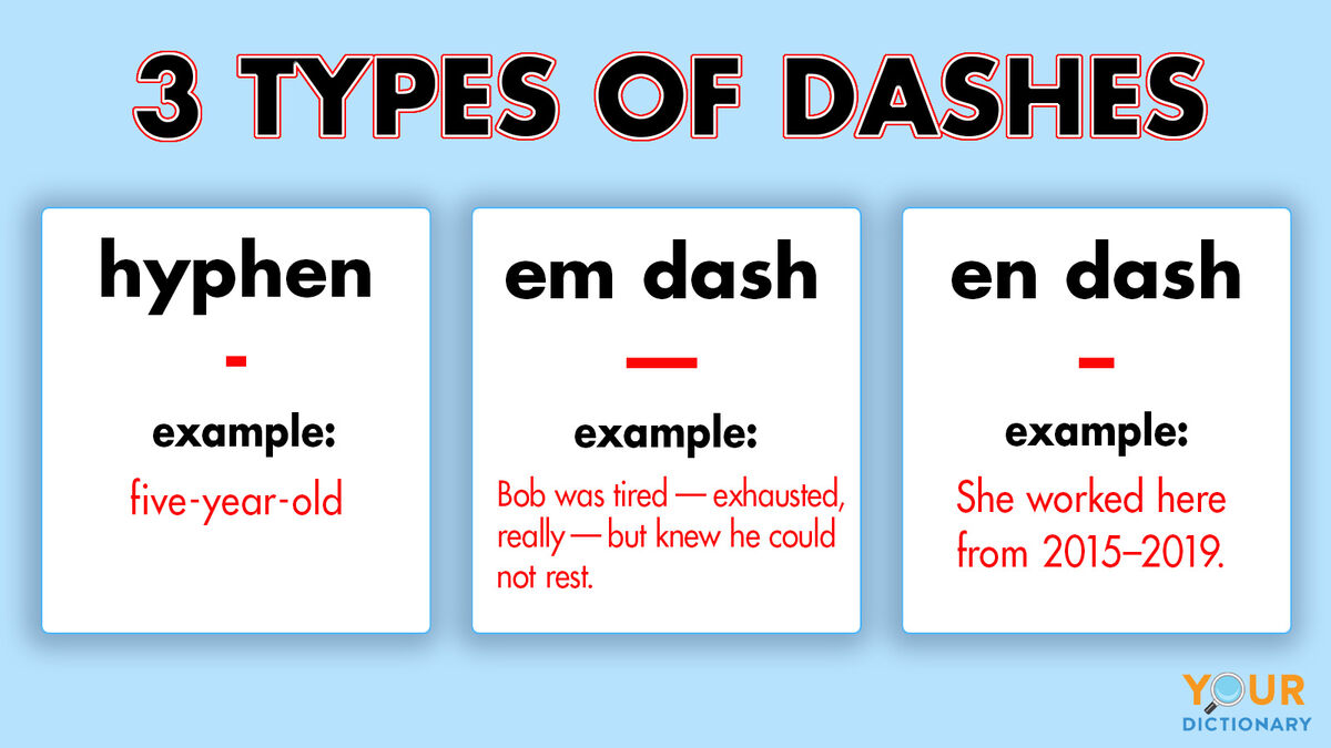
The En Dash (–): The Mark of Connection
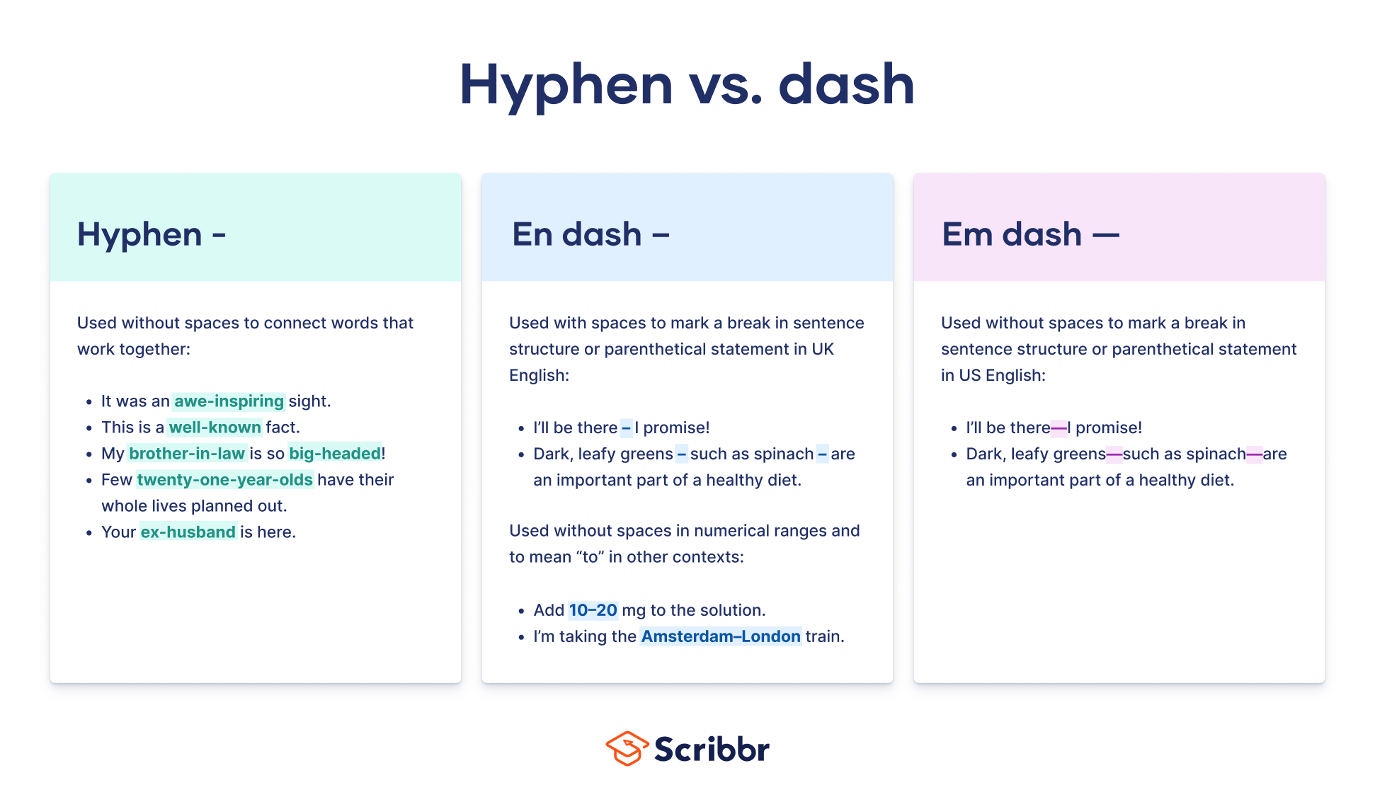
The en dash is approximately the width of the letter “N.” In the hierarchy of dashes, it sits between the tiny hyphen and the long em dash. Its primary function in professional branding is to denote ranges or connections.
-
Ranges: Use the en dash to connect numbers, such as dates or prices (e.g., “The 2023–2024 Fiscal Report” or “Consultation fee: $500–$1,000”).
-
Conflict or Connection: It is used when two equal entities are being linked, such as “The London–New York flight path” or “The brand–consumer relationship.”
The Em Dash (—): The Mark of Emphasis
The em dash is the width of the letter “M.” It is the most versatile and stylistically “loud” of the dashes. In brand storytelling, the em dash is used to indicate a break in thought, an interruption, or to provide additional emphasis on a specific brand benefit.
-
Replacing Commas: Use it to set off a parenthetical thought with more impact than a comma (e.g., “Our software—the fastest in the industry—is now available for download”).
-
Replacing Colons: It can introduce a list or an explanation with a more modern, energetic feel than a formal colon.
The Hyphen (-): What It Is Not
It is a common mistake for brands to use a hyphen for everything. A hyphen’s only job is to join words together (e.g., “customer-centric approach”). Using a hyphen as a dash is a hallmark of amateur branding and should be avoided in all professional corporate communications.
3. Implementing Dashes into Your Brand Style Guide

For a brand to maintain its identity at scale, it must have a documented style guide. This document should explicitly state how en and em dashes are to be used, ensuring that every employee—from the intern to the CEO—communicates with the same level of polish.
Choosing Your Style: AP vs. Chicago
The two most common professional style guides have different rules regarding the em dash. A brand must choose one and stick to it:
-
AP Style (Associated Press): Common in marketing and PR, AP style adds a space on either side of the em dash (e.g., “Brand — Value”).
-
Chicago Style: Common in publishing and corporate reports, Chicago style uses no spaces (e.g., “Brand—Value”).
Whichever you choose defines the “visual density” of your brand’s copy. Spaces (AP) feel more airy and modern; no spaces (Chicago) feel more academic and traditional.
Digital Accessibility and Dash Shortcuts
In the digital space, branding meets functionality. Not all keyboards make these dashes easy to find, leading to the “double hyphen” (–) shortcut. This should never appear in final brand assets. Your style guide should include a “Quick Keys” section for content creators:
-
Mac:
Option + Minus(En Dash);Shift + Option + Minus(Em Dash). -
Windows:
Alt + 0150(En Dash);Alt + 0151(Em Dash).
4. The Impact of Punctuation on Marketing Copy and Design
Punctuation isn’t just about grammar; it’s about design. In the context of a landing page or a social media ad, the length of a dash affects the visual “white space” of the layout.
Creating High-Impact Headlines
In marketing, the em dash acts as a visual “speed bump.” It forces the reader to pause and digest the information that follows. For example:
-
Without Dash: “Our platform helps you grow your revenue and scale your team.”
-
With Em Dash: “Grow your revenue—then scale your team effortlessly.”
The second option uses the em dash to create a narrative beat, making the brand’s promise feel more powerful and considered.
Improving User Experience (UX) in Copy
For B2B brands dealing with complex data, the en dash is a tool for clarity. When a user is scanning a pricing table or a technical specification sheet, the clean lines of an en dash (10–20 units) are much easier to parse than “10 to 20 units.” This reduces cognitive load, making the brand feel easier to work with.
5. Elevating Personal Branding Through Professional Polish
For executives and thought leaders, personal branding is built on the foundation of expertise. When a leader publishes an article on LinkedIn or a guest post on a major industry site, their use of punctuation reflects their intellectual rigor.
The “Expert” Aesthetic
Using the correct dash identifies you as someone who understands the nuances of professional communication. It places your content in the same league as The New York Times or The Harvard Business Review. In personal branding, appearing “polished” translates to being “prepared” and “detail-oriented.”
Communicating Voice and Tone
The way you use dashes can alter the “vibe” of your personal brand. Frequent use of em dashes can make your writing feel dynamic, conversational, and energetic—perfect for an innovative “disruptor” brand. Conversely, a more restrained use of dashes, favoring the en dash for data and the comma for pauses, suggests a brand that is stable, conservative, and traditional.
Conclusion: The Smallest Marks, the Biggest Impression
In the competitive landscape of modern business, a brand is the sum of its parts. While a logo provides the face and a mission statement provides the heart, typography provides the voice. Mastering the en dash and the em dash is not a pedantic exercise; it is a strategic move to ensure your brand communicates with clarity, authority, and professional sophistication.
By formalizing the use of these marks in your corporate style guide and training your team to recognize their value, you elevate your brand’s identity from “standard” to “exceptional.” Remember: a brand that cares about the length of its dashes is a brand that cares about the quality of its products and the satisfaction of its customers. Don’t just write—brand your writing.
aViewFromTheCave is a participant in the Amazon Services LLC Associates Program, an affiliate advertising program designed to provide a means for sites to earn advertising fees by advertising and linking to Amazon.com. Amazon, the Amazon logo, AmazonSupply, and the AmazonSupply logo are trademarks of Amazon.com, Inc. or its affiliates. As an Amazon Associate we earn affiliate commissions from qualifying purchases.