
In the modern landscape of digital marketing, where flickering banners and auto-playing videos dominate our screens, the concept of a “broadside” might seem like a relic of a bygone era. However, for brand strategists and marketing historians, the broadside represents the foundational DNA of modern advertising. Historically, a broadside was a large sheet of paper printed on one side, intended to be plastered onto walls, posted in town squares, or handed out in bustling marketplaces.
In the context of brand strategy, the broadside is more than just a piece of paper; it is the original high-impact, single-surface communication tool. It represents the art of capturing attention instantly and conveying a singular, powerful message before the viewer moves on. Understanding what broadsides are—and how their principles continue to govern visual identity and corporate marketing—is essential for any brand looking to cut through the noise of the 21st century.

The Historical Foundation: From Public Criers to Brand Messaging
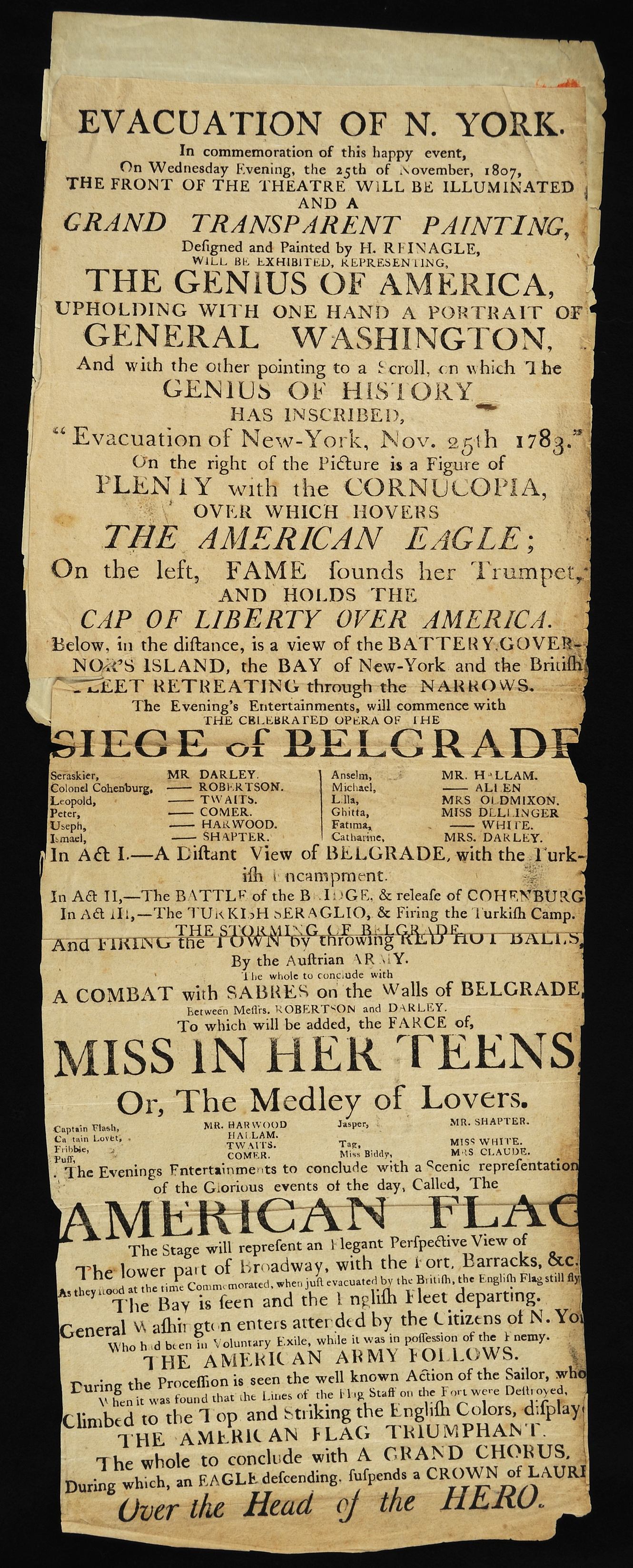
Before the advent of the daily newspaper or the digital billboard, the broadside was the primary vehicle for public discourse. It was the “breaking news” of the 16th through 19th centuries. From royal proclamations and political manifestos to advertisements for local merchants and traveling circuses, the broadside was designed to be ephemeral yet authoritative.
Defining the Broadside in a Marketing Context
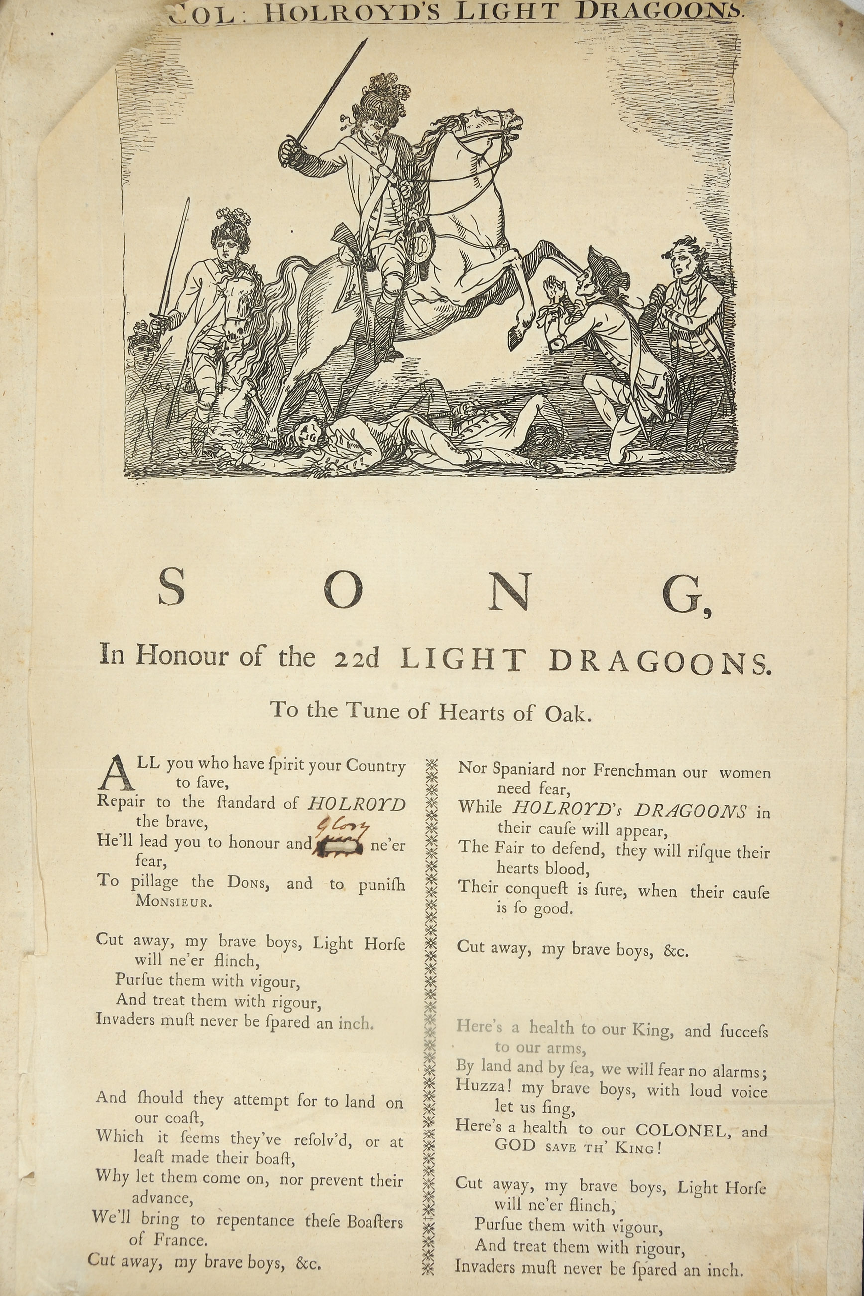
Technically, a broadside is defined by its format: a single sheet of paper, typically of a large size, printed on only one side. Because the back remained blank, it was ideally suited for “posting” on flat surfaces. From a brand perspective, this created a specific constraint that birthed creativity. Without the luxury of multiple pages or interactive elements, the creator had to rely on bold typography and striking imagery to command the environment.
The Power of the Single Sheet
The broadside taught early marketers the value of the “Elevator Pitch.” Because these sheets were often encountered by people on the move, the brand message had to be distilled into its purest form. This is where the concept of the “headline” truly matured. If the headline of a broadside didn’t hook the passerby within seconds, the communication failed. Today, this principle lives on in landing page design and social media graphics, where the “above the fold” content serves as the digital broadside of the modern age.
Visual Identity and the Art of the Broadside
One cannot discuss broadsides without delving into the world of design and corporate identity. Historically, because printing technology was limited, broadside designers had to maximize the impact of woodblock illustrations and lead type. This necessity forced the development of a strong visual hierarchy—a cornerstone of modern brand design.
Typography as a Brand Asset
In the era of the broadside, “fonts” weren’t just choices in a dropdown menu; they were physical assets that conveyed tone and authority. A broadside announcing a government decree used heavy, serifed fonts to denote stability and power. Conversely, a broadside advertising a theater performance might use more decorative, whimsical typefaces.
Modern branding follows this exact logic. A brand’s choice of typography is its “voice” on the page. When we look at the bold, sans-serif type used by tech giants like Google or Airbnb, we see the descendant of the clean, functional broadside. The goal remains the same: immediate legibility and the immediate projection of a brand persona.
Hierarchy and Visual Impact
Broadsides were the first medium to master the “Z-pattern” and “F-pattern” of reading. Designers placed the most critical information—the Brand Name or the Call to Action—where the eye would naturally land first. By using varying sizes of type and strategically placed borders, they guided the viewer’s journey across the single sheet. This mastery of visual hierarchy is exactly what a brand strategy agency does today when designing a brand’s visual identity system. It ensures that the consumer’s eye is led toward the most valuable information in a logical, persuasive order.
Strategic Implementation: Using Broadside Principles in Modern Marketing
While we may no longer rely on paper sheets tacked to tavern doors, the strategic principles of the broadside are more relevant than ever. In an age of “information overload,” the ability to provide a “broadside moment”—a clear, singular, and unavoidable brand message—is a competitive advantage.
The Minimalism of High-Impact Advertising
Some of the most successful brand campaigns in history have been, in essence, digital or modern broadsides. Consider Apple’s “Think Different” posters or Nike’s “Just Do It” billboards. These advertisements do not list features or prices; they present a singular image and a singular phrase on a single surface. This minimalism forces the consumer to focus on the brand’s core essence. In brand strategy, this is known as “distillation”—removing the clutter until only the most potent version of the brand remains.
Out-of-Home (OOH) Media as the Digital Broadside
Modern Out-of-Home (OOH) advertising, such as digital billboards in Times Square or posters in subway stations, is the direct descendant of the 18th-century broadside. The constraints are identical: the audience is in motion, the space is limited, and the competition for attention is fierce. Strategic brands treat these spaces not as places for complex information, but as canvases for “broadside” impact. A successful OOH campaign uses the broadside philosophy to create a visual “punch” that builds brand awareness and reinforces corporate identity in the physical world.
Psychological Triggers: Why Single-Surface Messaging Works
The effectiveness of the broadside isn’t just about design; it’s rooted in human psychology. Our brains are wired to process visual information rapidly, but our cognitive load is limited. The broadside format respects these biological limits by offering a “low-friction” information exchange.
Attention Economy and Immediate Recognition
In the “Attention Economy,” attention is the most valuable currency. A broadside-style message works because it doesn’t ask for a significant time investment. A consumer can “consume” the brand message of a well-designed poster or Instagram post in under three seconds. This immediate recognition builds “mental availability,” a key metric in brand growth. When a brand consistently uses the same colors, fonts, and “broadside” layouts, it creates a cognitive shortcut in the consumer’s mind, making the brand easier to remember and choose.
Building Credibility Through Authority and Form
There is an inherent “authority” to the broadside format. Historically, because printing was expensive and regulated, a broadside carried the weight of legitimacy. Today, that psychological residue remains. High-quality print media or a professionally designed “static” digital ad carries a sense of permanence and “truth” that a fleeting video ad might lack. For a brand, utilizing this format can signal stability, confidence, and premium positioning.
Crafting Your Brand’s Modern Broadside
To apply the lessons of the broadside to a modern brand strategy, one must move beyond the literal definition and embrace the “Broadside Mindset.” This involves a commitment to clarity, a mastery of visual assets, and a strategic understanding of where and how your brand meets the public eye.
Consistency Across Mediums
A brand’s identity should be robust enough that any single “slice” of its marketing—whether it’s a LinkedIn header, a physical flyer, or a packaging label—functions as a broadside. This requires a strict adherence to brand guidelines. If your “broadsides” look different every time they appear, you lose the cumulative effect of brand recognition. Consistency transforms a single piece of communication into a brick in the wall of brand equity.
The Future of Static Communication in a Dynamic World
As we move further into the age of AI-generated content and hyper-personalized video, the “static” broadside will actually become more powerful, not less. In a world of constant motion, the static image provides a point of stillness. It allows the brand to say, “This is who we are. This is what we stand for. This is where we are going.”
By mastering the art of the broadside, brand managers can ensure that their message isn’t just seen—it’s felt. Whether it’s through a high-concept print ad or a perfectly executed social media tile, the principles of the broadside remain the most effective way to plant a flag in the consumer’s mind and claim a territory for your brand. In the end, the broadside reminds us that in branding, the most powerful voice is often the one that speaks with the most clarity, on a single sheet, for all the world to see.
aViewFromTheCave is a participant in the Amazon Services LLC Associates Program, an affiliate advertising program designed to provide a means for sites to earn advertising fees by advertising and linking to Amazon.com. Amazon, the Amazon logo, AmazonSupply, and the AmazonSupply logo are trademarks of Amazon.com, Inc. or its affiliates. As an Amazon Associate we earn affiliate commissions from qualifying purchases.