
In an increasingly data-driven world, the ability to effectively communicate insights is paramount. Raw numbers, while foundational, often fail to convey the full story. This is where graphs—powerful visual representations of data—come into play. Learning “how to make a graph” is not merely a technical skill; it’s an essential competency for anyone looking to understand, interpret, and present information clearly and compellingly. From scientific research and business analytics to personal finance tracking, graphs transform complex datasets into digestible, actionable intelligence. This guide delves into the technical process of creating impactful graphs, exploring various tools, best practices, and methodologies to elevate your data visualization prowess.

Understanding the Fundamentals of Graph Creation
Before diving into the mechanics of software and code, a foundational understanding of data visualization principles is crucial. A well-crafted graph is more than just a collection of points and lines; it’s a carefully constructed narrative designed to reveal patterns, trends, and outliers that might otherwise remain hidden.
Why Visualize Data? The Power of Graphs
Data visualization leverages the human brain’s remarkable capacity to process visual information far more efficiently than text or tables. A graph can:
- Reveal Trends and Patterns: Quickly spot upward or downward trends, cyclical patterns, or correlations between variables.
- Simplify Complex Data: Condense large datasets into easily understandable visual summaries.
- Aid Decision-Making: Provide clear, immediate insights that support informed choices in business, research, and personal life.
- Enhance Communication: Make presentations and reports more engaging and persuasive, ensuring your audience grasps key takeaways.
- Identify Outliers: Highlight anomalous data points that warrant further investigation.
Without visualization, even the most profound datasets risk being overlooked or misinterpreted. Graphs serve as the bridge between raw data and actionable knowledge.
Choosing the Right Graph Type for Your Data
The effectiveness of a graph largely depends on selecting the appropriate type for your specific data and the message you wish to convey. Mismatching graph type and data can lead to confusion or misinterpretation.
- Bar Charts: Ideal for comparing discrete categories or showing changes over time (e.g., sales figures across different product lines).
- Line Graphs: Excellent for illustrating trends over continuous periods, revealing patterns and fluctuations (e.g., stock prices over months, temperature changes).
- Pie Charts: Best for showing parts of a whole, though generally recommended for a limited number of categories (e.g., market share distribution).
- Scatter Plots: Perfect for exploring relationships and correlations between two continuous variables (e.g., height vs. weight, advertising spend vs. sales).
- Histograms: Used to display the distribution of a single continuous variable, showing frequency within bins (e.g., age distribution in a population).
- Area Charts: Similar to line charts but with the area beneath the lines filled, suitable for showing cumulative totals over time.
- Box Plots: Useful for displaying the distribution of data based on a five-number summary: minimum, first quartile, median, third quartile, and maximum.
- Heatmaps: Visualize data in a matrix where individual values are represented as colors, great for showing intensity or density (e.g., correlation matrices, website click patterns).
Understanding the strengths and weaknesses of each type is the first step towards creating impactful visualizations.
Essential Components of a Good Graph
Regardless of the type, an effective graph typically includes several key components:
- Title: A clear, concise title that summarizes the graph’s purpose.
- Axes Labels: Clearly labeled X and Y axes, indicating what data they represent (e.g., “Time (Months)”, “Revenue ($)”).
- Units: Appropriate units for the data being displayed (e.g., %, $, °C).
- Legend (if applicable): Explains what different colors, symbols, or line styles represent.
- Data Points/Elements: The visual representation of your data (bars, lines, points).
- Source: A citation indicating where the data came from, especially for public data.
- Scale: An appropriate scale for the axes to avoid distorting the data.
Missing or ambiguous components can quickly render a graph ineffective or misleading.
Leveraging Software Tools for Graph Generation
The digital age offers an abundance of tools for graph creation, ranging from simple spreadsheet applications to sophisticated programming libraries. The choice of tool often depends on the complexity of your data, your technical proficiency, and your specific visualization needs.
Spreadsheet Software: Excel and Google Sheets
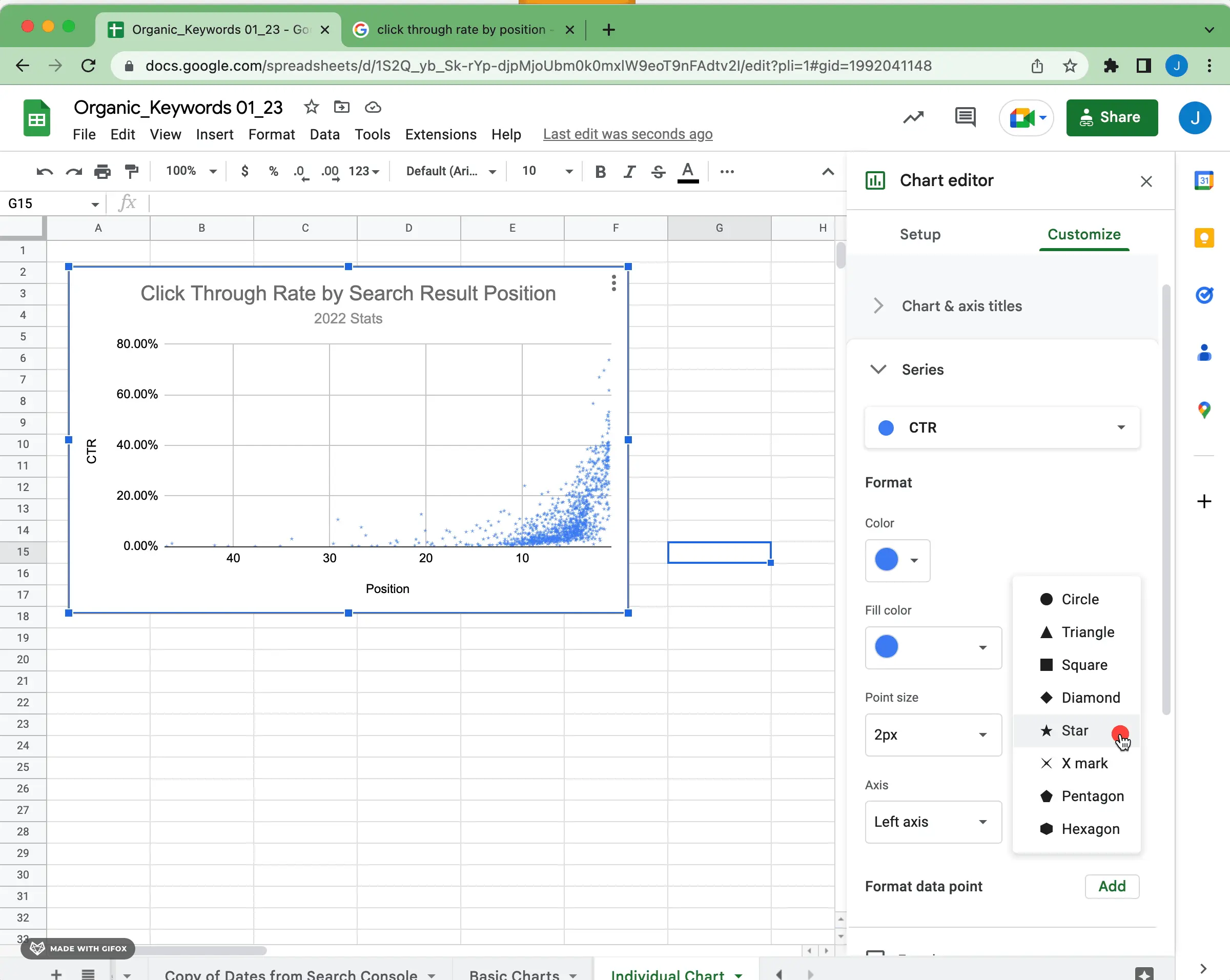
For many, spreadsheet software like Microsoft Excel and Google Sheets serves as the entry point into data visualization. Their accessibility and user-friendly interfaces make them ideal for quick analyses and common graph types.
- Microsoft Excel: Offers a robust set of charting tools accessible via the “Insert” tab. Users can select data ranges, choose from a wide array of chart types, and customize titles, labels, colors, and more. Excel’s power lies in its data manipulation capabilities combined with its charting features, making it suitable for both analysis and presentation.
- Google Sheets: A cloud-based alternative, Google Sheets provides similar charting functionalities. Its collaborative features are a major advantage, allowing multiple users to work on data and visualizations simultaneously. It integrates seamlessly with other Google Workspace tools, simplifying data flow.
Both platforms are excellent for creating standard bar, line, pie, and scatter charts, and they require minimal technical expertise.
Specialized Visualization Tools: Tableau, Power BI, and D3.js
When dealing with larger datasets, complex relationships, or the need for interactive dashboards, specialized visualization tools become indispensable.
- Tableau: A leading data visualization tool known for its intuitive drag-and-drop interface and powerful analytical capabilities. Tableau allows users to connect to various data sources, create highly interactive dashboards, and publish visualizations to the web or desktop. It excels at creating exploratory visualizations and enabling deep dives into data.
- Microsoft Power BI: Another industry giant, Power BI offers robust features for data modeling, analysis, and visualization. It integrates tightly with other Microsoft products and is particularly strong for business intelligence reporting, allowing users to create dynamic reports and dashboards.
- D3.js (Data-Driven Documents): For those with web development skills, D3.js is a powerful JavaScript library for creating custom, highly interactive, and web-based data visualizations. While it has a steeper learning curve, D3 offers unparalleled flexibility and control, allowing developers to craft unique visualizations tailored to exact specifications.
These tools are designed for more professional and intricate data visualization projects, often used by data analysts, business intelligence specialists, and web developers.
Programming Languages: Python (Matplotlib, Seaborn) and R (ggplot2)
For data scientists, researchers, and developers who require maximum control, automation, and statistical rigor, programming languages offer the ultimate flexibility.
- Python: With libraries like Matplotlib and Seaborn, Python is a powerhouse for data visualization.
- Matplotlib: A fundamental plotting library, Matplotlib provides a highly customizable framework for creating a vast range of static, animated, and interactive visualizations. It offers fine-grained control over every aspect of a plot.
- Seaborn: Built on top of Matplotlib, Seaborn simplifies the creation of complex statistical graphics. It comes with beautiful default styles and focuses on visualizing the relationships between variables, making it ideal for exploratory data analysis.
- R: Widely used in statistical computing and graphics, R offers several excellent visualization packages.
- ggplot2: A cornerstone of R visualization, ggplot2 implements the “grammar of graphics” approach, allowing users to build complex plots layer by layer. It’s renowned for producing high-quality, aesthetically pleasing statistical graphics with relatively concise code.
These programming-based approaches are best suited for users who regularly work with data, perform advanced statistical analysis, and need to integrate visualization into larger analytical workflows.
Step-by-Step Guide to Creating Graphs
While the specific steps vary by tool, the general workflow for creating an effective graph remains consistent.
Data Collection and Preparation
The foundation of any good graph is clean, accurate data.
- Define Your Data Needs: Clearly identify what data you need to answer your question or prove your hypothesis.
- Collect Data: Gather data from reliable sources, whether through experiments, surveys, databases, or public datasets.
- Clean and Organize Data: This crucial step involves handling missing values, correcting errors, removing duplicates, and ensuring data consistency. Data should typically be in a structured format (e.g., rows represent observations, columns represent variables).
- Transform Data (if necessary): Aggregate data, calculate new variables, or normalize values to prepare them for visualization.

Garbage in, garbage out – accurate visualization begins with pristine data.
Selecting Your Graphing Tool
Based on your data complexity, technical comfort, and desired output, choose the most appropriate tool from the categories discussed above (spreadsheets, specialized tools, or programming languages). Consider factors like learning curve, interactivity needs, and integration with existing workflows.
Plotting Your Data and Customization
This is where you bring your data to life visually.
- Input/Import Data: Load your cleaned data into your chosen graphing tool.
- Select Data Range: Identify the specific columns or rows of data you wish to plot.
- Choose Graph Type: Based on your data and objective, select the most suitable graph type. Most tools offer a gallery of options.
- Generate Initial Graph: The tool will create a basic version of your graph.
- Customize Elements:
- Add a Title: Make it descriptive and informative.
- Label Axes: Clearly indicate what the X and Y axes represent, including units.
- Add a Legend: If multiple series are plotted, explain them.
- Adjust Colors: Use a consistent and meaningful color palette. Avoid overly vibrant or clashing colors.
- Modify Font Sizes: Ensure readability of all text.
- Add Data Labels (sparingly): Only if they enhance clarity without cluttering.
- Adjust Axis Scales: Ensure the scale starts appropriately and accurately represents the data range.
Thoughtful customization is key to making your graph both informative and aesthetically pleasing.
Reviewing and Refining Your Graph
Before sharing, always critically review your visualization.
- Clarity: Is the message clear and easily understandable?
- Accuracy: Does the graph accurately represent the data without distortion?
- Simplicity: Is there any unnecessary clutter that can be removed?
- Effectiveness: Does it achieve its intended purpose? Does it answer the question you set out to explore?
- Audience Appropriateness: Is it tailored to your target audience’s level of understanding?
- Proofread: Check for any typos in titles, labels, or legends.
Refine iteratively until the graph is polished and compelling.
Best Practices for Effective Data Visualization
Creating graphs is an art as much as a science. Adhering to best practices ensures your visualizations are not only accurate but also impactful and ethical.
Clarity and Simplicity
The primary goal of a graph is to communicate clearly.
- Eliminate Clutter: Remove unnecessary gridlines, excessive labels, heavy borders, or distracting background elements. “Data-ink ratio” suggests maximizing the ink dedicated to data representation.
- Focus on the Message: Each graph should ideally convey one primary message. If you have multiple points, consider multiple graphs.
- Use Intuitive Design: Employ design principles that are familiar and easy for the audience to grasp. Standard chart conventions (e.g., time on the x-axis) should generally be followed.
A simple, uncluttered graph is often the most powerful.
Accuracy and Avoiding Misrepresentation
Ethical visualization demands accuracy. Graphs can be unintentionally or intentionally misleading.
- Avoid Truncated Axes: Starting the Y-axis at a non-zero value can exaggerate differences between data points. While sometimes justifiable to focus on small variations, always use caution and clearly indicate when an axis is truncated.
- Consistent Scales: When comparing multiple graphs, ensure they use consistent scales for meaningful comparison.
- Proportional Representation: In charts like pie charts, ensure segments accurately reflect their numerical proportions. 3D effects can sometimes distort perceived sizes.
- Appropriate Binning (Histograms): Choose bin sizes that reveal underlying distributions without obscuring or exaggerating features.
Always strive for an honest and true representation of your data.
Accessibility and Inclusivity
Good data visualization is accessible to everyone.
- Color Blindness Considerations: Avoid relying solely on color to convey information, as a significant portion of the population has some form of color blindness. Use distinct patterns, textures, or direct labels in addition to color. Choose color palettes that are color-blind friendly (e.g., using online tools to check palettes).
- High Contrast: Ensure sufficient contrast between data elements and the background for readability.
- Legible Text: Use clear, readable fonts and appropriate font sizes for titles, labels, and legends.
- Descriptive Alternative Text: For web-based graphs, provide descriptive alt text for screen readers to explain the graph’s content.
Designing with accessibility in mind ensures your insights can reach the widest possible audience.
Advanced Graphing Techniques and Future Trends
As data grows in volume and complexity, so do the techniques and tools for visualizing it.
Interactive Graphs and Dashboards
Static graphs, while useful, have limitations. Interactive graphs and dashboards allow users to explore data dynamically.
- Filtering and Sorting: Users can interactively filter data by categories or sort values to find specific insights.
- Drill-Down Capabilities: Click on a summary point to reveal underlying detailed data.
- Tooltips: Hovering over data points to display specific values or additional information.
- Animation: Showing changes over time or transitions between different views.
Tools like Tableau, Power BI, and D3.js excel at creating these dynamic experiences, transforming passive viewing into active exploration. Dashboards, in particular, consolidate multiple related visualizations onto a single screen, providing a comprehensive overview of key performance indicators (KPIs) or trends.
AI-Powered Visualization
The advent of artificial intelligence and machine learning is beginning to revolutionize data visualization.
- Automated Insights: AI tools can analyze datasets and automatically suggest relevant graph types, identify key patterns, and even generate natural language summaries of findings.
- Smart Data Discovery: AI can help users uncover hidden correlations or anomalies that might be missed by manual exploration.
- Natural Language Interaction: Future tools may allow users to simply ask questions in plain English (e.g., “Show me sales by region for the last quarter”) and have graphs automatically generated.
While still evolving, AI integration promises to make data visualization even more accessible and powerful, automating many of the initial data exploration and graph creation steps.
Mastering the art and science of “how to make a graph” is an invaluable skill in today’s data-rich environment. By understanding the fundamentals, leveraging the right tools, following a structured process, and adhering to best practices, you can transform raw data into compelling stories that inform, persuade, and drive meaningful action. As technology continues to advance, the possibilities for impactful data visualization will only expand, offering exciting new ways to see and understand the world around us.
aViewFromTheCave is a participant in the Amazon Services LLC Associates Program, an affiliate advertising program designed to provide a means for sites to earn advertising fees by advertising and linking to Amazon.com. Amazon, the Amazon logo, AmazonSupply, and the AmazonSupply logo are trademarks of Amazon.com, Inc. or its affiliates. As an Amazon Associate we earn affiliate commissions from qualifying purchases.