
Graphing fundamental equations like “x = 4” might seem deceptively simple, yet it represents a cornerstone of data visualization, computational geometry, and various branches of software development and engineering. Far from being a mere academic exercise, understanding how to plot such a basic constraint on a coordinate plane is essential for anyone delving into programming graphical interfaces, analyzing datasets, designing virtual environments, or even troubleshooting system parameters. This article will guide you through the process of graphing x = 4, exploring both manual techniques and the powerful digital tools that streamline this process in modern tech contexts, and subsequently extending this knowledge to practical applications within the technology landscape.

Understanding the Fundamentals of Cartesian Coordinates
Before we plunge into the specifics of graphing x = 4, it’s crucial to solidify our understanding of the Cartesian coordinate system, which serves as the universal language for plotting points and equations in two dimensions. This foundational knowledge is indispensable, whether you’re working with pen and paper or sophisticated graphing software.
The Cartesian Plane: A Quick Refresher
The Cartesian plane, named after the French mathematician René Descartes, is a two-dimensional grid defined by two perpendicular number lines: the horizontal x-axis and the vertical y-axis. These axes intersect at a point called the origin (0,0). The plane is divided into four quadrants, typically labeled counter-clockwise from the top-right.
- X-axis: Represents the horizontal position. Positive values extend to the right of the origin, negative values to the left.
- Y-axis: Represents the vertical position. Positive values extend upwards from the origin, negative values downwards.
Every point on this plane can be uniquely identified by an ordered pair of coordinates (x, y), where ‘x’ is its horizontal position and ‘y’ is its vertical position. This system provides a clear framework for translating abstract mathematical relationships into visual representations.
What x = 4 Means in a Two-Dimensional Space
When we encounter an equation like x = 4 in a two-dimensional context, it carries a specific and powerful implication. Unlike equations that involve both ‘x’ and ‘y’ (e.g., y = 2x + 1), x = 4 is a special case where the value of ‘y’ is not explicitly constrained by ‘x’. This means that for any possible value of ‘y’—positive, negative, or zero—the x-coordinate of the point must always be 4.
Consider a few points that satisfy this condition:
- (4, 0): The point where x is 4 and y is 0 (on the x-axis).
- (4, 2): The point where x is 4 and y is 2.
- (4, -3): The point where x is 4 and y is -3.
- (4, 100): The point where x is 4 and y is 100.
No matter how far up or down you go along the y-axis, as long as the x-coordinate remains 4, the point lies on our desired graph. This leads directly to its graphical representation.
Distinguishing Between x = constant and y = constant
It’s crucial to understand the fundamental difference between x = constant and y = constant equations.
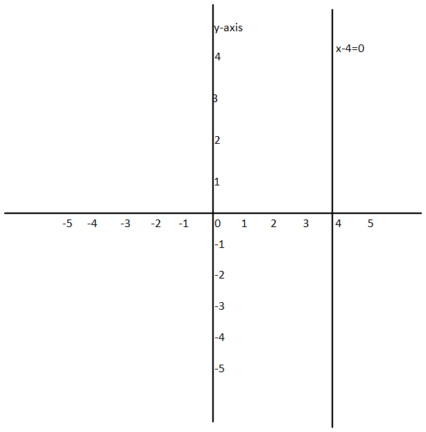
- Equations of the form x = constant (e.g., x = 4): These equations always represent vertical lines. The line will intersect the x-axis at the value of the constant. In our case, x = 4 will be a vertical line passing through the point (4, 0) on the x-axis. No matter what ‘y’ value you choose, ‘x’ will always be 4.
- Equations of the form y = constant (e.g., y = 3): These equations always represent horizontal lines. The line will intersect the y-axis at the value of the constant. For example, y = 3 would be a horizontal line passing through the point (0, 3) on the y-axis. No matter what ‘x’ value you choose, ‘y’ will always be 3.
This distinction is vital for accurately interpreting and plotting these basic linear relationships, which often serve as boundaries or reference points in more complex technical visualizations.
Step-by-Step Guide to Graphing x = 4 Manually
While digital tools have revolutionized graphing, understanding the manual process provides invaluable insight into the underlying mechanics. It’s akin to understanding the assembly language before diving into high-level programming; it builds a strong foundational intuition.
Setting Up Your Graph Paper or Digital Canvas
Whether you’re using physical graph paper or a digital drawing tool, the initial setup is critical for clarity and accuracy.
- Draw/Establish the Axes: Draw a horizontal line (the x-axis) and a vertical line (the y-axis) that intersect at a central point (the origin). In digital software, this is often done for you by default when opening a new graphing workspace.
- Label the Axes: Label the horizontal axis ‘x’ and the vertical axis ‘y’. This prevents confusion, especially when dealing with multiple graphs or complex systems.
- Choose a Scale: Decide on a consistent increment for your tick marks along both axes. For simple equations like x = 4, a scale of 1 unit per square (or pixel in digital tools) is usually sufficient. Mark positive and negative numbers along both axes, extending far enough to include the value 4 on the x-axis and a reasonable range for y values. For instance, mark -5, -4, -3, -2, -1, 0, 1, 2, 3, 4, 5 on the x-axis, and similarly for the y-axis.
Identifying Key Points for x = 4
As discussed, x = 4 means that any point on the graph must have an x-coordinate of 4. The y-coordinate can be anything. To illustrate this, let’s pick a few arbitrary y-values and combine them with our fixed x-value:
- If y = -2, the point is (4, -2).
- If y = 0, the point is (4, 0). This point lies directly on the x-axis.
- If y = 3, the point is (4, 3).
- If y = 5, the point is (4, 5).
Plot these points on your graph paper or digital canvas. You’ll observe that all these points align vertically, directly above and below the x-axis point of 4.
Drawing the Line and Labeling It
Once you’ve plotted a few key points, the final step is to connect them and label your graph.
- Draw the Line: Using a ruler (or the line tool in digital software), draw a straight line that passes through all the points you plotted. This line should extend indefinitely upwards and downwards, indicating that there are no bounds to the possible y-values.
- Label the Line: Neatly label the drawn line with its equation: “x = 4”. This makes your graph clear and easily understandable.
This completed graph visually represents all possible (x, y) pairs where x is equal to 4, providing a clear visual boundary or reference point.
Leveraging Digital Tools for Graphing x = 4
In the modern technical landscape, manual graphing is often a conceptual exercise. For speed, accuracy, and the ability to visualize complex functions, digital tools are indispensable. These platforms are integral to various tech disciplines, from data science to game development.
Online Graphing Calculators and Web Apps (e.g., Desmos, GeoGebra)
Web-based graphing calculators have democratized access to powerful visualization capabilities. Tools like Desmos and GeoGebra are highly intuitive and widely used in education and professional settings.
- Desmos: Simply navigate to Desmos.com/calculator. On the left-hand panel, you’ll see an input field. Type
x = 4directly into this field. Instantly, a vertical line will appear on the graph grid at x = 4. You can zoom in and out, pan, and even click on the line to see coordinates, confirming that every point on it has an x-value of 4. - GeoGebra: Similar to Desmos, GeoGebra (geogebra.org/calculator) offers a dynamic interface. In the “Input” bar at the bottom, type
x = 4and press Enter. The line will be drawn, and you can explore its properties, including points, intersections, and equations.
These tools are not just for basic lines; they can handle complex equations, inequalities, 3D graphs, and even statistical plots, making them invaluable for exploratory data analysis and mathematical modeling in tech.
Programming Libraries for Graphing (e.g., Matplotlib in Python)
For developers and data scientists, integrating graphing directly into their code is a common practice. Programming libraries allow for dynamic, data-driven visualizations. Python’s Matplotlib is a prime example.
To graph x = 4 using Matplotlib, you essentially tell the library to draw a vertical line. Since Matplotlib primarily plots (x, y) points, we need to create a list of x-values that are all 4, and a corresponding range of y-values.
import matplotlib.pyplot as plt
import numpy as np

# Define the x-value
x_constant = 4

# Define a range for y-values (e.g., from -5 to 5)
y_values = np.linspace(-5, 5, 100) # Generates 100 evenly spaced points between -5 and 5

# Create a list of x-values, where each is the constant 4
x_values = [x_constant] * len(y_values)

# Plot the vertical line
plt.plot(x_values, y_values, label=f'x = {x_constant}', color='blue')

# Add labels and title
plt.xlabel('X-axis')
plt.ylabel('Y-axis')
plt.title(f'Graph of x = {x_constant}')
plt.grid(True)
plt.axvline(x=x_constant, color='red', linestyle='--', label='Alternative: axvline') # A more direct way to draw a vertical line
plt.legend()
plt.show()
This snippet demonstrates how a programmer can explicitly define a vertical line. plt.axvline() is an even more direct Matplotlib function specifically designed for drawing vertical lines, simplifying the process. Understanding how to generate such simple plots programmatically is fundamental for building dashboards, creating custom data visualizations, or incorporating graphical elements into software applications.
Expanding Beyond x = 4: Inequalities and Real-World Tech Applications
The seemingly simple graph of x = 4 forms a foundational concept that extends into more complex graphical representations, especially when dealing with inequalities, and has direct relevance across various tech domains.
Graphing x > 4 and x < 4: The Concept of Shading
Building on the vertical line x = 4, we can introduce inequalities:
- Graphing x > 4: This means “x is greater than 4”. On the Cartesian plane, this represents all points to the right of the line
x = 4.- Dashed vs. Solid Line: Since ‘x’ must be strictly greater than 4 (not equal to), the line
x = 4itself is not included in the solution set. Therefore, we drawx = 4as a dashed (or dotted) vertical line. - Shading: We then shade the region to the right of this dashed line to indicate all points (x, y) where x > 4.
- Dashed vs. Solid Line: Since ‘x’ must be strictly greater than 4 (not equal to), the line
- Graphing x < 4: This means “x is less than 4”. This represents all points to the left of the line
x = 4.- Again,
x = 4would be a dashed vertical line. - We shade the region to the left of this dashed line.
- Again,
- Graphing x ≥ 4 or x ≤ 4: If the inequality includes “equal to” (greater than or equal to, or less than or equal to), the line
x = 4is included in the solution set. In this case,x = 4would be drawn as a solid vertical line, and the appropriate side (right for ≥, left for ≤) would be shaded.
Understanding this concept of boundary lines and shaded regions is critical in fields like computer graphics for defining clipping regions, in algorithms for setting search spaces, and in game development for establishing level boundaries or trigger zones.
Understanding Vertical Lines in Data Analysis and Software Development
The concept of a vertical line at x = constant might appear abstract, but its applications in tech are tangible and widespread.
- Constraints in Programming: In programming, especially in user interface (UI) design or game development,
x = constantcan define a boundary or a fixed position. For example, a UI element might beanchored at x = 200 pixelsfrom the left edge of a screen. In physics engines for games, a vertical line could represent an immovable wall. - Thresholds in Data Processing: In data analysis, a vertical line often represents a threshold. For instance, if you’re analyzing sensor data,
x = 4might denote a specific time point (e.g., 4 seconds into an experiment) where an event occurred or a critical reading was taken. It could also mark a classification boundary in machine learning algorithms where features are plotted. - Defining Regions of Interest: In image processing or computer vision, vertical lines (or their equivalent in a pixel grid) can define regions of interest (ROIs) for further analysis, such as segmenting an image or focusing on a specific vertical strip of pixels.
Practical Examples: From Game Development to Engineering Blueprints
The ability to graph and interpret simple linear equations like x = 4 is fundamental to countless real-world tech applications.
- Game Development: Imagine a side-scrolling platformer. A vertical line
x = constantcould denote the edge of a level, an invisible wall that prevents the player from moving further, or a trigger point that activates an event when the player crosses it. Character positions are typically managed using (x, y) coordinates. - Geographic Information Systems (GIS): In mapping applications, a vertical line might represent a specific meridian (line of longitude) or a fixed easting coordinate, used for defining zones or boundaries.
- Engineering Blueprints and CAD: Computer-Aided Design (CAD) software, used in engineering and architecture, relies heavily on precise coordinate geometry. Defining a vertical structural element, a cut line, or a measurement reference at
x = 4 unitsis a routine operation, ensuring accuracy in digital models. - Robotics: In robotics,
x = 4could specify a robot’s operational boundary or a target x-coordinate it needs to reach or avoid within its workspace.
Best Practices and Common Pitfalls
To ensure clarity, accuracy, and effective communication through your graphs, adhere to best practices and be aware of common errors.
Accuracy and Precision in Graphing
- Consistent Scale: Always use a consistent scale on your axes. Distorted scales can misrepresent data and spatial relationships. Digital tools typically handle this automatically but ensure manual input maintains consistency.
- Clear Labeling: Label your axes (x, y), tick marks, and the equation of your line clearly. Ambiguous labels can lead to confusion and misinterpretation, especially when sharing graphs with others or revisiting them later.
- Appropriate Range: Choose an appropriate range for your axes. For
x = 4, ensure your x-axis includes 4, and your y-axis extends far enough to show the line’s infinite nature.
Avoiding Misinterpretations of Constant Equations
A common pitfall is misunderstanding the nature of x = constant and y = constant equations. Remember:
x = constantis always vertical.y = constantis always horizontal.
Confusing these can lead to incorrectly plotted graphs and flawed assumptions in technical analyses. Double-check which variable is being set to a constant value.

The Importance of Digital Tools for Complex Visualizations
While manual graphing builds intuition, rely on digital tools for:
- Efficiency: They plot instantly, saving time for complex functions or datasets.
- Accuracy: They eliminate human error in plotting points or drawing lines.
- Complexity: They can handle equations that are difficult or impossible to graph manually, such as implicit functions, 3D surfaces, or dynamic simulations.
- Interactivity: Digital graphs often allow zooming, panning, and exploring data points, enhancing insight.
Embrace these tools not as a replacement for understanding, but as powerful extensions of your analytical and visualization capabilities in the tech world.
In conclusion, the seemingly straightforward task of graphing x = 4 is a fundamental building block in the vast and intricate landscape of technology. It underpins principles in programming, data visualization, engineering, and digital design. By mastering this basic concept, both manually and through digital tools, you equip yourself with a vital skill for interpreting technical information, communicating complex ideas, and developing innovative solutions across the diverse fields of tech.