
Graphing, at its core, is the art and science of visualizing mathematical relationships. In the realm of technology, this skill is not merely academic; it’s a fundamental capability powering everything from data analytics and machine learning to computer graphics and engineering simulations. Among the myriad functions one might encounter, the humble x^2 (or y = x-squared) stands out as an iconic and foundational parabola. Understanding how to graph x^2 is a critical entry point into visual mathematics and a practical skill that transcends various tech disciplines. This tutorial will delve into the technical underpinnings of graphing x^2, exploring both traditional manual methods and the sophisticated digital tools that make this process efficient and insightful.
Understanding the Parabola: The Foundational Element in Tech Visualization
Before we jump into the mechanics of graphing, it’s crucial to grasp what x^2 represents and why it’s so ubiquitous. In a technical context, x^2 is not just an algebraic expression; it’s a model for specific types of growth, relationships, and shapes encountered across computing and engineering.
What is x^2? Its Significance in Mathematical Modeling
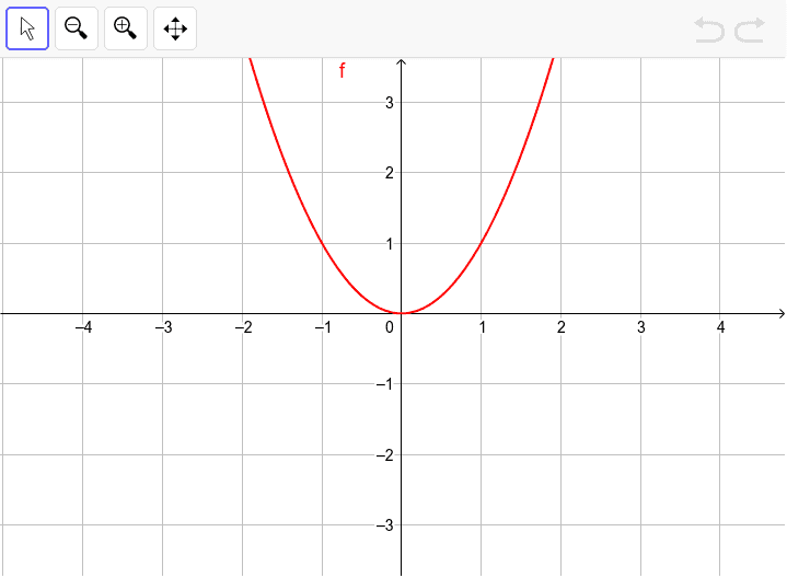
The expression x^2 denotes “x multiplied by itself.” When we set it equal to y (i.e., y = x^2), we are defining a relationship where the output y is always the square of the input x. Geometrically, this function produces a specific curve known as a parabola. This particular parabola, y = x^2, is the simplest and most fundamental quadratic function. Its graph is symmetric, opens upwards, and has its lowest point (vertex) at the origin (0,0).
From a tech perspective, understanding x^2 is paramount because many real-world phenomena and computational models exhibit parabolic behavior. For instance, the performance of an algorithm might degrade quadratically with input size, or the path of a projectile in a game simulation follows a parabolic trajectory. In optimization problems, the cost function often has a parabolic shape, and finding its minimum corresponds to finding the optimal solution. The simple elegance of x^2 makes it a powerful building block for more complex models, serving as a baseline for understanding quadratic growth and curvature in digital environments.
Key Characteristics of y = x^2: Digital Footprints
Every function has unique characteristics that define its graph. For y = x^2, these features are particularly straightforward and are critical for both manual plotting and interpreting digital visualizations.
- Vertex: The vertex is the turning point of the parabola. For
y = x^2, the vertex is at the origin (0,0). This is the minimumyvalue the function can achieve, as squaring any non-zero real number results in a positive number. In digital systems, identifying the vertex can be crucial for tasks like finding the optimal point in a quadratic optimization problem. - Axis of Symmetry: The parabola
y = x^2is symmetric about the y-axis (the linex = 0). This means if you fold the graph along the y-axis, the two halves perfectly overlap. This symmetry is a powerful property, simplifying plotting by hand and enabling efficient rendering in computer graphics, as only one half needs to be computed or stored and then mirrored. - Opening Direction: Since
x^2always produces non-negative values (asx^2 >= 0for all realx), theyvalues will always be zero or positive. This causes the parabola to open upwards. This characteristic tells us immediately whether the function has a minimum or maximum value – fory = x^2, it has a global minimum. - Domain and Range: The domain of
y = x^2is all real numbers, meaningxcan be any value from negative infinity to positive infinity. The range, however, isy >= 0, as squaring any real number always results in a non-negative number. Understanding domain and range is vital in computing for setting appropriate data input ranges or understanding the possible output spectrum of a function within a given system.
These characteristics form the algorithmic blueprint for x^2, whether you’re drawing it on paper or instructing a machine to visualize it.
Manual Graphing Techniques: The Algorithmic Approach to Visualization
While modern technology offers sophisticated tools, understanding the manual process of graphing x^2 provides a fundamental insight into how these tools operate. It’s akin to understanding the assembly language before diving into high-level programming; it builds a strong foundational intuition.
The Point-Plotting Method: Step-by-Step Data Generation
The most straightforward method for graphing any function, including y = x^2, is point-plotting. This involves selecting a range of x values, calculating their corresponding y values, and then plotting these coordinate pairs on a grid. This method mirrors how a computer generates a graph by calculating discrete points.
-
Create a Table of Values:
Start by choosing a set ofxvalues that span across positive and negative numbers, including zero. A good starting set might bex = {-3, -2, -1, 0, 1, 2, 3}.
Then, for eachxvalue, calculatey = x^2:x x^2 y (x, y) -3 (-3)^2 9 (-3, 9) -2 (-2)^2 4 (-2, 4) -1 (-1)^2 1 (-1, 1) 0 (0)^2 0 (0, 0) 1 (1)^2 1 (1, 1) 2 (2)^2 4 (2, 4) 3 (3)^2 9 (3, 9) -
Plot the Points:
On a Cartesian coordinate system (a grid with an x-axis and a y-axis), locate and mark each(x, y)pair from your table. Remember that the x-value indicates horizontal position and the y-value indicates vertical position. -
Sketch the Curve:
Once all the points are plotted, connect them with a smooth curve. It’s crucial to avoid connecting them with straight line segments, as a parabola is a continuous curve. The curve should pass through the vertex (0,0) and extend upwards symmetrically. Extend the curve with arrows at its ends to indicate that it continues infinitely. This final step involves pattern recognition and interpolation, skills that are often programmed into rendering engines.
This manual process reinforces the understanding of input-output relationships and the visual representation of functions, a foundational skill for anyone working with data visualization or computational geometry.
Identifying Key Features for an Efficient Sketch
Beyond brute-force point plotting, using the known characteristics of y = x^2 can make manual graphing more efficient and accurate. This is analogous to leveraging algorithmic shortcuts in programming.
- Vertex as the Anchor: Always start by plotting the vertex. For
y = x^2, this is(0,0). This point anchors your graph and provides a central reference. - Utilize Symmetry: Once you plot a point like
(2, 4), you immediately know that(-2, 4)must also be on the graph due to the y-axis symmetry. This halves the number of calculations and plots needed. - Predicting General Shape: Knowing it’s a parabola that opens upwards, you can anticipate its general “U” shape. This helps in sketching a smooth curve that matches the points, rather than connecting them linearly.
These mental shortcuts translate directly into optimization techniques in computational graphing, where algorithms exploit symmetry and known geometric properties to render complex functions more quickly and accurately.
Leveraging Digital Tools for Graphing x^2: Automation and Precision
In the modern tech landscape, manual graphing is often a conceptual exercise. Real-world applications rely heavily on digital tools that offer unparalleled speed, precision, and interactive capabilities. These tools range from dedicated graphing calculators to sophisticated software and programming libraries.
Graphing Calculators: The Original Portable Computing Device
Graphing calculators like the TI-84 Plus CE or Casio fx-CG50 have been staples in STEM education for decades. They are purpose-built computers for mathematical functions, including graphing.
- Inputting the Function: Typically, you’d navigate to the
Y=editor (or similar menu), clear any existing functions, and typeX^2(oftenXis a dedicated button, and^is for exponentiation). - Setting the Window: The “Window” or “View Window” settings are crucial. These define the
x-min,x-max,y-min, andy-maxvalues, controlling the visible portion of the coordinate plane. Fory = x^2, a good starting window might bex-min = -5,x-max = 5,y-min = -1,y-max = 10(sinceyvalues are non-negative and grow quickly). - Graphing and Tracing: Pressing the “Graph” button will display the parabola. Most calculators also have a “Trace” function, allowing you to move a cursor along the curve, displaying the
(x, y)coordinates at each point, offering dynamic data inspection.
Graphing calculators serve as an excellent introduction to digital graphing, providing a tangible interface for manipulating mathematical functions. They highlight the concept of setting boundaries and rendering algorithms that calculate points within those boundaries.
Online Graphing Software: Interactive and Accessible Platforms
Web-based tools like Desmos and GeoGebra have revolutionized accessibility to graphing. They offer intuitive interfaces, real-time plotting, and collaborative features, making them invaluable for both learning and professional exploration.
- Desmos: Simply type
y = x^2into the input bar on the left, and Desmos instantly renders the parabola. Its interactive nature allows you to click and drag the graph, zoom in/out, and even animate variables in more complex functions. Desmos excels in its user-friendliness and dynamic visualizations. Its underlying engine continuously re-calculates and renders the curve as you interact, showcasing highly optimized real-time graphical computation. - GeoGebra: Similar to Desmos, GeoGebra offers a dynamic geometry, algebra, and calculus environment. You can enter
y = x^2in the input bar, and it will graph the function. GeoGebra also provides tools for adding points, lines, and performing geometric constructions directly on the graph, making it a powerful tool for exploring relationships between algebra and geometry. Both platforms demonstrate sophisticated front-end development and real-time numerical processing.
These online platforms are perfect examples of how web technology makes complex mathematical visualization accessible to anyone with an internet connection, fostering exploration and understanding without the need for specialized hardware or software installations.
Spreadsheet Applications: Data-Driven Visualization
While not dedicated graphing tools, spreadsheet applications like Microsoft Excel or Google Sheets are incredibly versatile for visualizing data-driven functions, including y = x^2. This method emphasizes the tabular, data-centric approach to graphing, which is fundamental in analytics.
- Generate X-values: In column A, list a range of
xvalues (e.g., -5, -4.5, -4, … 4.5, 5). Use a small increment (like 0.5 or 0.1) for a smoother curve. - Calculate Y-values: In column B, next to your
xvalues, enter the formula=A1^2(assuming your firstxvalue is in A1) and drag this formula down to calculateyfor allxvalues. - Create a Scatter Plot: Select both columns of data. Go to “Insert” -> “Charts” and choose a “Scatter with Smooth Lines” chart type. Excel or Google Sheets will then generate a visual representation of
y = x^2. - Customization: You can then customize the chart’s appearance, add axis labels, a title, and adjust colors, which is crucial for clear data communication.
This method highlights the computational backbone of graphing: discrete data points generated by formulas and then interpolated and rendered visually. It’s a skill invaluable for data scientists and analysts who frequently need to visualize functional relationships from raw data.
Programming Languages (Python with Matplotlib): The Ultimate Control
For those in software development, data science, or engineering, programmatically generating graphs offers the highest degree of control and automation. Python, with its Matplotlib library, is a dominant choice.
- Import Matplotlib:
import matplotlib.pyplot as plt - Generate Data:
import numpy as np
x = np.linspace(-5, 5, 100)# Generates 100 evenly spaced points from -5 to 5
y = x**2# Calculates y for each x - Plot the Data:
plt.plot(x, y) - Add Labels and Title:
plt.xlabel("x-axis")
plt.ylabel("y-axis")
plt.title("Graph of y = x^2") - Display the Graph:
plt.grid(True)# Optional: add a grid
plt.show()
This approach demonstrates the power of programmatic graphing, allowing for dynamic generation, integration into larger applications, and sophisticated customization. It’s the method of choice for creating interactive dashboards, generating reports, and performing complex scientific visualizations. Understanding x^2 programmatically is a stepping stone to visualizing machine learning models, signal processing functions, and advanced computational geometry.
Advanced Concepts and Applications in Tech
Graphing x^2 is merely the beginning. The principles extend to understanding more complex functions and finding real-world applications across various tech domains.
Transformations of x^2: Building Blocks of Complex Functions
Once you master y = x^2, you can easily understand its transformations, which are fundamental in modeling diverse phenomena. These transformations are achieved by adding constants, multiplying by coefficients, or shifting the x variable.
- Vertical Shift:
y = x^2 + c(shifts the parabola up/down) - Horizontal Shift:
y = (x - h)^2(shifts the parabola left/right) - Vertical Stretch/Compression and Reflection:
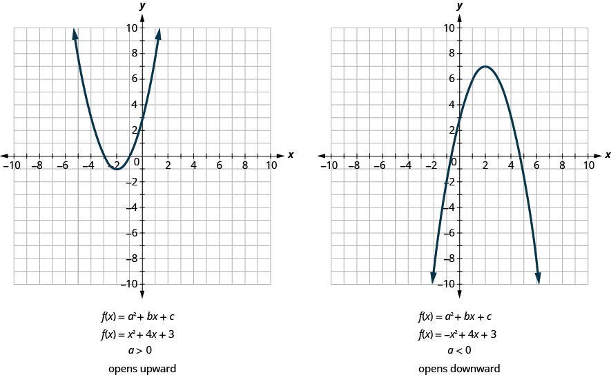
y = ax^2(stretches or compresses the parabola vertically; ifais negative, it reflects it downwards).
Many real-world tech models, from antenna design to predicting resource consumption, are based on variations of the quadratic function y = ax^2 + bx + c. Digital tools make it trivial to visualize these transformations in real-time, allowing engineers and developers to quickly iterate on design parameters.
Real-World Tech Applications: Beyond the Classroom
The parabolic shape isn’t just an abstract mathematical concept; it’s deeply embedded in numerous technological applications:
- Physics Simulations (Gaming & Engineering): The trajectory of a projectile (e.g., a thrown object in a video game, a missile in a simulation) follows a parabolic path under constant gravity. Graphics engines use quadratic equations to render these movements accurately.
- Antenna and Satellite Dish Design: Parabolic reflectors are used in satellite dishes, car headlights, and radio telescopes. The unique property of a parabola is that all parallel rays entering it are focused at a single point (the focus), and vice-versa. This principle is crucial for efficient signal transmission and reception. CAD software heavily relies on defining these parabolic surfaces.
- Machine Learning and Optimization: Many machine learning algorithms, particularly in linear and logistic regression, involve optimizing a “cost function” that is often quadratic or can be approximated quadratically. Finding the minimum of this parabola (the vertex) helps the model learn the best parameters. Gradient descent algorithms navigate these “parabolic landscapes” to find optimal solutions.
- Computer Graphics and Spline Interpolation: Quadratic Bézier curves, a type of polynomial, are fundamental in computer graphics for creating smooth, curved lines and shapes in vector graphics, animation, and font rendering. They are essentially segments of parabolas defined by control points.
AI and Automated Graphing: The Future of Visualization
The advent of AI and machine learning further enhances our ability to graph and interpret functions.
- Intelligent Function Recognition: AI can analyze raw data points and suggest the most likely mathematical function (e.g., quadratic, linear, exponential) that fits the data, even if it’s noisy.
- Automated Visualization Tools: AI-powered tools can automatically select optimal scales, labels, and chart types based on the data’s characteristics, generating clear and insightful graphs with minimal human intervention.
- Predictive Graphing: Beyond just plotting known functions, AI can predict the future behavior of dynamic systems and visualize these predictions, aiding in forecasting and system design.
- Interpretable AI: In fields like Explainable AI (XAI), visualizing complex AI model behaviors often involves plotting simpler underlying functions or approximations, including quadratic relationships, to make black-box models more transparent.
These advancements signify a future where graphing becomes even more integrated into intelligent systems, offering dynamic, predictive, and highly optimized visualizations.
Best Practices for Effective Graphing and Data Visualization
Regardless of whether you’re drawing x^2 by hand or using a sophisticated software suite, adhering to best practices ensures your graphs are clear, accurate, and insightful. This is particularly important in tech, where clarity of data representation can significantly impact decision-making.
Choosing the Right Tool for the Task
The “best” tool depends on your objective:
- For learning fundamental concepts: Manual plotting or a basic graphing calculator.
- For quick exploration and interaction: Online tools like Desmos or GeoGebra.
- For generating graphs from data sets and integration into reports: Spreadsheet applications.
- For automation, advanced customization, and embedding into applications: Programming libraries like Matplotlib.
Selecting the appropriate tool ensures efficiency and alignment with the project’s technical requirements.
Labeling and Annotations: Ensuring Clarity in Digital Graphs
A graph without proper labels is largely useless. In the digital realm, this means:
- Axis Labels: Clearly label your x-axis (e.g., “Input (x)”) and y-axis (e.g., “Output (y)”), including units if applicable.
- Graph Title: Provide a concise, descriptive title (e.g., “Graph of y = x^2”).
- Legend (for multiple functions): If you’re plotting
x^2alongsidex^3or2x^2, use a legend to differentiate the lines. - Annotations: Use text boxes, arrows, or data points to highlight specific features like the vertex, intercepts, or points of interest. This contextualizes the visualization.
These elements transform a simple plot into a powerful piece of visual communication, essential for technical documentation and presentations.
Interpreting Graphs: Beyond Just Plotting
The true value of a graph lies in its interpretation. When looking at y = x^2:
- Behavior at the Origin: Notice the minimum value at
(0,0). What does this tell you about the function’s output whenxis zero? - Rate of Change: Observe how the curve becomes steeper as
xmoves away from zero. This indicates thatyincreases at an accelerating rate asxgrows (or decreases negatively). This concept is vital for understanding derivatives in calculus and gradient descent in machine learning. - Symmetry: Reinforce your understanding of the symmetry about the y-axis. What implications does this have for solving equations or understanding data distribution?
Interpreting goes beyond just seeing the shape; it’s about extracting meaningful insights and understanding the functional relationships represented.

Troubleshooting Common Graphing Issues
Even with digital tools, issues can arise:
- Incorrect Window Settings: If you don’t see anything, your window might be too small or in the wrong range. Adjust
x-min,x-max,y-min,y-max. Fory = x^2, ensurey-minis set to 0 or a small negative number to see the vertex. - Input Errors: Double-check your function input (
x^2notx2or2x). Syntax is critical in programming and calculator input. - Data Resolution: If your graph looks jagged, you might not have enough data points. Increase the
linspacevalue in Python or use smaller increments in spreadsheets. - Misleading Labels: Ensure labels are accurate and don’t misrepresent the data.
By understanding how to graph x^2 through both manual methods and sophisticated digital tools, you gain a foundational technical skill invaluable across various disciplines. From programming algorithms to designing hardware or analyzing data, the ability to visualize and interpret mathematical functions is a cornerstone of modern technology.