
In an increasingly data-driven world, the ability to effectively visualize information is no longer a niche skill but a fundamental necessity. Whether you’re a data scientist analyzing complex datasets, a business professional presenting quarterly reports, an educator explaining concepts, or a researcher illustrating findings, graphs serve as the universal language for translating raw numbers into understandable insights. Drawing a graph is about more than just plotting points; it’s about crafting a compelling visual narrative that communicates complex information with clarity, precision, and impact.
This guide delves into the technical art of graph drawing, exploring the tools, techniques, and best practices that transform raw data into powerful visual stories. We’ll navigate the digital landscape of data visualization, from foundational principles to advanced methods, ensuring that your graphs not only look professional but also effectively convey their intended message within the robust realm of technology.
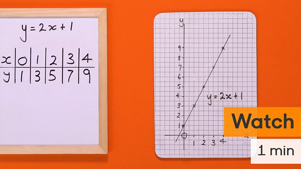
Understanding the Core Principles of Data Visualization
Before diving into the mechanics of drawing a graph, it’s crucial to grasp the foundational principles that underpin effective data visualization. A well-designed graph is a powerful analytical and communication tool, capable of revealing trends, outliers, and patterns that might remain hidden in tabular data.
The Purpose of Graphs: Insight and Communication
At its heart, a graph serves two primary purposes: to facilitate insight for the creator and to enable communication for the audience. For the creator, the act of visualizing data often uncovers relationships, anomalies, or correlations that wouldn’t be apparent through mere numerical inspection. For the audience, a graph distills complex information into an easily digestible format, making it quicker and simpler to grasp key takeaways. Effective graphs cut through noise, present evidence clearly, and support decision-making. They transform abstract data points into a tangible reality, fostering a deeper understanding of the underlying phenomena.
Key Elements of a Graph: Axes, Labels, Data Series, Legends
Every effective graph relies on a consistent set of fundamental components:
- Axes: Typically, a graph has at least two axes: the horizontal X-axis (independent variable) and the vertical Y-axis (dependent variable). These provide the framework for plotting data points and define the scale and range of the data being represented.
- Labels: Clear and concise labels for both axes are paramount. They tell the viewer what each axis represents (e.g., “Time (Months)” for the X-axis, “Revenue ($)” for the Y-axis), ensuring no ambiguity.
- Data Series: This refers to the actual data points, lines, bars, or shapes that are plotted on the graph. Each series represents a specific category or measurement.
- Legends: When multiple data series are present, a legend is essential. It acts as a key, explaining what each color, pattern, or symbol represents within the graph.
- Title: A descriptive title provides immediate context, summarizing the graph’s main message or the data it represents.
Neglecting any of these elements can lead to confusion, misinterpretation, or a complete failure to convey the intended message, rendering the graph useless regardless of its technical sophistication.
Common Graph Types and Their Applications
Choosing the right graph type is perhaps the most critical decision in data visualization, as each type is best suited for particular kinds of data and messages:
- Bar Charts: Excellent for comparing discrete categories or showing changes over time (e.g., sales by product category, website visits per month). They are intuitive and easily understood.
- Line Charts: Ideal for displaying trends over continuous intervals, especially time (e.g., stock prices over a year, temperature fluctuations). They highlight patterns of change.
- Pie Charts: Best for showing parts of a whole, where the sum of all segments equals 100% (e.g., market share distribution). Caution: Avoid using too many slices, as they can become difficult to read.
- Scatter Plots: Used to show the relationship or correlation between two numerical variables (e.g., advertising spend vs. sales, height vs. weight). They can reveal clusters and outliers.
- Histograms: Similar to bar charts but specifically used to show the distribution of a single numerical variable (e.g., frequency of different age groups in a population).
- Area Charts: Similar to line charts but with the area below the line filled, often used to show trends of multiple series where the total sum is also important.
Understanding the strengths and weaknesses of each chart type is paramount for selecting the visualization that most accurately and effectively represents your data and conveys your message.
Navigating the Digital Landscape: Choosing Your Graphing Tools
The digital age offers an unprecedented array of tools for drawing graphs, ranging from accessible spreadsheet functions to sophisticated programming libraries. The choice of tool largely depends on the complexity of your data, the level of customization required, your technical proficiency, and your budget.
Spreadsheet Software: Excel, Google Sheets
For many, spreadsheet applications like Microsoft Excel or Google Sheets are the entry point into data visualization. They are widely accessible, user-friendly, and capable of generating a broad range of standard charts with relative ease.
- Pros: Intuitive interface, quick chart generation from structured data, common in business environments, good for basic comparisons and trends.
- Cons: Limited customization options, can struggle with very large datasets, not ideal for complex statistical visualizations or highly interactive dashboards.
- Use Cases: Quick ad-hoc analyses, departmental reports, simple presentations, personal budgeting.
Dedicated Data Visualization Tools: Tableau, Power BI
These platforms are built specifically for data exploration, analysis, and dashboard creation. They offer robust features for connecting to various data sources, performing advanced transformations, and creating highly interactive and aesthetically pleasing visualizations.
- Pros: Powerful data connectivity, extensive customization, interactive dashboards, excellent for large datasets and complex analytical tasks, strong community support.
- Cons: Steeper learning curve, can be costly (especially enterprise versions), might be overkill for simple graphing needs.
- Use Cases: Business intelligence dashboards, complex data storytelling, executive reporting, in-depth market analysis.
Programming Libraries: Matplotlib, Seaborn (Python), ggplot2 (R)
For those with programming skills, libraries in languages like Python (Matplotlib, Seaborn, Plotly, Bokeh) or R (ggplot2) offer unparalleled flexibility and control over every aspect of graph design.
- Pros: Ultimate customization, automation of graph generation, ability to handle massive datasets, integration with statistical modeling and machine learning workflows, reproducibility.
- Cons: Requires coding proficiency, initial setup can be challenging, not suitable for non-technical users.
- Use Cases: Scientific research, advanced statistical plotting, custom interactive visualizations for web applications, machine learning results visualization.
Online Chart Makers and SaaS Solutions
Web-based tools like Canva, Piktochart, Datawrapper, or Infogram offer a middle ground, providing drag-and-drop interfaces for creating attractive charts and infographics without requiring coding.
- Pros: User-friendly, often free tiers available, good for quick, visually appealing graphics, collaboration features, no software installation needed.
- Cons: Limited data capacity, fewer advanced analytical features, design templates can sometimes restrict true originality.
- Use Cases: Blog graphics, social media content, simple reports, quick presentations, small business marketing materials.
A Step-by-Step Guide to Crafting Effective Graphs
Regardless of the tool chosen, the process of drawing an effective graph follows a consistent methodology, emphasizing data preparation, thoughtful design, and iterative refinement.
Data Preparation: Cleaning, Structuring, and Aggregating
The quality of your graph is directly tied to the quality of your data. This initial phase is critical and often the most time-consuming:
- Data Collection: Ensure your data is sourced reliably and accurately.
- Cleaning: Address missing values, correct errors, remove duplicates, and standardize formats. Inconsistent data will lead to misleading visualizations.
- Structuring: Organize your data into a clear, tabular format. Typically, each row represents an observation, and each column represents a variable.
- Aggregating: If your data is granular, you may need to aggregate it (e.g., sum, average, count) to the appropriate level for your visualization’s message. For instance, converting daily sales figures into monthly totals.
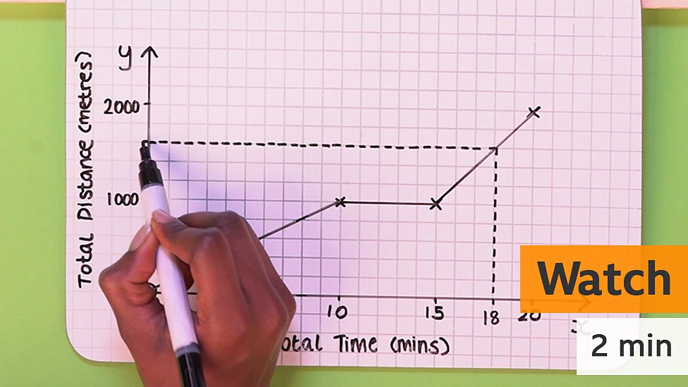
Without a clean and well-structured dataset, even the most sophisticated visualization tool will produce a flawed or confusing graph.
Selecting the Right Graph Type for Your Data and Message
This is where understanding the “Common Graph Types and Their Applications” becomes vital. Ask yourself:
- What relationship am I trying to show (comparison, trend, distribution, correlation, composition)?
- What type of data do I have (categorical, numerical, time-series)?
- Who is my audience, and what level of detail do they need?
Matching your data’s characteristics and your message’s objective to the appropriate graph type ensures maximum clarity and impact. A mismatch can obscure insights or even misrepresent the data.
Design Principles: Clarity, Simplicity, and Visual Hierarchy
Once your data is prepared and your graph type selected, focus on design principles to optimize readability and understanding:
- Clarity: Ensure all labels, titles, and legends are clear, concise, and easy to read. Avoid jargon.
- Simplicity (Data-Ink Ratio): Maximize the “data ink” (ink used to display data) and minimize “non-data ink” (extraneous elements like heavy borders, unnecessary gridlines, distracting backgrounds). Every element should serve a purpose.
- Visual Hierarchy: Guide the viewer’s eye to the most important information. Use size, color, and position to emphasize key data points or trends.
- Color Use: Employ color strategically and consistently. Use distinct colors for different categories, and sequential colors for gradients. Be mindful of colorblindness accessibility.
- Annotations: Add text annotations directly on the graph to highlight specific points, explain outliers, or provide context, making the interpretation process smoother.
Iteration and Refinement: Feedback and Optimization
Graph drawing is rarely a one-shot process. It often involves iteration:
- Drafting: Create an initial version of your graph.
- Review: Examine it critically. Does it answer the question you intended? Is it easy to understand? Does it have any misleading elements?
- Seek Feedback: Share your graph with others, especially those unfamiliar with the data. Their fresh perspective can reveal ambiguities or areas for improvement.
- Optimize: Based on feedback, refine your labels, colors, chart type, or even the underlying data aggregation.
This iterative process ensures your final graph is as effective and impactful as possible.
Best Practices for Impactful Graph Presentation
Beyond the technical steps, several best practices elevate a graph from merely functional to truly impactful and professional, especially within a tech context where accuracy and ethics are paramount.
Avoiding Misleading Visualizations: Ethical Considerations
The power of graphs comes with a significant ethical responsibility. Misleading visualizations, whether intentional or accidental, can lead to incorrect conclusions and poor decisions. Common pitfalls include:
- Truncated Y-axes: Starting the Y-axis at a value other than zero can exaggerate differences between categories, making small changes appear dramatic.
- Manipulated Scales: Inconsistent or non-linear scales can distort trends and magnitudes.
- Ignoring Baselines: Failing to provide a baseline or reference point for comparison.
- Cherry-picking Data: Only showing data that supports a particular narrative, while omitting contradictory evidence.
- Inappropriate Chart Types: Using a pie chart for non-proportional data or a 3D chart that distorts perception.
Always strive for transparency and accuracy. Present the data faithfully, even if it doesn’t perfectly align with a preconceived notion. The goal is to inform, not to persuade through deception.
Accessibility and Inclusivity in Graph Design
In a diverse world, ensuring your graphs are accessible to all users, including those with disabilities, is a critical best practice in tech.
- Color Contrast: Ensure sufficient contrast between text, data points, and background colors, especially for users with color vision deficiencies.
- Alternative Text (Alt Text): For digital graphs, provide descriptive alt text that explains the graph’s content and key takeaways for screen reader users.
- Legible Fonts and Sizes: Use clear, sans-serif fonts at an appropriate size that is easy to read.
- Avoid Over-reliance on Color: Supplement color coding with patterns, shapes, or labels to convey information, particularly for users with colorblindness.
- Interactive Features: For online graphs, enable features like tooltips that reveal data points on hover, providing additional detail without cluttering the main visualization.
Designing for accessibility not only broadens your audience but often leads to clearer, more robust visualizations for everyone.
Storytelling with Data: Narratives Beyond the Numbers
The most compelling graphs do more than just display data; they tell a story. In the tech world, where innovation often stems from understanding complex systems, the ability to weave a narrative around your data is invaluable.
- Define Your Message: Before creating the graph, clearly articulate the primary insight or story you want to convey.
- Use Annotations and Text: Don’t just show the data; explain it. Add text boxes to highlight significant events, trends, or turning points.
- Sequence Your Visualizations: If using multiple graphs, arrange them logically to build a coherent narrative.
- Contextualize: Provide background information or relevant comparisons to help the audience understand the significance of the data.
- Call to Action (if applicable): If your graph leads to a conclusion, clearly state what action should be taken or what implication arises from the data.
Effective data storytelling transforms passive viewing into active understanding, making your graphs memorable and impactful.
The Future of Graph Drawing: Innovation in Data Visualization
The field of data visualization is dynamic, constantly evolving with technological advancements. The future promises even more sophisticated, immersive, and intelligent ways to draw graphs and derive insights.
Interactive and Dynamic Visualizations
Static images, while foundational, are increasingly complemented by interactive and dynamic graphs. Web-based libraries and tools allow users to filter, sort, zoom, and drill down into data, exploring different facets of the information at their own pace. This interactivity transforms passive data consumption into active data exploration, fostering deeper understanding and personalized insights. Expect more advanced web components and easier integration of dynamic graphs into various platforms.
AI and Machine Learning in Graph Generation
Artificial intelligence and machine learning are poised to revolutionize graph drawing. AI-powered tools can already suggest optimal chart types based on data characteristics, automate data cleaning, and even generate narratives explaining key findings. In the future, AI might predict the most impactful visualizations, identify subtle patterns missed by human eyes, or create highly personalized data experiences tailored to individual user needs and cognitive styles. This could dramatically lower the barrier to entry for complex data analysis.

Immersive Data Experiences: VR/AR and 3D Graphs
Beyond traditional 2D displays, augmented reality (AR) and virtual reality (VR) offer exciting new frontiers for data visualization. Imagine stepping inside a 3D scatter plot to identify clusters, manipulating data points with gestures, or exploring complex network graphs in an immersive environment. While still nascent, these technologies hold the potential to make data exploration more intuitive, collaborative, and engaging, particularly for large, multi-dimensional datasets where traditional 2D graphs fall short. The challenge will be to ensure these experiences enhance clarity rather than introduce confusion.
The journey of drawing a graph is one that starts with raw data and culminates in clear, compelling visual communication. By mastering the principles of design, leveraging the right technological tools, and adhering to best practices, anyone can transform numbers into powerful narratives. As technology continues to advance, the methods and capabilities for data visualization will only grow, promising an exciting future for those dedicated to understanding and interpreting the world through data.
aViewFromTheCave is a participant in the Amazon Services LLC Associates Program, an affiliate advertising program designed to provide a means for sites to earn advertising fees by advertising and linking to Amazon.com. Amazon, the Amazon logo, AmazonSupply, and the AmazonSupply logo are trademarks of Amazon.com, Inc. or its affiliates. As an Amazon Associate we earn affiliate commissions from qualifying purchases.