
Designing a Shopify website is no longer a simple matter of choosing a pre-made template and uploading a logo. In the modern e-commerce landscape, technical precision, architectural integrity, and software synergy are the primary drivers of a successful digital storefront. To design a Shopify site effectively, one must understand the underlying framework of the platform—specifically the Online Store 2.0 (OS 2.0) architecture—and how to leverage its tech stack to create a high-performing, scalable, and responsive user interface.
Choosing the Right Technical Foundation: Themes and Online Store 2.0
The design process begins with the selection of a theme, which serves as the software backbone of your website. With the rollout of Shopify’s Online Store 2.0, the technical environment has shifted toward a modular approach that offers developers and designers significantly more granular control over the document object model (DOM) and the rendering engine.
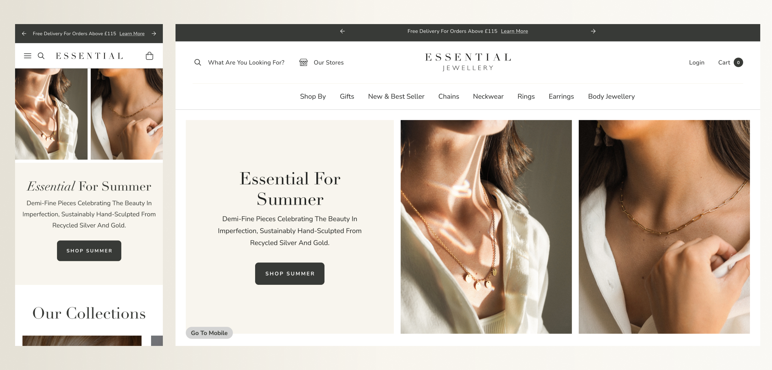
The Transition to OS 2.0 Architecture
Older Shopify themes (Vintage) relied on static liquid templates for specific pages, limiting customization to the homepage or requiring heavy code intervention for other sections. OS 2.0 changed the paradigm by introducing JSON templates. This allows every page type—from product pages to collection lists—to support sections and blocks. When designing, you must select a theme built on this architecture to ensure you can move functional components around without rewriting the backend logic.
Evaluating Theme Frameworks and Performance
Not all themes are created equal from a technical standpoint. A heavy theme laden with bloated JavaScript libraries can throttle your site’s speed before you even add content. When selecting a theme, it is essential to audit its code base. Look for themes that prioritize “Dawn,” Shopify’s reference theme, as a benchmark for speed and flexibility. A lean theme utilizes modern CSS instead of heavy image assets and avoids excessive external dependencies, ensuring that the Time to Interactive (TTI) remains low.
Mastering Shopify Customization: From Liquid to Custom CSS
While the visual editor provides a user-friendly interface for basic adjustments, true professional design requires a deep dive into the platform’s code. Shopify uses Liquid, an open-source template language written in Ruby, to bridge the gap between store data and the HTML displayed in the browser.
Understanding Liquid Code and Logic
To design a unique experience, designers must understand how Liquid functions. Liquid uses a combination of objects, tags, and filters. Objects contain the data (e.g., product titles, prices), tags control the logic (e.g., if/else statements, for loops), and filters change the output (e.g., resizing images on the fly). By modifying the .liquid files within the theme’s layout and templates folders, you can create custom logic—such as displaying specific banners only when a user is logged in or dynamically changing the layout based on product tags.
Utilizing JSON Templates for Modular Design
JSON templates have replaced the old liquid-based page templates in modern Shopify design. These files act as a data schema that tells the Shopify engine which sections to render and in what order. By editing these JSON files, designers can create “Global Sections”—design elements that can be updated in one place and reflected across the entire site. This technical approach ensures design consistency and simplifies the maintenance of the site’s visual hierarchy.
Implementing Custom CSS and Schema Adjustments
For precision design, the standard theme settings often fall short. Designers must utilize the “Custom CSS” feature or modify the theme’s stylesheet (usually base.css or theme.css). This allows for the implementation of advanced CSS techniques such as Flexbox and CSS Grid, which are vital for creating complex, responsive layouts. Furthermore, by adjusting the settings_schema.json file, developers can create custom input fields in the Shopify admin, allowing non-technical users to change specific design variables like hex codes or font weights without touching the raw code.
Integrating the Tech Stack: Apps, APIs, and Functional Extensions

A Shopify website is rarely a standalone entity; it is the hub of a broader technological ecosystem. Designing the site requires a strategic integration of third-party applications and APIs to extend the platform’s native capabilities.
Streamlining Functionality with Apps
Apps provide the additional features that standard themes lack, such as advanced filtering, loyalty programs, or sophisticated search engines. However, from a technical perspective, apps can be a double-edged sword. Each app typically injects its own script tags and CSS into your theme’s <head>, which can lead to “render-blocking” issues. A technical designer must audit these apps, preferring those that use “App Blocks” (an OS 2.0 feature) which allow for cleaner integration and easier removal without leaving “ghost code” in the theme files.
Utilizing Shopify APIs and Headless Solutions
For enterprises requiring a bespoke frontend experience that the liquid engine cannot provide, the Shopify Storefront API offers a path toward “Headless Commerce.” In this design architecture, the Shopify backend handles the commerce logic (checkout, inventory, payments), while a custom-built frontend—often using frameworks like React or Next.js—handles the UI. This allows for total design freedom and the ability to leverage modern web development tools like Tailwind CSS or Framer Motion for high-end animations and transitions.
Optimizing the User Experience: Mobile Responsiveness and Site Speed
In the tech-driven world of e-commerce, a beautiful design is worthless if it does not load quickly or function on mobile devices. Design must be viewed through the lens of performance engineering.
Core Web Vitals and Performance Tuning
Google’s Core Web Vitals (Largest Contentful Paint, First Input Delay, and Cumulative Layout Shift) are the gold standard for measuring user experience. When designing a Shopify site, you must optimize these metrics by:
-
Image Optimization: Utilizing Shopify’s native image filters to serve WebP formats and implementing lazy loading for images below the fold.
-
Minification: Reducing the file size of CSS and JavaScript files by removing unnecessary characters and whitespace.
-
Font Management: Using system fonts where possible or employing the
font-display: swapCSS property to prevent Flash of Unstyled Text (FOUT).
Mobile-First Development Strategies
With over 70% of e-commerce traffic originating from mobile devices, the design must be mobile-first. This involves more than just a responsive grid; it requires technical considerations for touch targets, thumb-zone navigation, and the elimination of hover-dependent interactions. Designing the mobile navigation menu—often the most complex technical component of a mobile site—requires careful execution of JavaScript to ensure it opens and closes fluidly without causing layout shifts.
Future-Proofing the Design: Security and Scalability
A well-designed Shopify site must be built to handle growth and protect data. The technical architecture must account for high-traffic events and maintain strict security standards.
Ensuring Technical Security and PCI Compliance
One of the primary advantages of Shopify is its hosted nature, which handles PCI compliance and SSL certification out of the box. However, designers must still be vigilant. When integrating third-party scripts (like tracking pixels or heatmaps), it is essential to use Shopify’s “Web Pixels API.” This provides a sandboxed environment for scripts, ensuring that third-party code cannot interfere with the checkout process or compromise customer data.

Designing for Global Scale and Localization
As a business expands, the design must adapt to different markets. Shopify’s “Markets” feature allows designers to create localized experiences within a single store instance. Technically, this involves using the localization object in Liquid to serve different content, currencies, and languages based on the user’s IP address. Design-wise, this requires a flexible UI that can accommodate varying text lengths (e.g., German translations are often much longer than English) without breaking the layout.
By approaching Shopify design as a technical discipline rather than a purely aesthetic one, you create a digital environment that is not only visually compelling but also structurally sound. The synergy between Liquid logic, OS 2.0 modularity, and performance optimization is what separates a standard template from a high-conversion, professional-grade e-commerce engine.
aViewFromTheCave is a participant in the Amazon Services LLC Associates Program, an affiliate advertising program designed to provide a means for sites to earn advertising fees by advertising and linking to Amazon.com. Amazon, the Amazon logo, AmazonSupply, and the AmazonSupply logo are trademarks of Amazon.com, Inc. or its affiliates. As an Amazon Associate we earn affiliate commissions from qualifying purchases.