
The question of how to spell “Airbnb” might seem like a simple inquiry into orthography, but it serves as a gateway into one of the most successful brand strategy case studies of the twenty-first century. In a world where names like Google, Uber, and Amazon have transitioned from nouns to verbs, the spelling and presentation of a brand name carry immense weight. For Airbnb, the journey from a literal description of a service to a global icon of the “belonging” economy is a masterclass in brand architecture, phonetic marketing, and visual identity.

To understand the spelling is to understand the strategy. It is not just about the letters on the page; it is about how a brand positions itself in the digital landscape and the minds of consumers. From the idiosyncratic capitalization to the removal of spaces, every character in “Airbnb” tells a story of transformation.
From AirBed & Breakfast to Airbnb: The Linguistic Evolution
In the early days of 2007, the company did not have a sleek, four-syllable name. It was born as “AirBedandBreakfast.com.” This original name was functional and descriptive—it told the customer exactly what to expect: an air mattress and a morning meal in a shared living space. However, from a brand strategy perspective, the original name was a mouthful. It was difficult to type, lacked a distinct visual rhythm, and was far too literal to allow for the massive scaling the founders envisioned.
The Shift to the Portmanteau
By 2009, the founders shortened the name to “Airbnb.” This shift represented a critical pivot in brand identity. A portmanteau—a linguistic blend of words—allows a company to retain its heritage while creating a new, proprietary term that it can own legally and psychologically. By stripping away the “Bed & Breakfast” terminology, the company moved away from the dusty, traditional image of a B&B and toward a tech-forward, streamlined platform.
The spelling of “Airbnb” as a single word without spaces was a strategic move to align with the “Web 2.0” aesthetic of the era. During this time, the trend in tech branding was to eliminate spaces and utilize CamelCase or lowercase styling to appear more accessible and digitally native. By fusing the words, the brand became a singular entity rather than a description of a service.
The Capitalization Debate
One of the most frequent points of confusion is whether the “b” in the middle should be capitalized. In the official brand guidelines, the company is referred to as “Airbnb” (capital A, lowercase b) when used in a sentence. However, in the wordmark—the stylized logo—it is presented in all lowercase: “airbnb.”
This distinction is intentional. The lowercase logo conveys a sense of humility, accessibility, and community. It suggests that the brand is not a cold, corporate monolith but a grassroots platform powered by individuals. Conversely, the title-case spelling in text provides the necessary authority of a global corporation. Understanding this nuance is key to understanding how the brand balances being a “community” platform while maintaining a multi-billion-dollar corporate identity.
The Power of a Unique Name in Global Branding
Brand naming is a psychological exercise. A name must be easy to pronounce across different languages, it must be “sticky” (memorable), and it must evoke a specific emotion. “Airbnb” succeeds on all these fronts because of its phonetic structure and its ability to transcend its literal meaning.
Phonetics and “Stickiness”
The name starts with a vowel, giving it an open, airy sound that matches the “Air” in its name. The “b” sounds provide hard stops that make the word punchy and rhythmic. From a marketing standpoint, “Airbnb” is a “plosive” word—the “b” sounds require a burst of air to pronounce, which often makes words more memorable to the human ear. This phonetic stickiness is why the name has successfully transitioned into a verb. Much like people say they will “Google” something, they now say they are going to “Airbnb” a cabin for the weekend. This “verbification” is the holy grail of brand strategy, as it indicates the brand has become synonymous with the category itself.
The Psychology of Alliteration and Rhythm
While not a perfect alliteration, the repetition of the “b” sound (Air-b-n-b) creates a rhythmic cadence. In brand strategy, rhythm helps in cognitive processing. When a name is easy to say, it is perceived as more trustworthy. The simplicity of the spelling—seven letters, three syllables—allows it to occupy a small but permanent “plot of land” in the consumer’s brain.

Distancing from Competition
When the company rebranded, the short, punchy “Airbnb” stood in stark contrast to the legacy hospitality industry. Traditional hotel chains often use surnames (Hilton, Marriott) or geographic descriptors. By choosing a name that felt like a digital-first startup, Airbnb immediately signaled that it was a disruptor. The spelling itself was a signal to the market that this was not your parents’ travel agency; it was a new way to experience the world.
Visual Identity and the “Bélo” Symbol
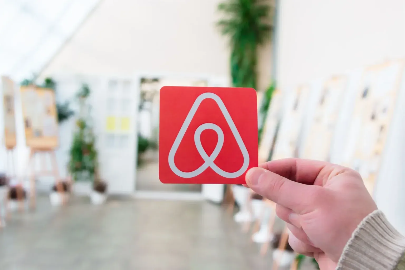
The spelling of a brand cannot be separated from its visual representation. In 2014, Airbnb underwent a massive rebranding effort led by the design agency DesignStudio. This rebrand introduced the “Bélo,” a symbol that has become as recognizable as the Nike Swoosh or the Apple logo.
Integrating Typography and Iconography
The 2014 rebrand moved away from the “bubbly” blue font of the early years to a custom typeface called “Cereal.” The way “airbnb” was spelled in the new logo was thinner, more sophisticated, and more balanced. The typography was designed to sit perfectly alongside the Bélo symbol—an icon that represents a combination of people, places, love, and the letter ‘A’.
The strategy here was to move the brand from a “utility” (finding a place to sleep) to an “aspiration” (belonging anywhere). By refining the spelling in the logo to be more elegant, the brand strategy shifted to target a more global, diverse, and upscale demographic while retaining its core message of inclusivity.
The Concept of “Belonging Anywhere”
The spelling and the logo work in tandem to support the brand’s mission statement: “Belong Anywhere.” The lowercase “a” in the logo is designed to feel like an open door. The brand strategy emphasizes that “Airbnb” is not just a platform; it is a community. This is reflected in the brand’s willingness to let users “remix” the logo and the name for their own listings, a bold move in an industry where brand guidelines are usually enforced with iron-fisted rigidity.
Maintaining Brand Integrity Across Digital Platforms
In the digital age, the way a brand is spelled impacts everything from Search Engine Optimization (SEO) to user experience (UX). For Airbnb, protecting the “spelling” of the brand means managing how it appears across millions of touchpoints.
SEO and Misspellings
One of the challenges of a unique name like Airbnb is the potential for misspellings. Users frequently search for “Air B and B,” “AirBNB,” “AirBnb,” or even “Air bnb.” A key part of the brand’s digital strategy involves aggressive SEO and SEM (Search Engine Marketing) to ensure that regardless of how a user spells the name in a search bar, they are directed to the official platform.
By owning the “misspellings” in the digital space, the brand ensures that its identity remains cohesive. This is a vital lesson for any brand strategy: your name is not just what you call yourself; it is also how the world searches for you. If you don’t own the variations of your name, your competitors will.
Consistency in the App Ecosystem
Within the app and website, the spelling of Airbnb is kept consistent to reinforce brand authority. The use of the custom typeface, “Circular” (and later “Cereal”), ensures that every time a user sees the name, it carries the same visual weight. Consistency breeds familiarity, and familiarity breeds trust. In the short-term rental market, where you are often staying in a stranger’s home, trust is the most valuable currency the brand possesses.
The Evolution of Brand Language
Ultimately, the question “how do you spell airbnb” reveals the success of a brand that has managed to embed itself into the global lexicon. What started as a literal description of air mattresses has evolved into a singular, iconic word that represents a revolutionary shift in travel and hospitality.
The strategy behind the spelling—the move to a portmanteau, the choice of lowercase for accessibility, and the rigorous consistency across digital platforms—has allowed the company to grow from a San Francisco apartment to a global powerhouse. Airbnb’s brand strategy shows that a name is more than just a label; it is a vessel for the company’s values, its history, and its future. Whether written in a logo, typed into a search engine, or spoken as a verb, “Airbnb” stands as a testament to the power of deliberate, thoughtful branding in the modern age.
aViewFromTheCave is a participant in the Amazon Services LLC Associates Program, an affiliate advertising program designed to provide a means for sites to earn advertising fees by advertising and linking to Amazon.com. Amazon, the Amazon logo, AmazonSupply, and the AmazonSupply logo are trademarks of Amazon.com, Inc. or its affiliates. As an Amazon Associate we earn affiliate commissions from qualifying purchases.