
Understanding how to graph equations is a foundational skill in mathematics, but in the digital age, it’s also a fundamental exercise in leveraging technology. While an equation as simple as “x = 4” might seem trivial to plot by hand, exploring how various technological tools handle it reveals their capabilities, nuances, and the sheer power they bring to visual mathematics. This article delves into the process of graphing this specific vertical line, not just manually for conceptual clarity, but predominantly through the lens of modern tech – from user-friendly web applications to robust programming libraries and emerging AI tools. By mastering such basic visualizations with technology, we lay the groundwork for tackling far more complex data and functions with efficiency and precision.

The Foundation: Understanding x = 4 as a Mathematical Concept
Before diving into the digital realm, it’s crucial to grasp the inherent mathematical meaning of “x = 4.” This understanding forms the bedrock upon which all technological graphing tools operate, ensuring that we interpret their outputs correctly.
What x = 4 Truly Means
In a two-dimensional Cartesian coordinate system, an equation like x = 4 describes a specific set of points. Unlike equations such as y = 2x + 1 (which define lines with varying slopes) or y = x² (which define parabolas), x = 4 is unique because it fixes the value of the x-coordinate while allowing the y-coordinate to take on any value.
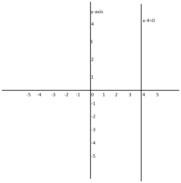
This means that any point (x, y) that satisfies this equation must have an x-value of 4. Examples of such points include (4, -5), (4, 0), (4, 2.5), (4, 100), and so on. When all these points are plotted and connected, they form a straight line that is perfectly vertical, passing through the x-axis at the point (4, 0). It runs parallel to the y-axis, extending infinitely in both the positive and negative y-directions.
This characteristic makes x = 4 a special type of linear equation, often referred to as a “vertical line equation.” It cannot be expressed in the common slope-intercept form y = mx + b because its slope is undefined (a change in x is zero, leading to division by zero if one tries to calculate rise/run).
Manual Plotting for Conceptual Clarity
Even when technology is readily available, a brief mental or physical exercise in manual plotting reinforces the underlying concept. To graph x = 4 by hand:
-
Draw a Coordinate Plane: Sketch an x-axis (horizontal) and a y-axis (vertical), intersecting at the origin
(0, 0). Label your axes. -
Locate Points: Choose several y-values and remember that for each,
xmust be4. For instance:-
If
y = 0, the point is(4, 0). -
If
y = 2, the point is(4, 2). -
If
y = -3, the point is(4, -3).
-
-
Plot the Points: Mark these points on your coordinate plane.
-
Draw the Line: Use a ruler to draw a straight line connecting these points. This line should be perfectly vertical and pass through the x-axis at
x = 4.
This manual exercise quickly confirms that x = 4 is indeed a vertical line, offering an intuitive understanding that digital tools then visually confirm with speed and accuracy.
Leveraging Digital Graphing Calculators and Web Tools
The leap from manual plotting to digital tools brings immense advantages in speed, accuracy, and interactivity. For an equation like x = 4, these tools make visualization instantaneous.
Desmos: The User-Friendly Web Powerhouse
Desmos is arguably one of the most intuitive and widely used online graphing calculators. Its elegant interface and real-time plotting capabilities make it a go-to for students and educators alike.
How to Graph x = 4 in Desmos:
-
Access Desmos: Open your web browser and navigate to www.desmos.com/calculator.
-
Input the Equation: On the left-hand side, you’ll see an input box (often labeled “Expression 1”). Simply type
x = 4into this box. -
Observe the Graph: As you type, Desmos will instantly plot the vertical line
x = 4on the coordinate plane. It will appear as a solid line, usually in a distinct color, passing through the x-axis at the point(4, 0).
Benefits of Desmos:
-
Real-time Visualization: Graphs update instantly as you type, allowing for immediate feedback and exploration.
-
Interactivity: You can click and drag the graph to pan, zoom in and out using your mouse wheel or pinch gestures, and even click on specific points (like intercepts) to see their coordinates.
-
Clarity and Simplicity: Desmos excels at presenting complex mathematics in an easily digestible visual format, making it ideal for beginners.
-
Sharing and Collaboration: Graphs can be saved, shared via a unique URL, or embedded, facilitating collaborative learning and presentation.
GeoGebra: Dynamic Mathematics for Deeper Exploration
GeoGebra is another powerful dynamic mathematics software that combines geometry, algebra, spreadsheets, graphing, statistics, and calculus into one easy-to-use package. While it offers more advanced features than Desmos, it handles basic graphing with similar ease.
How to Graph x = 4 in GeoGebra (Classic App):
-
Launch GeoGebra: Download and install the GeoGebra Classic application, or use the online version at www.geogebra.org/classic.
-
Input the Equation: Locate the “Input” bar at the bottom of the screen. Type
x = 4and press Enter. -
View the Graph: The vertical line
x = 4will immediately appear on the graphing canvas, represented by a solid line passing through(4, 0). GeoGebra also lists the equation under the “Algebra View” panel on the left.
Benefits of GeoGebra:
-
Integrated Environment: Beyond simple graphing, GeoGebra allows for geometric constructions, spreadsheet data manipulation, and calculus operations, all within the same interface.
-
Dynamic Objects: Objects created in GeoGebra are dynamic; you can manipulate parameters and see how the graph changes in real-time. (Though less apparent for
x=4, this is powerful for more complex equations). -
Multiple Views: Simultaneously view algebraic representations, geometric constructions, and tabular data, offering a comprehensive understanding.
-
Educational Focus: Widely used in educational settings for its robust feature set and ability to visualize abstract mathematical concepts.
Handheld Graphing Calculators (e.g., TI-83/84/Nspire)
While web tools have largely superseded handheld graphing calculators for their convenience and modern interfaces, these devices remain staples in many classrooms and standardized tests. Graphing x = 4 on them can be slightly less straightforward than on Desmos or GeoGebra due to how they typically handle function inputs (y = ...).
Challenges and Workarounds for x = 4:
Most handheld graphing calculators are primarily designed to graph functions of the form y = f(x). Since x = 4 cannot be easily rearranged into this form (its slope is undefined, and y is not explicitly dependent on x), you often can’t simply type x = 4 into the Y= editor.
Instead, you usually need to use a “DRAW” function or a specific menu option for vertical lines:
-
Access the DRAW Menu: On many TI calculators, you would press
2ndthenPRGM(for the DRAW menu). -
Select Vertical Line: Look for an option like
VerticalorLine(. -
Input the X-value: Once selected, the calculator might prompt you for an x-value. Enter
4. -
Draw: Press
ENTERto draw the line.
Important Considerations:
-
Function-Oriented: This highlights the fact that handheld calculators are fundamentally built around plotting functions where
yis a dependent variable ofx. -
Menu-Driven: Graphing non-function relations often requires navigating specific menus rather than direct input.
-
Less Intuitive: Compared to web-based tools, the process can feel less intuitive for simple non-functional equations.
Programming for Precision: Graphing x = 4 with Python
For those seeking ultimate control, customization, and the ability to integrate graphing into larger data analysis workflows, programming languages like Python offer unparalleled flexibility. Matplotlib, Python’s dominant plotting library, is an excellent choice for this.
Matplotlib: The Industry Standard for Data Visualization
Matplotlib is a powerful and versatile library for creating static, animated, and interactive visualizations in Python. It’s widely used in scientific computing, data analysis, and machine learning.
Code to Graph x = 4 using Matplotlib:
import matplotlib.pyplot as plt


import numpy as np


# Define the x-value for the vertical line


x_val = 4


# --- Method 1: Explicitly defining x and y arrays ---


# Create an array of y-values to cover the desired range


y_coords = np.linspace(-10, 10, 100) # From y=-10 to y=10, 100 points


# Create an array of x-values, all equal to x_val


x_coords = np.full_like(y_coords, x_val) # x is always 4 for all y_coords


plt.figure(figsize=(8, 6)) # Set figure size for better readability


plt.plot(x_coords, y_coords, label=f'x = {x_val} (using plot)',


         color='blue', linewidth=2, linestyle='-')


# --- Method 2: Using plt.axvline for a dedicated vertical line ---


# This is often simpler and more direct for vertical lines


plt.axvline(x=x_val, color='red', linestyle='--', linewidth=1.5,


            label=f'x = {x_val} (using axvline)')


# Add grid, labels, title, and axes for context


plt.grid(True, linestyle=':', alpha=0.7)


plt.xlabel("X-axis", fontsize=12)


plt.ylabel("Y-axis", fontsize=12)


plt.title(f"Graph of the Vertical Line: x = {x_val}", fontsize=14)


# Set x and y limits for better visualization


plt.xlim(x_val - 5, x_val + 5) # E.g., from -1 to 9


plt.ylim(min(y_coords) - 1, max(y_coords) + 1) # Extend y-limits slightly


# Draw x-axis and y-axis lines at 0 for clarity


plt.axhline(0, color='black', linewidth=0.8)


plt.axvline(0, color='black', linewidth=0.8)


plt.legend(fontsize=10) # Display the legend


plt.gca().set_aspect('equal', adjustable='box') # Ensure aspect ratio is equal


plt.show()
Explanation of the Code:
-
import matplotlib.pyplot as plt: Imports thepyplotmodule, which provides a MATLAB-like interface for plotting. -
import numpy as np: ImportsNumPy, a library essential for numerical operations, especially for creating arrays of numbers. -
x_val = 4: Defines the specific x-coordinate for our vertical line. -
np.linspace(-10, 10, 100): Creates an array of 100 evenly spaced numbers between -10 and 10. These will serve as our y-coordinates. -
np.full_like(y_coords, x_val): Creates an array of the same shape asy_coords, where every element isx_val(i.e., 4). This explicitly defines the(x,y)pairs for the line:(4, -10),(4, -9.8), …,(4, 10). -
plt.plot(x_coords, y_coords, ...): The core function to draw the line using the generatedx_coordsandy_coords. -
plt.axvline(x=x_val, ...): A more specialized Matplotlib function specifically designed to draw a vertical line at a given x-coordinate. This is often the most elegant method for simple vertical lines. -
plt.grid(True),plt.xlabel(),plt.ylabel(),plt.title(): Functions to add standard plot elements for readability. -
plt.axhline(0, ...),plt.axvline(0, ...): Draws the actual x and y axes for reference, asplt.gridonly draws the grid lines. -
plt.legend(): Displays the labels defined inplt.plotandplt.axvline. -
plt.gca().set_aspect('equal', adjustable='box'): Ensures that one unit on the x-axis is the same physical length as one unit on the y-axis, preventing distortion (e.g., a circle looking like an ellipse). -
plt.show(): Displays the generated plot.
Advantages of Programmatic Graphing:
-
Automation: Generate hundreds of graphs from data or equations programmatically without manual intervention.
-
Customization: Full control over every aspect of the plot: colors, line styles, fonts, annotations, subplots, etc.
-
Integration: Seamlessly embed graphs into larger applications, reports, dashboards, or data science pipelines.
-
Reproducibility: Code ensures that graphs are generated identically every time, crucial for scientific research and data auditing.
-
Dynamic Data: Easily plot data from various sources (CSV, databases, APIs) and update graphs as data changes.
AI-Powered Graphing and Future Trends
The advent of Artificial Intelligence and Natural Language Processing (NLP) is revolutionizing how we interact with technology, including graphing tools. While x = 4 is a simple query, AI’s ability to interpret and execute complex commands points to an exciting future for data visualization.
Conversational AI for Instant Graphing
Modern AI chatbots and intelligent assistants, such as ChatGPT, Google Gemini, and even advanced computational knowledge engines like Wolfram Alpha, can often graph equations directly from natural language input.
How it Works:
-
Ask a Question: You can simply type or speak a command like:
-
“Graph x = 4”
-
“Plot the equation x equals 4”
-
“Show me the graph of the vertical line at x=4”
-
-
AI Response: The AI, leveraging its understanding of mathematical concepts and access to computational tools, will typically do one of the following:
-
Directly Display a Graph: Some AI tools (especially those integrated with a graphing engine) will generate and display the graph image directly within the chat interface.
-
Provide a Link: The AI might generate a link to an external graphing tool (like Desmos or Wolfram Alpha) with the equation pre-loaded.
-
Explain the Process: For simpler queries or when a direct graph isn’t possible, the AI will explain what
x = 4represents graphically (a vertical line at x=4) and guide you on how to plot it using conventional tools. -
Generate Code: More advanced AI, especially those trained on code, might even provide the Python Matplotlib code snippet to graph
x = 4.
-
This “conversational graphing” lowers the barrier to entry, allowing users to visualize equations without needing to learn specific syntax or navigate complex interfaces.
The Evolution of Visualization Tools
AI’s role in graphing is poised to expand significantly:
-
Predictive Graphing: AI could anticipate what users want to graph next based on context or previous queries, suggesting relevant visualizations.
-
Smart Annotation: Automatically adding labels, axes, and even insights to graphs, making them more informative without manual effort.
-
Natural Language Customization: Instead of tweaking plot parameters in code or menus, users could simply say, “Make the line red and dashed” or “Add a title that says ‘My Vertical Line Plot’.”
-
Interactive Explanations: AI could not only generate a graph but also dynamically explain what each part of the graph means, what the slope represents (or why it’s undefined), and its significance in relation to other functions.
-
Complex Data Interpretation: Beyond simple equations, AI will increasingly assist in visualizing, interpreting, and even finding patterns in large, multi-dimensional datasets, making advanced analytics accessible to non-experts.
The trend is towards making graphing tools more intelligent, intuitive, and seamlessly integrated into our daily digital interactions, transforming how we explore and understand visual data.

Conclusion
Graphing the simple equation x = 4 might seem like a basic task, but it serves as an excellent illustrative example of the vast and evolving landscape of modern technological tools available for visualization. From the intuitive, real-time plotting offered by web-based calculators like Desmos and GeoGebra to the precise and customizable output of programming libraries such as Matplotlib in Python, each technology offers unique advantages. As AI continues to integrate into our digital lives, conversational interfaces are making graphing even more accessible, allowing users to simply ask for a visualization and receive it instantly.
Mastering how to plot fundamental equations using these diverse tools not only reinforces mathematical understanding but also equips individuals with critical skills for navigating the increasingly data-driven world. Whether you’re a student, an analyst, a developer, or just someone curious about the visual representation of mathematics, embracing these technological aids will undoubtedly enhance your ability to explore, interpret, and communicate through graphs. The journey of graphing x = 4 is, in essence, an introduction to the powerful potential of tech in making abstract concepts concrete and understandable.