
In the intricate world of brand strategy and corporate identity, every visual element plays a critical role in shaping perception. Among these, color stands paramount, wielding the power to evoke emotions, communicate values, and establish immediate recognition. The question of “what color neutralizes green” is not merely an exercise in color theory; it is a foundational query for designers and brand strategists seeking to manage visual impact, create harmony, and direct audience attention effectively within a brand’s ecosystem. Understanding color neutralization, particularly for a color as prevalent and psychologically loaded as green, is indispensable for crafting compelling and cohesive brand narratives.
The Core Principles of Color Neutralization in Branding
Color neutralization, at its heart, is about balancing or muting the intensity of a specific hue. In branding, this isn’t solely for aesthetic appeal; it’s a strategic tool to control visual hierarchy, prevent color clashes, and ensure that a brand’s message is delivered with clarity and impact. Green, often associated with nature, growth, freshness, and sustainability, carries significant weight. Knowing how to neutralize it allows brands to temper its inherent vibrancy or, conversely, make it pop more effectively when paired with its opposite.
Understanding the Color Wheel: Complementary Colors
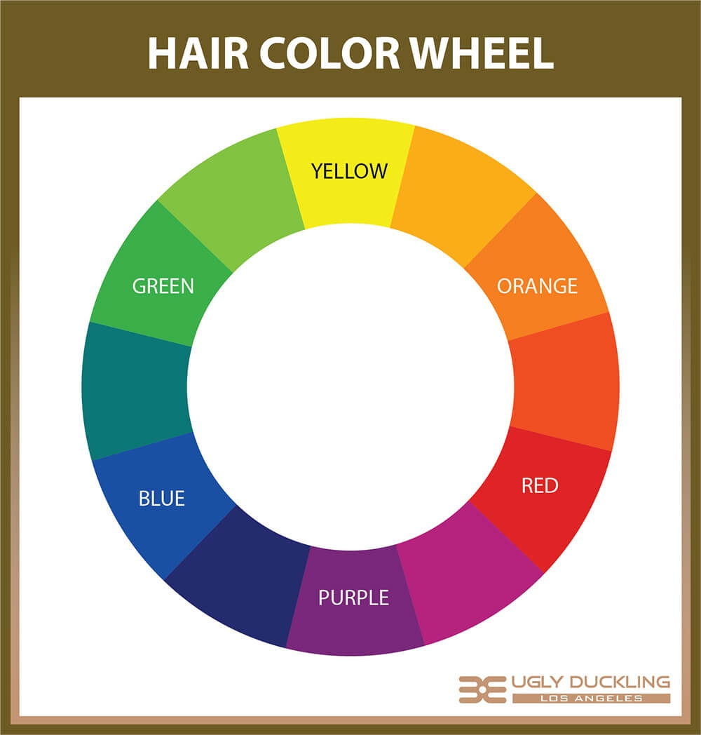
The concept of color neutralization is rooted deeply in the color wheel. A primary tool for artists and designers, the color wheel visually represents the relationships between colors. Complementary colors are those situated directly opposite each each other on this wheel. When mixed, they effectively cancel each other out, producing a neutral tone like gray or brown. When placed side-by-side, however, they create the strongest possible contrast, making each other appear more vibrant and intense. For green, its direct complement is red. This isn’t an arbitrary pairing; it’s a fundamental principle of light and pigment.
The Psychology of Green and Its Brand Implications
Green’s psychological associations are vast and generally positive, encompassing nature, tranquility, health, and prosperity. Brands in sectors like eco-friendly products, finance (money), health and wellness, and outdoor goods frequently leverage green to align with these inherent meanings. However, like any strong color, an overuse or improper application of green can become overwhelming, monotonous, or even, in some contexts, denote envy or sickness. Strategic neutralization allows a brand to harness green’s positive attributes without succumbing to its potential downsides, creating a more sophisticated and balanced visual presence.
Why Neutralization Matters for Brand Perception
For brands, the ability to neutralize a color like green is crucial for several reasons:
- Visual Harmony: It prevents color schemes from becoming chaotic or jarring, ensuring a polished and professional look.
- Highlighting Key Elements: By neutralizing a dominant green background, for instance, a brand can make critical information or a call-to-action stand out with greater intensity.
- Managing Emotional Impact: If green is used to convey calm, a contrasting neutral can prevent it from becoming too passive, adding a touch of dynamism. Conversely, if green is vibrant, a neutralizer can ground it, preventing an overly energetic or aggressive feel.
- Brand Differentiation: Thoughtful color application, including neutralization techniques, can help a brand stand out from competitors who might be using similar dominant hues.
Unpacking Red: Green’s Direct Counterpart
The unequivocal answer to “what color neutralizes green” is red. These two colors sit directly opposite each other on the traditional color wheel, making them a complementary pair. Understanding this relationship is foundational for any brand designer.
The Scientific Basis of Complementary Pairs
The complementary relationship between red and green is not just an artistic convention; it has scientific grounding in how human eyes perceive color. When light containing all colors (white light) passes through a green filter, the green wavelengths are allowed through, and other wavelengths are absorbed. The remaining absorbed wavelengths, when combined, would appear red. In terms of pigments, mixing red and green paint will result in a muddy brown or gray. This visual opposition is why, when placed next to each other, they create maximum contrast and cause each other to appear more vivid. This optical phenomenon is powerful for capturing attention, a vital aspect of marketing and brand communication.
Strategic Application: Using Red to Temper Green
In branding, “neutralizing” green with red doesn’t always mean mixing them into a brown. More often, it refers to using red alongside green to achieve various strategic effects:
- Balancing Dominance: If a brand’s primary color is a lush green, introducing accents of red can prevent the green from overwhelming the viewer. This is particularly useful in logo design, website layouts, or product packaging where a single hue might dominate.
- Creating Visual Interest: A touch of red can break the monotony of an all-green palette, drawing the eye to specific areas or information. Think of a green-themed sustainability report using red graphs or highlights to emphasize critical data points.
- Conveying Energy and Urgency: While green suggests calm and growth, red communicates passion, energy, and urgency. A brand might use a predominant green to establish trust and then employ a subtle red element for a “Buy Now” button or a promotional banner, leveraging the contrasting psychological impact.
- Building a Dynamic Brand Personality: Brands wanting to convey a sense of balance between natural harmony and innovative drive might skillfully integrate both colors. For instance, an eco-tech company might use a vibrant green as its core identity, with red accents symbolizing its cutting-edge, passionate approach.
Beyond Pure Red: Tints, Tones, and Shades for Nuance
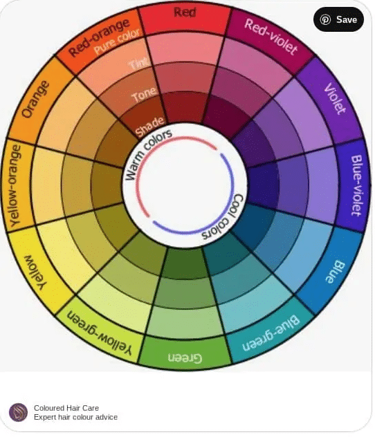
While pure red is green’s direct complement, brand design rarely operates with only primary, saturated colors. The effective neutralization and balancing of green often involves a broader spectrum of red variations:
- Tints of Red: Adding white to red creates pinks. A soft pink can offer a delicate contrast to a deep green, creating a more feminine or gentle brand aesthetic without losing the neutralizing effect.
- Shades of Red: Adding black creates darker reds, such as maroon or burgundy. These can provide a sophisticated, muted contrast to lighter greens, suitable for luxury brands or those aiming for a more traditional feel.
- Tones of Red: Adding gray to red produces muted, desaturated reds. These can create a more harmonious, less jarring contrast with green, especially if the green itself is not overly vibrant. This approach is excellent for brands seeking understated elegance.
- Other Warm Hues: While not direct complements, colors adjacent to red on the warm side of the wheel, such as oranges and even some yellows, can also provide a strong contrast and visual interest when paired with green, albeit with different psychological effects. Orange, for example, shares some of red’s vibrancy and can offer a more playful alternative.
Achieving Harmony: Beyond Direct Neutralization with Analogous and Triadic Schemes
While red directly neutralizes green, effective brand design often involves broader color strategies that extend beyond a single complementary pair. Designers frequently employ analogous and triadic color schemes, along with neutral colors, to create sophisticated palettes that balance, enhance, and strategically ground a brand’s primary green hue.
Analogous Colors: Gentle Shifts for Brand Cohesion
Analogous colors are those that sit next to each other on the color wheel, sharing a common base color. For green, analogous colors would include blues (teal, cyan) and yellows (lime green, chartreuse).
- Subtle Harmony: Using analogous colors with green creates a harmonious and serene aesthetic. Instead of neutralizing green with its opposite, this approach builds upon its inherent nature. For a brand, this can convey a sense of organic unity, natural flow, and calm.
- Depth Without Conflict: When a brand’s core is green, incorporating an analogous blue can introduce depth and a sense of professionalism (blue’s common association) without disrupting the natural theme. Similarly, yellow-greens can add a touch of energy and optimism.
- Brand Applications: This strategy is ideal for eco-conscious brands, health and wellness companies, or organizations that want to emphasize growth and natural processes. An outdoor apparel brand might use a palette of forest green, moss green, and a soft blue to evoke a cohesive natural landscape.
Triadic Schemes: Dynamic Balance and Visual Interest

A triadic color scheme involves three colors that are equally spaced around the color wheel, forming an equilateral triangle. For green, its triadic partners are orange and violet (purple).
- Vibrant and Balanced: This scheme offers a rich, dynamic, and balanced palette. Each color is distinct, but together they create a powerful visual statement without any single color dominating excessively.
- Strategic Energy: Introducing orange to green can inject warmth, enthusiasm, and creativity, while violet can add a touch of luxury, sophistication, or wisdom. This combination allows a brand to express a multifaceted personality.
- Targeted Use: Triadic schemes are excellent for brands that want to be seen as innovative, creative, or encompassing a wide range of offerings. A children’s educational brand might use a bright green for growth, orange for creativity, and violet for imagination to appeal to a young, vibrant audience.
The Role of Neutrals (Grays, Browns, Beiges) in Grounding Vibrant Palettes
Beyond direct color relationships, neutral colors play an indispensable role in any brand’s palette, especially when working with strong hues like green. Grays, browns, beiges, and off-whites provide a critical visual resting place.
- Grounding and Sophistication: Neutrals prevent vibrant colors from becoming overwhelming. A rich green, for example, can be exquisitely highlighted and grounded by a charcoal gray or a warm beige. This adds sophistication and allows the green to shine without clashing.
- Enhancing Readability: For website design, marketing materials, and packaging, neutrals are essential for background text or secondary information, ensuring readability while allowing the brand’s primary colors to capture attention.
- Timelessness: Incorporating a well-chosen neutral alongside green can extend the longevity of a brand’s visual identity, making it feel less trend-dependent and more timeless. Many sustainable luxury brands pair deep greens with earthy browns or sophisticated grays to convey quality and enduring value.
Practical Applications for Brand Identity and Marketing
Understanding how to neutralize or strategically combine green is not just theoretical; it has profound practical implications across all brand touchpoints. From logos to marketing campaigns, judicious color application ensures consistency, reinforces brand messaging, and captifies the target audience.
Logo Design and Brand Mark Considerations
The logo is often the first visual encounter with a brand. If green is a primary color in a logo, knowing its neutralizing or complementary colors is vital. A logo that primarily uses green might incorporate a subtle red accent to draw attention to a specific element or to convey a balanced message (e.g., an eco-friendly tech company using a green leaf with a red circuit line). Alternatively, a logo using green might be presented on a neutral gray or beige background to allow the green to pop without visual competition. For example, a “natural” food brand might use a vibrant green emblem against a creamy off-white background to evoke purity and freshness.
Website and User Interface (UI) Design
In web and UI design, color relationships are critical for user experience. A website with a dominant green palette (perhaps for an environmental non-profit or a health app) will benefit immensely from strategic neutralization. Red (or shades of red, like maroon for urgency) can be used for calls-to-action buttons that need to stand out. Neutral colors like various shades of gray are indispensable for text, backgrounds, and negative space, allowing the green elements to guide the user’s eye without causing fatigue. An analogous blue could be used for links or secondary navigation elements, maintaining harmony while providing visual differentiation.
Packaging and Product Presentation
Packaging is a silent salesperson. For products using green to signify natural ingredients, organic status, or freshness, balancing this green is key. A green-tea brand might use a vibrant green carton, but incorporate subtle red lettering for its premium variant to denote richness or a unique flavor profile. Similarly, earthy browns or whites are often paired with green packaging to reinforce the natural and wholesome image, while providing a clean backdrop for product information. The strategic use of contrasting colors can make a product jump off the shelf, even within a crowded category.
Marketing Campaigns and Advertising Visuals
Marketing visuals, from print ads to digital banners, benefit from sophisticated color management. A campaign promoting a new line of sustainable products, heavily featuring green imagery, might use red or orange elements for headlines or limited-time offers to create immediate visual impact and drive conversions. Conversely, for a campaign emphasizing calm and relaxation, pairing soft greens with muted grays or creams creates an inviting and serene visual narrative. Understanding the psychological interplay of these colors ensures the campaign’s emotional resonance aligns perfectly with its objectives.
Internal Branding and Workplace Aesthetics
The application of color extends beyond external customer-facing elements to the internal environment of a company. A workplace designed with a primary green theme to foster creativity and well-being might use neutral furnishings (gray desks, beige walls) to prevent the green from being overstimulating. Red accents could be strategically placed in break areas to stimulate energy, or in collaboration zones to encourage dynamic interaction, balancing the calm associated with green. This holistic approach to color contributes to employee morale, productivity, and a consistent brand experience.
Mastering Color for Brand Impact
Ultimately, mastering color, including the art of neutralization, is about precision in brand communication. It’s not about rigid rules but about informed choices that resonate with an audience and reinforce brand values. The choice to neutralize green, to let it stand alone, or to combine it with other hues is a deliberate strategic decision.
Cultural Context and Target Audience
The perception of colors is not universal. While green generally signifies nature in Western cultures, its specific connotations can vary globally. Similarly, red’s association with danger or passion differs. A global brand must consider these nuances. For instance, a green product entering a market where red signifies celebration might find that subtle red accents on its packaging enhance its appeal, rather than purely neutralizing its green base. Understanding the target audience’s cultural lens is paramount for effective color strategy.
Brand Personality and Emotional Resonance
Every color choice should be aligned with the brand’s personality and the emotional response it aims to elicit. If a brand wants to be perceived as innovative and daring, a vibrant green paired with a bold red might be more appropriate than a muted green with a soft beige. Conversely, a luxury brand emphasizing exclusivity might lean towards deep greens with rich, dark red or sophisticated gray accents. The emotional resonance of the color palette directly impacts how the brand is felt, not just seen.
Consistency Across All Touchpoints
Perhaps the most critical aspect of brand color strategy is consistency. Once a color palette, including how green is neutralized or complemented, is established, it must be applied uniformly across all brand touchpoints—from the logo to the website, social media, merchandise, physical spaces, and advertising. This consistency builds brand recognition, reinforces identity, and fosters trust, ensuring that every interaction with the brand, regardless of context, communicates a unified and intentional message. By mastering the intricate dance of color, brands can elevate their visual presence from mere aesthetics to a powerful strategic asset.
aViewFromTheCave is a participant in the Amazon Services LLC Associates Program, an affiliate advertising program designed to provide a means for sites to earn advertising fees by advertising and linking to Amazon.com. Amazon, the Amazon logo, AmazonSupply, and the AmazonSupply logo are trademarks of Amazon.com, Inc. or its affiliates. As an Amazon Associate we earn affiliate commissions from qualifying purchases.