
Pink, often perceived as vibrant and emotionally resonant, has evolved significantly in the realm of brand identity and marketing. Far from being relegated to niche markets, it now stands as a powerful hue capable of conveying a spectrum of messages, from playful innocence to sophisticated luxury. The strategic integration of pink into a brand’s visual language, however, relies heavily on its accompanying colours. Understanding what colours complement pink is not merely an aesthetic choice; it’s a critical decision that shapes brand perception, influences audience engagement, and reinforces core brand values.
The Strategic Power of Pink in Branding
The journey of pink in branding is a fascinating one, moving from gendered stereotypes to a symbol of modern versatility. Its psychological impact is profound, making the choice of complementary colours paramount for precise brand messaging.
Decoding Pink’s Psychological Impact
Pink, at its core, is a variation of red, softened by white, which inherently carries associations with love, passion, and energy, albeit in a more subdued and approachable form. Depending on its saturation and tone, pink can evoke a multitude of feelings:
- Light or Pastel Pinks: Often associated with tenderness, romance, sweetness, and youth. Brands aiming for a gentle, nurturing, or compassionate image might lean into these shades. Think of wellness brands, baby products, or artisanal crafts.
- Fuchsia or Hot Pinks: These vibrant shades convey energy, excitement, playfulness, and confidence. They are often adopted by fashion labels, beauty brands, and tech companies looking to project a modern, bold, and dynamic identity that stands out.
- Dusty Rose or Mauve Pinks: More sophisticated and subtle, these hues suggest elegance, nostalgia, and understated luxury. Brands in high-end cosmetics, interior design, or premium services might utilize these to communicate refinement and exclusivity.
The initial perception of a pink-infused brand is heavily influenced by these inherent associations. However, the true nuance and broader appeal are unlocked through its strategic pairings.
Why Complementary Colours Matter for Brand Perception
No colour operates in isolation within a brand’s visual ecosystem. Complementary colours serve several vital functions:
- Balance and Harmony: They prevent pink from becoming overwhelming or monotonous, creating a visually pleasing balance.
- Contrast and Readability: Essential for legibility in logos, website text, and marketing materials.
- Enhanced Messaging: They can temper, amplify, or redefine pink’s inherent psychological traits, allowing a brand to fine-tune its message. For example, pink paired with black can pivot from sweet to edgy, or pink with gold can shift from playful to opulent.
- Differentiation: Unique colour combinations help a brand stand out in a crowded market, creating a memorable visual identity.
The carefully chosen palette becomes more than just colours; it becomes a non-verbal language that communicates brand personality, values, and offerings instantly.
Mastering Pink Palettes: Strategic Combinations for Diverse Brand Messages
When considering “what colours look good with pink,” it’s crucial to think about the desired brand outcome. Different pairings yield distinctly different impressions.
Sophistication & Luxury: Pink with Neutrals (Grey, Beige, Cream, White)
Pairing pink with neutral tones is a timeless strategy for brands aiming for elegance, minimalism, and upscale appeal.
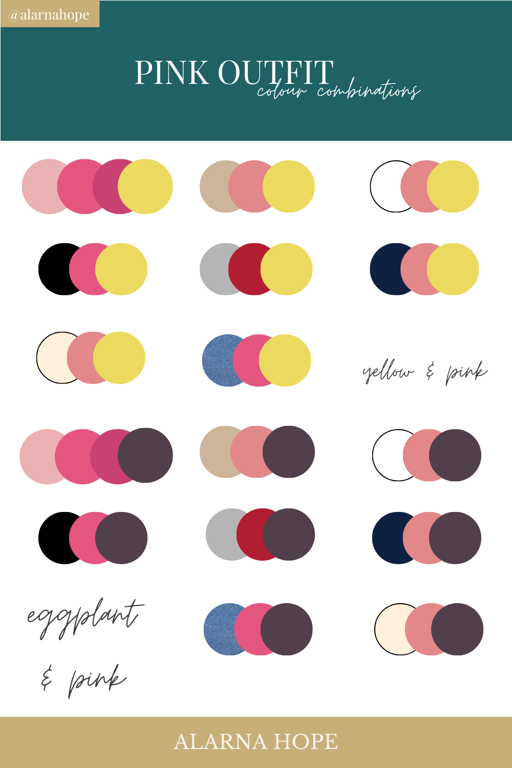
- Pink and Grey: This combination exudes modern sophistication. A soft pink alongside a charcoal or slate grey creates a balanced, professional, yet approachable feel. It’s often seen in high-end fashion, architectural firms, or tech startups seeking a chic, intelligent aesthetic. The grey grounds the pink, preventing it from appearing overly saccharine.
- Pink and Beige/Cream: For a warmer, organic, and comforting luxury, beige or cream with pink works beautifully. This palette suggests natural beauty, premium quality, and a gentle approach. Ideal for wellness brands, sustainable products, or artisanal crafts that want to convey warmth and authenticity without sacrificing sophistication.
- Pink and White: A classic for cleanliness, simplicity, and purity. While it can lean towards youthful, strategic use of texture and typography can elevate it to a minimalist luxury. Brands in beauty, healthcare, or minimalistic lifestyle often employ this crisp combination.
Vibrancy & Modernity: Pink with Teal, Mint, or Orange
To inject dynamism, freshness, and a contemporary edge, pink finds excellent partners in bright, complementary hues.
- Pink and Teal/Mint: This pairing is inherently refreshing and modern. The coolness of teal or mint provides a striking contrast to pink’s warmth, creating an energetic yet balanced visual. It suggests innovation, creativity, and a forward-thinking attitude. Popular with tech brands, digital agencies, or lifestyle brands targeting a youthful, trend-aware audience.
- Pink and Orange: A bold, high-energy combination that screams optimism and creativity. It’s vibrant, playful, and commands attention. This palette is perfect for brands that want to be seen as daring, artistic, or full of life, often found in event branding, entertainment, or innovative product design.
Boldness & Contrast: Pink with Black, Navy, or Deep Green
For brands that want to make a strong statement, convey power, or project a sense of robust reliability, deep contrasting colours are ideal.
- Pink and Black: An iconic pairing that instantly adds an edge and sophistication. Depending on the shade of pink, it can be glamorous, rebellious, or ultra-modern. Hot pink with black is punk-chic; dusty rose with black is refined and elegant. This combination is a staple for luxury fashion, bold beauty brands, and cutting-edge design.
- Pink and Navy: Offers a refined yet robust contrast. Navy blue grounds the pink, adding a sense of trustworthiness, professionalism, and stability, while the pink injects personality and approachability. This is excellent for corporate brands seeking to soften their image, or established brands aiming for a touch of modern flair.
- Pink and Deep Green: Evokes nature, growth, and a connection to the environment, but with an unexpected twist. A rich forest green with pink suggests organic luxury, ethical sophistication, or a contemporary take on natural wellness. It’s a compelling choice for eco-conscious brands, high-end florists, or sustainable fashion.
Playfulness & Youth: Pink with Yellow, Light Blue, or Coral
Brands targeting a younger demographic or wishing to project an image of joy and lightheartedness can leverage these bright, cheerful combinations.
- Pink and Yellow: A sunny, optimistic, and undeniably cheerful pairing. It communicates joy, friendliness, and creativity. Ideal for brands focused on children, casual wear, or services that emphasize happiness and positivity.
- Pink and Light Blue: A classic, gentle combination that often evokes innocence, dreams, and softness. It can be quite whimsical and serene, suitable for brands in children’s products, comfort-focused services, or tranquil environments.
- Pink and Coral: A vibrant, warm, and inviting pairing. Coral, being a blend of pink and orange, naturally harmonizes with pink, creating a lively and tropical feel. Excellent for travel brands, summery products, or anything aiming for a joyful, approachable, and warm vibe.

Applying Pink Colour Schemes Across Brand Touchpoints
Once the ideal pink palette is defined, its consistent application across all brand touchpoints is paramount for cementing brand identity.
Logo Design & Brand Identity
The brand logo is the cornerstone of visual identity. Here, the chosen pink and its complementary colour(s) must work seamlessly to convey the brand’s essence at a glance. Consider not just the colours themselves, but also their ratio and placement. A dominant pink with a subtle accent colour, or vice-versa, can drastically alter perception. Typeface selection also plays a role; a bold sans-serif with pink and black will differ greatly from a delicate serif with pink and cream.
Website & Digital Presence
A brand’s website, social media profiles, and digital advertisements are critical spaces for colour application. The pink palette should guide everything from background colours and button accents to hover states and iconography.
- Readability: Ensure text contrasts well against pink backgrounds or elements.
- User Experience: Use pink strategically to highlight calls to action or key information.
- Consistency: Maintain the chosen palette across all digital platforms to reinforce brand recognition.
Marketing Collateral & Product Packaging
Physical marketing materials like brochures, business cards, and product packaging offer tactile opportunities to engage with the brand’s colours. The material, finish (matte vs. gloss), and printing process can all subtly influence how pink and its complements are perceived. For packaging, the colour scheme contributes directly to shelf appeal and conveys product value and attributes. A luxury item using pink and gold on a textured box speaks volumes.
Social Media Aesthetics
On platforms like Instagram, Pinterest, and TikTok, visual consistency is king. Brands employing pink should have a clear style guide for their content, ensuring that filters, graphic elements, and photography align with their chosen pink palette. This creates a cohesive, recognizable feed that strengthens brand recall and aesthetic appeal.
Best Practices for Integrating Pink in Your Brand Identity
Beyond selecting the right shades, the strategic deployment of pink requires a thoughtful approach.
Understanding Your Target Audience
The most effective colour choices are deeply informed by who the brand is trying to reach. A youthful, energetic brand will utilize pink and its complements differently than a high-end luxury brand. Research demographics, psychographics, and cultural associations to ensure the chosen palette resonates positively.
Consistency is Key
Once a pink palette is established, unwavering consistency across all visual assets is crucial. This builds familiarity, trust, and strong brand recognition. Develop a comprehensive brand guide that details exact colour codes (CMYK, RGB, Hex), preferred ratios, and usage rules.
The Role of Contrast and Dominance
Effective colour schemes leverage contrast to create visual interest and hierarchy. Determine which colour will be dominant, which will be secondary, and which will serve as an accent. Pink can be the star, or it can be a vibrant accent against a more neutral backdrop. The amount of contrast also impacts readability and visual impact.

Future-Proofing Your Pink Palette
While trends influence colour popularity, a strong brand palette should transcend fleeting fads. Choose colours that align with the brand’s enduring values rather than just current popularity. A well-designed pink palette should feel fresh and relevant for years to come, with perhaps minor adjustments over time rather than wholesale overhauls.
In conclusion, understanding “what colours look good with pink” is a sophisticated exercise in brand strategy. It’s about more than mere aesthetics; it’s about crafting a deliberate visual narrative that speaks volumes, connects with the right audience, and distinguishes a brand in a competitive marketplace. By carefully considering the psychological impact, strategic pairings, and consistent application across all touchpoints, brands can harness the full, versatile power of pink.
aViewFromTheCave is a participant in the Amazon Services LLC Associates Program, an affiliate advertising program designed to provide a means for sites to earn advertising fees by advertising and linking to Amazon.com. Amazon, the Amazon logo, AmazonSupply, and the AmazonSupply logo are trademarks of Amazon.com, Inc. or its affiliates. As an Amazon Associate we earn affiliate commissions from qualifying purchases.