Defining Your Kitchen’s Aesthetic Brand Identity
The kitchen, often considered the heart of the home, functions much like a flagship store or a personal brand statement. Every design choice, from cabinetry to lighting, contributes to its overarching aesthetic brand identity. White cabinets, by their very nature, serve as an unparalleled canvas—neutral, clean, and universally appealing. Their pristine uniformity offers a unique opportunity to define the kitchen’s “brand personality” through strategic countertop selection. The choice of countertop is not merely a practical decision; it’s a foundational element that dictates the mood, style, and perceived quality of the entire space, much like a brand’s logo or color palette shapes its public image.
When approaching this decision, consider the core message you wish your kitchen to convey. Is it a beacon of sleek modernity, a haven of rustic charm, a bastion of classic elegance, or a testament to bold individuality? The countertop material and color are critical in articulating this vision. They influence how the space is perceived, how it feels to interact with, and ultimately, the “brand experience” it delivers. White cabinets provide the perfect backdrop for virtually any aesthetic, allowing the countertop to step forward and establish the dominant design narrative. This strategic approach ensures that the kitchen’s design is cohesive, intentional, and reflective of a well-defined brand identity, whether it’s for a residential dwelling, a commercial display, or a property being prepared for market. Understanding this interplay between the foundational neutrality of white cabinets and the expressive potential of countertops is the first step in crafting a truly impactful and memorable kitchen brand.
Strategic Color Palettes: Building Core Brand Statements
The selection of countertop colors can be strategically aligned with desired brand statements, transforming a functional space into a powerful expression of style and quality. Each color family inherently carries a distinct brand message.
The Sophisticated Statement: Dark Countertops
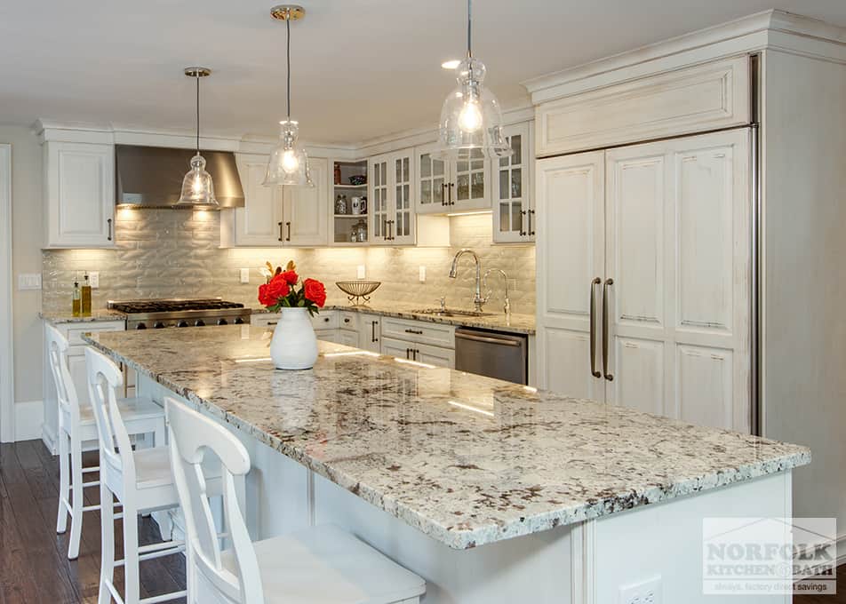
Opting for dark countertops—such as deep blacks, charcoals, or rich espresso browns—in conjunction with white cabinets crafts a remarkably sophisticated and modern brand identity. This high-contrast pairing exudes a sense of confident luxury and contemporary flair. Dark countertops anchor the bright airiness of white cabinets, creating a dramatic visual tension that communicates strength and unwavering elegance. Materials like honed absolute black granite or quartz with subtle dark veining reinforce a brand image of refined taste and cutting-edge design. The perception is one of deliberate choices, high-end appeal, and a timeless, yet distinctly modern, sophistication. This palette is ideal for individuals or properties aiming to convey a strong, unwavering, and premium brand message. It suggests a space that is both functional and artfully composed, much like a meticulously crafted luxury product.
The Serene & Expansive Brand: Light Countertops
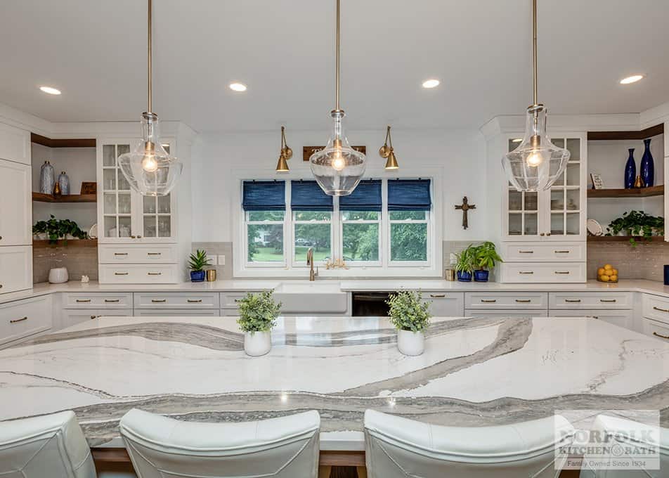
Conversely, pairing white cabinets with light countertops—ranging from pristine whites and creams to very light greys—establishes a brand identity centered on serenity, spaciousness, and minimalist purity. This low-contrast approach creates a seamless, expansive aesthetic that reflects light and promotes an open, airy atmosphere. White marble, white quartz, or even light concrete countertops can achieve this effect, conveying a sense of pristine cleanliness and effortless elegance. The brand message here is one of calm sophistication, understated luxury, and a modern approach to design that prioritizes clarity and order. It’s a choice that speaks to a desire for simplicity, efficiency, and a tranquil environment, appealing to a brand audience that values cleanliness, minimalism, and a timeless, uncluttered aesthetic. This design promotes a feeling of quiet luxury, allowing the architectural lines and natural light to become primary brand elements.
The Grounded & Welcoming Brand: Earth Tones
Incorporating earth-toned countertops with white cabinets cultivates a brand identity that is both grounded and inviting. Shades like warm beiges, soft browns, and greys with subtle warm undertones create a comforting and approachable aesthetic. This palette avoids stark contrasts, instead fostering a harmonious and organic feel. Natural wood, certain granite varieties, or quartz with warm, earthy flecks can convey this brand message effectively. The impression is one of natural beauty, stability, and a welcoming warmth that makes the space feel instantly hospitable. This choice communicates a brand that values authenticity, comfort, and an understated elegance rooted in natural elements. It speaks to a desire for a nurturing environment, an approachable luxury, and a connection to the organic world, creating a distinctively warm and inviting kitchen brand that feels both timeless and deeply personal.
Injecting Unique Brand Personality with Distinctive Hues
Beyond the classic palettes, selecting countertops with more distinctive hues allows for a powerful injection of unique brand personality. These choices enable the kitchen to tell a more specific and memorable brand story, moving beyond universal appeal to cultivate a truly signature aesthetic.
The Bold & Expressive Brand: Blues and Greens
For those aiming to establish a kitchen brand that is vibrant, distinctive, and highly personalized, incorporating blues or greens into the countertop selection can be transformative. A deep navy quartz, a serene seafoam green recycled glass, or an emerald-toned granite can create a focal point that speaks volumes about the space’s unique character. These colors can evoke various brand narratives: a coastal retreat feel, a tranquil oasis, or a daring contemporary statement. With white cabinets providing a clean visual break, a blue countertop might convey a brand identity of sophistication, tranquility, and understated confidence. A green countertop, on the other hand, could suggest freshness, organic vitality, or a connection to nature, crafting a more lively and regenerative brand presence. Such choices communicate a willingness to innovate and express a strong, individual brand voice, appealing to an audience that values originality and a curated personal aesthetic over convention. This approach is about crafting a memorable brand experience that stands out.
The Organic & Artisan Brand: Wood Countertops
Choosing wood countertops—whether in the form of butcher block, reclaimed planks, or finely finished solid wood—immediately establishes an organic, artisan, and deeply welcoming brand identity for the kitchen. The inherent warmth, natural grain patterns, and tactile quality of wood introduce a layer of texture and authenticity that starker materials cannot replicate. Paired with white cabinets, wood countertops create a beautiful contrast that grounds the space, imbuing it with a sense of handcrafted quality and approachable luxury. This brand message speaks to a preference for natural materials, a respect for craftsmanship, and a desire for a warm, inviting environment that feels both sophisticated and inherently comfortable.
Whether the wood is light maple for a clean, Scandinavian-inspired brand, or rich walnut for a more traditional, luxurious appeal, it consistently conveys a brand personality rooted in authenticity and natural elegance. This choice is particularly effective for brands that wish to emphasize heritage, coziness, and a connection to nature, presenting the kitchen not just as a functional area, but as a space with character, history, and a soul. It’s an ideal option for creating a kitchen brand that feels lived-in, loved, and deeply personal.
Beyond Color: Texture, Finish, and Edge as Brand Elements
While color is undeniably a primary driver of a kitchen’s brand identity, the nuanced choices in texture, finish, and edge profiles of countertops contribute significantly to the overall brand narrative. These elements often work subtly, yet powerfully, to refine the perceived quality and specific stylistic brand of the space.
The texture of a countertop material speaks volumes about its tactile experience and visual depth. A highly polished granite or quartz surface offers a slick, reflective finish that amplifies light and contributes to a high-gloss, luxurious brand aesthetic, often associated with modernity and pristine elegance. In contrast, a honed or leathered finish presents a matte, velvety texture that absorbs light, conveying a more subdued, sophisticated, and perhaps even rugged brand identity. A honed surface might suggest an understated luxury, while a leathered finish can communicate a rustic or industrial-chic brand, emphasizing durability and an organic feel. These textural distinctions are crucial in shaping how the kitchen’s brand is physically and visually experienced, adding layers of sensory appeal.
The finish—gloss versus matte—further refines the brand message. A glossy finish on a dark countertop paired with white cabinets creates a striking, almost architectural brand statement of sharp contrasts and high-impact design. It speaks to a brand that is bold, confident, and contemporary. A matte finish, conversely, often softens the aesthetic, imparting a more sophisticated, approachable, and less overtly flashy brand image. It can make a strong color feel more grounded and timeless, aligning with a brand that values enduring style over fleeting trends.
Finally, the edge profile acts as a subtle but impactful brand signature. A simple, clean eased or straight edge reinforces a minimalist, streamlined brand identity, emphasizing sleek lines and uncluttered aesthetics. A more decorative edge, such as an ogee or bullnose, can hint at a classic, traditional, or even ornate brand persona, suggesting attention to detail and a historical elegance. These details, though small, contribute to the overall impression of craftsmanship and design intent, reinforcing the perceived value and unique brand character of the kitchen. Together, these elements transcend mere functionality, becoming integral components in crafting a cohesive and compelling brand narrative for the space.

The Long-Term Brand Value: Durability and Timeless Appeal
When curating a kitchen’s brand identity, particularly with white cabinets as the foundation, considerations of durability and timeless appeal are paramount. These factors directly influence the long-term perceived value and enduring strength of the kitchen’s “brand” in the market, whether for personal enjoyment or potential resale. A kitchen is a significant investment, and its design choices should reflect a strategic approach to maintaining its aesthetic and functional integrity over time.
Choosing high-quality, durable countertop materials—such as quartz, granite, or solid-surface options—reinforces a brand promise of reliability and longevity. A countertop that resists scratches, stains, and heat not only serves its functional purpose but also communicates a brand message of meticulous construction and lasting value. Conversely, opting for materials that quickly show wear or require extensive maintenance can inadvertently diminish the kitchen’s brand image, suggesting a compromise on quality and an eventual decline in aesthetic appeal. Smart material selection is, therefore, an investment in the kitchen’s future brand equity.
Furthermore, balancing timely design trends with timeless appeal is crucial for ensuring the kitchen’s brand remains relevant and desirable. While certain colors or patterns might be fashionable in the short term, they risk dating the space quickly. A timeless countertop choice—be it classic white marble, sophisticated black granite, or a neutral quartz—ensures that the kitchen’s brand identity remains fresh and appealing across different eras and personal preferences. This strategic approach safeguards against the need for frequent updates, preserving the initial investment and enhancing the property’s overall market appeal. A well-designed, durable kitchen with enduring aesthetic value communicates a strong, stable brand that transcends fleeting fads, offering consistent appeal and maximizing its brand impact for years to come.
aViewFromTheCave is a participant in the Amazon Services LLC Associates Program, an affiliate advertising program designed to provide a means for sites to earn advertising fees by advertising and linking to Amazon.com. Amazon, the Amazon logo, AmazonSupply, and the AmazonSupply logo are trademarks of Amazon.com, Inc. or its affiliates. As an Amazon Associate we earn affiliate commissions from qualifying purchases.