
The Allure of Jewel Tones in Brand Identity
Jewel tone colors are a captivating palette inspired directly by the Earth’s most precious gemstones: the deep, rich hues of emeralds, rubies, sapphires, amethysts, and topaz. These are not merely vibrant colors; they are colors imbued with a sense of depth, luxury, and sophistication, inherently echoing the qualities of the stones they represent. From the verdant depth of an emerald green to the fiery passion of ruby red, the serene authority of sapphire blue, the mystical allure of amethyst purple, and the golden warmth of citrine or topaz, jewel tones collectively form a visual language that speaks of opulence, tradition, and enduring value.

Historically, gemstones and their corresponding colors have been associated with royalty, wealth, and spiritual significance across cultures. Kings, queens, and religious leaders adorned themselves with these treasures, signifying power, status, and divine connection. This deep-seated historical and cultural association is precisely what makes jewel tones so potent in brand identity. When a brand incorporates these colors, it subtly taps into centuries of perceived value, quality, and exclusivity. The psychological impact is immediate: jewel tones elevate a brand’s perceived stature, suggesting a premium offering, meticulous craftsmanship, and an experience beyond the ordinary. They communicate a message of discernment and taste, appealing to consumers who value quality, heritage, and a touch of luxury.
Strategic Application in Brand Design and Marketing
Leveraging jewel tones in brand design and marketing is a nuanced strategy that, when executed correctly, can significantly enhance a brand’s messaging and market positioning. The effectiveness lies not just in their inherent beauty but in their ability to evoke specific emotions and resonate with particular target audiences.
Emotional and Psychological Impact
Each jewel tone carries its own unique psychological weight and emotional resonance, making their selection a critical decision in brand strategy:
- Emerald Green: This lush, deep green often symbolizes growth, harmony, nature, and wealth. For brands, it can convey a sense of prestige, environmental consciousness (when paired thoughtfully), stability, and a refined aesthetic. Luxury eco-conscious brands or financial institutions seeking to project trustworthiness often gravitate towards emerald.
- Ruby Red: A vibrant, deep red, ruby signifies passion, energy, power, and courage. It’s a bold choice that can evoke excitement, stimulate desire, and command attention. Brands in the luxury automotive, high-end fashion, or entertainment sectors might use ruby to convey dynamism and desirability.
- Sapphire Blue: Deep and majestic, sapphire blue is synonymous with trust, loyalty, wisdom, and professionalism. It exudes a sense of calm authority and reliability. This makes it a popular choice for corporate brands, financial services, tech companies, and educational institutions aiming to communicate dependability and expertise.
- Amethyst Purple: A rich, regal purple, amethyst is linked to creativity, imagination, luxury, and spirituality. It can suggest sophistication, uniqueness, and a touch of mystique. Brands in the beauty industry, creative arts, or niche luxury markets might employ amethyst to stand out and appeal to an imaginative clientele.
- Topaz/Citrine Yellow-Orange: These warmer jewel tones, ranging from golden yellow to deep amber, signify warmth, joy, optimism, and intellectual power. While still luxurious, they can feel more approachable than some of the deeper, cooler tones. Brands looking to combine elegance with an inviting, vibrant energy, particularly in hospitality, leisure, or high-end lifestyle products, might find these tones appealing.
- Garnet Red-Brown: A deep, rich, often reddish-brown tone, garnet conveys grounded elegance, endurance, and a sophisticated earthiness. It can bridge the gap between classic luxury and a more organic, artisanal feel, suitable for heritage brands, premium artisanal goods, or high-quality home furnishings.
Target Audience Connection
The choice to employ jewel tones is often strategic, aimed at connecting with a specific demographic or market segment. These colors resonate particularly well with:
- Luxury Consumers: Individuals who prioritize quality, exclusivity, and a premium experience. Jewel tones inherently align with these values, signifying a higher-tier product or service.
- Fashion and Beauty Industries: Where visual appeal and aspirational branding are paramount. Jewel tones can convey elegance, trendiness, and an elevated aesthetic.
- High-End Hospitality and Interior Design: To create opulent, inviting, and memorable environments that speak to comfort and luxury.
- Art and Culture Sectors: Where depth, creativity, and a sense of gravitas are valued.
- Professional Services: Brands aiming to project authority, trustworthiness, and a sophisticated approach to their craft.
By leveraging jewel tones, brands can differentiate themselves in crowded markets, escaping the blandness often associated with more conventional palettes. They offer a powerful way to make a strong visual statement, create memorable brand recognition, and reinforce a brand’s unique value proposition.
Crafting a Cohesive Jewel Tone Palette for Your Brand
The successful integration of jewel tones into a brand’s visual identity goes beyond simply picking a favorite color. It requires thoughtful consideration of the entire palette, its application, and its consistency across all brand touchpoints.
Choosing Your Core Jewel Tones
The first step is to identify which jewel tones best align with your brand’s core values, mission, and personality. Is your brand about bold innovation (ruby), serene reliability (sapphire), or luxurious growth (emerald)? Seldom does a brand use all jewel tones; rather, it selects a primary and perhaps one or two secondary tones that tell a coherent story. For instance, a luxury watch brand might pair a deep sapphire with subtle platinum accents, while a high-end chocolatier might combine rich garnet with gilded gold. Consider the emotional impact you wish to evoke and choose colors that reinforce that narrative.
Integration with Other Colors
While jewel tones are powerful, they often shine brightest when paired thoughtfully with complementary or contrasting hues.
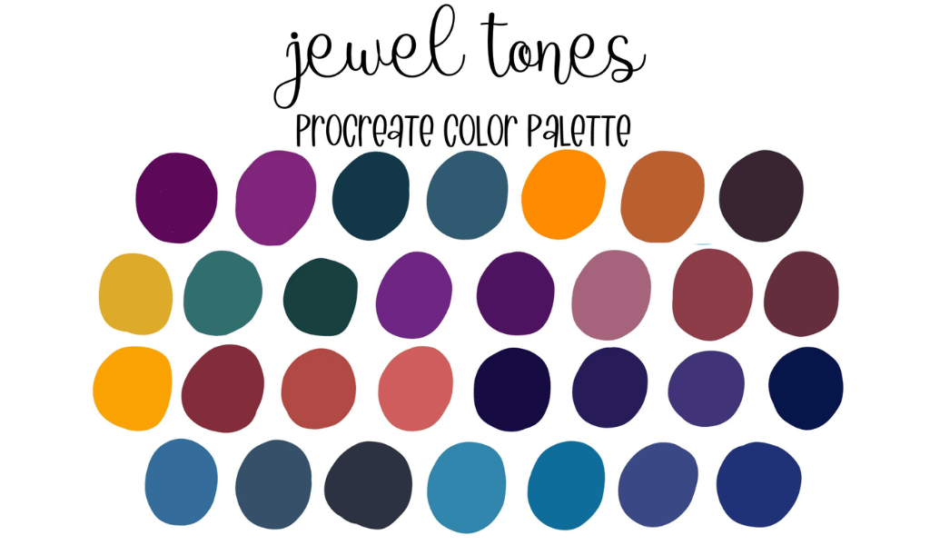
- Neutrals: Pairing jewel tones with sophisticated neutrals like charcoal gray, warm cream, pure white, or deep black can provide balance and allow the jewel tones to pop without overwhelming the viewer. These neutrals can serve as backgrounds, text colors, or secondary elements that support the primary vibrant hues.
- Metallics: Gold, silver, bronze, and rose gold are natural companions to jewel tones, reinforcing the sense of luxury and preciousness. A metallic accent in a logo, packaging, or website design can significantly elevate the overall aesthetic.
- Subtle Contrasts: Sometimes, a carefully chosen pastel or a muted tone from an adjacent color family can create an intriguing contrast, adding depth and visual interest without detracting from the primary jewel tones. The key is to maintain a sense of balance and sophistication.
Consistency Across Touchpoints
A brand’s visual identity is only as strong as its consistency. Once a jewel tone palette is established, it must be meticulously applied across every single brand touchpoint. This includes:
- Logo and Branding Elements: The primary manifestation of your brand’s color strategy.
- Website and Digital Presence: Ensuring consistent color representation across web pages, social media profiles, email campaigns, and online advertisements.
- Packaging: High-quality packaging in jewel tones can convey product value before it’s even opened.
- Physical Spaces: Retail environments, office decor, or event branding should all reflect the chosen palette.
- Marketing Collateral: Brochures, business cards, print ads, and presentations must maintain color accuracy.
- Uniforms and Merchandise: For brands where employees interact with customers, consistent uniforms reinforce the brand image.
Inconsistency dilutes brand recognition and can send mixed signals about quality and attention to detail. Tools for brand guidelines and style guides are crucial here, outlining exact color codes (Pantone, CMYK, RGB, Hex) and approved usage.
Digital vs. Print Considerations
It’s vital to remember that colors display differently across various media. What looks vibrant on a screen (RGB) might appear slightly different in print (CMYK). Brand designers must account for these variations, often using Pantone Matching System (PMS) colors for print to ensure absolute consistency and vibrancy, and carefully calibrating digital displays to accurately represent brand colors. Achieving consistent jewel tone brilliance across both digital and physical realms requires expert knowledge and meticulous quality control.
Case Studies and Best Practices
Observing how successful brands utilize jewel tones can provide valuable insights into their strategic application and impact.
Examples of Brands Using Jewel Tones Effectively
Many high-end brands intuitively leverage jewel tones to reinforce their market position:
- Luxury Fashion Houses: Brands like Versace often incorporate opulent jewel tones, sometimes in rich patterns or striking monochromatic statements, to evoke extravagance and a sense of high drama. Gucci, under certain creative directions, has also utilized deep emeralds, sapphires, and rubies in its accessories and ready-to-wear lines to communicate heritage and lavishness.
- High-End Hospitality: Boutique hotels and luxury resorts frequently use jewel tones in their interior design, from deep velvet furnishings to accent walls, creating an atmosphere of comfort, sophistication, and exclusivity. The Ritz-Carlton brand, while primarily using blues and golds, often integrates deep jewel-toned accents to enhance its luxurious ambiance.
- Premium Tech Brands: While many tech companies lean towards minimalist blues and grays, some premium brands, particularly in software or luxury electronics, might use subtle jewel tones in their UI/UX or branding to convey sophistication and a cutting-edge, refined experience. For instance, Apple’s product color variants often include deep blues or greens (like Midnight Green or Pacific Blue iPhones) that echo jewel tones, suggesting premium quality and aesthetic appeal.
- Event Planning and Design: For galas, weddings, and high-profile corporate events, jewel tone palettes are frequently employed to create an atmosphere of grandeur, elegance, and celebration. The rich depth of these colors translates beautifully in lighting and decor.
Common Pitfalls to Avoid
While powerful, jewel tones require careful handling to avoid common branding missteps:
- Overuse and Clutter: Too many intense jewel tones without sufficient neutral breaks can lead to a visually overwhelming, busy, or even gaudy aesthetic, diluting the sense of luxury they are meant to convey. Balance is key.
- Misalignment with Brand Values: Applying jewel tones to a brand that aims for an approachable, budget-friendly, or whimsical image can create a disconnect. The inherent seriousness and luxury associated with these colors might confuse the target audience.
- Poor Readability: When using jewel tones for backgrounds or large color blocks, ensure that overlaid text, especially in contrasting light colors, remains highly readable. Insufficient contrast can lead to accessibility issues and poor user experience.
- Ignoring Accessibility: Colorblindness and other visual impairments must be considered. While jewel tones are beautiful, ensure that key information conveyed through color is also discernible through other means (e.g., text labels, patterns, icons).
- Dating the Brand: While classic, jewel tones can sometimes feel dated if not applied with a modern design sensibility. Incorporating current trends in gradients, textures, or minimalist layouts can prevent a brand from looking stuck in the past.

Future Trends
Jewel tones are timeless, but their application evolves. We see them integrated into modern branding through:
- Subtle Gradients: Smooth transitions between jewel tones or from a jewel tone to a deep neutral can create a contemporary, dynamic effect.
- Matte Finishes: Moving beyond glossy opulence, matte jewel tones offer a sophisticated, understated luxury in packaging and digital design.
- Minimalist Accents: Using a single, striking jewel tone as an accent against a largely neutral palette can be incredibly effective, allowing the color to make a powerful statement without overwhelming the design.
- Digital-First Applications: Exploring how these rich colors translate into animated interfaces, interactive elements, and augmented reality experiences.
By understanding the inherent power of jewel tones and applying them with strategic foresight and meticulous design, brands can craft a visual identity that is not only beautiful but deeply resonant, communicating luxury, quality, and a distinct presence in the marketplace.
aViewFromTheCave is a participant in the Amazon Services LLC Associates Program, an affiliate advertising program designed to provide a means for sites to earn advertising fees by advertising and linking to Amazon.com. Amazon, the Amazon logo, AmazonSupply, and the AmazonSupply logo are trademarks of Amazon.com, Inc. or its affiliates. As an Amazon Associate we earn affiliate commissions from qualifying purchases.