
Brown, a color often dismissed as mundane, holds immense power and versatility within brand strategy and visual identity. Far from being a mere background shade, brown can convey a spectrum of sophisticated meanings, from earthy authenticity and rugged durability to luxurious warmth and dependable stability. For brands looking to leverage this understated yet impactful hue, understanding its psychological associations and, critically, which colors best complement it, is paramount to crafting a cohesive and memorable visual presence.
The Enduring Appeal and Psychology of Brown in Branding
Brown’s psychological impact on consumers is profound, rooted deeply in nature and tangible experiences. It’s the color of soil, wood, coffee, chocolate, and leather – all elements associated with comfort, foundation, and natural quality. When a brand chooses brown as a primary or secondary color, it taps into these inherent associations, shaping consumer perception in distinct ways.
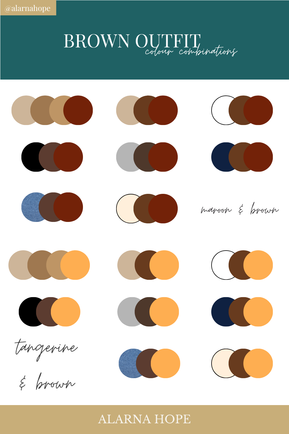
Decoding Brown’s Brand Personality
At its core, brown communicates reliability and trustworthiness. Brands that aim to project stability, honesty, and a no-nonsense approach often gravitate towards its various shades. Think of financial institutions or heritage brands that want to convey a sense of established integrity. Beyond reliability, brown also evokes warmth and comfort, making it a natural fit for brands in the food and beverage industry, particularly coffee shops, bakeries, and organic food producers. The richness of dark browns can also signify luxury and sophistication, especially when paired with metallic accents or deep jewel tones. This elevates brown beyond its rustic roots, positioning it within high-end fashion, upscale interiors, or artisanal craft brands seeking to communicate quality and exclusivity. Furthermore, its connection to the natural world makes it an obvious choice for outdoor apparel, environmental initiatives, and sustainable products, embodying an eco-conscious and grounded identity.
When and Why Brands Choose Brown
The strategic decision to incorporate brown into a brand’s palette is rarely accidental. Brands in sectors such as agriculture, woodworking, coffee, and gourmet foods often adopt brown to reinforce their connection to natural ingredients, traditional methods, or an organic aesthetic. For instance, a specialty coffee brand might use a deep espresso brown to evoke the rich aroma and quality of its beans, while a handcrafted furniture maker might employ lighter wood tones to highlight craftsmanship and natural materials.
Beyond literal associations, brown serves as a grounding color. In a visually chaotic marketplace, a carefully chosen brown can provide a sense of calm and order. It allows other, more vibrant colors in the brand’s palette to stand out without feeling jarring, acting as a sturdy anchor for the entire visual system. This makes it an excellent choice for brands that want to convey understated elegance rather than overt flashiness.
Mastering Color Theory for Brown-Based Brand Palettes
Selecting complementary colors for brown isn’t merely an aesthetic exercise; it’s a strategic decision informed by color theory and the brand’s desired message. The right pairings can enhance brown’s inherent qualities, create visual interest, and guide consumer perception.
The Fundamentals: Complementary, Analogous, Triadic Schemes
To effectively match colors with brown, an understanding of basic color theory is crucial.
- Complementary colors are opposite each other on the color wheel and create high contrast. While brown isn’t on the traditional color wheel, its undertones (often reddish-orange or yellowish-orange) mean that cool colors like blues and greens often act as effective complements, providing dynamic contrast without clashing.
- Analogous colors are next to each other on the color wheel, creating a harmonious and cohesive look. For browns with warmer undertones, analogous colors might include deep oranges, reds, and even some muted yellows, evoking an autumnal palette.
- Triadic schemes involve three colors evenly spaced on the color wheel, offering a more balanced and vibrant palette. For brown, this might involve pairing its warm undertones with greens and purples, creating a more sophisticated and diverse visual identity.
Crafting Visual Harmony: Achieving Balance and Contrast
The key to successful color matching with brown lies in achieving the right balance between harmony and contrast. Too much harmony can make a brand feel bland or indistinguishable, while too much contrast can be jarring. Brown, being a neutral-leaning color, is excellent at providing a solid foundation upon which more vibrant or lighter hues can truly pop. It can absorb and balance intense colors, making them feel more grounded and less overwhelming. Conversely, when paired with softer, lighter neutrals, brown can introduce necessary depth and a sense of gravitas. The variation in shade and saturation of brown itself also plays a role; a light tan will require different pairings than a deep chocolate brown to achieve the desired effect.
Beyond Aesthetics: The Role of Color in Brand Recognition and Message
Color is one of the most powerful non-verbal communicators in branding. The specific colors chosen to accompany brown contribute significantly to brand recognition and the immediate message it conveys. A brown paired with a bright, energetic color sends a different signal than one paired with a muted, sophisticated tone. This choice is vital in differentiating a brand from competitors and ensuring its visual identity aligns perfectly with its core values and market positioning. Consistent application of these carefully chosen color palettes across all brand touchpoints—from logos and packaging to websites and advertising—builds strong brand recall and reinforces its unique identity.
Strategic Pairings: Elevating Brown with Complementary Hues
Brown’s versatility allows it to form compelling partnerships with a wide array of colors, each pairing creating a distinct brand mood and message.
Earthy Harmony: Greens and Creams for Natural Brands
For brands rooted in nature, sustainability, or organic products, pairing brown with greens and creams is a classic and effective choice. Deep forest greens or olive greens echo foliage and the natural world, while soft creams, beiges, or off-whites provide a light, airy contrast that feels fresh and clean. This palette evokes a sense of calm, purity, and environmental consciousness, ideal for eco-friendly packaging, natural food brands, or wellness products. Think artisanal bakeries using unbleached paper textures.
Sophisticated Contrast: Blues and Golds for Premium Brands
When aiming for a luxurious or professional aesthetic, brown finds its match in sophisticated blues and opulent golds. A rich navy blue or a deep sapphire offers a striking, elegant contrast to warm browns, conveying authority, trust, and a refined sensibility. Adding touches of gold or brass elevates the palette further, signifying premium quality, heritage, and exclusivity. This combination is often seen in high-end leather goods, corporate branding for established firms, or luxury lifestyle brands.

Vibrant Energy: Oranges and Teals for Playful or Modern Brands
For brands that want to inject energy or a contemporary edge while retaining brown’s warmth, vibrant oranges and cool teals are excellent choices. An autumnal orange can amplify brown’s inherent coziness and warmth, creating a friendly and inviting atmosphere, perfect for casual dining or creative services. Teal, a captivating blend of blue and green, provides a modern, refreshing contrast that prevents the brown from feeling too traditional or heavy. This pairing is dynamic and engaging, suitable for innovative tech startups, youth-oriented brands, or companies aiming for a blend of established comfort and forward-thinking design.
Monochromatic Depth: Leveraging Tones of Brown and Beige
Sometimes, the most powerful statement comes from simplicity. A monochromatic palette using various shades of brown, from deep chocolate to light beige and tan, can create incredible depth, texture, and sophistication. This approach speaks volumes about understated elegance, craftsmanship, and natural beauty. It’s often employed by minimalist brands, high-end fashion, or interior design companies that prioritize texture and subtle variations over bold color splashes. The distinction between matte and glossy browns, or the interplay of different materials, becomes key here.
Unexpected Alliances: Bold Choices for Unique Identities
For brands daring to be different, brown can be a surprisingly effective anchor for bolder, more unconventional pairings. A deep brown background can make vibrant fuchsia, electric blue, or even a neon yellow feel more grounded and sophisticated rather than garish. These unexpected alliances are perfect for brands targeting niche markets, those with an avant-garde aesthetic, or businesses looking to disrupt traditional norms. The key is strategic application, using the bolder color as an accent or highlight against brown’s reassuring presence.
Integrating Brown Palettes into Your Brand Identity
The chosen brown palette must be consistently applied across all brand touchpoints to build a strong, cohesive identity.
From Logo to Website: Consistent Application Across Touchpoints
A brand’s color palette is more than just a logo; it’s an entire visual ecosystem. The chosen browns and their complementary hues must be seamlessly integrated into every visual element: the brand logo, packaging, website design, social media graphics, in-store signage, and even employee uniforms. Consistency reinforces brand recognition and builds trust. A well-defined brand style guide outlining the precise use of each color (including hex codes, RGB, and CMYK values) is indispensable for maintaining this uniformity across different mediums and designers.
The Role of Brown in Marketing and Visual Storytelling
In marketing, brown’s role extends beyond mere aesthetics; it contributes to visual storytelling. A brand might use brown in its photography to convey natural textures and a rustic charm, or it might use lighter beige backgrounds to create a sense of spaciousness and purity. In advertising campaigns, the specific shade of brown chosen for a product shot, a graphic element, or a textual overlay can subtly influence how the message is received, reinforcing themes of quality, heritage, or environmental responsibility. It’s about creating an emotional connection through color.
Tools and Resources for Brand Color Development
Developing a robust brand color palette often involves collaboration with professional graphic designers and brand strategists. These experts use various tools and methodologies, from color psychology workshops to sophisticated design software, to ensure the chosen colors align perfectly with the brand’s vision and target audience. Digital tools like Adobe Color, Coolors, or Canva’s color palette generator can aid in experimenting with different combinations, while mock-ups and user testing can help validate the palette’s effectiveness before final implementation. Ultimately, the objective is to create a timeless, versatile, and impactful color story that brown can powerfully anchor.
Case Studies: Brown’s Brand Impact in Practice
Observing how successful brands leverage brown and its complementary colors provides invaluable insights into its strategic power.
UPS: Trust and Reliability with Brown and Gold
United Parcel Service (UPS) is perhaps the most iconic example of brown in branding. Their signature “Pullman Brown” was chosen in the early 20th century to evoke professionalism, dependability, and solidity—the color of railroad cars and mail delivery. Paired with a bold gold, it communicates a sense of premium service and efficiency. This combination has become synonymous with trust and reliability in logistics, proving that brown, far from being boring, can be a cornerstone of a powerful corporate identity.
Starbucks: Warmth and Community with Brown and Green
Starbucks masterfully uses brown in conjunction with its famous green to create an inviting and comforting brand experience. The brown, often seen in their coffee cups, packaging, and interior designs, grounds the brand in the rich, earthy tones of coffee beans, while the vibrant green siren logo adds a fresh, natural, and slightly energetic touch. This palette successfully communicates warmth, quality, and a sense of community, establishing Starbucks as a beloved third place for many.
Herschel Supply Co.: Heritage and Quality with Earth Tones
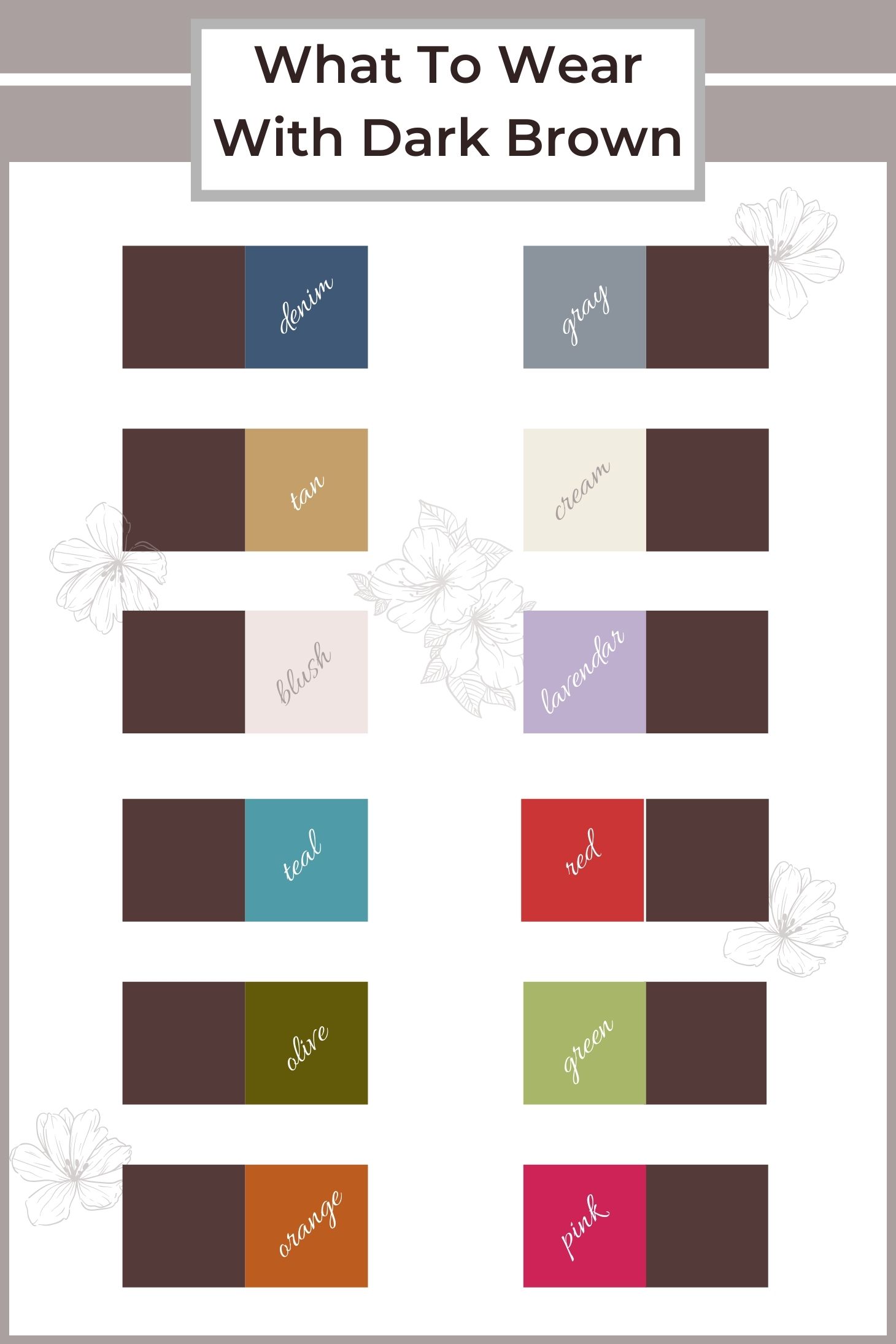
Herschel Supply Co., known for its vintage-inspired backpacks and accessories, expertly employs a range of browns, tans, and other earth tones in its branding. This palette immediately conveys a sense of heritage, durability, and a classic, timeless aesthetic. Their use of natural browns, often paired with deep blues, muted reds, or khaki, reinforces their focus on quality materials and functional design, appealing to consumers who value authenticity and enduring style over fleeting trends.
These examples demonstrate that brown, when strategically paired and thoughtfully integrated, is an incredibly potent color for building strong, resonant brand identities across diverse industries. Its ability to convey warmth, reliability, luxury, and natural authenticity makes it an invaluable asset in any brand strategist’s toolkit.
aViewFromTheCave is a participant in the Amazon Services LLC Associates Program, an affiliate advertising program designed to provide a means for sites to earn advertising fees by advertising and linking to Amazon.com. Amazon, the Amazon logo, AmazonSupply, and the AmazonSupply logo are trademarks of Amazon.com, Inc. or its affiliates. As an Amazon Associate we earn affiliate commissions from qualifying purchases.