The vibrant hue of red – the flush of a rose, the urgency of a stop sign, the passion in a painted canvas – is a cornerstone of our visual experience. Yet, for millions worldwide, this fundamental perception is altered. Color blindness, more accurately termed color vision deficiency (CVD), isn’t about seeing the world in black and white; it’s a spectrum of conditions where distinguishing certain colors, most commonly reds and greens, becomes a challenge. Understanding what red looks like to someone with CVD requires delving into the fascinating intersection of biology, perception, and the technological advancements that are helping us bridge these visual gaps.
This exploration will touch upon the fundamental science behind color vision, the specific ways red is perceived differently by individuals with various types of CVD, and how this impacts not only daily life but also the way we design products, brands, and even digital experiences. From the nuances of marketing and branding to the practicalities of personal finance and the development of assistive technologies, understanding color perception is crucial for creating inclusive and effective solutions in our tech-driven world.
The Biology of Seeing Red: How Our Eyes Process Color
Before we can understand what red doesn’t look like, it’s essential to grasp how it does look to most people. Our ability to perceive color is a complex biological process that begins with light and ends with our brain interpreting signals.
The Role of Cones: The Color Receptors in Our Eyes
Within the retina, the light-sensitive tissue at the back of our eye, are specialized cells called photoreceptors. We have two main types: rods, responsible for vision in low light, and cones, which are responsible for color vision and function best in brighter conditions. Humans typically have three types of cone cells, each containing a different photopigment that is most sensitive to a particular range of light wavelengths:
- L-cones (Long-wavelength sensitive): Primarily sensitive to red light.
- M-cones (Medium-wavelength sensitive): Primarily sensitive to green light.
- S-cones (Short-wavelength sensitive): Primarily sensitive to blue light.
When light enters our eye, it strikes these cones. The photopigments within each cone type absorb light, triggering a cascade of chemical and electrical signals. The brain then compares the relative strength of the signals received from these different cone types to perceive a specific color. For example, when we see pure red light, the L-cones are strongly stimulated, while the M-cones are stimulated much less, and the S-cones are minimally stimulated. This pattern of stimulation is what our brain interprets as “red.”
The “Red” Signal: A Symphony of Cone Activation
The perception of “red” is not a single, isolated signal. Instead, it’s a nuanced response. Pure red light elicits a strong signal from the L-cones and a weaker signal from the M-cones. This difference in activation between the L and M cones is what allows us to differentiate red from other colors, particularly greens. When someone has normal color vision, they can readily distinguish between these subtle variations in cone stimulation, allowing them to perceive the full spectrum of colors, including the distinctiveness of red.
Understanding Red-Blindness: Variations in Cone Function
The most common forms of color vision deficiency involve the L-cones and M-cones, leading to difficulties in distinguishing between red and green. These conditions are often hereditary and are more prevalent in males due to their X-linked inheritance pattern.
Deuteranopia and Protanopia: The Two Faces of Red-Green Deficiency
The terms “red-blindness” and “green-blindness” are often used interchangeably, but there are distinct types of red-green CVD:
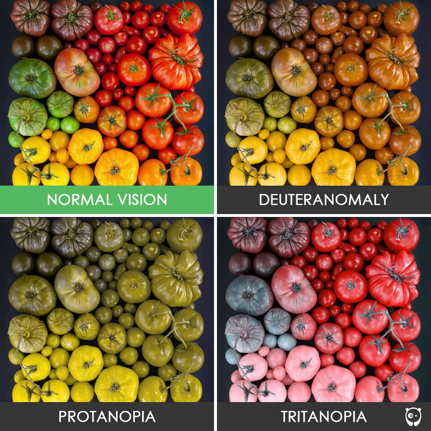
- Deuteranopia: This is a form of “green-blindness” where the M-cones are absent or non-functional. Individuals with deuteranopia have difficulty distinguishing between blues and greens, and also between reds and greens. Red colors may appear muted, brownish, or grayish. The signal from the L-cones remains, but the absence of functional M-cones means the brain receives a less nuanced comparison, leading to a flattened perception of the red-green spectrum.
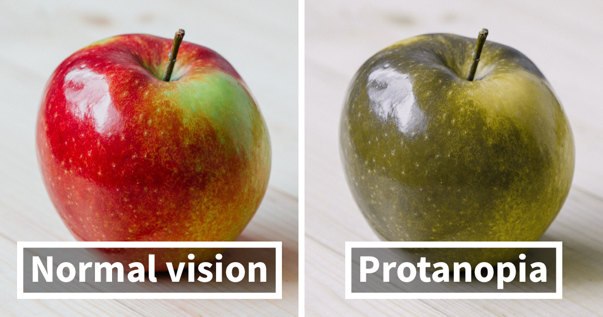
- Protanopia: This is a form of “red-blindness” where the L-cones are absent or non-functional. In this case, red colors are not perceived as intensely and may appear more yellowish or grayish. The brain receives a weaker signal from the L-cones, making it difficult to differentiate red from greens and blues. Essentially, the “red” signal is diminished.
It’s crucial to understand that individuals with these conditions do see red, but their perception of it is different. They don’t see a void where red should be; rather, red is often perceived as a shade of brown, gray, or a muted yellowish-green, depending on the specific hue and the individual’s particular type and severity of CVD.
Red-Green Color Blindness: A Spectrum of Difficulty
Beyond complete absence (anopia), there are also less severe forms of red-green CVD known as deuteranomaly and protanomaly. In these cases, the cones are present but their photopigments are slightly altered, shifting their sensitivity.
- Deuteranomaly: This is the most common form of CVD overall. Individuals with deuteranomaly have M-cones with a shifted sensitivity, meaning they are less sensitive to green light. Reds may appear less intense and harder to distinguish from greens. They might confuse yellow and green, or purple and blue.
- Protanomaly: Individuals with protanomaly have L-cones with a shifted sensitivity. This leads to reds appearing less bright and harder to distinguish from greens. They might also have difficulty seeing the full range of blues and purples.
For someone with protanomaly, red might appear less vibrant, more like a dull orange or brown. For someone with deuteranomaly, reds might blend more with greens, appearing as murky or grayish hues. The intensity of the color is often reduced, and the subtle distinctions that define different shades of red become blurred or indistinguishable from shades of green.
The Impact of Red-Blindness Beyond Visual Perception
The challenges posed by color vision deficiency extend far beyond simply not being able to identify a red apple. The perception of color plays a significant role in how we navigate the world, make decisions, and interact with our environment.
Navigating Daily Life and Critical Systems
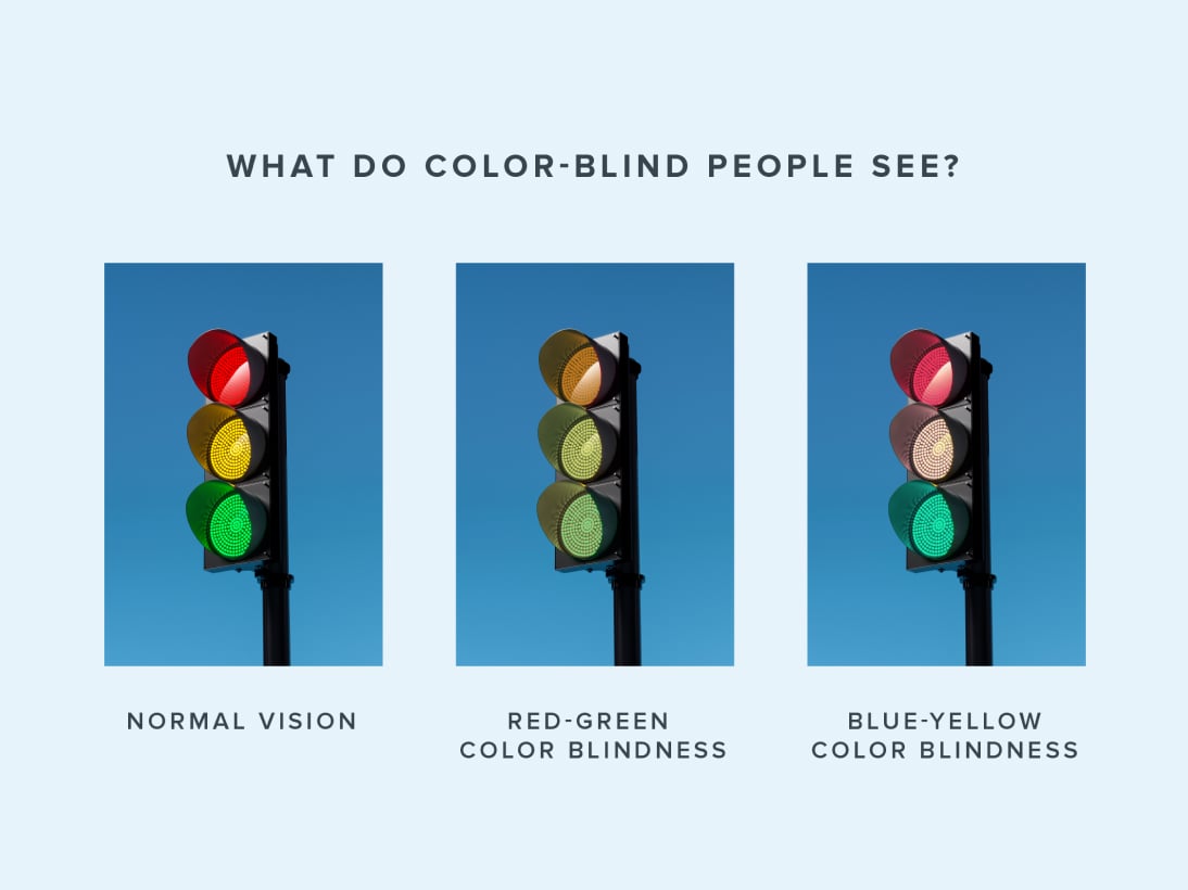
The implications for daily life can be surprisingly profound. Traffic lights, for instance, are designed with specific positions to aid those with CVD. However, relying solely on color can be problematic. Similarly, warning signs, indicators on electrical equipment, and even the color-coding of wires in technology can pose a risk if not implemented with color blindness in mind.
In professional fields, CVD can have a significant impact. Pilots, electricians, and certain medical professionals may face career limitations due to the critical nature of color differentiation in their roles. This underscores the importance of inclusive design principles in various sectors.
Design, Branding, and Marketing: The Power of Color Choices
In the realms of Brand and Tech, color is a powerful tool.
Designing Inclusive Brands and Products
For brands, color is fundamental to identity. A brand’s logo, packaging, and marketing materials all rely on color to evoke emotions, convey messages, and create recognition. When a significant portion of the population perceives these colors differently, it can impact brand perception and accessibility.
- Brand Identity and Recognition: A brand that heavily relies on red for its core identity might not be as recognizable or impactful to someone with protanopia. They might see the red as a dull orange or brown, potentially diluting the intended brand message. Companies need to consider alternative visual cues or ensure their primary colors are distinguishable by a wider audience. This is where robust Personal Branding and Corporate Identity strategies become crucial, incorporating principles of universal design.
- Marketing and Advertising: The effectiveness of advertisements can be diminished if key information is conveyed solely through color. For example, a sale advertised with a bright red banner might be less impactful if the target audience perceives it as a muted hue. Marketing campaigns that are inclusive of colorblind individuals can reach a broader audience and demonstrate a commitment to accessibility, enhancing their Reputation.
- Product Design and User Interface (UI): In the Tech sector, the design of apps, websites, and gadgets often utilizes color coding. Colorblind-friendly design ensures that essential information remains accessible regardless of a user’s color perception. This includes using sufficient contrast, employing patterns or textures in addition to color, and providing textual labels. User Interface and User Experience (UX) designers must consider these factors from the outset, moving beyond purely aesthetic choices to functional inclusivity.
The Role of AI and Technology in Bridging Visual Gaps
Fortunately, advancements in Tech are offering innovative solutions. AI Tools are being developed to simulate how colors appear to individuals with different types of CVD. These tools can help designers and marketers preview their creations from the perspective of someone with color blindness, allowing for necessary adjustments before launch.
Software and Apps are emerging that can dynamically adjust colors on screens or provide real-time assistance. For instance, some apps can identify colors and provide their names, or alert users when they are about to make a color-based mistake, such as selecting the wrong color in a design program. Gadgets are also being developed, such as specialized glasses that can enhance color perception for some individuals with CVD, although these are not a universal solution and can sometimes distort other colors. Digital Security considerations also arise, as color-coded security features could be bypassed if not designed inclusively.
Financial Literacy and Color-Coded Information
In the realm of Money, color often plays a vital role in conveying information, especially in financial contexts.
Understanding Red and Green in Financial Markets
The most common use of red and green in finance is to denote price movements: red for a decrease, and green for an increase. For individuals with red-green color blindness, this can create confusion.
- Investing and Trading: When looking at stock tickers or financial charts, an investor with CVD might struggle to quickly differentiate between a rising and falling market. This can lead to misinterpretations and potentially costly investment decisions. While experienced traders may develop workarounds, the initial learning curve and ongoing reliance on context can be challenging.
- Personal Finance Management: Budgeting apps and financial tools often use color to categorize expenses or highlight areas of concern. For example, overspending might be shown in red. If these colors are indistinguishable, it can hinder effective Personal Finance management.
- Financial Tools and Reporting: Financial reports and Financial Tools can be optimized for colorblind accessibility. This might involve using distinct symbols, clear textual indicators, or patterns in addition to color to convey critical data. Online Income platforms and Side Hustles should also consider this when presenting performance metrics or payment statuses.
The development of financial platforms that are inherently colorblind-friendly can significantly improve accessibility and empower a wider range of individuals to engage confidently with their finances. This involves not just color choices but also ensuring clarity in the overall presentation of financial data.
Looking Ahead: Towards a More Visually Inclusive Future
The journey to understanding what red looks like to a colorblind person is a reminder that our individual perceptions are not universal. As technology continues to advance and our understanding of human perception deepens, the potential for creating more inclusive experiences across all aspects of life grows.
From designing user-friendly apps and accessible websites to creating impactful branding and empowering individuals in their financial journeys, color plays a critical role. By embracing the principles of universal design and leveraging the power of Tech, we can ensure that the vibrant spectrum of the world is accessible and understandable to everyone, regardless of how they see the color red. The ongoing development of AI Tools and accessible design methodologies will be instrumental in shaping a future where visual communication is truly inclusive.
aViewFromTheCave is a participant in the Amazon Services LLC Associates Program, an affiliate advertising program designed to provide a means for sites to earn advertising fees by advertising and linking to Amazon.com. Amazon, the Amazon logo, AmazonSupply, and the AmazonSupply logo are trademarks of Amazon.com, Inc. or its affiliates. As an Amazon Associate we earn affiliate commissions from qualifying purchases.