
The Architecture of Identity: Defining the Corporate Emblem
In the realm of brand strategy and corporate identity, few symbols have achieved the longevity, global recognition, and psychological depth of the Masonic square and compasses with the letter “G” at its center. While the historical and esoteric roots of Freemasonry are subjects of academic debate, from a branding perspective, the “G” serves as an masterclass in semiotic power. It is a focal point—a graphic anchor that defines the organization’s core values, ethical promise, and internal culture. When we analyze this symbol through the lens of modern brand strategy, we see how an organization—or a business—can leverage a single character to encapsulate an entire philosophy, effectively communicating mission and ethos without the need for a single word of copy.
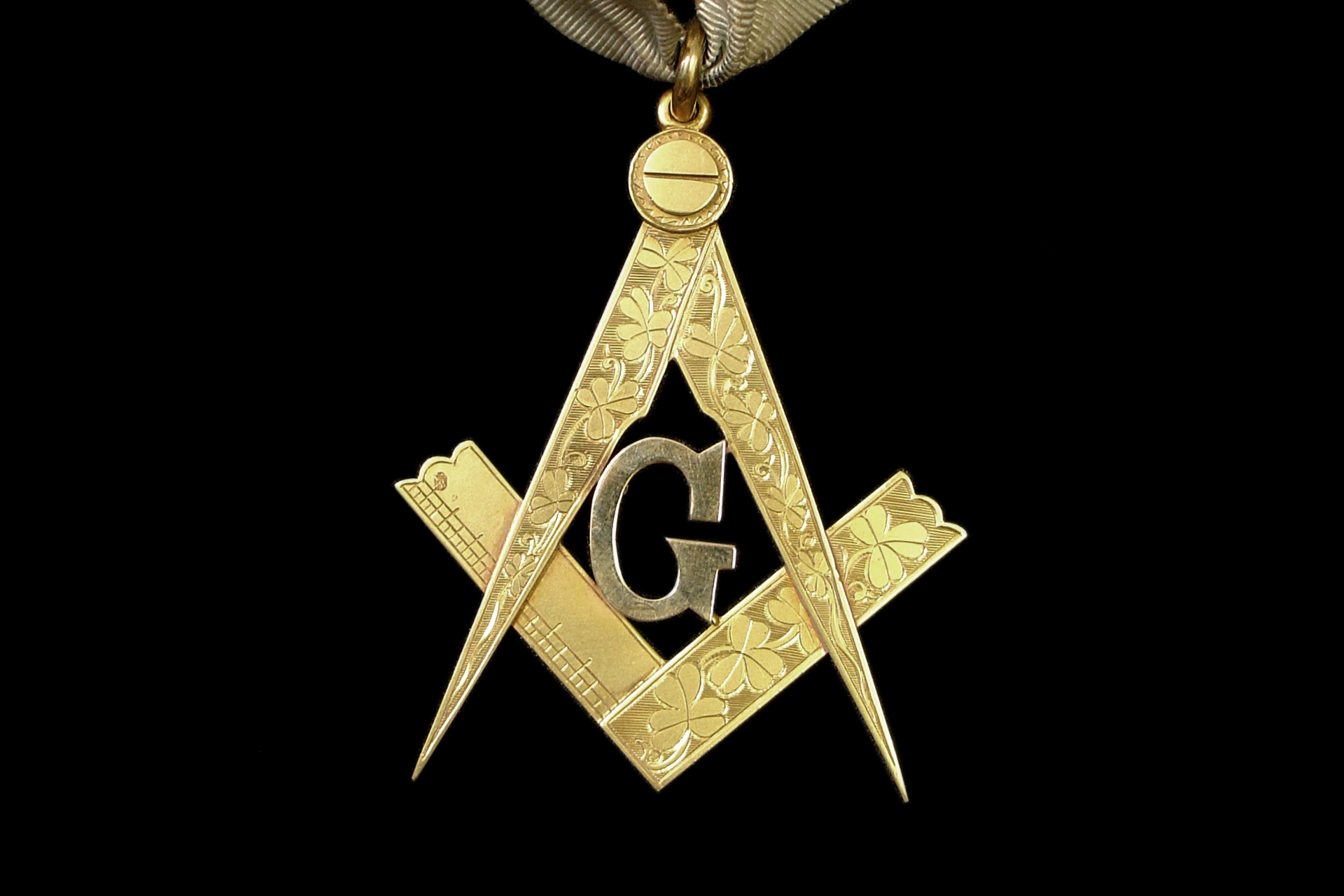
A brand’s identity is not merely its logo; it is the visual shorthand for the promise the entity makes to the world. For a brand to sustain relevance over centuries, its core emblem must be versatile, scalable, and—most importantly—philosophically coherent. The “G” acts as the “North Star” of the Masonic brand architecture. It represents the nexus where organizational purpose meets individual integrity. In corporate terms, this is the equivalent of a mission statement distilled into a single, high-impact glyph.
The Semantics of Synergy: Why Symbols Matter in Branding
The choice of a symbol is perhaps the most consequential decision in brand design. In the case of the Masonic “G,” the inclusion of the letter provides a specific interpretive layer that separates it from mere decorative geometry. From a brand management standpoint, the “G” represents a pivot point. Depending on the geographical region or the specific lodge’s interpretation, the “G” is often attributed to “Geometry” or “God.” This duality is not an accidental oversight; rather, it is a brilliant example of intentional ambiguity—a technique often used in high-end luxury branding to allow the consumer or member to project their own values onto the brand.
The Power of Geometric Branding
Geometry has long been the language of order and precision. By pairing the square and compasses—tools of the mason—with the letter “G,” the brand is visually reinforcing its commitment to structure, standard-setting, and foundational integrity. In modern marketing, this is known as “Visual Allegory.” When a brand adopts geometric motifs, it signals reliability and intelligence. The “G” serves as the architectural blueprint for the organization, suggesting that every member, like a brick in a building, is a component of a larger, deliberate, and harmonious design.
The Cognitive Load of Minimalist Design
Complexity is the enemy of retention. The brilliance of the Masonic emblem lies in its minimalist execution. By utilizing a single letter, the design minimizes cognitive load while maximizing emotional resonance. In the context of personal branding, this serves as a reminder: the most effective brands are those that can be recognized instantly, even in silhouette. Whether it is the “G” in the Masonic symbol or the “Swoosh” of Nike, the most iconic brands prioritize simplicity to ensure that their core message—whatever it may be—is never obscured by excessive ornamentation.
Institutional Trust and the “G” as a Core Value Proposition
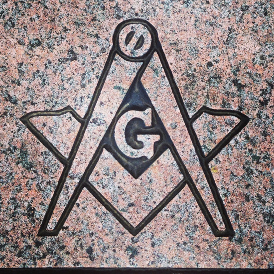
Every successful organization requires a Value Proposition that transcends its functional output. For the Masonic brand, the “G” represents the moral and ethical framework that governs the behavior of its members. In a corporate environment, this is analogous to a company’s culture deck or internal code of ethics. When an organization prominently displays a value-driven symbol, it creates a psychological contract between the entity and the stakeholder.
Building Trust Through Symbolic Consistency
Trust is the most valuable currency in any brand strategy. By centering the emblem around a concept—whether it is Geometry (the science of truth) or God (the source of morality)—the organization signals that its operations are guided by something greater than profit or temporal gain. This is a vital lesson for modern corporate branding: stakeholders today are looking for companies that have a “G”—a core, guiding principle that remains visible even when the environment around it changes. A brand that stands for nothing is easily forgotten, but a brand that stands for a specific principle, represented by a clear visual marker, gains institutional permanence.
The Role of Ambiguity in Brand Longevity
The debate over what the “G” stands for—be it the Supreme Being or the mathematical perfection of the universe—is actually a driver of brand engagement. By not being overly prescriptive, the brand allows its participants to engage in a deeper, more personal way. In marketing, this is called “Participation-Based Branding.” If a brand dictates exactly how you must perceive it, it shuts down dialogue. If a brand provides a symbolic anchor (the “G”) and allows for individual interpretation, it encourages a lifelong relationship. This “open-source” approach to a brand’s meaning is why the Masonic symbol remains as relevant today as it was in the eighteenth century.
Transcending the Logo: Brand Philosophy as Legacy
Ultimately, the “G” in the Masonic symbol demonstrates that a brand is most powerful when it becomes a vessel for the values of its members. The logo is not the brand; the logo is the gateway. The real brand identity is the collective behavior of those who identify with the symbol. This is the ultimate goal of corporate identity: to move from being a product or a service provider to becoming a fundamental part of an individual’s identity.
Aligning Strategy with Identity
For businesses looking to build a legacy, the lesson is clear: your brand must be anchored in something substantive. Whether your organization focuses on technology, retail, or finance, the symbol you choose—and the meaning you ascribe to it—must be representative of a higher standard. When you look at the Masonic “G,” you are not just looking at a letter; you are looking at a commitment to a standard of behavior. That is what brand strategy should achieve. It should turn a graphic designer’s creation into a moral compass for the company.
Designing for Future-Proofing
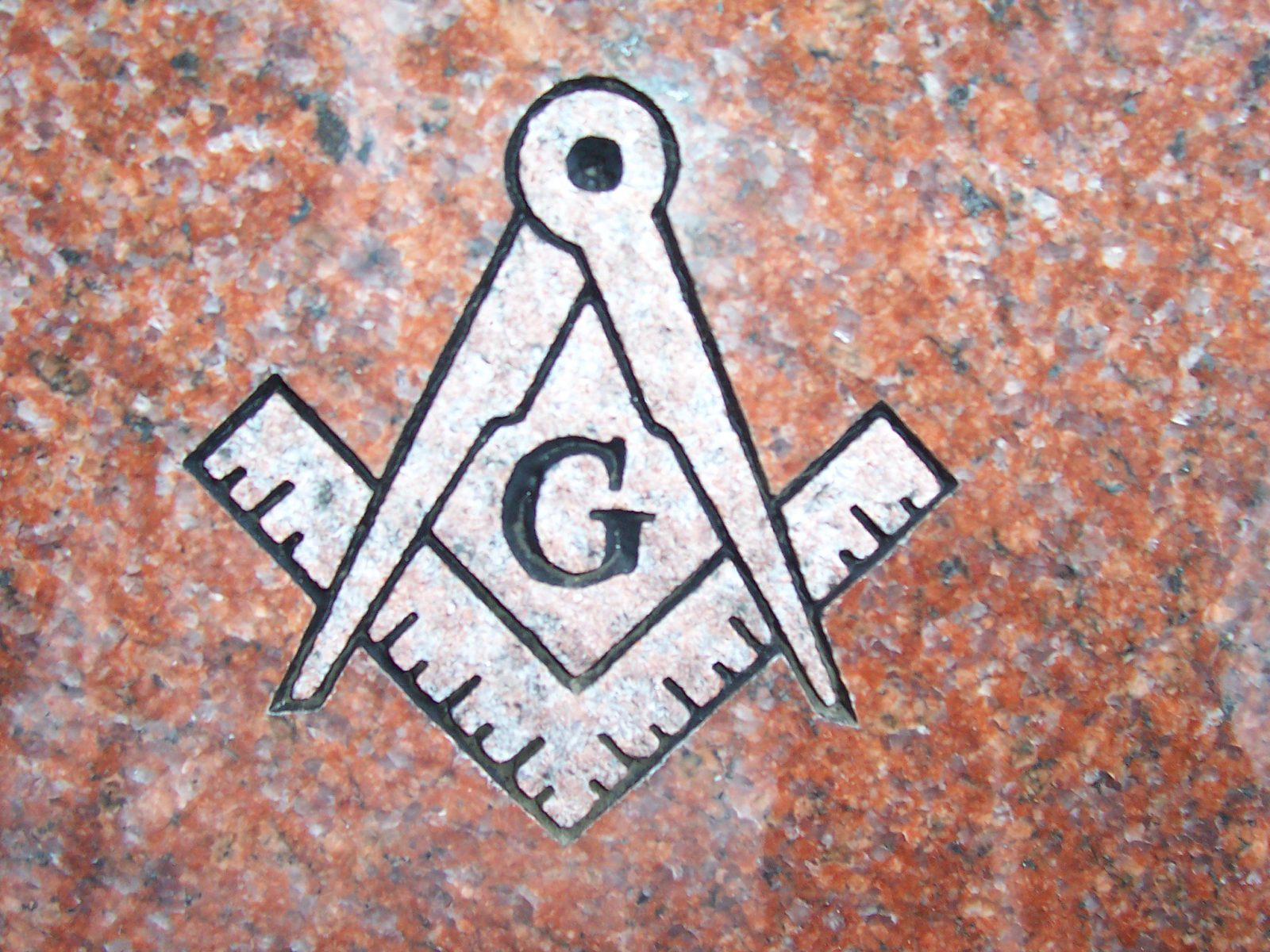
The endurance of the Masonic symbol suggests that if you design your brand identity around universal human truths—truth, morality, structure, and order—your brand will be able to weather the volatility of changing markets. Modern companies often suffer from “rebranding fatigue,” constantly updating logos to fit the latest aesthetic trends. Yet, the most iconic symbols—those that anchor themselves to a deep, unchanging concept—never need to change. They are built to outlast the trends.
By understanding the “G” not as a secret code, but as a branding masterstroke of clarity, purpose, and symbolic depth, we gain insight into how to build brands that matter. It is a testament to the fact that when you pair a minimalist visual with an profound internal philosophy, you create a brand that does not merely occupy space in the market; it occupies a permanent place in the minds of the people who encounter it. The symbol is the shorthand for the entire culture, and the “G” is the final, essential stroke that makes that identity complete.
aViewFromTheCave is a participant in the Amazon Services LLC Associates Program, an affiliate advertising program designed to provide a means for sites to earn advertising fees by advertising and linking to Amazon.com. Amazon, the Amazon logo, AmazonSupply, and the AmazonSupply logo are trademarks of Amazon.com, Inc. or its affiliates. As an Amazon Associate we earn affiliate commissions from qualifying purchases.