
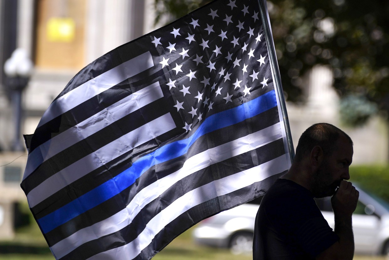
When analyzing the visual landscape of modern symbols, the “Thin Blue Line” flag—typically depicted as a black-and-white field bisected by a single blue stripe—represents a fascinating case study in branding, semiotics, and corporate identity. While the symbol is most frequently discussed in political and social contexts, its evolution provides a masterclass in how a singular visual motif can be adopted, adapted, and polarized within the public consciousness. From a branding perspective, the black-and-blue flag serves as a primary example of how visual assets can transcend their original intent to become powerful, albeit controversial, markers of tribal identity and institutional affiliation.

The Semiotics of Minimalist Branding
In the world of professional design, the most effective branding often relies on extreme minimalism. The Thin Blue Line flag utilizes this principle by stripping away the color palette of the traditional American flag, replacing it with a monochromatic black-and-white scheme, and introducing a single, high-contrast horizontal line of blue. This design choice is not accidental; it is a calculated aesthetic shift intended to pivot the viewer’s attention away from the traditional symbolism of the nation and toward a specific sub-brand: law enforcement.
The Power of Monochromatic Application
By removing the red and white stripes of the traditional flag, the designers of the Thin Blue Line variant achieved a “neutral” canvas. This allows the blue stripe to act as an accent color, functioning similarly to a “call-to-action” button on a website. In marketing, high-contrast accents draw the eye immediately. By isolating the blue, the design forces the viewer to focus on the concept of the “line.” In design theory, a line represents a boundary or a threshold. In this context, the line serves as the visual metaphor for the police force acting as the barrier between societal order and chaos.
Brand Recognition and Iconography
The success of the black-and-blue flag as a brand asset is evidenced by its rapid saturation in the marketplace. Whether displayed on a vinyl decal on a truck, a patch on a uniform, or as a filter on a social media profile picture, the symbol achieves high “brand recall.” It is instantly recognizable, requires no text to convey its message, and scales perfectly across different media formats. This level of brand consistency is what many corporate identities strive for but rarely achieve.
The Evolution of the “Thin Blue Line” Brand Identity
Like any long-standing brand, the Thin Blue Line flag has undergone a process of identity evolution. Originally conceived as a way to honor fallen officers, the symbol has shifted through various iterations. This movement illustrates a critical principle in brand strategy: symbols do not exist in a vacuum; they inherit the “brand equity” of the behaviors and narratives associated with them by the public.
From Commemoration to Advocacy
Initially, the symbol functioned as a “badge of honor”—a non-profit, grassroots effort to express solidarity with law enforcement. In brand strategy, this is the “emotional resonance” phase. The target audience for this iteration was the families and supporters of law enforcement officers. However, as the brand gained visibility, its identity shifted. As the symbol began to appear at rallies and in counter-protest scenarios, the brand’s meaning expanded. It ceased to be merely an internal symbol for a profession and became an external political brand.

The Challenge of Brand Polarization
One of the greatest risks to any brand identity is polarization. When a symbol becomes linked to contentious political movements, it ceases to be a universal mark of support and instead becomes a “coded” signal. For marketers, this is a cautionary tale. Once a visual asset is adopted by disparate groups with competing agendas, the original brand owner loses control over the messaging. The black-and-blue flag is now a prime example of a symbol that has been “rebranded” by its users; regardless of the original design intent, the public perception has been permanently altered by the context in which the flag is displayed.
Visual Communication and Corporate Identity Control
The proliferation of the black-and-blue flag provides a profound lesson in how brands lose control of their iconography in the digital age. In a corporate environment, a brand guideline document strictly dictates where a logo can appear, what colors can be used, and the tone of the messaging surrounding it. The Thin Blue Line flag, however, is a “decentralized brand.”
The Decentralization of Symbols
Because the flag has no single copyright holder or governing body, its usage has become decentralized. This is similar to open-source software, where the product is continuously modified by the community. While this leads to massive, organic growth—far exceeding the marketing budget of any traditional corporation—it also leads to brand dilution. When a symbol is applied to everything from coffee mugs to political campaign flyers, the core identity of the symbol becomes fractured.
Managing Brand Perception
For professional designers and brand strategists, the key takeaway is the importance of “brand context.” If a visual identity is meant to represent a specific, professional, or inclusive message, it must be protected from indiscriminate use. When a brand allows its visual markers to be subsumed into larger, chaotic cultural shifts, the original intent is often lost. The black-and-blue flag demonstrates that once a visual asset reaches a certain level of cultural penetration, it is no longer owned by its creator—it is owned by the public.
The Future of Iconic Branding in Public Spaces
As we look at the trajectory of the Thin Blue Line symbol, we see the future of visual communication in a highly polarized world. We are living in an era where “symbolic branding” is replacing nuanced discourse. Instead of debating policies or social issues, stakeholders on all sides utilize minimalist, high-contrast symbols—like the black-and-blue flag—to project their values instantly.
Designing for Longevity
What can designers learn from this? First, simplicity wins. The reason the black-and-blue flag became so ubiquitous is its simplicity. If the design had been overly complex, it would not have been replicable at scale. Second, brands must anticipate the “cultural hijacking” of their symbols. When a design gains significant traction, it will inevitably be repurposed for messages that the original creator may not have intended. Developing a brand identity today requires not only the creation of the logo but a strategy for managing its interpretation in the public sphere.
The Intersection of Design and Identity
Ultimately, the black-and-blue flag is a testament to the power of design to define identity. It successfully turned a professional group into a recognizable subculture with its own visual flag. Whether the symbol is perceived as a mark of respect, a political statement, or a badge of controversy, its effectiveness as a visual tool is undeniable. It highlights a fundamental truth about branding: a logo, a flag, or a line is never just a design choice. It is a vehicle for meaning that shifts according to the culture in which it lives. As designers, the responsibility lies in understanding that once a brand enters the public consciousness, the visual becomes an evolving narrative, one that we can design, but one that we can rarely fully control.
In conclusion, the study of the black-and-blue flag is a masterclass in how visual assets operate in the wild. It teaches us about the persistence of minimalist design, the inherent risks of decentralized brand management, and the inescapable reality that in the modern world, every design choice carries a heavy burden of social and cultural weight. Professional brand strategy is not just about creating a logo; it is about managing the ripple effects of that logo as it moves through the complex, often unpredictable currents of public opinion.
aViewFromTheCave is a participant in the Amazon Services LLC Associates Program, an affiliate advertising program designed to provide a means for sites to earn advertising fees by advertising and linking to Amazon.com. Amazon, the Amazon logo, AmazonSupply, and the AmazonSupply logo are trademarks of Amazon.com, Inc. or its affiliates. As an Amazon Associate we earn affiliate commissions from qualifying purchases.