
In the competitive landscape of modern commerce, a brand’s visual identity often speaks before its mission statement does. Among the vast spectrum of the visible light, few hues carry as much psychological weight and strategic versatility as “Ocean Blue.” But to a brand strategist or a professional designer, the question “What color is ocean blue?” is not a simple request for a hex code. It is an inquiry into a specific emotional frequency that bridges the gap between traditional reliability and forward-thinking innovation.
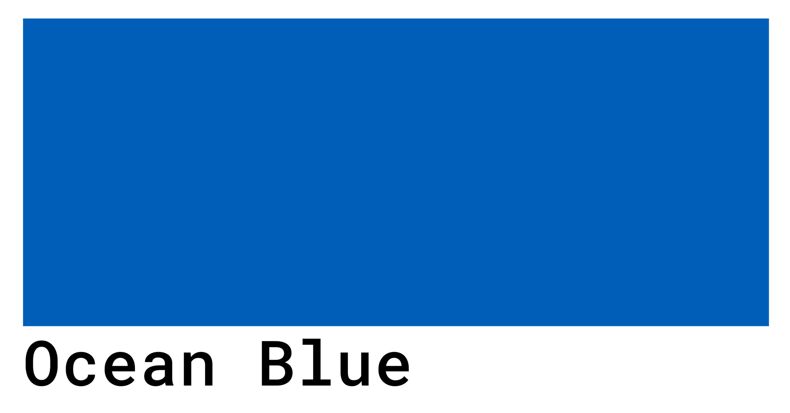
Ocean blue is not a singular point on a color wheel; it is a sophisticated range of teals, navies, and deep cyans that evoke the depth, vastness, and consistency of the world’s waters. In branding, selecting the right shade of ocean blue is a high-stakes decision that influences consumer perception, dictates market positioning, and establishes a foundation for long-term corporate identity.
The Psychology of Ocean Blue in Corporate Identity
Color psychology is the bedrock of strategic brand development. When a company selects ocean blue as its primary brand color, it is making a calculated move to tap into universal human subconscious associations.
Trust, Reliability, and the “Safe Bet”
There is a reason why the world’s most powerful financial institutions and technology firms—from Chase to IBM—rely heavily on blue. Ocean blue, particularly in its deeper iterations, signals stability. Unlike the volatility of red or the experimental nature of neon green, ocean blue suggests a brand that is established, secure, and permanent. In an era of digital uncertainty, using an oceanic palette reassures the consumer that the brand is a “safe harbor.” It suggests that the company, like the sea, is vast and capable of weathering any storm.
Evoking Calm and Clarity in a Noisy Market
The modern consumer is bombarded with sensory data. Ocean blue provides a visual “cool down.” In branding, lighter oceanic tones (reminiscent of tropical shallows) convey transparency and approachability. Conversely, the deeper “midnight” ocean blues suggest wisdom and authority. By utilizing these shades, brands can create a sense of professional calm, making their products or services feel like a solution to the chaos of the marketplace rather than an addition to it.
The Technical Palette: Defining Ocean Blue for Multi-Platform Consistency
From a design and technical perspective, “ocean blue” must be translated into precise values to ensure brand equity remains intact across print, web, and physical environments. A brand that looks “Pacific Blue” on a smartphone but “Steel Grey” on a billboard loses its professional edge.
The Hex and RGB Spectrum of Oceanic Tones
To achieve the perfect ocean blue, designers typically look toward the intersection of blue and green. Common technical definitions include:
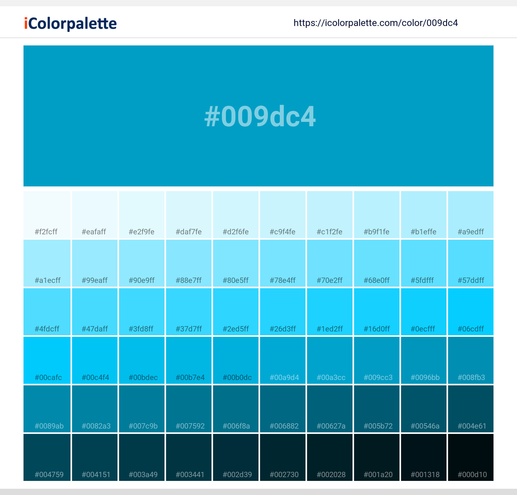
- The Deep Atlantic (#006994): A rich, authoritative blue with a hint of green that provides high contrast against white text, making it ideal for corporate headers and UI elements.
- The Tropical Cyan (#0077be): A more vibrant, energetic blue that represents the “innovative” side of ocean blue, often used by tech startups and lifestyle brands.
- The Navy Horizon (#000080): While technically a dark blue, when used in an oceanic context, it serves as the “anchor” color for high-end, luxury branding.
Print vs. Digital: Managing the “Ocean Blue” Across Mediums
One of the greatest challenges in brand management is the conversion between RGB (digital) and CMYK (print). Blue is notoriously difficult to replicate perfectly in print because the glowing pixels of a screen can produce “vibrant” blues that physical inks often struggle to match. A professional brand strategy must include a rigorous “Style Guide” that defines specific Pantone (PMS) matches for ocean blue. This ensures that a business card, a product package, and a website landing page all project the exact same “temperature” of blue, maintaining the integrity of the brand’s visual language.
Strategic Brand Positioning Through Coastal Visuals

Beyond the color itself, the concept of “ocean blue” informs how a brand positions itself within its industry. It moves the conversation from “what we sell” to “how we feel.”
Differentiation in a “Red Ocean”
In business theory, a “Red Ocean” represents a saturated market where competitors fight for a sliver of market share, leaving the water “bloody.” In contrast, a “Blue Ocean Strategy” involves creating an uncontested market space where competition is irrelevant. By adopting an ocean blue aesthetic, brands subtly signal that they are operating in this “Blue Ocean.” They are not just another competitor; they are the pioneers of a new, vast territory. This visual metaphor is particularly powerful for software-as-a-service (SaaS) companies and disruptors who want to look “limitless.”
Sustainability and the “Blue Economy” Aesthetic
As ESG (Environmental, Social, and Governance) criteria become central to investment and consumer choice, ocean blue has taken on a new layer of meaning: environmental stewardship. Brands involved in sustainability, clean energy, or oceanic preservation use these hues to align themselves with the “Blue Economy.” In this context, ocean blue is no longer just about corporate stability; it is about the health of the planet. Choosing a “Seafoam” or “Deep Sea” palette helps a brand communicate its commitment to ecological responsibility without saying a single word.
Case Studies: Brands That Own the Ocean Blue
To understand the power of this color, we must look at how industry leaders have weaponized it to build multi-billion-dollar identities.
Tech Leaders and the “Digital Ocean”
Consider brands like Dell, Intel, or Salesforce. Their use of ocean blue is not accidental. In the tech sector, blue represents the “cleanliness” of data and the efficiency of logic. Salesforce, specifically, uses a bright, cloud-integrated ocean blue that suggests a limitless horizon of data. By staying within the oceanic spectrum, these companies avoid the “aggressive” feel of darker colors, opting instead for a look that feels like a utility—necessary, vast, and reliable.
Luxury and Lifestyle: Deep Blues for Exclusivity
While tech uses blue for “accessibility,” luxury brands use deeper ocean tones for “exclusivity.” Brands like Rolex or various high-end yachting manufacturers utilize a “Deep Sea Blue” to evoke a sense of heritage and elite performance. In this niche, ocean blue is paired with silver or gold accents to create a high-contrast visual that suggests the brand is a premium “vessel” for the consumer’s aspirations. It moves the needle from “everyone’s blue” to “the elite blue.”
Designing for the Future: The Evolution of Ocean Blue
As we move further into the digital-first era, the definition of ocean blue continues to evolve. With the rise of dark mode interfaces and high-dynamic-range (HDR) displays, the “glow” of ocean blue has become a staple of modern UI/UX design.
Accessibility and the User Experience
In professional brand design, “Ocean Blue” is prized for its high readability. Blue-yellow color blindness is significantly less common than red-green, making blue a more inclusive choice for global brands. Furthermore, ocean blue provides excellent contrast ratios, ensuring that websites and apps are accessible to users with visual impairments. A brand that prioritizes ocean blue is often a brand that prioritizes user experience (UX).
The Symbology of the Horizon
Ultimately, ocean blue represents the horizon—the point where the known meets the unknown. For a brand, this is the ultimate positioning. It suggests that the company has deep roots in what works (the sea) but is constantly looking toward what is next (the horizon). Whether it is a fintech startup promising a new way to invest or a legacy logistics company moving goods across the globe, the color ocean blue remains the most potent visual shorthand for a brand that is both grounded and ambitious.
In conclusion, “What color is ocean blue?” is a question that defines the very soul of a brand’s strategy. It is a color that commands respect without demanding it, provides comfort while suggesting power, and offers a timeless canvas for the innovations of tomorrow. For any brand looking to build a legacy, the journey begins in the deep, reliable, and infinite waters of ocean blue.
aViewFromTheCave is a participant in the Amazon Services LLC Associates Program, an affiliate advertising program designed to provide a means for sites to earn advertising fees by advertising and linking to Amazon.com. Amazon, the Amazon logo, AmazonSupply, and the AmazonSupply logo are trademarks of Amazon.com, Inc. or its affiliates. As an Amazon Associate we earn affiliate commissions from qualifying purchases.