
In the realm of global iconography, few symbols carry as much weight, history, and “brand” recognition as the flags of the LGBTQ+ community. While the six-color rainbow flag serves as the “umbrella brand” for the community at large, the specific sub-identities—such as the lesbian flag—function as niche brand identities. These symbols are not merely pieces of colored fabric; they are sophisticated visual systems designed to foster community, signal identity, and communicate complex values through color theory and design.
To understand what the lesbian flag looks like from a professional brand and design perspective is to understand the evolution of a visual identity that has moved from fragmented iterations to a unified, globally recognized mark.
The Evolution of the Visual Mark: A Case Study in Community Identity
Every successful brand undergoes iterations. Just as a corporation might update its logo to reflect modern sensibilities or distance itself from past controversies, the lesbian community’s visual identity has evolved significantly over the last two decades.
From the Labrys to the Lipstick Flag
Historically, the “brand” of lesbian identity utilized symbols like the Labrys (a double-headed axe) or the violet. However, as the digital age demanded more recognizable flag-based systems, the “Lipstick Lesbian” flag emerged in the early 2010s. This design featured six shades of pink and red with a white bar in the center, often topped with a lipstick smudge icon.
From a brand strategy standpoint, this design was flawed. It was exclusionary, focusing only on a specific aesthetic (femme) and was eventually discarded due to the problematic history of its creator. This led to a “brand crisis” where the community lacked a unified visual anchor, leading to the development of the modern “Sunset” flag.
The Adoption of the “Sunset” Design
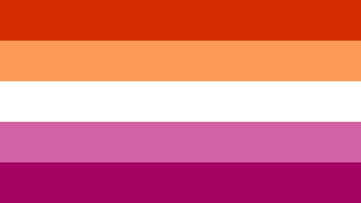
The current widely accepted lesbian flag—often called the “Sunset” or “Orange-Pink” flag—was introduced in 2018. It was a conscious redesign aimed at inclusivity. By expanding the color palette to include oranges, the brand shifted from representing a narrow aesthetic to representing a broad spectrum of experiences. This shift is a masterclass in brand expansion: keeping the core essence (the horizontal bar structure) while modifying the palette to appeal to a wider demographic.
Color Theory and Semiotics: Deconstructing the “Sunset” Palette
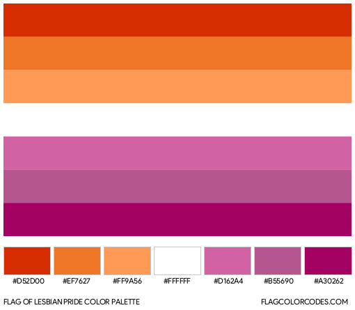
In professional design, color is never arbitrary. Each hue in a brand’s palette is chosen to evoke specific psychological responses and convey distinct meanings. The modern lesbian flag utilizes a seven-stripe or five-stripe horizontal layout that creates a cohesive, high-contrast visual identity.
The Warm Spectrum: Oranges and Reds
The top half of the flag consists of dark orange, mid-orange, and light orange stripes. In the context of branding, orange is often associated with energy, warmth, and creativity. Within this specific identity system:
- Dark Orange represents gender non-conformity.
- Mid-Orange represents independence.
- Light Orange represents community.
By utilizing these warm tones, the “brand” communicates a sense of vibrancy and proactive self-determination, departing from the cooler, more passive tones found in other flags.
The Neutral and Cool Spectrums: White and Pinks
The center white stripe serves as a visual “breathing space,” a common technique in logo design to provide contrast and represent a “middle ground” or neutral state—in this case, representing unique relationships to womanhood.

The bottom half consists of light pink, mid-pink, and dark pink (or dusty rose):
- Light Pink represents serenity and peace.
- Mid-Pink represents love and sex.
- Dark Pink represents femininity.
This gradient from deep orange to deep rose creates a “sunset” effect. From a design perspective, this gradient is highly effective because it is aesthetically pleasing and easily recognizable even at low resolutions or on small digital screens, such as social media avatars.
Corporate Application: Integrating the Lesbian Flag into Global Brand Strategy
For modern corporations, Pride Month is no longer just a social gesture; it is a significant marketing and corporate identity event. Understanding the specific design of the lesbian flag is crucial for brands that wish to engage in “authentic” rather than “performative” marketing.
Strategic Partnerships vs. Performance Marketing
When a brand like Nike, Apple, or Disney incorporates LGBTQ+ symbols, they must navigate the nuances of sub-identities. Using the general rainbow flag is a “broad-reach” strategy. However, using the specific lesbian flag in product lines (such as “Pride” edition sneakers or watch bands) signals a deeper level of brand maturity and market research. It shows that the brand understands the internal diversity of the LGBTQ+ market.
Visual Consistency in Multi-Brand Environments
In corporate identity, “co-branding” occurs when a company places its logo alongside another symbol. When brands use the lesbian flag, they must ensure visual harmony. The sunset palette is vibrant and can clash with certain corporate brand guidelines. Designers often solve this by:
- Desaturating the palette: Adjusting the flag’s hex codes to match the “mood” of the corporate brand.
- Using the palette as an accent: Rather than a full flag, using the orange-to-pink gradient in typography or iconography.
- Minimalist interpretation: Reducing the seven stripes to five for a cleaner, more modern look that fits better on mobile UI/UX designs.
The Future of Identity Design: Adaptive Symbols in the Digital Marketplace
As we move further into a digital-first economy, symbols like the lesbian flag must be adaptable. The way a brand looks on a physical flag is different from how it appears as a 16×16 pixel favicon or a 3D asset in a metaverse environment.
Scalability and Digital Recognition
The lesbian flag’s strength lies in its horizontal stripe consistency. This geometric simplicity is a hallmark of great branding. It is scalable (it looks good on a billboard or a lapel pin) and it is reproducible. For developers and digital designers, the flag is easily translated into CSS code or SVG vectors, allowing for seamless integration into apps and websites.
Personal Branding and Semiotics
Beyond corporate use, the flag serves as a cornerstone of “personal branding.” In the gig economy and social media landscape, individuals use the flag’s color palette to “brand” their digital presence. Whether it is a YouTuber’s channel art or a freelancer’s portfolio accent colors, the “sunset” palette acts as a shorthand for identity, values, and community alignment. This is the ultimate goal of any brand: to be adopted by the audience so thoroughly that it becomes a part of their own self-expression.
Conclusion: The Power of a Unified Visual Identity
What the lesbian flag looks like is more than a list of colors; it is a sophisticated visual identity system that has been refined through community feedback and design evolution. For brand strategists and designers, it serves as a powerful example of how a marginalized group can “rebrand” its image to be more inclusive, aesthetically modern, and globally recognizable.
By moving from the exclusionary designs of the past to the inclusive “sunset” palette, the lesbian community has established a visual mark that is both professionally sound and emotionally resonant. Whether it is appearing in a corporate marketing campaign or as a digital badge of identity, the flag’s design—with its balanced oranges and pinks—stands as a testament to the power of strategic visual communication in the 21st century.
aViewFromTheCave is a participant in the Amazon Services LLC Associates Program, an affiliate advertising program designed to provide a means for sites to earn advertising fees by advertising and linking to Amazon.com. Amazon, the Amazon logo, AmazonSupply, and the AmazonSupply logo are trademarks of Amazon.com, Inc. or its affiliates. As an Amazon Associate we earn affiliate commissions from qualifying purchases.