
In the competitive landscape of modern commerce, a brand’s visual identity is often the first point of contact with a potential consumer. Among the myriad of design elements available to a brand strategist, color remains one of the most potent tools for communicating values, evoking emotions, and establishing a market position. Specifically, the color light blue—a hue often associated with the expansive sky and the calming sea—holds a unique psychological weight. This article explores the symbolism of light blue within the “Brand” niche, examining how it influences consumer perception, its strategic application across various industries, and the ways it can define a corporate identity.
The Core Symbolism of Light Blue in Branding
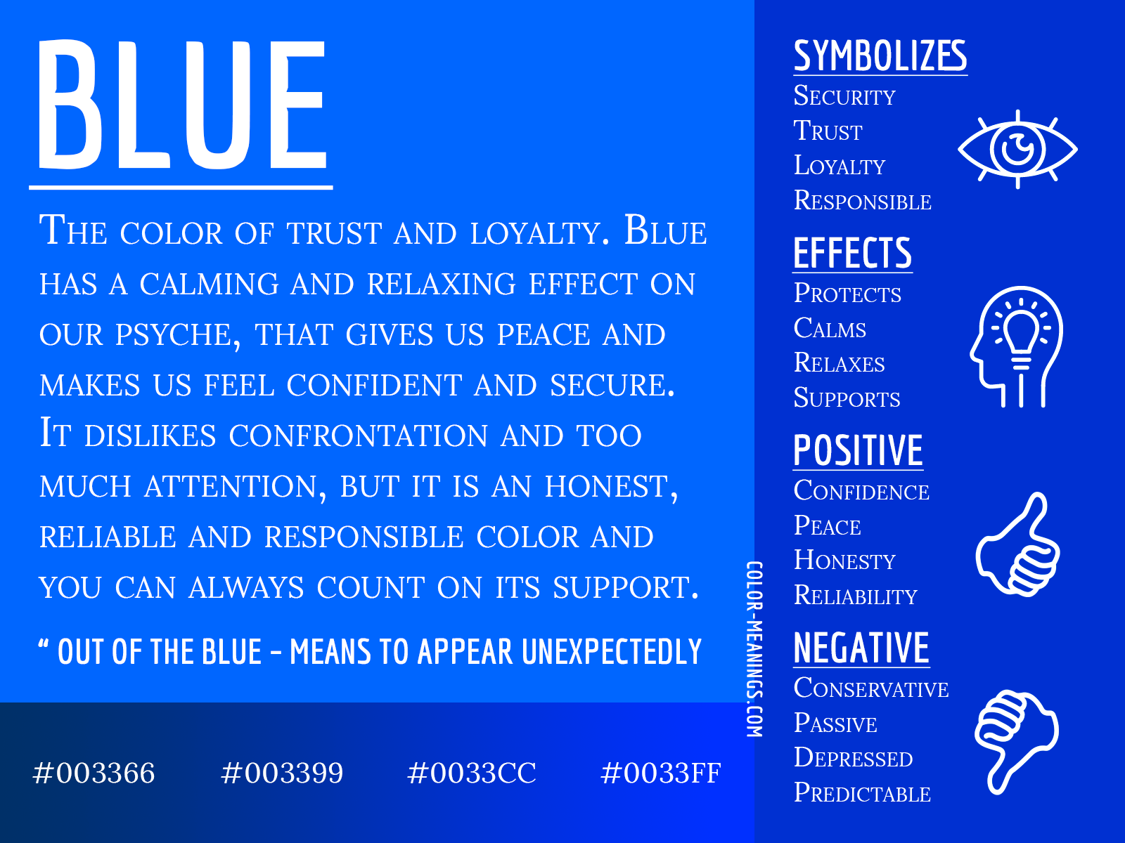
When a brand selects light blue as its primary or secondary color, it is making a calculated decision to tap into a specific set of psychological triggers. Unlike dark blue, which often commands authority and rigid professionalism, light blue leans toward accessibility, openness, and tranquility.
Trust, Dependability, and Professionalism
In the world of brand strategy, blue has long been the “safe” color, but light blue offers a modern twist on this tradition. It symbolizes a form of trust that is not intimidating. While a dark navy blue might represent a centuries-old bank, a light blue represents a modern partner. It conveys a sense of dependability and reliability without the baggage of traditional corporate coldness. For brands in sectors like logistics or software-as-a-service (SaaS), this hue reassures the consumer that the brand is stable and competent.
Accessibility and Friendliness
Light blue is inherently approachable. In color psychology, lighter tints are perceived as less “heavy” than their darker counterparts. For a brand, this translates to friendliness. It suggests that the company is open to communication and is customer-centric. This is why many social media platforms and communication tools gravitate toward lighter shades of blue; it lowers the barrier to entry and makes the user feel invited into a communal space rather than a restricted one.
Clarity and Innovation
The color of a clear sky is perhaps the most universal association with light blue. Symbolically, this translates to clarity of thought and transparency in business practices. In an era where consumers demand honesty from brands, light blue acts as a visual shorthand for “nothing to hide.” Furthermore, it is often associated with the “future”—a clean, bright horizon. This makes it a preferred choice for companies that want to position themselves as innovators who are bringing fresh, clear perspectives to old problems.
Light Blue Across Diverse Industries
The versatility of light blue allows it to function effectively across disparate sectors, though the specific message it conveys shifts slightly depending on the industry context.
Tech and SaaS: Creating a Sense of Seamlessness
In the technology sector, light blue is ubiquitous. From the original Twitter bird to the interface of LinkedIn and the branding of Skype, the color is used to represent the digital ether. For tech brands, light blue symbolizes the “cloud”—the invisible, seamless connection between users and data. It helps to humanize technology, making complex software feel more like a helpful tool and less like an intimidating machine. By using light blue, tech brands emphasize the ease of use and the flow of information.
Healthcare and Wellness: Evoking Hygiene and Calm
In healthcare branding, light blue is a staple due to its association with water and cleanliness. It evokes a sense of sterility and hygiene without the harshness of pure white or the clinical feel of grey. For wellness brands, the color serves to calm the nervous system. A light blue logo for a dental practice or a pharmaceutical company suggests a “painless” and “soothing” experience, which is critical in industries where consumer anxiety is high. It bridges the gap between scientific precision and empathetic care.
Financial Services: Softening the Corporate Edge
Traditional banking has historically used deep blues and greens to signal wealth and power. However, modern fintech (Financial Technology) brands have disrupted this by adopting light blue. By doing so, they signal a departure from the “stuffy” banking of the past. Light blue in finance symbolizes a more democratic, transparent, and user-friendly approach to money management. It suggests that the brand is a facilitator of dreams (the “blue sky” thinking) rather than just a vault for cash.
Visual Strategy: Implementing Light Blue in Corporate Identity
Choosing light blue is only the first step; the success of a brand’s identity depends on how that color is implemented within a broader design system.
Color Pairings and Contrast
The symbolism of light blue can be modified significantly by the colors it is paired with.
- Light Blue and White: This is the ultimate “clean” combination. It maximizes the feeling of space and transparency, often used by brands that want to emphasize purity or simplicity.
- Light Blue and Navy: This creates a professional gradient, combining the friendliness of the light shade with the authority of the dark shade.
- Light Blue and Orange: As complementary colors on the color wheel, this pairing creates a vibrant, high-energy contrast. It is often used by brands that want to appear both trustworthy (blue) and energetic or playful (orange).
The Role of Saturation and Brightness
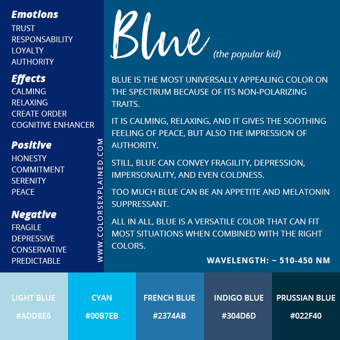
Not all light blues are created equal. A “powder blue” carries a soft, almost nostalgic feel, often used in baby products or luxury linens to denote softness. In contrast, a “neon light blue” or “electric cyan” moves the brand into the realm of high-tech and futuristic energy. Brand strategists must carefully select the specific HEX code to ensure the saturation aligns with the brand’s “voice.” A muted, desaturated light blue feels sophisticated and calm, while a high-vibrancy light blue feels youthful and disruptive.
Digital-First Considerations
In the digital age, light blue is a functional powerhouse. It is one of the most readable colors for buttons and links, often providing enough contrast against white backgrounds to meet accessibility standards while remaining easy on the eyes during long periods of screen time. Brands that prioritize “digital-first” identities often select light blue because it renders consistently across different device screens, ensuring brand cohesion in a multi-platform world.
Case Studies: Brands That Mastered the Light Blue Palette
Examining real-world examples illustrates how light blue can be leveraged to create an iconic brand presence.
Tiffany & Co.: The Power of Exclusive Association
Perhaps no brand is more synonymous with a specific shade of light blue than Tiffany & Co. Their “Tiffany Blue” (Pantone 1837) is a trademarked asset that defines their entire brand strategy. In this context, the light blue does not just symbolize calm; it symbolizes luxury, exclusivity, and the “dream” of a specific lifestyle. It is a masterclass in how a color can become so deeply embedded in a brand’s identity that the color itself becomes the product.
PayPal: The Evolution of Digital Trust
PayPal’s rebranding efforts over the years have consistently refined their use of blue. Their current palette utilizes a vibrant light blue to distinguish themselves in the crowded fintech space. For PayPal, the light blue symbolizes the speed and fluidity of modern transactions. It moves away from the “heavy” blues of traditional credit cards and toward a lighter, more agile digital wallet identity, reinforcing the brand’s position as a facilitator of the global digital economy.
Intel: Reliability in Innovation
Intel has long used a bright light blue to represent the “intelligence” inside the computer. In their case, the color bridges the gap between the physical hardware and the abstract concept of processing power. It suggests a brand that is both technically superior and fundamentally reliable, helping consumers feel confident in the “unseen” components of their technology.

The Future of Color Symbolism in Digital Branding
As we look toward the future of branding, the role of light blue continues to evolve. With the rise of “Dark Mode” in UI design, light blue has become even more critical as a high-contrast accent color that remains legible and aesthetically pleasing against dark backgrounds.
Furthermore, as brands move toward more sustainable and eco-conscious messaging, light blue is being used to represent “clean air” and “clean water” initiatives. It is shifting from being a purely corporate or tech-focused color to one that represents a brand’s commitment to the environment and global well-being.
In conclusion, the symbolism of light blue in brand identity is multifaceted. It is a hue that balances the dual needs of modern businesses: the need to appear professional and stable, and the need to be accessible and innovative. By understanding the psychological nuances of this color, brand strategists can craft identities that resonate deeply with their target audience, building a foundation of trust that lasts far beyond the initial visual impression. Whether it is the soft beckoning of a luxury box or the crisp interface of a world-changing app, light blue remains a cornerstone of effective corporate identity.
aViewFromTheCave is a participant in the Amazon Services LLC Associates Program, an affiliate advertising program designed to provide a means for sites to earn advertising fees by advertising and linking to Amazon.com. Amazon, the Amazon logo, AmazonSupply, and the AmazonSupply logo are trademarks of Amazon.com, Inc. or its affiliates. As an Amazon Associate we earn affiliate commissions from qualifying purchases.