
Blue, a color that evokes trust, stability, and serenity, is a perennial favorite in design, branding, and personal expression. Its versatility is undeniable, forming the bedrock of countless palettes. However, unlocking blue’s full potential often hinges on judicious color pairing. While it’s a forgiving hue, understanding which colors complement blue can elevate a design from merely pleasing to truly impactful. This exploration delves into the art and science of color theory as it applies to blue, focusing specifically on its strategic application within the Brand niche. From crafting memorable logos to designing user interfaces that foster engagement, the right color combinations with blue can significantly influence perception, evoke desired emotions, and ultimately, strengthen a brand’s identity.

The Psychology and Impact of Blue in Branding
Before we explore specific color pairings, it’s crucial to understand why blue holds such a prominent position in the branding landscape. Its inherent associations are powerful and widely recognized, making it a strategic choice for brands aiming to communicate specific values.
Evoking Trust and Reliability
Blue is consistently linked to feelings of trust, loyalty, security, and dependability. This makes it a go-to color for industries where these qualities are paramount, such as finance, technology, and healthcare. Think of the ubiquitous blues in banking logos or the calming hues often found in medical facilities. This psychological resonance is a primary driver for its adoption in branding. When a brand uses blue, it subtly signals to its audience that it is a stable, reliable entity they can depend on.
Conveying Professionalism and Calmness
Beyond trust, blue also projects an aura of professionalism and calm. It’s a color that doesn’t typically incite strong negative emotions, making it a safe yet effective choice for a broad range of applications. This calming effect can be particularly beneficial in user interface (UI) design, where it can reduce user anxiety and create a more pleasant experience. For brands seeking to establish a sophisticated and unflappable image, blue is an excellent foundation.
Versatility Across Tones and Shades
The term “blue” encompasses a vast spectrum, from deep, authoritative navy to vibrant, energetic electric blue, and soft, tranquil sky blue. This inherent variety means that blue can be adapted to suit diverse brand personalities. A deep navy might be used for a luxury brand, while a lighter, brighter blue could signal innovation and accessibility. Understanding the nuances of different blue shades allows for even more targeted emotional and psychological impact.
Complementary Color Strategies for Blue Branding
The effectiveness of blue in branding is amplified when paired with the right complementary colors. These pairings can enhance blue’s inherent qualities, introduce contrasting elements to create visual interest, or add layers of meaning and emotion.
Analogous Color Pairings: Harmony and Sophistication
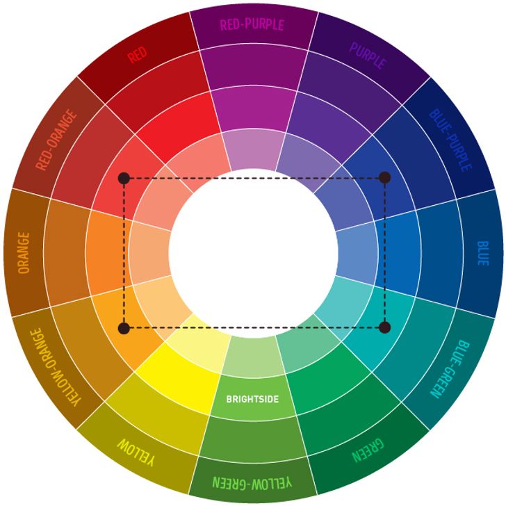
Analogous colors are those that sit next to each other on the color wheel, creating a sense of harmony and unity. When pairing analogous colors with blue, the goal is often to create a palette that feels cohesive, calm, and sophisticated.
Blue and Green: Nature, Growth, and Freshness
Blue and green are natural companions, both residing on the cooler side of the color spectrum. This pairing often evokes themes of nature, growth, freshness, and sustainability. Brands in the environmental sector, health and wellness, or those aiming for a natural, organic feel frequently leverage this combination. For example, a sustainable clothing brand might use a deep ocean blue with a muted forest green to convey a connection to the earth and responsible practices. In UI design, a blue background with green accents can create a refreshing and user-friendly interface.
Blue and Purple: Creativity, Luxury, and Mystery
The transition from blue to purple on the color wheel introduces elements of creativity, luxury, royalty, and even a touch of mystery. This pairing can lend a brand an air of sophistication and uniqueness. A brand that wants to emphasize innovation or artistic flair might opt for a royal blue paired with a rich violet. This combination can feel premium and aspirational, making it suitable for high-end products or services that aim to stand out from the crowd.
Complementary Color Pairings: Contrast and Vibrancy
Complementary colors are located directly opposite each other on the color wheel. Pairing blue with its complement, orange, creates a high-contrast, dynamic, and energetic effect. This can be incredibly effective for brands that want to capture attention and convey a sense of excitement or urgency.
Blue and Orange: Energy, Playfulness, and Urgency
The stark contrast between blue and orange is visually striking and can evoke a range of emotions. While blue offers stability, orange brings warmth, enthusiasm, and a sense of playfulness. This combination is excellent for brands that want to be perceived as approachable, energetic, and attention-grabbing. Consider a fast-food chain that uses a vibrant blue with pops of bright orange to signal quick service and a fun dining experience. In digital marketing, this pairing can be used for calls to action (CTAs) to make them stand out prominently against a blue interface. However, it’s important to use this combination judiciously to avoid overwhelming the viewer. Strategic application of orange accents against a blue backdrop can be highly effective.
Triadic Color Pairings: Balance and Boldness
A triadic color scheme uses three colors evenly spaced around the color wheel. For blue, a common triadic pairing involves yellow and red, or variations thereof. These schemes offer a high degree of vibrancy and can create a bold, memorable brand identity, though they require careful balancing.
Blue, Yellow, and Red: Dynamic and Engaging
The classic primary triad of blue, yellow, and red, or their more nuanced derivatives, can create a powerful and engaging brand aesthetic. This combination is often seen in children’s brands, sports teams, or brands that aim for a universally appealing and energetic image. The inherent contrast between these hues demands thoughtful application to avoid appearing chaotic. Brands often select dominant and secondary colors within this triad, using the third color for accents. For instance, a sports team might use a dominant navy blue with yellow and red accents to represent strength, optimism, and passion. This palette communicates a sense of dynamism and resilience.
Strategic Application of Blue Color Palettes in Branding Design
The theoretical understanding of color pairings is only the first step. The true art lies in how these combinations are applied across various branding touchpoints to achieve specific strategic objectives.
Logo Design: First Impressions and Brand Recognition
A logo is often the first visual touchpoint a consumer has with a brand. The colors chosen for a logo are therefore critical in establishing initial perceptions and ensuring memorability. For brands that rely on blue, the strategic selection of a complementary or analogous color can reinforce the intended message.
Defining Brand Personality with Logo Colors
A logo featuring a deep navy blue alongside a subtle silver or gray might convey a sense of established authority and premium quality, suitable for a financial institution or a luxury service. Conversely, a logo with a bright cerulean blue paired with a lively lime green could signal a fresh, innovative tech startup focused on sustainability or user experience. The interplay of blue with other hues in the logo sets the immediate tone for the brand’s personality.
Website and App UI/UX: Enhancing User Experience and Engagement
In the digital realm, color plays a vital role in guiding user behavior, improving readability, and fostering an emotional connection. Blue’s inherent qualities make it a strong candidate for primary interface colors, but the judicious use of secondary and accent colors is crucial for optimal UI/UX.
Creating Intuitive Navigation and Clear Hierarchy
A predominantly blue interface can establish a sense of calm and order, making it easier for users to navigate. Accent colors are then used strategically to draw attention to key elements. For example, a bright orange or yellow button for a “Sign Up” or “Purchase” action against a blue background will instantly grab the user’s attention, guiding them towards conversion. Subtle blues and greens can be used for informational elements and navigation menus to promote clarity, while warmer tones might be reserved for interactive components that require immediate user input.
Marketing Collateral: Consistent Messaging Across Channels
From brochures and advertisements to social media graphics and packaging, consistent color application across all marketing materials is essential for a cohesive brand identity. The chosen blue color palette should be reflected uniformly to build brand recognition and reinforce the brand’s message.
Reinforcing Brand Values Through Visual Consistency
When a brand consistently uses a specific blue in combination with, for instance, a warm peach or a grounding brown, it reinforces a particular set of values. A wellness brand might use a calming sky blue with gentle peach tones in its social media graphics and packaging to evoke feelings of relaxation and natural well-being. This consistent visual language builds familiarity and trust with the audience, strengthening the overall brand perception.
Beyond Basic Pairings: Advanced Color Considerations for Blue Brands
While fundamental color theory provides a strong foundation, successful branding often involves a more nuanced approach to color selection and application. This includes considering the emotional nuances of different shades and the role of neutrals and metallics.
Exploring Nuances: From Navy to Teal
The broad spectrum of blue offers a wealth of possibilities. Each shade carries slightly different connotations and pairs uniquely with other colors.
Deep Navy vs. Electric Blue: Different Brand Expressions
A deep navy blue, often paired with gold or silver, can exude sophistication, tradition, and luxury – think of high-end fashion brands or established financial institutions. Conversely, an electric or cobalt blue, often paired with sharp whites or vibrant yellows, can communicate innovation, energy, and modernity, fitting for tech startups or dynamic creative agencies. Teal, a blue-green, offers a balance between the calmness of blue and the freshness of green, suitable for brands aiming to convey eco-consciousness or a harmonious balance.
The Role of Neutrals and Metallics with Blue
Neutrals and metallics are often the unsung heroes in color palettes, providing balance, sophistication, and a touch of luxury that can elevate any combination with blue.
White and Gray: Enhancing Clarity and Professionalism
White is the quintessential neutral that works with virtually any color, and it’s particularly effective with blue. It enhances blue’s inherent sense of clarity, openness, and professionalism. A simple navy and white palette is a classic for a reason, conveying trustworthiness and a clean aesthetic. Grays, from light to charcoal, can add depth and sophistication, creating a more muted and mature feel when paired with blue. This combination is excellent for brands that want to appear grounded and authoritative without being overly aggressive.
Black: Sophistication and Boldness
Black, when paired with blue, can create a dramatic and sophisticated effect. It adds a sense of depth, power, and elegance. A rich royal blue with black accents can feel very premium and exclusive, suitable for luxury goods or high-impact branding. This combination often suggests a brand that is confident, strong, and possesses an air of mystery.

Metallics (Gold, Silver, Bronze): Adding Luxury and Prestige
Metallics like gold, silver, and bronze can instantly elevate a blue palette, imbuing it with a sense of luxury, prestige, and premium quality. Gold paired with deep blues can convey opulence and tradition, while silver with lighter blues can suggest modernity and technological advancement. Bronze offers a warmer, more grounded metallic feel that can add a touch of artisanal quality to a blue-based brand. These metallic accents are often used sparingly for logos, key design elements, or premium packaging to convey a high-end positioning.
In conclusion, understanding what colors go good with blue is not merely an aesthetic pursuit; it’s a strategic imperative for any brand aiming to build a strong, resonant identity. By thoughtfully considering the psychological impact of blue and its diverse pairings, brands can craft visual narratives that communicate trust, professionalism, and a unique personality, ultimately fostering deeper connections with their audience and achieving lasting success.
aViewFromTheCave is a participant in the Amazon Services LLC Associates Program, an affiliate advertising program designed to provide a means for sites to earn advertising fees by advertising and linking to Amazon.com. Amazon, the Amazon logo, AmazonSupply, and the AmazonSupply logo are trademarks of Amazon.com, Inc. or its affiliates. As an Amazon Associate we earn affiliate commissions from qualifying purchases.