
While the life of Princess Diana was often dissected and analyzed through the lens of global media, her personal preferences, including her favorite color, remain a subject of fascination. While a definitive, singular “favorite” color is difficult to pinpoint definitively, her sartorial choices and public appearances offer compelling insights into the hues that resonated with her, and more importantly, what those color choices communicated to the world. This exploration delves into the strategic use of color in Princess Diana’s public persona, examining how specific shades contributed to her brand, influenced public perception, and ultimately, reinforced her unique position in the global consciousness.
The Psychology of Color in Personal Branding
Color is a powerful, albeit often subconscious, communication tool. It evokes emotions, shapes perceptions, and can instantly convey a wealth of information about an individual or entity. For public figures like Princess Diana, whose image was meticulously crafted and broadcast globally, the strategic selection of color was not merely a matter of personal taste but a crucial element of her personal brand. Understanding the psychological impact of different colors allows us to appreciate the deliberate choices Diana made and the messages they carried.
Red: Passion, Power, and Presence
Red is a color that commands attention. It’s associated with passion, energy, confidence, and sometimes, even danger. Princess Diana was known to wear red on numerous significant occasions. A striking red dress could instantly make her stand out in a crowd, projecting an aura of strength and vitality. When she donned red, particularly for diplomatic visits or important public engagements, it signaled a confident and engaged presence. This wasn’t just about looking good; it was about projecting an image of a strong, capable royal who was not afraid to be seen and heard.
The choice of red could also be interpreted as a reflection of her passionate advocacy for various causes. Her dedication to humanitarian work, her empathy for the less fortunate, and her unyielding spirit in the face of personal adversity were all qualities that red can symbolize. Wearing red during these times amplified the perception of her unwavering commitment and the emotional intensity she brought to her philanthropic endeavors. Furthermore, in the context of royal protocol and expectations, red often signifies power and authority. Diana, while breaking many traditional royal molds, still operated within a system where such symbolism held weight. Her judicious use of red allowed her to project a regal presence while simultaneously infusing it with her own warmth and accessibility.
Blue: Trust, Serenity, and Regal Elegance
Blue is perhaps the color most consistently associated with royalty and with a sense of calm and trustworthiness. Shades of blue, from deep navy to soft sky blue, were a recurring feature in Princess Diana’s wardrobe. These choices often conveyed an impression of serenity, stability, and a refined sense of elegance. When Diana appeared in blue, especially in more formal settings or during official engagements, it projected an image of a composed and reliable figure.
The association of blue with trust is particularly relevant to Diana’s role as a public figure. In an era where transparency and authenticity were increasingly valued, her ability to connect with people on a genuine level was paramount. Blue, as a color that fosters feelings of security and dependability, would have subtly reinforced this perception of trustworthiness. It offered a visual counterpoint to the more intense emotions that red could evoke, providing a balanced spectrum of her public persona. Furthermore, different shades of blue could convey different nuances. A crisp, royal blue often exuded authority and a classic regal bearing, while softer blues, like pastel shades, could enhance her approachable and maternal image.
White and Pastels: Purity, Grace, and Approachability
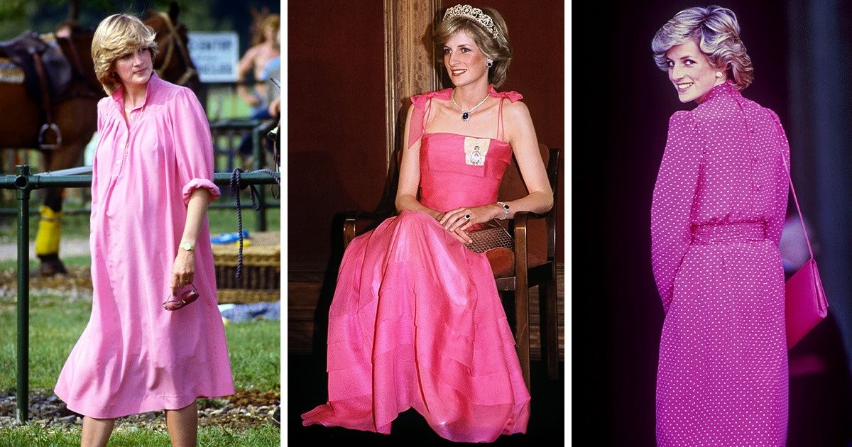
White, and softer pastel shades, offered Princess Diana another powerful avenue for communicating her brand. White is universally associated with purity, innocence, and new beginnings. Pastels, on the other hand, evoke feelings of gentleness, sweetness, and approachability. Diana often chose these lighter hues for occasions where she wanted to appear more maternal, compassionate, or to connect with a broader audience, particularly children.
When Diana wore white, it often coincided with moments where she aimed to project an image of grace and understated elegance. This was particularly evident in some of her more iconic evening gowns. The simplicity of white could allow her own radiance to shine through, without the distraction of bold colors. It projected an air of sophistication and timeless beauty.
Similarly, pastel colors allowed Diana to project a softer, more vulnerable, and incredibly relatable side. Think of her engagements with children or her more informal public appearances. These lighter, softer tones made her seem more accessible and less imposing, breaking down the perceived barriers of royalty. This strategic use of color contributed significantly to her image as the “people’s princess,” a title that was earned not just through her actions, but also through the visual cues she presented. These choices amplified her inherent warmth and empathy, making her a figure that many felt they could connect with on a deeply personal level.
The Strategic Significance of Color in Royal Branding
In the complex world of royal duties and public relations, every element of a royal’s presentation is scrutinized. Princess Diana, while often seen as a style icon, was also a master strategist in her public appearances, and color played a pivotal role in shaping her brand. Her choices were rarely accidental; they were deliberate decisions that aimed to convey specific messages and reinforce her evolving role within the monarchy and on the global stage. This section examines how her color choices were intrinsically linked to the broader strategy of her royal branding.
Reinforcing Royal Identity and Tradition
The British monarchy, by its very nature, is steeped in tradition and symbolism. Colors have long been used to signify royal status, authority, and lineage. Historically, certain colors, like royal blue, purple, and crimson, have been associated with nobility and power. Princess Diana, as a member of the royal family, understood the importance of acknowledging and, at times, subtly referencing these traditions. Her frequent use of blues, particularly deep and royal blues, served to reinforce her position within the royal institution. These colors evoked a sense of gravitas and historical continuity, aligning her with the established protocols and expectations of her role.
However, Diana was also a modernizer, and her approach to color was not solely about adherence to tradition. She managed to blend the established symbolism with her own contemporary sensibilities, creating a unique brand that was both regal and accessible. This delicate balance was crucial for her to navigate the expectations placed upon her while also forging her own path. Her ability to wear colors that were both traditional and fashionable allowed her to appeal to a wider audience, bridging the gap between the old and the new in royal representation.
Connecting with Diverse Audiences
Princess Diana’s global appeal was extraordinary, transcending cultural and social boundaries. Her color choices were instrumental in facilitating these connections. While certain colors might hold specific meanings in Western cultures, Diana’s ability to select hues that resonated universally was a testament to her intuitive understanding of visual communication. For instance, vibrant colors like red and yellow can be associated with celebration and positivity in many cultures, making her appear more universally welcoming and engaging.
When she visited different countries, her wardrobe often subtly reflected the colors of the national flags or traditional attire of the region. This thoughtful gesture demonstrated respect and a genuine desire to connect with the local populace. It was a visual form of diplomacy, a silent acknowledgment of her host nation that fostered goodwill and strengthened relationships. This level of cultural sensitivity in her sartorial choices underscored her commitment to building bridges and her role as an international ambassador of goodwill. Her color palette became a language of understanding, spoken across borders.
Projecting Empathy and Approachability
Perhaps one of the most profound aspects of Princess Diana’s brand was her remarkable ability to project empathy and approachability, earning her the title “the People’s Princess.” Her color choices played a significant role in cultivating this image. While bold colors could convey strength and confidence, softer, more muted tones were often employed to highlight her compassionate nature.
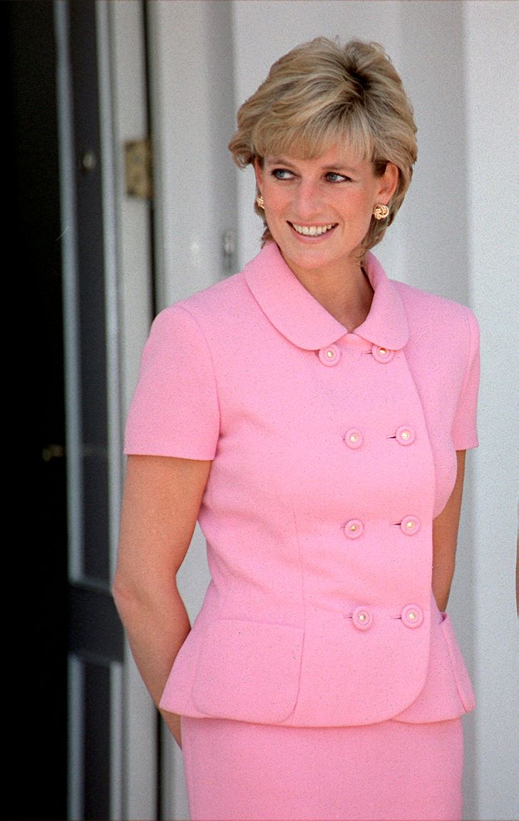
Think of the countless images of Diana interacting with sick children, victims of landmines, or those affected by poverty. In these situations, she often opted for softer blues, gentle pinks, and warm neutrals. These colors are inherently calming and reassuring, creating a visual atmosphere of tenderness and understanding. They allowed her to appear less like an imposing royal figure and more like a caring individual extending a hand of comfort. This deliberate use of color helped to demystify the monarchy and make it feel more human and relatable, fostering a deep emotional connection with the public. Her wardrobe was a tool for conveying genuine warmth, making her accessible even in the most formal of settings.
The Enduring Legacy of Diana’s Color Palette
Princess Diana’s influence on fashion and public perception continues to resonate decades after her untimely death. Her approach to color was not just about aesthetics; it was a nuanced and strategic element of her personal brand that contributed significantly to her enduring legacy. By understanding the psychology of color and its role in strategic communication, we can appreciate the deliberate choices she made and the lasting impact they have had. Her ability to wield color as a tool for connection, empathy, and projecting a powerful yet relatable image remains a masterclass in personal branding.
From Royal Fashion to Global Influence
Diana’s fashion choices were meticulously documented and widely emulated. Her ability to champion certain colors or styles often led to their increased popularity. For example, when she wore a particular shade of blue, it could become a sought-after hue. This demonstrates the potent influence of a well-placed style icon on consumer trends and cultural perceptions. Her impact extended beyond mere fashion; it influenced how people thought about the colors they wore and the messages they conveyed.
Her sartorial diplomacy, as mentioned earlier, also had a lasting effect. By thoughtfully incorporating colors relevant to host nations, she set a precedent for how global figures could engage with diverse cultures through visual means. This demonstrated a sophisticated understanding of soft power, where even the seemingly superficial act of choosing a color could foster significant goodwill and strengthen international relations. Her legacy is a testament to the fact that personal presentation, including the strategic use of color, can be a powerful force for positive change and global connection.
Color as a Symbol of Transformation and Evolution
Princess Diana’s personal journey was one of remarkable transformation. She evolved from a shy young woman into a confident and globally recognized humanitarian. Her color palette mirrored this evolution. In her earlier years, her choices might have leaned towards more traditional and understated hues. As she grew more confident and established her own voice, her wardrobe became bolder, more diverse, and more expressive.
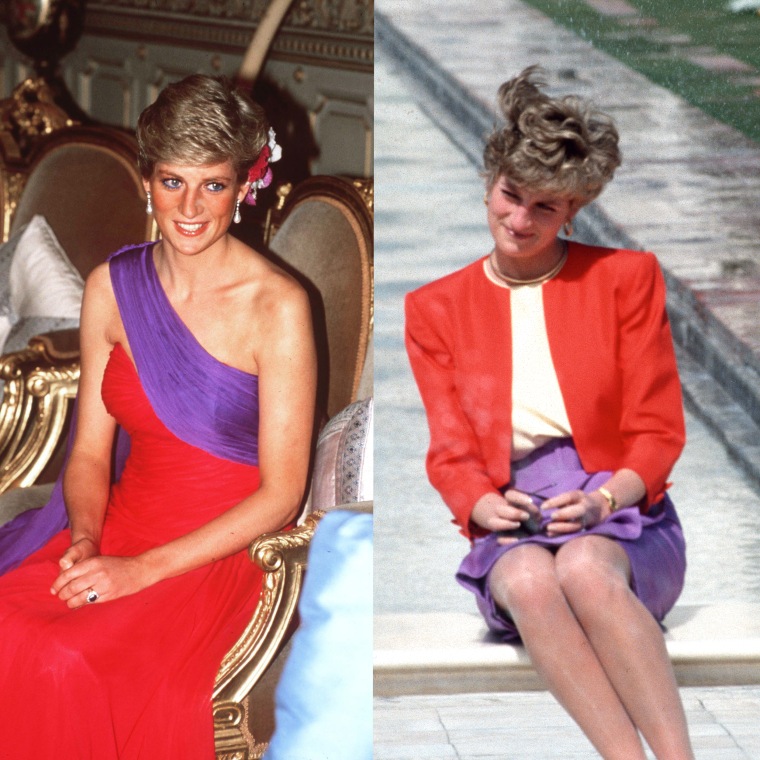
The shift in her color choices reflected her growing assertiveness and her willingness to push boundaries. From demure pastels to powerful reds and sophisticated jewel tones, her wardrobe became a visual narrative of her personal growth. This transformation was not lost on the public, who followed her journey with rapt attention. Her willingness to experiment with color and to use it to express different facets of her personality made her a relatable and inspiring figure. Her story, told in part through the colors she wore, continues to inspire individuals to embrace their own transformations and to use their personal presentation to express their evolving identities.
The Enduring Appeal of Authenticity Through Color
Ultimately, the enduring appeal of Princess Diana’s use of color lies in its perceived authenticity. While her choices were undoubtedly strategic, they also felt deeply personal and genuine. The public responded to the emotional resonance of the colors she wore, interpreting them as reflections of her true character and intentions. This ability to connect on an emotional level, facilitated by the powerful language of color, is what cemented her status as a beloved and iconic figure.
Her legacy serves as a reminder that while trends and styles may change, the fundamental power of authentic self-expression through visual means remains constant. In a world often saturated with carefully curated and artificial personas, Diana’s use of color offered a window into her heart and her humanity. It demonstrated that even within the constraints of a public role, there is ample space for genuine expression and for colors to speak volumes about who we are and what we stand for. Her favorite colors, or the spectrum of colors she embraced, continue to inspire us to consider the power and meaning embedded in the hues we choose to surround ourselves with, and the messages they send to the world.
aViewFromTheCave is a participant in the Amazon Services LLC Associates Program, an affiliate advertising program designed to provide a means for sites to earn advertising fees by advertising and linking to Amazon.com. Amazon, the Amazon logo, AmazonSupply, and the AmazonSupply logo are trademarks of Amazon.com, Inc. or its affiliates. As an Amazon Associate we earn affiliate commissions from qualifying purchases.