
In the realm of cinematic history and literary genius, few names evoke as much immediate psychological recognition as the Overlook Hotel. While casual viewers often ask, “What is the name of the hotel from The Shining?” marketing experts and brand strategists look at the Overlook as something far more significant: a masterclass in atmospheric branding and the creation of a permanent cultural identity. The Overlook Hotel is not merely a setting for a horror story; it is a brand so potent that it has transcended the screen to influence interior design, hospitality marketing, and the way we perceive “haunted” luxury.

The Name Behind the Nightmare: Identifying the Overlook Hotel as a Brand Icon
The name “Overlook Hotel” is a stroke of branding brilliance. In the context of the story, it refers to its physical location high in the Colorado Rockies, but from a strategic standpoint, the name serves as a double entendre that defines the brand’s persona. It suggests both a grand, panoramic view and the act of “overlooking” the dark history contained within its walls.
From Fiction to Cultural Permanence
When Stephen King first penned the name, he created a brand that would eventually outgrow its medium. Today, the Overlook Hotel exists as a “phantom brand.” Much like the fictional ACME Corporation or Wonka’s Chocolate Factory, the Overlook has a brand equity that rivals real-world hospitality giants like Hilton or Marriott. This permanence is achieved through consistent visual cues—the name itself is inextricably linked to specific fonts, color palettes (mustard yellows, blood reds, and deep oranges), and a sense of isolated grandeur. For a brand to achieve this level of recognition, it must possess a unique selling proposition (USP). The Overlook’s USP is its personality; the hotel is a living entity, a “character” brand that interacts with its guests rather than just housing them.
The Symbolism of the Logo and Visual Identity
While many hotels rely on a literal logo, the Overlook Hotel’s brand identity is built on patterns. The most famous of these is the “Hicks Hexagon” carpet pattern designed by David Hicks for the film adaptation. This geometric design has become a brand asset as recognizable as the Nike Swoosh or the Apple logo. In brand strategy, this is known as “associative branding.” When a consumer sees that specific orange and red pattern, their brain immediately retrieves the “Overlook” brand. This demonstrates the power of visual identity in brand building; by creating a unique, repeatable aesthetic, a brand can claim “real estate” in the consumer’s subconscious mind.
Location Branding: How The Shining Created a Tourism Powerhouse
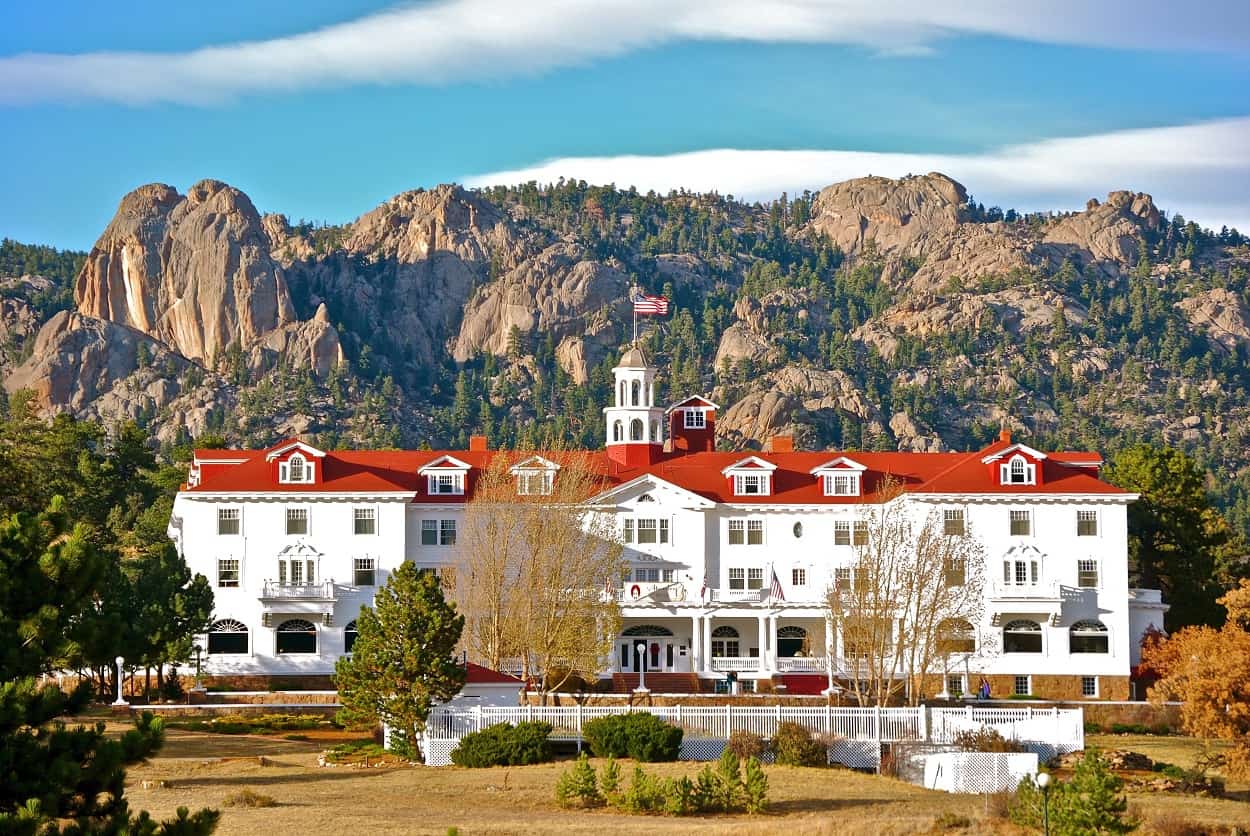
The Overlook Hotel provides a fascinating case study in how a fictional brand can breathe life into real-world corporate identities. The Overlook is actually a composite of two distinct locations: The Stanley Hotel in Colorado and the Timberline Lodge in Oregon. Both have leveraged the “Overlook” brand to create multi-million dollar tourism ecosystems.
The Stanley Hotel vs. The Timberline Lodge
The Stanley Hotel in Estes Park, Colorado, served as Stephen King’s original inspiration. After the success of the book and film, the Stanley leaned into its association with the fictional Overlook. They didn’t shy away from the horror; they rebranded around it. They installed a hedge maze (which didn’t exist at the original hotel but was a key feature of the movie) and began offering “Ghost Tours.” This is a classic example of brand alignment. By aligning their real-world corporate identity with the fictional “Overlook” brand, they tapped into a pre-existing audience of millions.
The Timberline Lodge, used for the exterior shots in Stanley Kubrick’s film, followed a different brand path. They maintained their identity as a premier ski destination but discreetly acknowledged their role in cinematic history. This “dual branding” allows them to serve two markets: the luxury traveler and the film enthusiast. It proves that a location can carry multiple brand identities simultaneously if the marketing is handled with enough nuance.

Leveraging Horror as a Marketing USP
Typically, hospitality brands strive to project safety, comfort, and relaxation. The Overlook brand flipped the script. It proved that there is a massive market for “dark tourism” and experiential branding based on tension. The Overlook “brand” is sold on the idea of the sublime—the mixture of beauty and terror. Modern marketing often focuses on “delighting” the customer, but the Overlook brand focuses on “engaging” the customer through mystery. This has led to a surge in themed pop-up bars, escape rooms, and hotel packages globally that mimic the Overlook’s aesthetic, proving that even a “scary” brand can be highly profitable if it is iconic enough.
Architectural Storytelling: Designing a Brand Experience Through Space
In brand strategy, the physical environment is often referred to as “servicescape.” The Overlook Hotel is perhaps the most famous servicescape in history. Every hallway, the Gold Ballroom, and the dreaded Room 237 are designed to communicate the brand’s core values: isolation, history, and inescapable legacy.
The Psychology of the Hedge Maze and Interiors
The hedge maze is a vital component of the Overlook’s brand architecture. It represents the complexity and the “trap” of the brand experience. From a marketing perspective, the maze is a metaphor for a deep brand funnel—once the customer (or character) enters, they are fully immersed in the world. The interiors of the hotel, with their impossible geometry (noted by many film analysts as being physically inconsistent), create a “disorientation brand strategy.” This forces the guest to rely entirely on the brand’s own logic, a technique used in modern casino design to keep patrons engaged and spending for longer periods.
Creating “Immersive” Brand Environments
The Overlook Hotel teaches us that a brand is not just a logo or a name; it is a space. For modern businesses, this translates to the “retail experience.” Apple Stores, for instance, use architectural storytelling to convey a brand of minimalism and innovation. The Overlook uses its architecture to convey a brand of “overwhelming history.” By utilizing specific lighting (the harsh, fluorescent glow of the bathroom) and expansive scale (the high ceilings of the Great Lounge), the brand dictates how the “customer” feels. Businesses looking to create a strong corporate identity should study how the Overlook uses its physical environment to evoke a specific emotional response.
Lessons in Long-Term Brand Equity and Pop Culture Longevity
The fact that people still ask for the name of the hotel from The Shining decades after its release is a testament to its long-term brand equity. Brand equity is the value premium that a company generates from a product with a recognizable name when compared to a generic equivalent. The Overlook isn’t just a hotel; it’s the “Overlook.”
Consistency in the “Shining” Universe
Whether it is the original novel, the 1980 film, the 1997 miniseries, or the 2019 sequel Doctor Sleep, the Overlook brand has remained remarkably consistent. This is “Brand Continuity.” Even when the hotel was physically destroyed (in the book and later film versions), the brand of the Overlook remained. In Doctor Sleep, the return to the Overlook was marketed as a “homecoming” to a legendary brand. This shows that if a brand is built on a strong enough narrative foundation, it can survive the “death” of its physical assets.
Why the Overlook Brand Never Fades
The longevity of the Overlook brand lies in its ability to be “re-skinned” for new generations. In the 1980s, it was a brand of psychological isolation. In the digital age, it has become a brand of “aesthetic” and “vibe,” populating Instagram feeds with its iconic carpet patterns and symmetric cinematography. It has successfully transitioned from a literary concept to a visual brand, and finally to a lifestyle touchstone.
For brand strategists, the lesson is clear: a brand’s name is just the beginning. The “Overlook Hotel” succeeded because it combined a compelling name with a unique visual language, a physical location that people could visit, and a story that resonated with universal human fears. It is the ultimate example of how a fictional entity can become a global brand powerhouse, proving that in the world of marketing, the stories we tell are just as important as the products we sell. The Overlook isn’t just a place in the mountains; it is a permanent resident in the global brand landscape, proving that some brands truly do live “forever and ever and ever.”
aViewFromTheCave is a participant in the Amazon Services LLC Associates Program, an affiliate advertising program designed to provide a means for sites to earn advertising fees by advertising and linking to Amazon.com. Amazon, the Amazon logo, AmazonSupply, and the AmazonSupply logo are trademarks of Amazon.com, Inc. or its affiliates. As an Amazon Associate we earn affiliate commissions from qualifying purchases.