
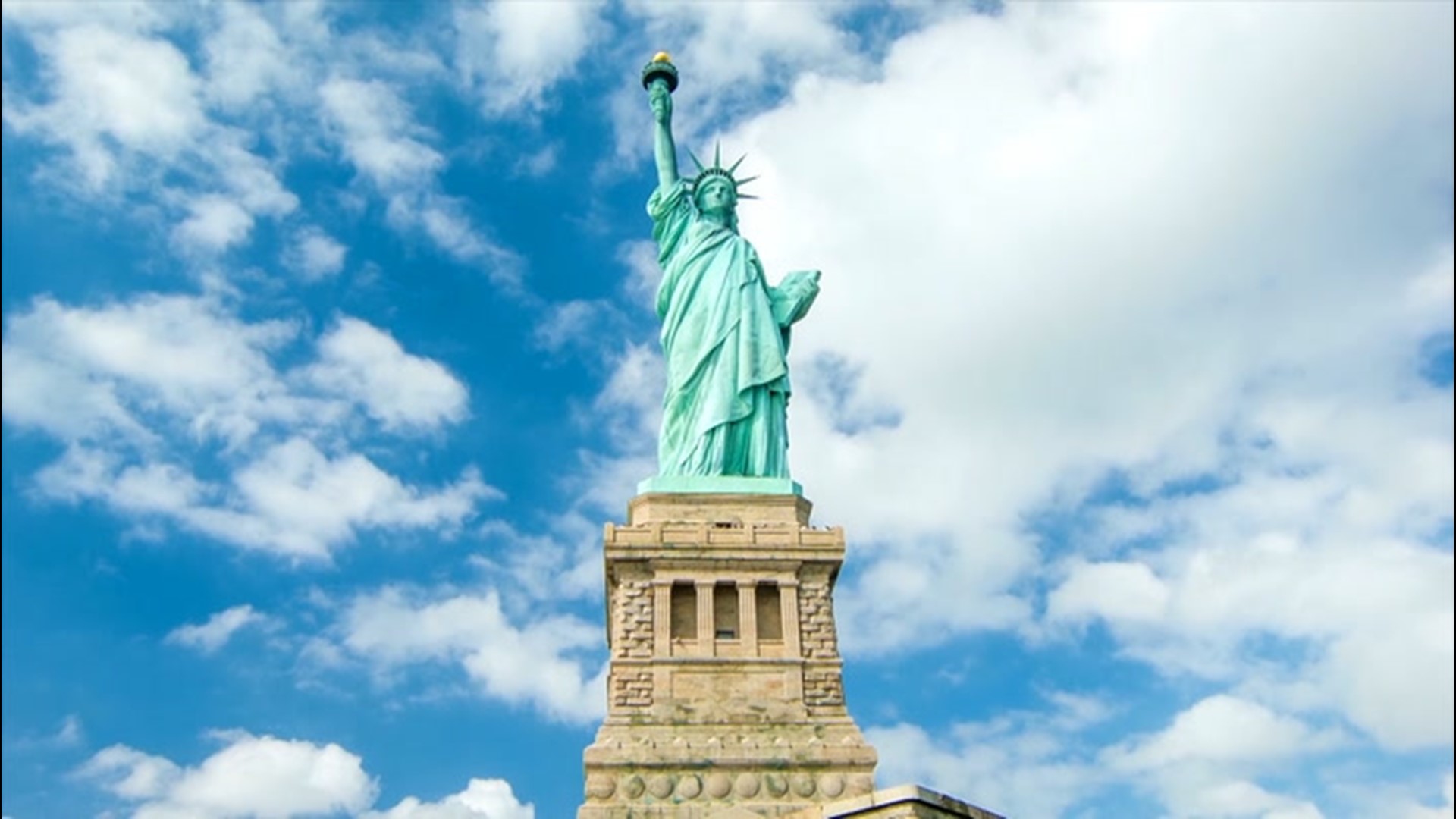
When we think of the Statue of Liberty, a very specific shade of seafoam green immediately comes to mind. It is a color so distinct that it has become synonymous with the concepts of freedom, democracy, and the American dream. However, the statue was not always this color, and the story of its visual transformation offers a masterclass in brand evolution, color psychology, and the power of visual equity. To understand the “color” of the Statue of Liberty is to understand how a physical object transcends its material components to become a globally recognized brand asset.

The Evolution of a Visual Asset: From Industrial Copper to Verdigris
To appreciate the current brand identity of Lady Liberty, one must first look at its “original launch” state. When the statue was gifted by France to the United States in 1886, it was the color of a brand-new penny. Clad in roughly 80 tons of thin copper sheets, the monument shimmered with a metallic, reddish-brown hue. At the time, this was a symbol of industrial prowess and modern engineering.
The Slow-Burn Rebrand
Unlike a corporate rebrand that happens overnight with a press release and a logo swap, the Statue of Liberty underwent a natural, decades-long metamorphosis. This process, known as patination, was a chemical reaction between the copper and the elements—oxygen, rain, and sea spray. By around 1906, the original copper had transitioned into a dull brown, and by 1920, it had completely transformed into the pale green patina we see today.
From a brand strategy perspective, this was an unplanned but highly effective visual pivot. The original copper, while impressive, was harsh and industrial. The green patina, scientifically known as verdigris, softened the monument’s appearance. It gave the “brand” a sense of age, stability, and organic growth. The transition from a “new” object to an “ancient” icon was facilitated entirely by this change in palette.
Authenticity and the Decision Not to “Refresh”
In the early 20th century, as the green began to take over, there were significant debates about whether to “clean” the statue back to its original copper state. The U.S. War Department, which oversaw the statue at the time, faced public outcry at the suggestion of painting or polishing the monument. The public had already bonded with the green identity.
This highlights a crucial lesson in brand management: the audience often owns the brand’s visual identity more than the stakeholders do. Had the government forced a return to copper, they would have stripped away the burgeoning “equity” of the green icon. By allowing the natural color to remain, they preserved an “authentic” visual narrative that suggested the statue was a living part of the landscape.
Color Psychology and the Symbolism of “Liberty Green”
In the world of branding and design, color is never just a visual choice; it is a psychological trigger. The specific shade of the Statue of Liberty carries heavy emotional weight that contributes to its status as a premier global brand.
The Psychology of Green in Brand Strategy
Green is traditionally associated with growth, renewal, and safety. In the context of the Statue of Liberty, the muted, desaturated green conveys a sense of calm authority. Unlike a vibrant, aggressive neon green, the statue’s patina suggests a timeless endurance. It is a color that looks as though it has always been there and will always remain.
For a brand representing a nation’s values, this stability is essential. If the statue were still a reflective, bright copper, it might feel more like a commercial product or a temporary installation. The green color creates a psychological “anchor,” making the monument feel like a foundational element of the global social contract.
Creating a Unique Color Category
Just as Tiffany & Co. has “Tiffany Blue” and UPS has its signature “Pullman Brown,” the Statue of Liberty has effectively “owned” its specific shade of green. While it is technically a byproduct of oxidation, in the marketplace of ideas, it is a proprietary visual cue.
When graphic designers create logos or advertisements meant to evoke NYC or American values, they don’t use a generic forest green; they use a specific “Liberty Green” (often categorized in digital design as a variant of hex code #669999 or #A2C2A8). By occupying this unique space on the color wheel, the brand ensures that it cannot be easily confused with other global landmarks or corporate entities.
Protecting the Intellectual Property of an Icon
While the Statue of Liberty is in the public domain, its visual identity is managed with the same level of care as a high-value corporate brand. The “brand” is managed by the National Park Service (NPS), but its influence extends into the private sector through licensing, tourism, and media.
Visual Consistency Across Mediums
Whether it’s a keychain sold in a souvenir shop, a digital render in a blockbuster film, or a logo for a New York-based professional sports team, the “color” of the statue is the primary identifier. If you change the color, you break the brand recognition.
Consistency is the bedrock of brand strategy. Because the statue’s color is its most recognizable feature—more so than the crown or the torch in silhouette—maintaining that visual consistency is paramount for any entity using the image of Lady Liberty to signify quality or heritage.
The 1980s Restoration: A Case Study in Brand Preservation
Between 1984 and 1986, the statue underwent a massive $87 million restoration. One of the most significant decisions during this period involved the torch. The original flame had been replaced with glass panels in 1916, which leaked and caused internal damage. During the restoration, it was replaced with a new copper flame gilded in 24k gold.
Notice the strategic choice: while the “skin” of the statue was kept green to preserve its iconic identity, the torch was made gold. This created a visual “call to action” or a “hero element” within the brand’s design. The contrast between the matte green body and the shining gold flame draws the eye upward, reinforcing the brand’s message of enlightenment and hope. This is classic visual hierarchy in design—using color to direct the viewer’s attention to the most important part of the message.
Modern Branding Lessons from Lady Liberty
Corporate brands and personal brands alike can learn a great deal from the visual history of the Statue of Liberty. It serves as a blueprint for how a brand can age gracefully while increasing its market value and emotional resonance.
1. Allow for Natural Evolution
Many brands are terrified of change, yet the Statue of Liberty’s greatest asset—its color—was an accidental change. The lesson here is that brands should be open to how their environment and their audience shape their identity. Sometimes, a “natural” shift in brand perception is more valuable than a forced, artificial image.
2. Longevity Outperforms Trends
The copper look was a trend of the industrial age. The green patina is a timeless aesthetic. In brand strategy, it is often better to lean into “timelessness” than to chase the latest design fads. By the time the statue turned green, the “industrial copper” look of the late 19th century was already falling out of fashion. The statue evolved into a palette that could exist outside of time.
3. Visual Equity is Built Through Consistency
The reason we immediately recognize the color is because it has been consistent for over a century. For a brand to achieve “icon status,” it must resist the urge to constantly tweak its core visual elements. If the NPS had painted the statue different colors over the years to “keep it fresh,” it would have diluted the brand’s power.
4. Emotional Connection Over Functional Value
People don’t love the Statue of Liberty because it is a marvel of copper engineering; they love it for what it represents. The color is the visual shorthand for that emotional connection. A successful brand strategy moves the focus away from “what the product is” (copper sheets on an iron frame) to “what the brand means” (liberty and welcome).

The Enduring Power of a Single Shade
What color is the Statue of Liberty? To a chemist, it is a complex layer of copper carbonates and hydroxides. To a historian, it is a record of 130 years of atmospheric exposure. But to a brand strategist, the color is a priceless asset that serves as the visual DNA of an international icon.
The “Liberty Green” we recognize today is a testament to the power of visual identity. It proves that the most successful brands are those that can weather the storm, adapt to their environment, and emerge with a look that is not only unique but emotionally resonant. Whether we are building a multi-billion dollar corporation or a personal brand, we can look to the lady in the harbor as a reminder that consistency, authenticity, and a well-defined visual palette are the keys to building a legacy that lasts for centuries.
aViewFromTheCave is a participant in the Amazon Services LLC Associates Program, an affiliate advertising program designed to provide a means for sites to earn advertising fees by advertising and linking to Amazon.com. Amazon, the Amazon logo, AmazonSupply, and the AmazonSupply logo are trademarks of Amazon.com, Inc. or its affiliates. As an Amazon Associate we earn affiliate commissions from qualifying purchases.