
In the hyper-competitive landscape of modern marketing, color is rarely a matter of mere aesthetics. It is a psychological trigger, a silent communicator of values, and a foundational pillar of brand strategy. When designers and brand architects ask, “What color is slate gray?” they are not simply looking for a coordinate on a color wheel. They are investigating a specific emotional frequency that balances the cold authority of industrial steel with the natural, grounded permanence of stone.
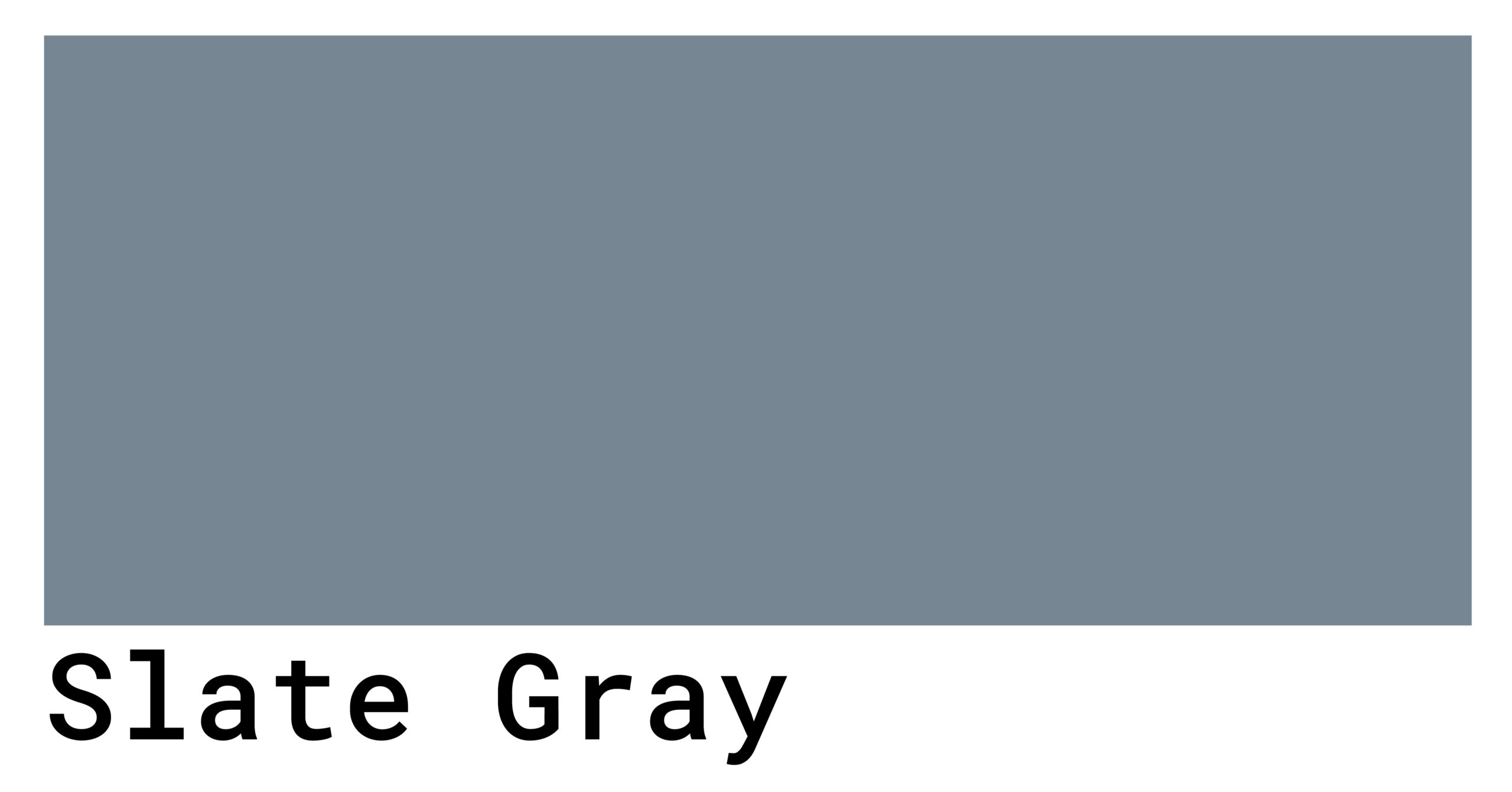
Slate gray is a sophisticated neutral that sits at the intersection of gray and blue. Unlike a true neutral gray, which is a perfect midpoint between black and white, slate gray carries a distinct cool undertone. In the hexadecimal system, it is most commonly represented as #708090. This specific composition—comprising roughly 44% red, 50% green, and 56% blue—gives it a “stormy” quality that suggests depth, intelligence, and resilience. For brands looking to convey a sense of “premium reliability,” slate gray is often the primary weapon of choice.

The Psychology of Slate Gray in Brand Strategy
Every color carries a psychological payload. In branding, gray is traditionally associated with neutrality, balance, and calm. However, the addition of the blue undertone in slate gray shifts that narrative toward professionalism and authority. While pure gray can sometimes feel detached or indecisive, slate gray feels intentional.
Establishing Trust and Authority
For corporate identities, particularly in the financial, legal, and consulting sectors, slate gray serves as a visual shorthand for stability. It lacks the aggressive finality of pure black, which can sometimes appear heavy or “villainous” in digital interfaces. Instead, slate gray offers a softer, more approachable version of authority. It suggests a brand that is established and serious but also modern and adaptable.
When a consumer interacts with a brand using a slate gray palette, the subconscious reaction is one of safety. It is the color of skyscrapers and high-end hardware; it is the color of deep water and weathered mountains. By leveraging these natural and industrial associations, brands can position themselves as “the bedrock” of their respective industries.
The Minimalist Aesthetic and Luxury
In the luxury market, slate gray has emerged as a key component of “quiet luxury.” Brands that want to move away from the ostentatious gold and red palettes of the past are turning to muted, complex neutrals. Slate gray allows a brand to breathe. It provides a high-contrast background for minimalist logos and elegant typography without the starkness of white.
In personal branding, slate gray is often used to signify expertise without ego. It is the color of the “expert in the room” who doesn’t need to shout to be heard. This subtle power makes it an ideal choice for high-end tech products, architectural firms, and boutique creative agencies.
The Technical Blueprint: Implementing Slate Gray Across Platforms
Understanding the visual essence of slate gray is only half the battle. For a brand identity to be successful, that color must be rendered consistently across every touchpoint, from a smartphone screen to a physical billboard.
Digital Precision: HEX and RGB
In the digital realm, slate gray (#708090) is a standard web color. Because of its blue bias, it performs exceptionally well on OLED and LCD screens. Unlike warmer grays, which can sometimes appear “muddy” or yellowed on lower-quality displays, slate gray maintains its crispness.
When designing User Interfaces (UI), slate gray is frequently used for “secondary” elements. It provides enough contrast against white backgrounds to be legible but remains subtle enough to allow “Call to Action” (CTA) buttons—often in vibrant oranges or teals—to pop. This creates a visual hierarchy that guides the user’s eye toward the most important information without causing visual fatigue.
Print Consistency: CMYK and Pantone
Translating slate gray to physical media requires a deep understanding of ink chemistry. In the CMYK process (Cyan, Magenta, Yellow, and Key/Black), slate gray requires a significant lean toward Cyan to preserve its cool essence. Without careful calibration, a printer might produce a “flat” gray that lacks the color’s signature blue-green depth.
For high-end brand collateral, such as business cards or luxury packaging, specifying a Pantone Matching System (PMS) color is essential. PMS 431 C is often cited as a close relative to slate gray. By using a spot color rather than a four-color process, brand managers ensure that their “slate” looks identical whether it is printed in London, Tokyo, or New York. This consistency is the hallmark of a professional brand identity.
Strategic Color Pairing: Elevating the Palette
Slate gray rarely works alone. Its true power in brand strategy is revealed when it is used as a foundation for a broader color system. Because it is a “cool neutral,” it pairs exceptionally well with colors that sit on the opposite side of the spectrum.
High-Contrast Accents
One of the most effective brand strategies involves pairing slate gray with high-energy colors like burnt orange, electric yellow, or coral. The slate gray acts as an anchor, preventing the more vibrant colors from overwhelming the viewer. This combination is particularly popular in the “SaaS” (Software as a Service) and “FinTech” worlds, where brands need to look both “innovative” (vibrant accents) and “secure” (slate gray base).
Monochromatic Sophistication
Alternatively, a monochromatic palette utilizing various shades of slate—from a pale “light slate gray” (#778899) to a deep “charcoal slate”—can create a sense of immense depth and sophistication. This approach is often used by high-end apparel brands and interior design firms. It suggests a brand that is focused on texture and quality rather than flashy trends.
The “Natural” Pairing
Because slate is a natural stone, it pairs beautifully with organic tones like forest green, sand, and wood grains. For brands focused on sustainability or outdoor lifestyle products, this palette communicates a “modern wilderness” aesthetic. It tells the consumer that the brand is high-tech but still deeply connected to the natural world.
Slate Gray in Corporate Identity: Case Studies and Applications
While many colors come and go with seasonal trends, slate gray has remained a staple in corporate identity for decades. Its longevity is a testament to its versatility.
Tech Hardware and Soft-Touch Finishes
Look at the evolution of high-end laptops and smartphones. While “Space Gray” and “Graphite” are often the marketing terms used, the actual color values frequently fall within the slate gray spectrum. This is because slate gray mimics the look of anodized aluminum. It conveys a sense of durability and precision engineering. In this context, slate gray isn’t just a color—it’s a material signifier.
Modern Professional Services
Consider a modern law firm or a strategic consultancy. Moving away from the heavy mahogany and navy blue of the 20th century, these firms are adopting slate gray and white palettes. This shift represents a move toward transparency, efficiency, and modernism. It signals that the firm is forward-thinking and digitally savvy while maintaining the gravitas required for high-stakes professional work.
Accessibility and Inclusive Design
In the modern era of Brand Strategy, accessibility is no longer optional. Slate gray plays a crucial role here. According to the Web Content Accessibility Guidelines (WCAG), text must have a specific contrast ratio against its background to be readable by those with visual impairments. Slate gray provides a perfect middle ground. It is dark enough to serve as a high-contrast text color against light backgrounds, yet it is less “harsh” than pure black, which can cause “vibration” or eye strain for users with dyslexia or light sensitivity.

The Future of Neutrals: Why Slate Gray Endures
As we look toward the future of digital and physical branding, the demand for “grounding” colors is only increasing. In a world of sensory overload and neon-drenched digital spaces, slate gray offers a visual sanctuary. It is a color that represents the “solid ground” in a volatile market.
Brand managers are increasingly choosing slate gray because it is “future-proof.” Unlike the “Millennial Pink” or “Gen Z Green” that define specific cultural moments, slate gray is timeless. It does not date a brand. A logo designed in slate gray in 2024 will likely look just as relevant in 2034.
Furthermore, as brands move toward more sustainable practices, slate gray is becoming synonymous with “un-dyed” or “natural” manufacturing processes. In the fashion and textile industries, it represents the raw beauty of minerals and recycled materials. This alignment with environmental values adds a new layer of meaning to the color, moving it from “industrial” to “ecological.”
In conclusion, slate gray is much more than a simple mixture of black, white, and blue. It is a sophisticated strategic tool that, when used correctly, can define a brand’s authority, elevate its aesthetic, and ensure its longevity. Whether it is used as a primary brand color or a subtle accent in a complex UI, slate gray remains the ultimate neutral for those who value both substance and style. For the brand builder, mastering slate gray is about mastering the art of the understated—knowing that sometimes, the most powerful statement is the one made with the quietest color.
aViewFromTheCave is a participant in the Amazon Services LLC Associates Program, an affiliate advertising program designed to provide a means for sites to earn advertising fees by advertising and linking to Amazon.com. Amazon, the Amazon logo, AmazonSupply, and the AmazonSupply logo are trademarks of Amazon.com, Inc. or its affiliates. As an Amazon Associate we earn affiliate commissions from qualifying purchases.