
In the competitive landscape of visual identity, color is never just an aesthetic choice; it is a psychological tool. Among the palette of deep, resonant tones available to designers and brand strategists, few carry the historical weight and emotional gravitas of oxblood. Often confused with burgundy, maroon, or cordovan, oxblood occupies a unique space in the color spectrum—a dark, brownish-red that evokes a sense of timelessness, authority, and high-end craftsmanship.
For a brand, choosing oxblood is a statement of intent. It suggests a legacy that spans generations while maintaining a contemporary edge. To understand “what color is oxblood” in a professional context, one must look beyond the hexadecimal code and explore how this specific hue influences consumer perception, dictates brand positioning, and solidifies market identity.
Defining the Oxblood Profile: Technical Precision and Heritage
From a technical standpoint, oxblood is a dark shade of red with significant purple and brown undertones. Unlike bright reds, which signal urgency or passion, oxblood is grounded. In the world of digital design and brand strategy, achieving the perfect oxblood requires a meticulous balance of CMYK or RGB values to ensure the color does not lean too far into “chocolate” or too close to “bright crimson.”
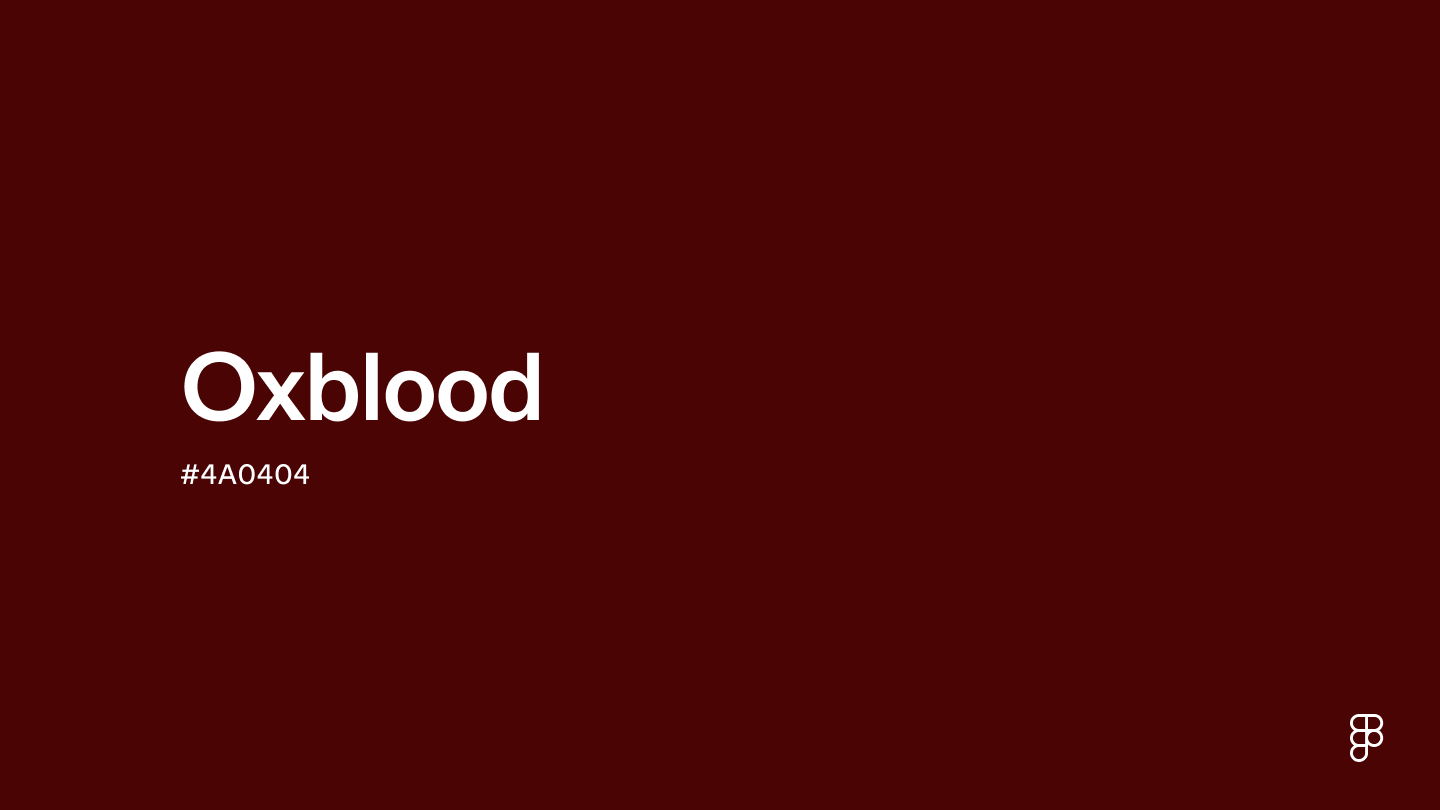
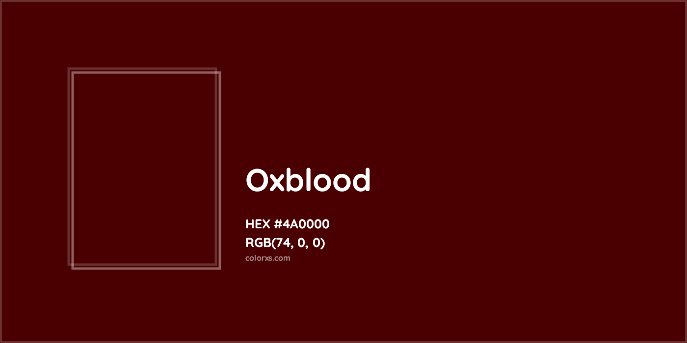
Typically represented by Hex codes such as #4A0E0E or #800020 (though true burgundy is slightly more purple), oxblood is characterized by its depth. It is a “heavy” color, meaning it provides a visual anchor for brand assets. In print branding, oxblood often requires high-quality finishes—such as matte lamination or spot UV—to truly capture its sophisticated sheen.
The heritage of the color is equally important to its brand narrative. Historically associated with leatherwork and fine upholstery, oxblood became a staple in the 17th and 18th centuries. This historical baggage is a goldmine for modern brands. When a company adopts oxblood, it leans into a narrative of “The Artisan.” It signals that the products are built to last, that the company values tradition, and that the brand is not swayed by the fleeting whims of fast-fashion trends.
The Nuance: Oxblood vs. Burgundy vs. Maroon
In brand strategy, precision is paramount. Using these terms interchangeably can lead to a diluted brand identity.
- Maroon is a brownish-red, often used in collegiate branding to represent stability and tradition.
- Burgundy has stronger purple/pink undertones, associated with the wine industry and a lighter sense of luxury.
- Oxblood contains more brown and black, giving it a “bloody,” darker, and more aggressive edge. It is less “pretty” than burgundy and more “powerful” than maroon.
The Psychology of Oxblood in Branding: Authority and Sophistication
Color psychology dictates that humans react to different wavelengths in predictable ways. Red is a stimulant; it increases heart rates and creates a sense of excitement. However, by deepening red into oxblood, brands can harness that inherent energy while tempering it with the reliability of brown. This creates a psychological profile of “controlled power.”
The “Ruler” Archetype
In the framework of brand archetypes, oxblood is most frequently associated with “The Ruler” and “The Sage.” The Ruler brand (think Rolex or Mercedes-Benz) seeks to create order from chaos and signifies leadership and status. Oxblood facilitates this by appearing “expensive.” It is a color that doesn’t need to scream for attention; it commands it through presence.
Gender Neutrality and Versatility
One of the most strategic advantages of oxblood is its gender-neutral appeal. While lighter pinks or bright primary reds are often pigeonholed into specific demographic targets, oxblood transcends these boundaries. In the luxury automotive industry, oxblood leather interiors are marketed equally to all high-net-worth individuals as a sign of bespoke quality. In the cosmetics industry, an oxblood lip color is marketed as “bold” and “professional” rather than merely “pretty.” This versatility allows a brand to widen its net without losing its core identity.
Emotional Resonance: Trust and Longevity
In an era of “disposable” tech and fast-moving consumer goods, brands that utilize oxblood tap into a subconscious desire for longevity. The color reminds consumers of old-world libraries, mahogany desks, and heavy leather-bound books. It fosters an environment of trust. A financial consultancy or a legal firm using oxblood in their corporate identity is signaling that they are an established pillar of the community, rather than a flighty startup.
Case Studies: Brands That Own the Oxblood Aesthetic

To truly understand how oxblood functions as a strategic asset, we can look at several high-profile brands that have successfully integrated the color into their DNA.
1. Dr. Martens: The DNA of Subculture
Perhaps no brand is more synonymous with oxblood than Dr. Martens. While the brand offers boots in every color imaginable, the “Smooth Cherry Red” (a classic oxblood) is their flagship. For Dr. Martens, oxblood represents the intersection of working-class utility and punk-rock rebellion. It is a color that wears in, rather than wears out. By maintaining oxblood as a core brand pillar, Dr. Martens has successfully bridged the gap between a utilitarian work boot and a high-fashion icon.
2. Gucci and the “Rosso Ancora” Era
Under the creative direction of Sabato De Sarno, Gucci recently pivoted its entire brand aesthetic toward a specific deep red known as “Rosso Ancora.” This shade is a direct descendant of oxblood. By saturating their marketing, packaging, and runway shows in this deep, moody red, Gucci moved away from the eclectic maximalism of the previous era toward a more “quiet luxury” and “timeless” positioning. This strategic shift used oxblood to signal a return to the brand’s heritage and craftsmanship.
3. Luxury Automotive Interiors: Bentley and Porsche
In the high-end automotive sector, oxblood is often used as a “statement” interior color. When a customer selects an oxblood leather package for a Porsche 911, they are opting for a classic look that maintains high resale value. Unlike bright red interiors, which can be polarizing and trend-dependent, oxblood is viewed as a “neutral luxury.” It complements wood veneers and carbon fiber alike, demonstrating the color’s ability to adapt to different brand textures.
Implementing Oxblood into Your Corporate Identity
If a brand decides to adopt oxblood, the implementation must be strategic to avoid making the brand look dated or overly somber.
Pairing Oxblood with Modern Accents
To prevent oxblood from looking “stuffy,” brand strategists often pair it with high-contrast, modern accents.
- Oxblood and Gold/Brass: The ultimate “Royal” palette. Best for luxury goods and high-end hospitality.
- Oxblood and Minimalist Grey: A sophisticated, corporate look. This pairing is excellent for tech companies that want to appear more “human” and less “silicon.”
- Oxblood and Cream/Ecru: This creates a soft, artisanal feel, perfect for organic brands or premium skincare.
Digital vs. Physical Consistency
One of the greatest challenges with dark tones like oxblood is color consistency across different mediums. On an OLED smartphone screen, oxblood can look incredibly vibrant and deep. However, on a standard office printer, it can easily turn into an unappealing “muddy” brown. Brands must invest in comprehensive style guides that specify different values for HEX, RGB, CMYK, and Pantone (PMS). For physical branding, specifying the correct paper stock is vital; uncoated paper will absorb the ink and dull the oxblood, while coated paper will help it retain its rich, “bloody” characteristics.
Typography and Readability
When using oxblood as a background color, typography choice becomes critical. White or light-grey sans-serif fonts provide a clean, modern contrast. However, for a more traditional brand, using gold-foiled serif typography against an oxblood background creates a tactile sense of luxury that is difficult to replicate with any other color combination.
The Future of Oxblood in Visual Marketing
As we move further into a digital-first economy, the role of “heavy” colors like oxblood is evolving. We are seeing a shift away from the bright, neon-heavy “app-style” branding of the 2010s. Consumers are experiencing “digital fatigue” and are increasingly drawn to brands that feel tactile, grounded, and “real.”
Oxblood fits this cultural shift perfectly. It is a color that feels like it has weight and history. In the world of UI/UX design, we are seeing oxblood being used for “Dark Mode” interfaces as a more sophisticated alternative to pure black. It provides enough contrast for readability while offering a warmth that black lacks.
Furthermore, the rise of sustainable branding is bringing oxblood back into the spotlight. As brands move toward natural dyes and eco-friendly materials, the earthy, organic tones of oxblood—which can be derived from various natural sources—align with the values of the environmentally conscious consumer.
In conclusion, oxblood is more than just a color; it is a strategic identity. It is a hue that balances the aggression of red with the stability of brown, offering brands a path to a “premium” positioning that is both authoritative and inviting. Whether it is used in the stitching of a luxury handbag, the interface of a high-end fintech app, or the logo of a heritage footwear brand, oxblood remains one of the most powerful tools in a brand strategist’s arsenal. To choose oxblood is to choose a legacy.
aViewFromTheCave is a participant in the Amazon Services LLC Associates Program, an affiliate advertising program designed to provide a means for sites to earn advertising fees by advertising and linking to Amazon.com. Amazon, the Amazon logo, AmazonSupply, and the AmazonSupply logo are trademarks of Amazon.com, Inc. or its affiliates. As an Amazon Associate we earn affiliate commissions from qualifying purchases.