
In the realm of brand strategy and corporate identity, color is far more than an aesthetic choice; it is a silent ambassador for a company’s values, heritage, and market positioning. Burgundy, a deep, saturated shade of red with purple undertones, occupies a unique space in the visual landscape. It carries the passion and energy of red but tempers it with the sophistication and stability of brown. For a brand looking to convey authority, luxury, or timelessness, burgundy is a premier choice. However, the effectiveness of burgundy depends entirely on its surrounding palette. Identifying what color compliments burgundy requires an understanding of color theory, consumer psychology, and strategic design application.
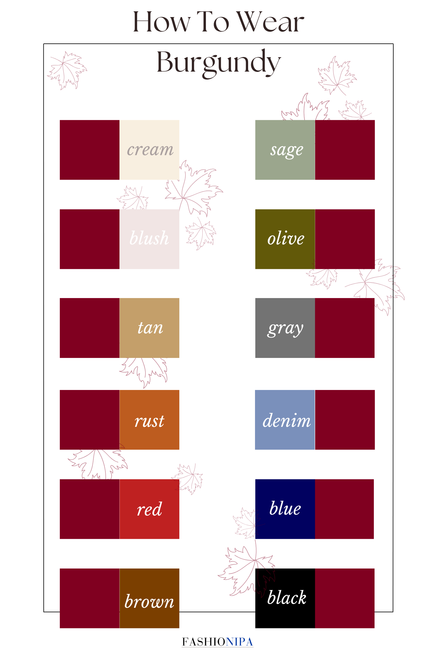
The Psychology of Burgundy in Brand Identity
Before selecting a complementary palette, a brand strategist must understand the psychological weight burgundy carries. Unlike bright scarlet or crimson, which demand immediate, sometimes impulsive attention, burgundy suggests a slow-burn authority. It is the color of vintage wine, academic robes, and high-end leather goods. It communicates maturity, wealth, and a certain degree of exclusivity.
When a brand adopts burgundy as its primary hue, it is signaling to the consumer that it is established and reliable. It is a favorite among financial institutions, private clubs, and luxury automotive brands because it feels grounded. However, used in isolation, burgundy can sometimes feel heavy or overly traditional. This is where the strategic selection of complementary colors becomes vital. The right pairing can modernize burgundy, make it feel more approachable, or elevate its sense of opulence to new heights.
Emotional Resonance and Market Positioning
Burgundy resonates with consumers who value quality over novelty. In the “Brand Personality” framework, burgundy aligns closely with “Competence” and “Sophistication.” To maintain this resonance, the secondary colors must either reinforce these traits or provide a calculated contrast that prevents the brand from appearing dated. For instance, a tech startup using burgundy might pair it with a crisp “Electric Blue” to signal a bridge between traditional reliability and future-facing innovation.
Strategic Color Pairings for Brand Cohesion
Selecting a color to compliment burgundy involves balancing contrast and harmony. In professional design, we look at the color wheel to determine which relationships—complementary, analogous, or monochromatic—will yield the desired market response.
The Luxury Standard: Burgundy and Metallic Gold
Perhaps the most classic pairing in brand history is burgundy and gold. This combination is the quintessential “prestige” palette. Gold provides a reflective, high-energy contrast to the matte depth of burgundy. This pairing is frequently seen in the branding of premium spirits, luxury hotels, and high-end stationery.
From a strategic standpoint, gold acts as a highlight, drawing the eye to specific elements like a logo or a Call to Action (CTA) button, while burgundy serves as the foundational backdrop. To keep this pairing modern, brand designers often opt for “Champagne Gold” or “Matte Brass” rather than high-shine yellow gold, which can sometimes feel kitsch.
The Corporate Professional: Burgundy and Navy Blue
For brands that want to appear authoritative but avoid the austerity of black and white, burgundy and navy blue is an exceptional choice. This is a “power” pairing. Because both colors are deep and saturated, they create a sense of immense stability.
This combination is often utilized in the legal and financial sectors. The blue provides a sense of calm and trust, while the burgundy adds a layer of warmth and “old-world” prestige. When using this palette, it is crucial to introduce a neutral “bridge” color, such as a light gray or cream, to ensure the design remains readable and doesn’t become too dark for digital interfaces.
The Modern Minimalist: Burgundy and Slate Gray
If the goal is to make burgundy feel contemporary and industrial, slate gray is the ideal companion. Gray neutralizes some of the inherent “heat” in burgundy, resulting in a palette that feels professional, sleek, and high-tech.
This combination is increasingly popular in the branding of architectural firms, boutique tech consultancies, and high-end skincare lines. It moves away from the “academic” feel of burgundy and toward a more urban, sophisticated aesthetic. Using different shades of gray—from charcoal to silver—can add depth to the brand identity without distracting from the primary burgundy focal point.
The High-Contrast Dynamic: Burgundy and Teal or Forest Green
On the color wheel, the direct complement to red is green. However, because burgundy is a nuanced red, a standard bright green can look festive rather than professional. Instead, brand designers look to teal or forest green.

A deep forest green creates a lush, organic feel when paired with burgundy, ideal for brands centered on heritage, outdoor luxury, or traditional craftsmanship. Teal, on the other hand, offers a more vibrant, modern contrast. The coolness of teal cuts through the warmth of burgundy, creating a visually stimulating balance that is excellent for creative agencies or lifestyle brands that want to stand out in a crowded marketplace.
Burgundy in Digital Design and UI/UX Strategy
In the digital age, a brand’s color palette must perform across various screens and resolutions. Burgundy presents unique challenges in UI (User Interface) design due to its low luminosity. When deciding what color compliments burgundy for a website or app, accessibility (WCAG compliance) must be a top priority.
Readability and Visual Hierarchy
Burgundy is an excellent choice for headers, footers, and secondary buttons, but it can be difficult to use as a primary background for long-form text. To compliment a burgundy-heavy digital interface, designers often use “Off-White” or “Light Parchment” rather than a stark, 100% white. This reduces eye strain and maintains the brand’s “premium” feel.
For interactive elements like links or alerts, a bright “Coral” or “Muted Cyan” can serve as an effective accent. These colors provide enough contrast against burgundy to be noticed immediately by the user, facilitating a smoother UX (User Experience).
Using Burgundy for Conversion
In marketing design, burgundy is often used to evoke a sense of urgency that is more “refined” than the typical bright red “Sale” banner. When complimented by a high-contrast cream or a soft gold, a burgundy CTA button can feel like an invitation to an exclusive opportunity rather than a loud demand for a click. This subtle psychological shift can lead to higher conversion rates among affluent or educated demographics.
Industry-Specific Applications of Burgundy Palettes
The “correct” compliment to burgundy often depends on the industry in which the brand operates. Different sectors have established visual languages that consumers sub-consciously use to categorize companies.
Education and Institutions
Universities and non-profits frequently use burgundy to denote history and intellectual rigor. In this sector, burgundy is almost always complimented by white and a secondary metallic or “Academic Blue.” This reinforces a sense of tradition and belonging.
The Wine and Spirits Industry
In this niche, burgundy is a literal representation of the product. To differentiate a brand, designers often pair burgundy with “Earth Tones” like terracotta, olive, or sand. This creates a “terroir” effect, connecting the product to the earth and the process of cultivation.
Fashion and Cosmetics
In the beauty industry, burgundy is often paired with “Nude” or “Blush Pink” tones. This softens the intensity of the burgundy, making the brand feel more personal, intimate, and feminine. It moves the brand away from “Power” and toward “Elegance” and “Self-Care.”
Implementation: Integrating Burgundy into Your Brand Style Guide
Once the complementary colors are chosen, the final step is ensuring consistent application through a Brand Style Guide. A color is not just a name; it is a specific set of values.
Defining the Values
To maintain integrity across print and digital media, the style guide must define burgundy and its compliments in multiple formats:
- HEX: For web and digital design.
- CMYK: For offset printing and physical collateral.
- Pantone (PMS): For precise color matching in manufacturing and logo design.

Establishing the Ratio
A successful brand identity often follows the 60-30-10 rule. 60% of the brand’s visual presence should be a dominant neutral (like cream or light gray), 30% should be the primary burgundy, and 10% should be the complementary accent color (like gold or teal). This ensures that the burgundy remains a powerful focal point without overwhelming the consumer’s visual field.
In conclusion, burgundy is a versatile and deeply evocative color that can anchor a brand in a sense of history and quality. Whether complimented by the opulence of gold, the stability of navy, or the modern edge of slate gray, the choice must be a strategic reflection of the brand’s core mission. By understanding the interplay of light, contrast, and psychology, a brand can use burgundy to create a visual identity that is not only beautiful but also commercially formidable.
aViewFromTheCave is a participant in the Amazon Services LLC Associates Program, an affiliate advertising program designed to provide a means for sites to earn advertising fees by advertising and linking to Amazon.com. Amazon, the Amazon logo, AmazonSupply, and the AmazonSupply logo are trademarks of Amazon.com, Inc. or its affiliates. As an Amazon Associate we earn affiliate commissions from qualifying purchases.