
In the world of brand strategy and corporate identity, color is more than a visual preference; it is a fundamental language that communicates values, luxury, and authority. When designers and brand strategists ask, “What primary colours make black?” they are rarely looking for a simple kindergarten answer. Instead, they are delving into the complex systems of subtractive and additive color theory that dictate how a brand is perceived across digital screens, high-end print collateral, and physical environments.
Understanding how to construct black from primary components is essential for maintaining brand consistency. Whether you are developing a minimalist tech logo or a luxury fashion house’s packaging, the “black” you choose—and how it is formulated—defines the depth and professional quality of your visual identity.
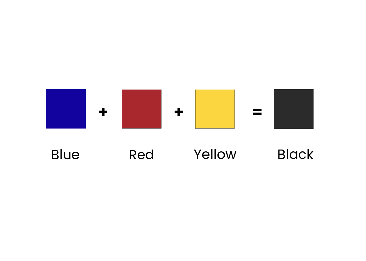
Understanding Subtractive and Additive Color Models in Branding
To answer what primary colors make black, we must first distinguish between the two primary environments where brands live: the physical world (print and products) and the digital world (screens and interfaces). These two realms operate on diametrically opposed scientific principles.
The CMYK Model: How Cyan, Magenta, and Yellow Build Black
In the context of physical branding—business cards, billboards, packaging, and stationery—we use the subtractive color model known as CMYK. In this system, the “primaries” are Cyan, Magenta, and Yellow. Theoretically, when you mix these three colors at 100% saturation, they should absorb all light and produce a pure, deep black.
However, in practical brand application, mixing pure Cyan, Magenta, and Yellow often results in a dark, muddy brown rather than a crisp black. This is due to impurities in physical pigments. To solve this for professional branding, a fourth “Key” color—Black (K)—is added to the mix. This is why the CMYK model is the standard for corporate identity. When a brand strategist asks for the primary colors of black in print, they are looking for the precise ratio of C, M, and Y that creates a “Rich Black,” a version of the color that feels more premium and intentional than standard black ink alone.
The RGB Model: The Absence of Light and Digital Black
Digital branding operates on the additive color model (RGB: Red, Green, Blue). In this space, the primary colors do not “make” black by mixing; rather, black is the result of the total absence of light. When Red, Green, and Blue light are all at 0% intensity, the result is the absolute black we see on our smartphone screens and monitors.
For a brand, managing this transition from the additive “nothingness” of digital black to the subtractive “saturation” of print black is a core challenge of brand management. A logo that looks deep and sophisticated on an OLED screen can look washed out or gray on a printed annual report if the underlying color theory isn’t managed with precision.
The Strategic Importance of “Rich Black” in Corporate Identity
In high-end brand design, “Standard Black” (using only the black ink in a printer) often appears thin or “cool” (slightly blue/grey). To elevate a brand’s visual impact, designers utilize “Rich Black.” This is a custom-mixed black that incorporates percentages of the other primary colors to create a more vibrant, deep, and luxurious finish.
Standard Black vs. Rich Black: Technical Precision for Print
A brand’s technical specifications guide—often called a Brand Bible—will specify the exact formula for its black. Using 100% K (Black) might be sufficient for body text in a document, but for a brand’s primary mark or a background on a luxury box, it lacks the necessary “weight.”
A common “Rich Black” formula used in corporate identity is 60% Cyan, 40% Magenta, 40% Yellow, and 100% Black. This combination creates a neutral, deep black that feels much more substantial to the eye. Some brands choose a “Cool Black” by increasing the Cyan primary, which lends a modern, tech-forward feel. Others opt for a “Warm Black” by boosting Magenta and Yellow, creating a traditional, earthy, and approachable aesthetic. These subtle shifts in the primary color balance are what differentiate a generic brand from a meticulously crafted corporate identity.
Consistency Across Touchpoints: From Digital Screens to Physical Assets
The greatest risk to a brand’s integrity is inconsistency. If a consumer sees a sleek, jet-black advertisement on Instagram but receives a package in a dull, charcoal-grey box, the perceived value of the brand drops. This is why understanding the primary components of black is a business imperative.

Brand managers must ensure that the RGB (0, 0, 0) of the digital world is mapped correctly to the CMYK formulas of the physical world. This involves color calibration and the use of Pantone Matching Systems (PMS). By identifying a specific Pantone Black, such as Pantone Black 6 C, brands can ensure that their primary colors are mixed identically regardless of which printing press is used anywhere in the world.
The Psychology of Black in Brand Strategy
Beyond the physics of light and ink, the decision to use black as a primary brand element carries immense psychological weight. Black is a “color of contradiction.” It can signify power and elegance, or it can signify mourning and darkness. For a brand strategist, the “primaries” that go into black also include the emotional triggers they set off.
Luxury, Authority, and Modernity
Black is the universal shorthand for luxury. Consider brands like Chanel, Prada, or Rolex. Their use of black isn’t accidental. In the world of premium branding, black suggests that the brand does not need to shout for attention. It is confident, timeless, and authoritative.
By utilizing the “Rich Black” formulas discussed earlier, these brands create a visual depth that suggests quality. A high-gloss black finish on a luxury vehicle or a matte black finish on a tech gadget (like the “Midnight” or “Space Grey” options from Apple) communicates a level of engineering precision. In these cases, black is used to frame other elements, making secondary brand colors pop with higher contrast.
Case Studies: Brands that Own the Dark Spectrum
- Nike: Nike’s use of black in its “Swoosh” is a masterclass in versatility. It is bold, energetic, and provides the ultimate contrast against any background. By mastering the primary components of black, Nike ensures its logo remains powerful whether it is embroidered on a jersey or rendered in a 3D digital billboard.
- Apple: Apple moved away from its rainbow origins to a sophisticated palette dominated by blacks, whites, and greys. This shift signaled a move from being a “niche creative tool” to a “global lifestyle authority.” Their precision in digital black (RGB) and physical product finishes (Anodized Aluminum) is a benchmark for the industry.
- Mastercard: While Mastercard is known for its red and yellow circles, its recent brand evolution uses a deep black for its wordmark. This provides a “grounding” effect, lending a sense of security and stability to a financial institution.
Practical Application: Mastering Color Synthesis for Design Professionals
For designers tasked with building a brand from scratch, the “how” of making black is a daily technical hurdle. It requires an understanding of how light interacts with surfaces and how different materials absorb the primary pigments.
Overcoming Common Production Pitfalls
One of the most frequent mistakes in brand production is “Over-saturation.” While adding Cyan, Magenta, and Yellow to Black creates a richer look, adding too much (e.g., 100% of all four) results in “Total Ink Limit” issues. This causes the paper to become oversaturated, leading to smearing, long drying times, and paper warping.
A professional brand identity will specify a “Total Area Coverage” (TAC) that usually does not exceed 240% to 300%. This ensures that the black is as dark as possible without compromising the physical integrity of the marketing material. This level of detail is what separates amateur design from professional brand engineering.
Accessibility and Readability in High-Contrast Branding
In the modern era, brand strategy must also account for accessibility (WCAG standards). When using black as a primary color—especially in digital interfaces—the contrast ratio between the black background and the text is paramount.
Using a “Pure Black” (RGB 0,0,0) on a digital screen can sometimes cause “haloing” or eye strain for users, particularly those with astigmatism. Many leading tech brands now use a “Near Black” or “Dark Grey” (like #121212) for their dark mode interfaces. This still provides the psychological benefits of black while offering a better user experience. Understanding how to pull back on the primary light intensity just enough to aid readability is a key skill for contemporary brand designers.
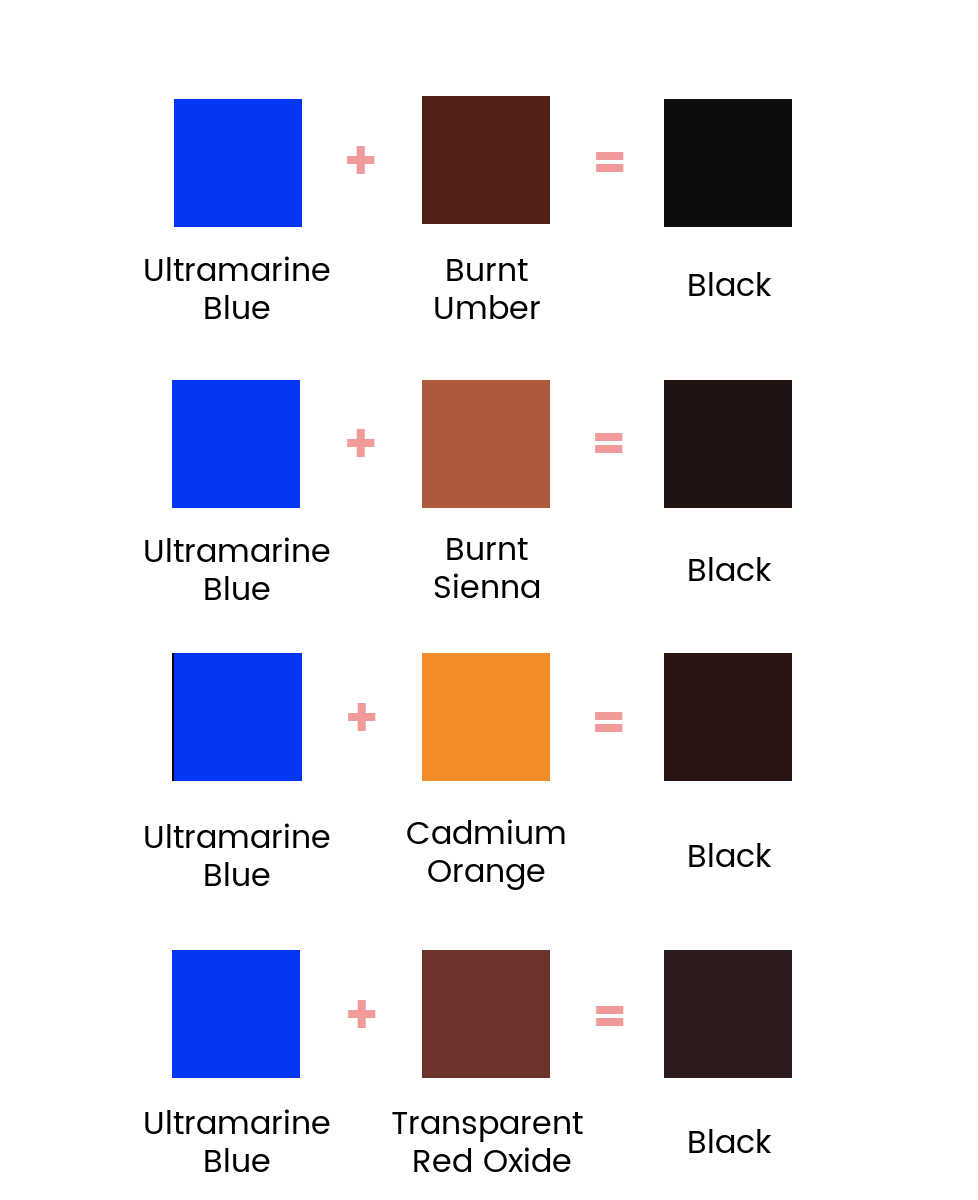
Future-Proofing Your Brand with Color Science
As we move into an era of augmented reality (AR) and advanced display technologies like Micro-LED, the way we define and create black will continue to evolve. Brands that understand the fundamental science—the primary colors and light waves that constitute the dark spectrum—will be better positioned to adapt.
The question “what primary colours make black” is the starting point for a journey into the heart of brand design. It leads to the realization that black is not just a void; it is a carefully constructed tool used to convey prestige, ensure quality, and build a lasting corporate identity. By mastering the balance of Cyan, Magenta, and Yellow in print, and the careful absence of Red, Green, and Blue in digital, brand professionals can create visual identities that are as deep and enduring as the color black itself.
aViewFromTheCave is a participant in the Amazon Services LLC Associates Program, an affiliate advertising program designed to provide a means for sites to earn advertising fees by advertising and linking to Amazon.com. Amazon, the Amazon logo, AmazonSupply, and the AmazonSupply logo are trademarks of Amazon.com, Inc. or its affiliates. As an Amazon Associate we earn affiliate commissions from qualifying purchases.