When you walk into a Lululemon boutique, you aren’t just entering a retail space; you are stepping into a carefully curated ecosystem of lifestyle aspirationalism and high-performance branding. However, for many consumers, a lingering question remains before they even touch a pair of Luon leggings: Why is it called Lululemon?
The name itself is whimsical, rhythmic, and entirely unique in the landscape of athletic apparel. It doesn’t sound like Nike (named after the Greek goddess of victory) or Adidas (a portmanteau of the founder’s name). Instead, Lululemon feels like a phonetic playground. From a brand strategy perspective, the story behind the name is a fascinating—and sometimes controversial—study in linguistics, international marketing, and the deliberate construction of a corporate identity.

The Origin Story: Why “Lululemon” Isn’t Just a Playful Word
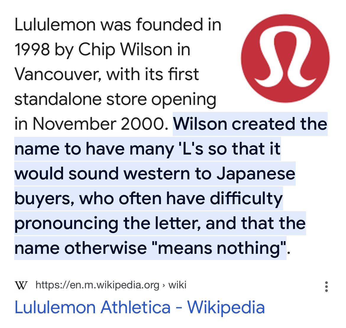
To understand the name Lululemon, one must look at the specific marketing philosophy of its founder, Chip Wilson. In the late 1990s, Wilson had already seen success with his previous venture, Westbeach Surf, and he was beginning to notice a burgeoning trend in Vancouver: the rise of yoga. He didn’t just want to create a clothing company; he wanted to create a brand that felt distinctively “Western” and premium.
The Linguistics of Marketing: Targeting an International Audience
The choice of the name was deeply rooted in Wilson’s observations of the Japanese market. He noticed that Japanese consumers often found it difficult to pronounce the letter “L,” as the phoneme does not exist in the same way in the Japanese language. Wilson believed that a name containing multiple “Ls” would sound quintessentially North American and authentic to an international audience.
By stacking three “Ls” into a single word—Lululemon—he was intentionally creating a brand name that was difficult for certain non-English speakers to pronounce. The logic, however controversial it may be today, was a calculated brand strategy: the difficulty of pronunciation served as a marker of “Western” exclusivity and imported status.
Chip Wilson’s Controversial Choice and Brand Provocation
From a modern corporate identity standpoint, the origin of the name is often cited as a cautionary tale of “brand provocation.” Wilson once famously noted that he found it funny to watch Japanese people try to say the name. While this admission sparked significant backlash years later, at the time of the brand’s inception, it was part of a ruthless focus on creating a brand that could not be easily mimicked or “knocked off” by foreign markets. It was a branding exercise in phonetic ownership. Wilson wanted a name that had “no roots” and “no meaning” other than what he would eventually imbue it with.
Building the Visual Identity: More Than Just a Logo
A name is only as strong as the symbol that represents it. For Lululemon, the visual identity is just as recognizable as the name, yet it contains its own set of brand mysteries. The “Lululemon logo”—that stylized, upside-down “U” or stylized “A”—is a masterclass in minimalist design that serves as a badge of honor for its community.
The Emblem: An “A” for Effort?
Many people assume the Lululemon logo is a stylized “L” or perhaps a representation of a woman’s hair and face. In reality, the logo predates the name Lululemon. When Wilson was first brainstorming the company, the original name he had in mind was “Athletically Hip.”
The logo we see today is actually a stylized “A” designed for that original name. Although “Athletically Hip” was eventually discarded in favor of the more rhythmic “Lululemon,” the design team liked the logo so much that they decided to keep it. This is a classic example of “visual equity” in brand strategy. By the time the name was finalized, the symbol had already begun to resonate with the early yoga community in Vancouver. Rather than starting from scratch, the brand leaned into the existing aesthetic, proving that a logo doesn’t always need to be a literal representation of the brand’s initials to be effective.
The Color Palette and Typography of High-End Athleisure
Lululemon’s brand identity is further solidified by its use of typography and color. The brand primarily uses a bold, sans-serif typeface that conveys stability and modernity. The color red, often used in their shopping bags and store signage, signifies energy, passion, and vitality—all traits associated with their target demographic. By combining a playful, nonsensical name with a serious, high-end visual identity, the brand created a unique tension that differentiated it from the “rugged” branding of competitors like North Face or the “aggressive” branding of Under Armour.
The Lululemon Manifesto: Cultivating a Lifestyle Brand
If the name was the hook and the logo was the bait, the “Manifesto” was the philosophy that reeled the customers in. Lululemon did not just sell yoga pants; they sold a vision of how to live a better life. This is where the brand transitioned from a corporate identity to a full-scale cultural movement.
Creating a Community, Not Just a Customer Base
One of the most brilliant aspects of the Lululemon brand strategy was the “Ambassador Program.” Instead of spending millions on traditional television commercials, Lululemon invested in local yoga instructors and fitness leaders. These individuals were given free gear and a platform in exchange for building a community around the store.
This strategy turned the retail locations into community hubs. The name “Lululemon” became synonymous with a specific lifestyle: one of mindfulness, physical health, and personal growth. In marketing terms, this is known as “referential branding.” The value of the product is derived from the social circle it places you in. When you wear the “A” logo, you are signaling to the world that you are part of a specific tribe that values the principles of the Lululemon Manifesto.
From Niche Yoga Studio to Global Fashion Dominance
The name Lululemon has evolved significantly from its Vancouver roots. Today, it represents a global standard for “athleisure”—a term Lululemon essentially helped invent. The brand strategy shifted from being a “yoga brand” to a “human performance brand.” By diversifying into running, swimming, and even professional office wear, the brand identity proved flexible enough to transcend its original niche. The name, which once seemed odd and cumbersome, now carries the weight of a multi-billion dollar luxury powerhouse.
Brand Strategy and the Power of Premium Positioning
A critical component of the Lululemon identity is its uncompromising premium positioning. The brand has famously avoided the “sale” culture that plagues many other retailers. By maintaining high price points and a controlled supply chain, the brand has protected its “brand equity.”
Scarcity and Exclusivity: The Inventory Model
Lululemon’s marketing strategy often relies on “scarcity.” They frequently release limited-edition prints and colors that are never restocked. This creates a “buy it now or lose it forever” mentality among their loyalists. This strategy reinforces the brand identity as something exclusive and highly sought after. It’s not just a pair of leggings; it’s a collectible. The name “Lululemon” thus becomes associated with the thrill of the find and the status of owning something rare.
The Vertical Integration Advantage
Unlike many competitors who sell through third-party department stores, Lululemon maintains a vertically integrated model. By owning the majority of their retail locations, they have total control over the brand experience—from the scent of the candles in the store to the way the employees (called “Educators”) speak to the customers. This level of control ensures that the brand identity is never diluted. Every touchpoint is a reinforces the “Lululemon” story.
Lessons in Modern Branding: Resilience and Evolution
The history of the Lululemon name and brand is a testament to how corporate identity can survive and even thrive through evolution and controversy. It highlights the importance of having a clear, even if unconventional, vision from the start.
Navigating Controversy while Maintaining Brand Equity
Despite the controversies surrounding Chip Wilson’s comments on the name and women’s body types, the brand has shown remarkable resilience. This is largely because the brand identity had become bigger than its founder. The community-centric model and the high quality of the product created a “brand moat” that protected the company during leadership transitions. Modern Lululemon has distanced itself from Wilson’s original comments, pivoting toward inclusivity and diversity, yet the name remains—a phonetic relic that has been successfully rebranded for a new generation.
The Future of the Lululemon Identity in a Competitive Market
As the athleisure market becomes increasingly crowded with brands like Alo Yoga and Vuori, Lululemon continues to rely on its established brand equity. The name “Lululemon” now serves as a gold standard. Its strategy moving forward involves leveraging its name to enter new categories, such as footwear and digital fitness.
In conclusion, the name Lululemon is a masterclass in how a word with no inherent meaning can be transformed into a global symbol of status and wellness. It was born out of a specific, calculated marketing tactic to sound “Western,” but it grew into something much more profound. Through strategic community building, premium positioning, and a visual identity that remains iconic, Lululemon has proven that what you call a brand is only the beginning; it’s the lifestyle you build around that name that truly defines its success.
aViewFromTheCave is a participant in the Amazon Services LLC Associates Program, an affiliate advertising program designed to provide a means for sites to earn advertising fees by advertising and linking to Amazon.com. Amazon, the Amazon logo, AmazonSupply, and the AmazonSupply logo are trademarks of Amazon.com, Inc. or its affiliates. As an Amazon Associate we earn affiliate commissions from qualifying purchases.