
In the landscape of modern retail, few names carry as much weight, recognition, and distinctiveness as Lululemon. From its humble beginnings in a Vancouver yoga studio to its current status as a multibillion-dollar global titan of “athleisure,” the brand has rewritten the playbook on corporate identity. Yet, for many consumers, the name “Lululemon” remains a phonetic puzzle—a whimsical, repetitive string of syllables that lacks an obvious connection to yoga, fitness, or high-performance apparel.
The story behind the naming of Lululemon is not one of focus groups or linguistic experts searching for a word that denotes “flexibility” or “strength.” Instead, it is a masterclass in unconventional brand strategy, phonetic positioning, and the risky, often controversial vision of its founder, Chip Wilson. Understanding why the brand was named Lululemon provides deep insights into how corporate identity can be built on the back of memorability, market psychology, and a calculated disregard for traditional naming conventions.

The Phonetic Architecture: Why Chip Wilson Chose the Letter “L”
To understand the name Lululemon, one must first understand the branding philosophy of Chip Wilson in the late 1990s. Before founding the yoga giant, Wilson was involved with a skateboard brand called “Homeless.” He noticed an interesting phenomenon when selling products in Japan: Japanese consumers often associated the letter “L” with Western authenticity. Because the “L” sound does not exist in the Japanese language in the same way it does in English, brands that featured the letter were perceived as exotic, premium, and undeniably American or Canadian.
The Japanese Market Strategy
Wilson’s experience with “Homeless” taught him that Japanese buyers were willing to pay a premium for brands that they struggled to pronounce, as the phonetic difficulty served as a marker of the brand’s foreign origin. When it came time to launch his new yoga-focused venture in 1998, Wilson decided to double down on this concept. He didn’t just want one “L”; he wanted as many as possible.
The goal was to create a name that was phonetically “Western” to an extreme degree. By stringing together three “L”s across four syllables, Wilson created a brand name that was designed to be a phonetic challenge for certain international markets while remaining catchy and rhythmic for North American ears. From a brand strategy perspective, this was a move toward “phonetic branding”—using the literal sound of a word to evoke a specific cultural or geographic association, regardless of what the word actually meant.
The Creation of the Name
Wilson reportedly toyed with dozens of variations before landing on Lululemon. The name does not have a Greek or Latin root, nor is it an acronym. It was essentially a nonsensical word constructed for its acoustic properties. In various interviews, Wilson has admitted that the name was an intentional attempt to see if he could create a brand that sounded “so Western” that it would command immediate prestige in the burgeoning global marketplace. While this approach was later criticized for its cultural insensitivity, from a pure branding mechanics standpoint, it achieved its goal: it created a unique, proprietary word that was impossible to confuse with any other company in the athletic space.
The Visual Identity: The Mystery of the Stylized “A”
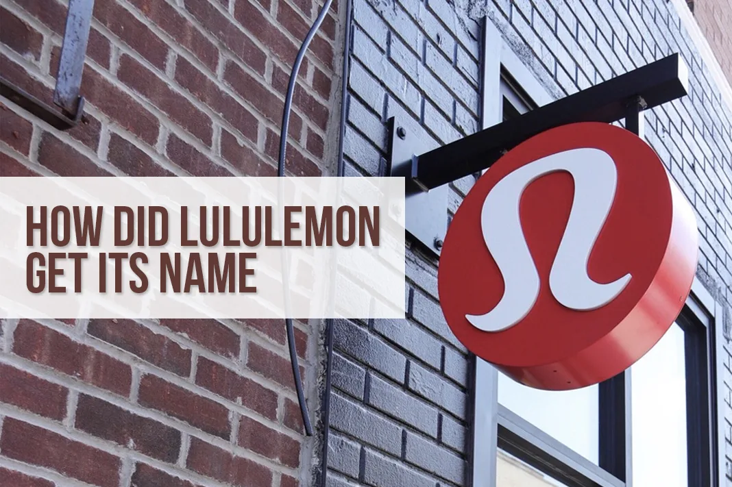
A fascinating component of Lululemon’s brand strategy is the disconnect between its name and its logo. If one looks closely at the Lululemon logo—often seen on the waistband of leggings or the back of hoodies—it is clearly a stylized letter “A.” For a company named Lululemon, the choice of an “A” logo seems counterintuitive.
The “Athletically Hip” Pivot
The discrepancy exists because “Lululemon” was not the original frontrunner for the brand’s name. In the early developmental stages, Wilson had considered the name “Athletically Hip.” The logo was designed to be a stylized version of that “A.” When the decision was made to pivot to the more idiosyncratic “Lululemon,” the logo had already tested exceptionally well with early adopters.
Rather than redesigning the logo to feature an “L,” the company made the strategic choice to keep the “A.” This decision highlights a key principle in corporate identity: visual equity often trumps literal consistency. The logo—a sleek, modern emblem that some mistake for a stylized Greek letter or a lock of hair—had already begun to signify a certain level of quality and community. By decoupling the name from the visual mark, Lululemon created a “mystique” around its branding that encouraged consumer inquiry and storytelling.
Logo as a Badge of Belonging
In the world of luxury and premium lifestyle branding, the logo functions as a badge. Lululemon’s logo became a signifier of the “yoga lifestyle.” Because the logo didn’t explicitly spell out the name or look like a traditional sports brand (like the Nike Swoosh or the Adidas stripes), it felt more like an exclusive club emblem. This helped the brand transition from being a mere apparel manufacturer to a lifestyle curator.
The Controversial Genesis and Brand Resilience
The naming of Lululemon is inseparable from the controversy surrounding Chip Wilson’s remarks regarding his motivations. Wilson’s admission that he found the phonetic struggle of Japanese speakers “funny” created a significant PR challenge for the brand as it scaled globally. From a brand strategy perspective, this serves as a cautionary tale: the internal logic used to create a brand name can eventually become public knowledge and impact brand perception.
Managing Founder Risk
As Lululemon grew, the corporate identity had to be distanced from the founder’s personal views. The brand’s strategy shifted from Wilson’s original phonetic experimentation toward a focus on technical innovation and community empowerment. This transition is a vital case study in how a brand can outgrow its origin story. Lululemon successfully pivoted its narrative, ensuring that the “Lulu” in the name came to represent “Love” or “Lifestyle” in the minds of consumers, rather than its original, more cynical roots.
The Power of Alliteration and Rhythm
Despite the controversy, the name Lululemon survived because it adhered to the “Rule of Three” in marketing. It is rhythmic, alliterative, and fun to say. In the world of branding, “mouthfeel”—the way a word feels when spoken—is a real metric. “Lululemon” has a playful, bouncy cadence that contrasted sharply with the aggressive, masculine names of traditional sports brands like Reebok, Under Armour, or Nike. This helped Lululemon carve out a space that felt feminine, approachable, and premium all at once.
Building a Community-Centric Corporate Identity
A name is only as strong as the culture built around it. Lululemon’s brand strategy succeeded because the name became a vessel for a very specific set of values, codified in the “Lululemon Manifesto.”
The Manifesto as Brand Pillar
The company didn’t just sell yoga pants; it sold a philosophy. By printing its manifesto—a collection of aphorisms like “Do one thing a day that scares you” and “Breathe deeply”—on its shopping bags, the brand gave the name “Lululemon” a moral and philosophical weight. This transformed the name from a nonsensical word into a shorthand for self-improvement and “mindful living.”
In brand strategy, this is known as “Value-Based Branding.” Lululemon’s identity was built on the idea that if you wore the brand, you were the type of person who cared about health, personal growth, and community. The name became a “container” for these aspirations. When someone says they are “wearing Lulu,” they aren’t just describing their clothes; they are signaling their membership in a specific socioeconomic and cultural demographic.
The Store as a Community Hub
Lululemon’s retail strategy also reinforced its brand name. By offering free yoga classes in-store and hiring “ambassadors” from the local fitness community, the brand ensured that the name Lululemon was associated with real-world human connection. This “grassroots” approach meant that the brand didn’t need to spend as much on traditional advertising; the name spread through word-of-mouth within the very communities that defined its market.

Lessons in Modern Branding from the Lululemon Case Study
The story of Lululemon’s name offers several critical takeaways for brand strategists and entrepreneurs:
-
Distinctiveness Over Meaning: A brand name does not need to describe what the company does. In fact, nonsensical or “empty vessel” names like Lululemon or Google can be more powerful because the company can define the meaning from scratch, without being pigeonholed by existing definitions.
-
Phonetic Strategy Matters: The way a brand sounds is as important as how it looks. The repetition of the “L” sound in Lululemon makes it memorable and gives it a unique acoustic signature in a crowded marketplace.
-
Visual Equity is Fluid: You don’t always need a perfect match between your name and your logo. If a visual mark resonates with your audience, that equity is worth more than a pedantic alignment with the company’s initials.
-
Community Anchoring: A unique or even controversial name can be anchored by a strong community and a clear set of values. Lululemon’s success lies in its ability to make a strange name feel like a warm, welcoming community.
Lululemon’s name is a reminder that in the world of branding, the “why” is often a mix of strategy, accident, and evolution. While the name began as a calculated phonetic experiment aimed at a specific international perception, it evolved into one of the most powerful lifestyle brands in history. It proves that a name doesn’t have to be perfect; it just has to be unforgettable. Through a combination of bold phonetic choices, a community-first approach, and a commitment to high-quality product design, Lululemon has ensured that its name is synonymous with the very peak of the global wellness industry.
aViewFromTheCave is a participant in the Amazon Services LLC Associates Program, an affiliate advertising program designed to provide a means for sites to earn advertising fees by advertising and linking to Amazon.com. Amazon, the Amazon logo, AmazonSupply, and the AmazonSupply logo are trademarks of Amazon.com, Inc. or its affiliates. As an Amazon Associate we earn affiliate commissions from qualifying purchases.