
The Foundation of Design: Understanding Watercolor Paper Weight
In the world of design, where every detail contributes to the overarching message and perception of a brand, the choice of materials is paramount. For designers and artists working with watercolor, the weight of the paper is not merely a technical specification; it is a critical decision that profoundly impacts the quality, longevity, and professional presentation of their work. Ultimately, this choice directly reflects on the creator’s brand identity and the perceived value of their output.
Paper weight is typically measured in pounds (lb) for US markets or grams per square meter (GSM) for international standards. These figures indicate the density and thickness of the paper. A higher number signifies a heavier, thicker sheet. Why does this matter so significantly for watercolor? Unlike dry media, watercolor painting involves a substantial amount of water. Water interacts with paper in unique ways, causing thinner papers to buckle, warp, or even tear. The right paper weight provides the stability and absorption necessary to handle wet techniques without compromising the integrity of the artwork.
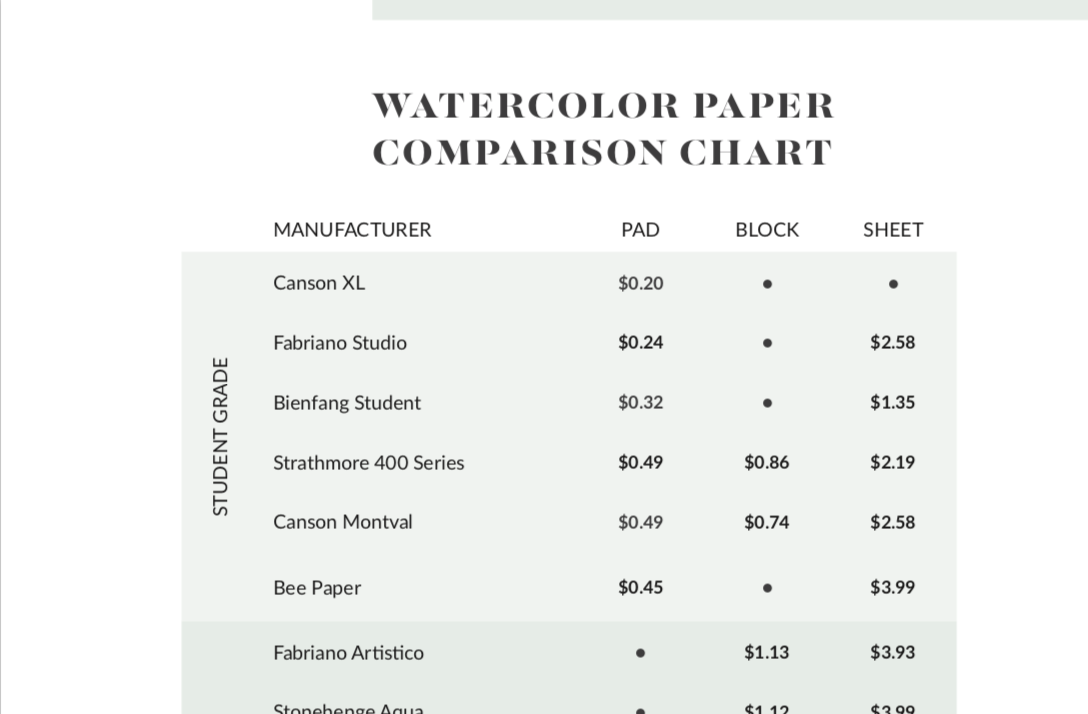
For any designer or agency, the finished product — whether an illustration for a marketing campaign, a fine art piece for a corporate collection, or a unique visual element for a branding project — must exude quality. Subpar paper can lead to an artwork that looks unprofessional, with wavy surfaces or colors that bleed unevenly. Such flaws can detract from the artistic intent and, more critically, diminish the perceived value of the design, thereby weakening the creator’s or client’s brand image. Investing in appropriate paper weight is, therefore, an investment in quality control and brand integrity.
Common Watercolor Paper Weights and Their Design Implications
The range of watercolor paper weights available caters to different needs, techniques, and budgets. Understanding the characteristics and optimal use cases for each weight is essential for making informed design decisions that uphold professional standards.
Lightweight Papers (90 lb / 190 GSM and less)
Lightweight watercolor papers, typically ranging from 90 lb (190 GSM) down to 60 lb (130 GSM), are the thinnest available for watercolor applications. Their primary characteristic is their propensity to buckle and warp significantly when exposed to water. This makes them challenging for anything beyond the lightest washes.
Design Use: These papers are generally reserved for quick sketches, preliminary studies, color tests, and practice exercises where the final aesthetic quality is not the primary concern. They are suitable for exploring ideas, trying out new techniques, or creating loose visual notes that won’t be presented externally. Due to their thinness, they absorb less water and dry quickly, which can be advantageous for rapid idea generation but detrimental for layered, complex washes.
Branding Angle: From a branding perspective, lightweight papers are rarely suitable for professional presentations, client deliverables, or any work intended for public display. The buckling and potential for ink to show through to the other side communicate a lack of polish and attention to detail. While cost-effective for internal exploration, using such paper for client work could inadvertently suggest a lower perceived value of the design and the designer’s services, potentially undermining a brand’s commitment to quality.
Medium-Weight Papers (140 lb / 300 GSM)
The 140 lb (300 GSM) paper weight is often considered the industry standard and a versatile workhorse for watercolor artists and designers. It strikes an excellent balance between cost, stability, and performance.
Design Use: This weight is robust enough to handle moderate to heavy washes without excessive buckling. While some slight cockling might occur with very wet techniques, it can often be mitigated by stretching the paper beforehand or by the paper flattening out as it dries. 140 lb paper is suitable for a vast array of applications, including finished illustrations, fine art paintings, custom stationery designs, architectural renderings, and commissioned works. It allows for layering, lifting, and various wet-on-wet techniques, providing a reliable surface for expressing complex design ideas. Its widespread availability and relative affordability make it a go-to choice for many professional projects.
Branding Angle: Opting for 140 lb paper is a professional choice that communicates competence and a commitment to quality without necessarily reaching for the most luxurious option. For most design projects and client presentations, this paper weight is perfectly adequate and will result in a visually pleasing and structurally sound piece of art. It allows designers to produce high-quality work that reflects positively on their brand, ensuring that the physical medium supports and enhances the artistic message rather than detracting from it. It’s often the default for establishing a consistent baseline of quality in design output.
Heavyweight Papers (300 lb / 640 GSM and more)
Heavyweight watercolor papers, starting at 300 lb (640 GSM) and going up to 400 lb (850 GSM) or even more, are the pinnacle of stability and luxury in watercolor paper. Their significant thickness and density mean they can withstand extreme amounts of water without any noticeable buckling.
Design Use: These papers are ideal for techniques involving multiple heavy washes, intense layering, and very wet applications where perfect flatness is crucial. They are often chosen for large-scale artworks, pieces intended for archival preservation, high-end commissions, and situations where the physical quality of the paper itself is a key component of the art’s value. The thickness also provides a luxurious feel and a substantial presence, making the finished piece feel more significant and durable.
Branding Angle: Utilizing heavyweight paper is a powerful statement of premium quality and attention to detail. For designers working with luxury brands, creating high-value collectible art, or producing pieces where permanence and prestige are paramount, 300 lb paper is an indispensable choice. It elevates the perceived value of the artwork and, by extension, the designer’s brand. This paper choice signals a commitment to excellence and an unwillingness to compromise on materials, directly reinforcing a brand image that is sophisticated, reliable, and high-end. When the physical artifact itself needs to convey a sense of gravitas and lasting quality, heavyweight paper is the ultimate choice.

Beyond Weight: Surface, Composition, and Their Design Synergy
While paper weight is a critical factor, the optimal design outcome also depends on other attributes of watercolor paper, which interact synergistically with weight to define the final aesthetic and functional qualities of the artwork. These aspects further contribute to a designer’s brand identity through the quality of their material selection.
Hot-Press vs. Cold-Press vs. Rough
The surface texture of watercolor paper significantly influences how paint behaves and the overall visual effect of a design.
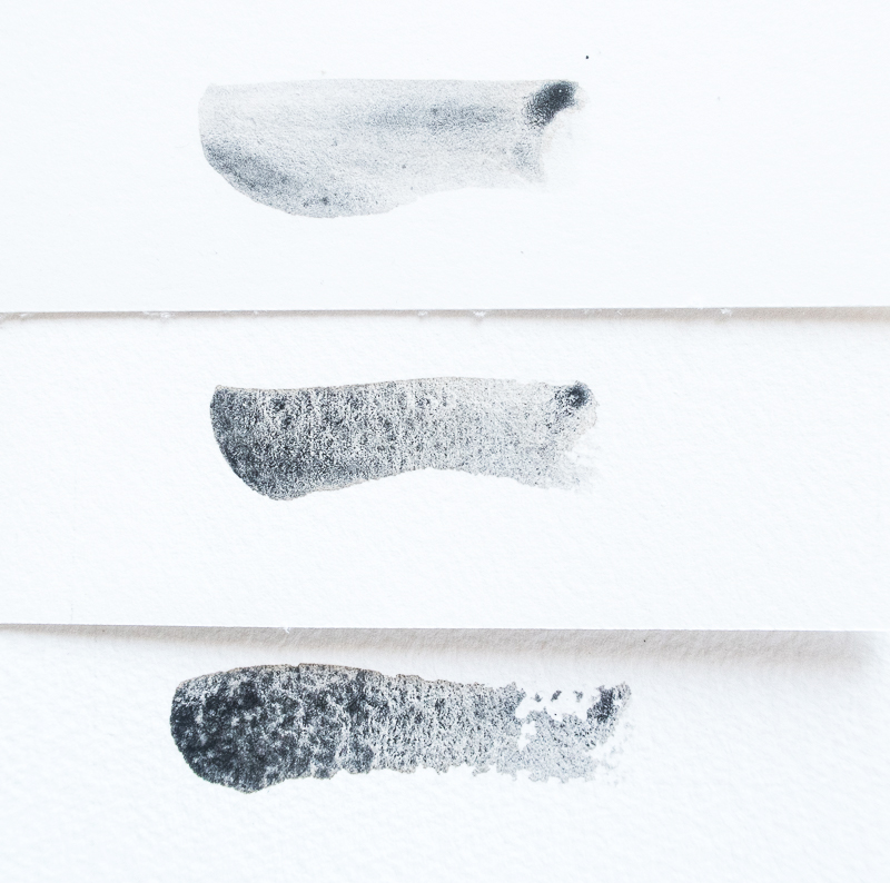
- Hot-Press: Features a very smooth surface. This texture is excellent for fine detail, precise lines, and smooth washes, as the paint sits more on the surface rather than sinking into valleys. For graphic designers creating detailed botanical illustrations, architectural renderings, or precise commercial art, hot-press paper paired with an appropriate weight allows for crisp definition that communicates precision and clarity—key aspects of a professional brand.
- Cold-Press: The most common texture, offering a slight tooth or medium texture. It provides a good balance for both detailed work and broad washes, capturing pigment in its subtle valleys to create a vibrant, textured look. This versatility makes it a favorite for many general design applications, allowing for a range of styles that reflect adaptability and broad skill.
- Rough: As its name suggests, rough paper has a heavily textured surface. This tooth creates a distinct, granular effect as paint settles into the deep valleys, leaving specks of white paper visible and enhancing the luminosity of washes. It’s ideal for landscapes, expressive styles, or designs where texture itself is a deliberate artistic element, conveying an organic or painterly brand aesthetic.
Choosing the right surface texture, in conjunction with weight, helps designers achieve specific visual outcomes, aligning the material’s properties with the brand’s aesthetic vision—whether that’s sleek modernity, versatile classicism, or rustic authenticity.
Cotton vs. Wood Pulp
The composition of watercolor paper dictates its archival quality and durability, fundamental considerations for any design meant to last.
- 100% Cotton (Rag Paper): Cotton fibers are naturally long and robust, resulting in paper that is exceptionally strong, durable, and naturally acid-free. This ensures that the paper will not yellow or become brittle over time, preserving the vibrancy and integrity of the artwork for centuries. For designers producing fine art, commissioned pieces, or any work intended for long-term display or collection, 100% cotton paper is the professional choice. It reflects a commitment to lasting quality and an understanding of archival standards, directly enhancing the value and legacy of the designer’s brand.
- Wood Pulp (Cellulose Paper): Often less expensive, wood pulp papers are suitable for practice or studies. However, unless they are specifically labeled “acid-free” or “archival quality,” they may degrade over time, yellowing and becoming fragile. While budget-friendly for preliminary work, reliance on non-archival wood pulp for final deliverables can undermine a designer’s reputation for producing lasting, high-quality work.
The Role of Sizing
Sizing refers to chemicals added to the paper pulp (internal sizing) or applied to the surface of the paper (external sizing) to control its absorbency. Proper sizing is crucial for watercolor paper. Without it, the paint would simply soak into the paper like a sponge, resulting in dull, uncontrollable washes.
Good sizing allows the paint to sit on the surface longer, enabling artists to manipulate washes, blend colors, and create delicate glazes without the paper becoming oversaturated too quickly. This control is vital for achieving refined design details and vibrant colors. The quality of sizing, alongside weight and composition, ensures that a designer has the technical control needed to execute their vision flawlessly, a hallmark of a truly professional output.
Making the Professional Choice: Aligning Paper Weight with Design Intent and Brand Message
The selection of watercolor paper weight, along with its surface and composition, is not just about technical suitability; it’s a strategic decision that aligns directly with a designer’s intent, project requirements, and ultimately, their brand identity.
Project Requirements and Budget Considerations
For every design project, there’s an optimal paper choice. A designer must weigh the project’s specific needs against practical constraints, including budget. For a high-stakes client presentation, a large-scale mural proposal, or a piece intended for a gallery exhibit, investing in heavyweight, 100% cotton paper is a wise decision. The enhanced stability and luxurious feel contribute to the perceived value of the work and the designer’s professionalism. Conversely, for quick concept sketches or high-volume internal mock-ups, a medium-weight paper might suffice, balancing quality with cost-effectiveness. The key is to make a conscious choice that elevates the relevant output, rather than compromising on quality where it matters most for the brand.
The Artist’s/Designer’s Brand Identity
A designer’s choice of materials is an extension of their personal or corporate brand. Just as a luxury fashion brand sources premium fabrics, a watercolor designer’s selection of paper reflects their commitment to quality and their distinctive aesthetic. Consistently choosing high-grade, appropriate paper weights for final works reinforces a brand identity built on excellence, durability, and a keen eye for detail. This material consistency helps build a signature style, communicates reliability, and sets a high benchmark for the designer’s output, allowing their work to stand out in a competitive landscape.
Client Expectations and Perceived Value
The tangible quality of a design directly influences client perception. Handing over a watercolor illustration on a warped, thin paper, regardless of the artistic merit, can subtly diminish a client’s appreciation and valuation of the work. In contrast, presenting a meticulously crafted piece on a substantial, archival-quality paper instantly elevates its perceived value. Clients often appreciate and expect professionalism in every aspect, and the physical medium is a significant part of that experience. By carefully selecting the appropriate paper weight, designers don’t just protect their artwork; they protect and enhance their brand’s reputation for delivering superior quality and thoughtful execution, fostering trust and repeat business. In the nuanced world of design, the very “feel” of a finished piece can speak volumes about the creator’s dedication and brand promise.
aViewFromTheCave is a participant in the Amazon Services LLC Associates Program, an affiliate advertising program designed to provide a means for sites to earn advertising fees by advertising and linking to Amazon.com. Amazon, the Amazon logo, AmazonSupply, and the AmazonSupply logo are trademarks of Amazon.com, Inc. or its affiliates. As an Amazon Associate we earn affiliate commissions from qualifying purchases.