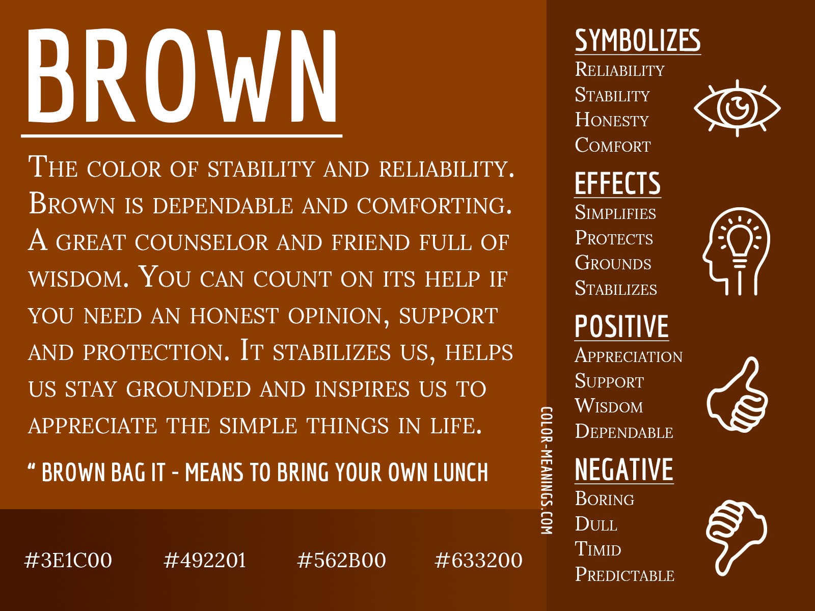
In the competitive landscape of modern aesthetics, color psychology is the silent partner of every successful brand. While the tech world gravitates toward “trustworthy” blue and the food industry is dominated by “appetizing” red, the color brown has long been relegated to the periphery. Often dismissed as drab, utilitarian, or secondary, brown is undergoing a profound transformation. In the context of contemporary brand strategy, brown is no longer just a color of utility—it is the color of heritage, sustainability, and authentic luxury.
The Psychology of Earth and Authenticity
Brand strategy is fundamentally about signaling values before a single word is read. Brown, in its various iterations from terracotta and ochre to deep espresso and mahogany, communicates a set of psychological triggers that are becoming increasingly valuable in a hyper-digitalized market.

Grounding in a Digital Age
Consumers are experiencing “screen fatigue.” As artificial intelligence and neon-hued digital interfaces dominate the workspace, there is a psychological pivot toward grounding. Brown acts as a visual anchor. It evokes the natural world, the texture of earth, and the stability of raw materials. Brands that utilize brown palettes are signaling to their audience that they are solid, dependable, and tethered to the physical world. This is not just a design choice; it is a strategic repositioning to capture the “conscious consumer” who feels overwhelmed by the synthetic gloss of digital-native brands.
The Shift from Dirt to Depth
Historically, brown was associated with poverty or the mundane. However, the current evolution of brand identity has reclaimed the spectrum of browns as symbols of sophistication. Think of the difference between a high-end leather bag and a cheap synthetic copy; the brown leather possesses depth, patina, and complexity. By leaning into these richer, more textured shades, brands can move away from the flat, sterile minimalism of “Big Tech” design and toward a warmer, more human-centric identity.
Strategic Implementation in Brand Design
Executing a brown-centric brand identity requires a nuanced understanding of contrast and material application. Unlike primary colors, which often demand bold, singular usage, brown thrives on complexity.
Texture as a Brand Asset
When a brand selects brown as a primary identifier, it must embrace the inherent relationship between the color and the medium. A flat brown digital square is unappealing; however, a brown canvas on a heavy, textured paper stock, or a matte-finish brown UI element with subtle grain, transforms the color into an experience. Designers must treat brown not as a pigment, but as a tactile element. This is why coffee shops, artisanal bakeries, and heritage fashion labels lean into this color—the brown is not just “there”; it is a representation of the organic nature of the product itself.
The Palette of Sustainability
Perhaps the most potent strategic application of brown in the modern market is its role in “eco-conscious branding.” While green has been the traditional signal for environmental responsibility, it has become overused to the point of cliché. Brown, conversely, signals “raw,” “recycled,” and “unprocessed.” For companies focused on circular economy initiatives, shifting the color palette toward kraft paper tones and deep soil hues differentiates the brand immediately. It bypasses the “greenwashing” fatigue of the consumer and presents a visual narrative of authenticity—the brand is not just claiming to be sustainable; it looks sustainable.
Brown as a Catalyst for Luxury and Heritage
In luxury brand strategy, the most powerful visual cues are those that communicate longevity. High-end brands do not chase the trends of the season; they rely on colors that signify timelessness.
The “Patina” Strategy
Luxury brands like Hermès or Louis Vuitton have long utilized brown not as a primary color, but as a foundation. It represents the aging process—the patina that leather acquires over time. This is a critical psychological hook. When a brand uses brown in its identity, it promises the consumer that the product will not just survive use, but improve with age. It is the antithesis of the “disposable” culture associated with mass-market retail. By adopting a brown-forward identity, newer, smaller brands can subconsciously “borrow” this sense of history, suggesting that their products have the same enduring quality as legacy institutions.
Differentiating Through Warmth
In a sea of black, white, and gray minimalist branding—the so-called “millennial aesthetic”—brown offers a way to stand out without resorting to aggressive or high-saturation colors. It provides a warm, sophisticated alternative that creates a sense of intimacy. If white branding feels clinical and black branding feels corporate or edgy, brown branding feels welcoming. It bridges the gap between professionalism and accessibility, making it an ideal choice for service-based brands that want to build long-term relationships with their clients.
The Future of Earth-Tones in Brand Strategy
The trend of “brown-scaping” is likely to expand as brand strategy moves away from the aggressive growth-at-all-costs ethos of the 2010s and toward a focus on community, well-being, and longevity.
Beyond the Trend Cycle
One of the dangers of choosing a trendy color is that it anchors the brand in a specific moment. Brown, however, is timeless. It is the color of the landscape, the color of wood, and the color of history. Because it does not fluctuate with the whims of digital design trends (like gradients or neon accents), a brown-based brand identity is remarkably durable. This is an efficient investment for companies looking to minimize the need for frequent rebrands.
Integrating Brown into Modern UX/UI
While brown has historically been an analog color, the challenge for digital designers is to bring that warmth into the high-contrast world of mobile displays. Successful brands are doing this by moving away from stark white backgrounds in favor of soft “off-white” or “vanilla” bases paired with deep, chocolate-brown typography. This reduces eye strain and creates a more human, editorial feel for the user experience. By replacing standard “black” text with a dark, warm brown, brands can make their digital presence feel curated and intentional rather than purely functional.
In summary, brown is the most underrated asset in a brand strategist’s toolkit. It is the color of reliability in a chaotic market, the texture of sustainability in an era of environmental concern, and the mark of luxury in a world of disposable goods. For brands willing to move past the traditional associations of the color, brown offers a path to genuine differentiation. It is a bold, quiet, and deeply strategic choice for any organization looking to build a brand that resonates on a human level, signaling that the company is not just interested in the transaction of the moment, but in the enduring value of the future.
aViewFromTheCave is a participant in the Amazon Services LLC Associates Program, an affiliate advertising program designed to provide a means for sites to earn advertising fees by advertising and linking to Amazon.com. Amazon, the Amazon logo, AmazonSupply, and the AmazonSupply logo are trademarks of Amazon.com, Inc. or its affiliates. As an Amazon Associate we earn affiliate commissions from qualifying purchases.