The year was 1971. In the damp, cobblestoned corridors of Seattle’s Pike Place Market, a small storefront opened its doors, not as the global café titan we know today, but as a humble retailer of high-quality coffee beans and equipment. While many casual consumers might only recognize the brand by its ubiquitous green logo and premium lattes, the foundational year of 1971 is the bedrock of one of the most sophisticated brand strategies in corporate history.
Understanding what year Starbucks began is more than a trivia point for historians; it is a case study for brand architects and marketers. It marks the transition from a localized commodity business to a global lifestyle brand that redefined the “Third Place” in modern society. To analyze the Starbucks brand is to analyze the intersection of heritage, visual storytelling, and strategic positioning.
![]()
The Genesis of the Third Place: 1971 and the Birth of a Brand
When Jerry Baldwin, Zev Siegl, and Gordon Bowker founded Starbucks in 1971, the brand was centered on a singular, high-fidelity promise: bringing the world’s finest coffees to Seattle. At this stage, the brand was a purist’s haven. There were no chairs, no Wi-Fi, and certainly no Frappuccinos. This era established the brand’s “Heritage DNA,” a crucial component that modern Starbucks marketing still leans on to justify its premium status.
From Peet’s Influence to Pike Place Market
The brand strategy of 1971 was heavily influenced by Alfred Peet, the founder of Peet’s Coffee. The original Starbucks founders were proteges of Peet, and their early corporate identity was built on “The Craft.” By focusing on dark-roasted beans—a rarity in a 1970s America dominated by canned, pre-ground coffee—Starbucks positioned itself as an artisanal authority. This “expert” persona is a cornerstone of brand identity. It suggests that the company is not just a seller, but a curator. Even today, despite its massive scale, the brand uses its 1971 origins to maintain an aura of “small-batch” credibility.
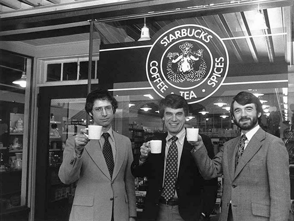
The Original Logo: Why the Siren Matters
Visual identity is perhaps the most recognizable element of the Starbucks brand. In 1971, the founders chose a twin-tailed mermaid, or siren, from a 16th-century Norse woodcut. The choice was deeply strategic, even if intuitive at the time. The siren was intended to be as seductive as the coffee itself, echoing the seafaring traditions of early coffee traders and the port city of Seattle. This link to history and mythology gave the brand a sense of “Old World” mystery, separating it from the sterile, industrial branding of mid-century American food corporations.
Transforming Product into Experience: Howard Schultz and the Italian Inspiration
While the brand began in 1971, its current global identity was forged in 1983. This was the year Howard Schultz, who had joined the company as Director of Retail Operations and Marketing, traveled to Milan. He realized that the brand should not just be about the beans, but about the experience of the beverage. This realization shifted Starbucks from a retail product brand to a service and lifestyle brand.
The 1983 Trip that Changed Everything
Schultz’s vision was to bring the romance of the Italian espresso bar to America. This required a radical pivot in brand strategy. It wasn’t enough to sell the ingredients; Starbucks had to sell the ritual. This era saw the introduction of the “Barista” as a key brand ambassador. By naming their employees Baristas and training them in the theater of coffee preparation, Starbucks created a human-centric brand identity that felt personal and elevated. This transition proved that a brand is not what you sell, but how you make the consumer feel.
Defining Corporate Identity through the “Third Place” Philosophy
The most significant contribution to the Starbucks brand strategy is the concept of the “Third Place.” In sociological terms, the first place is the home, and the second is the workplace. Starbucks positioned itself as the “Third Place”—a communal space where people could relax, connect, and enjoy a sense of belonging. From a branding perspective, this was a masterstroke of positioning. It allowed Starbucks to charge a premium for coffee because customers weren’t just paying for caffeine; they were paying for the environment, the comfortable chairs, the curated music, and the social status of being seen there.
Strategic Visual Identity: The Evolution of the Logo and Store Design
A brand that began in 1971 must evolve to stay relevant, and Starbucks is a leader in “evolutionary” rather than “revolutionary” rebranding. Each iteration of the Starbucks logo has stripped away layers of complexity to reach a state of iconic minimalism.
Modernizing the Siren: Minimalism as a Growth Strategy
In the original 1971 logo, the siren was brown and featured a highly detailed, somewhat visceral illustration. As the company grew, the brand identity needed to feel cleaner and more approachable. In 1987, the color changed to green—a color associated with growth, freshness, and prosperity. The most significant shift occurred in 2011, marking the company’s 40th anniversary. Starbucks removed the words “Starbucks Coffee” and the outer ring entirely, leaving only the green siren.
This move signaled a brand that had reached “iconic” status, similar to Nike’s swoosh or Apple’s bitten apple. From a brand strategy standpoint, removing the word “coffee” was an intentional move to de-couple the brand from a single product category, allowing for future expansion into tea, food, and even technology-driven services.
Sensory Branding: Creating a Consistent Global Atmosphere
Starbucks is a pioneer in sensory branding. When you walk into a Starbucks in London, Tokyo, or New York, the brand experience is remarkably consistent. This is achieved through a meticulous corporate identity manual that governs everything from the “aroma” of the store (the company famously banned smoking and pungent foods to ensure coffee was the dominant scent) to the lighting and acoustics. The brand uses “wood-forward” interior design to evoke the warmth of the original 1971 Pike Place store, even in high-tech urban environments.
Brand Scaling and Market Positioning: Why Starbucks Owns the Premium Coffee Space
The longevity of the Starbucks brand since 1971 is a testament to its ability to occupy the “accessible luxury” segment of the market. It is neither the cheapest nor the most expensive option, but it is the most recognized “premium” choice.
Community and Sustainability as Core Brand Pillars
In the modern era, a brand’s identity is tied to its values. Starbucks has spent decades integrating social responsibility into its brand narrative. Whether through “C.A.F.E. Practices” (Coffee and Farmer Equity) or commitments to reducing plastic waste, the brand communicates a message of global citizenship. By aligning the brand with the values of its millennial and Gen Z consumer base, Starbucks ensures that its 1971 origins don’t feel “dated,” but rather “principled.” This moral positioning is a vital part of its modern marketing strategy.
Cultivating Brand Loyalty through Personalization and Digital Presence
While the brand is rooted in the physical experience of 1971, its modern growth is driven by digital brand engagement. The Starbucks Rewards program and the mobile app are extensions of the brand’s commitment to “personalization.” By allowing customers to customize their drinks to an infinite degree, Starbucks reinforces the idea that the brand is about you. The digital interface uses the same green-and-white visual language, ensuring that the brand identity remains cohesive across both the physical “Third Place” and the digital space.
The Legacy of 1971 in a Modern Market
As we look back at the year Starbucks began, it is clear that the founders provided the “soul,” while subsequent leadership provided the “strategy.” The brand has successfully navigated the “Small-to-Big” paradox—growing into a massive multinational corporation while attempting to retain the intimate, artisanal feeling of a local coffee shop.
![]()
Adapting to Change Without Losing the Soul of the Brand
The challenge for any heritage brand is avoiding obsolescence. Starbucks manages this by constantly refreshing its store formats—introducing “Starbucks Reserve” roasteries for the high-end connoisseur while streamlining “Pickup” locations for the busy commuter. However, even in its most futuristic stores, the 1971 Pike Place logo is often displayed prominently. This serves as a “trust mark,” reminding consumers that despite the change, the brand’s core expertise in coffee remains unchanged.
In conclusion, the year 1971 was not just the start of a business; it was the birth of a brand identity that would eventually redefine the global beverage industry. Through strategic visual evolution, the creation of the “Third Place” philosophy, and a commitment to sensory and value-based branding, Starbucks has transformed from a local Seattle bean seller into a permanent fixture of global culture. The Siren continues to beckon, not just as a logo, but as a symbol of a brand that mastered the art of staying relevant across half a century of change.
aViewFromTheCave is a participant in the Amazon Services LLC Associates Program, an affiliate advertising program designed to provide a means for sites to earn advertising fees by advertising and linking to Amazon.com. Amazon, the Amazon logo, AmazonSupply, and the AmazonSupply logo are trademarks of Amazon.com, Inc. or its affiliates. As an Amazon Associate we earn affiliate commissions from qualifying purchases.