
In the competitive landscape of American finance, few brands command as much recognition and trust as PNC Bank. Today, it stands as one of the largest consolidated financial institutions in the United States, known for its ubiquitous blue-and-orange branding and its “Main Street” approach to banking. However, the name “PNC” was not a spontaneous creation. It is the result of a meticulously planned evolution of corporate identity, born from the strategic merger of two regional powerhouses and refined through decades of aggressive acquisition and brand consolidation.
To understand what PNC Bank was called before, one must look back to 1982, a pivotal year in banking history. The name itself is an initialism that pays homage to its dual heritage: Pittsburgh National Corporation and Provident National Corporation. The story of how these two distinct identities merged to form a singular, global brand offers profound insights into corporate strategy, the psychology of naming, and the importance of brand equity in the financial sector.

The Genesis of the PNC Brand: A Merger of Equals
The identity of PNC Bank is rooted in two separate narratives that converged in the early 1980s. At that time, banking regulations were shifting, and regional banks were beginning to realize that survival in a more deregulated environment required scale. This necessity led to the “merger of equals” between the Pittsburgh National Corporation and the Philadelphia-based Provident National Corporation.
Pittsburgh National Corporation: The Steel City Foundation
Pittsburgh National Bank, the lead subsidiary of Pittsburgh National Corporation, had roots stretching back to the mid-19th century. Originally founded as the Pittsburgh Trust and Savings Company in 1852, the institution grew alongside the American industrial revolution. As Pittsburgh became the epicenter of the global steel industry, the bank became synonymous with industrial growth and financial stability in Western Pennsylvania.
By the mid-20th century, the bank’s identity was deeply intertwined with the “Steel City.” It was seen as a conservative, reliable institution that fueled the growth of American infrastructure. Its brand strategy at the time was focused on regional dominance and local loyalty. However, by the late 1970s, the leadership recognized that being a “Pittsburgh bank” would eventually limit its growth potential in an increasingly interconnected national economy.
Provident National Corporation: The Philadelphia Connection
While Pittsburgh National was dominating the western half of the state, Provident National Corporation was establishing itself as a premier financial institution in Philadelphia. Provident’s history was equally storied, with roots dating back to the Provident Life and Trust Company of Philadelphia, founded by the Religious Society of Friends (Quakers) in 1865.
The Provident brand was built on a different set of values—discretion, trust, and a focus on asset management and fiduciary services. It was a brand that catered to the “old money” and established businesses of the East Coast. When the discussions for a merger began, the challenge was not just financial, but cultural and visual. How do you merge the industrial, forward-leaning identity of Pittsburgh with the conservative, trust-oriented identity of Philadelphia?
The Strategic Rebranding of 1982
On December 16, 1982, the two companies officially merged to form a new holding company. This was the moment the PNC brand was born. However, the transition to the “PNC Bank” we recognize today was a gradual process of brand architecture and strategic identity management.
From Initials to a Unified Identity
In the immediate aftermath of the merger, the company did not immediately discard its heritage names. Instead, it adopted the name “PNC Financial Corp” for the holding company, while the individual banks continued to operate as Pittsburgh National Bank and Provident National Bank in their respective markets. This is a common strategy in brand management known as a “house of brands” approach, designed to prevent alienating loyal local customers during a period of corporate transition.
The choice of “PNC” as the corporate moniker was a masterstroke of diplomatic branding. By using the shared initials of both founding entities—Pittsburgh National and Provident National—the company created a “neutral” identity that signaled a partnership rather than a takeover. This preserved the brand equity of both institutions while providing a clean slate for future national expansion.
Visual Identity and the Evolution of the Logo

The visual branding of PNC has undergone several iterations to reflect its growing sophistication. In the early days, the logo was a simple, conservative representation of the initials. However, as the bank transitioned from a holding company to a unified operational brand in the early 1990s, the visual identity needed to become more distinctive.
The most significant shift occurred in 1993, when the bank officially unified all its subsidiaries under the single name “PNC Bank.” Along with this name change came a refreshed visual identity. The bank introduced the stylized “PNC” text and eventually the “cog” or “gear” symbol that many customers remember. This logo was designed to evoke a sense of movement, precision, and the industrial heritage of its founding cities. In more recent years, the brand has shifted toward a more modern, minimalist square logo, emphasizing digital accessibility and a cleaner, more approachable aesthetic.
Corporate Identity Through Aggressive Acquisition
The evolution of the PNC brand didn’t stop with the 1982 merger. Over the next four decades, PNC became one of the most prolific acquirers in the banking industry. Each acquisition presented a new challenge for the brand: how to absorb a local favorite without losing the trust of its customers.
Integrating the Central Trust Company and Beyond
Throughout the 1980s and 90s, PNC expanded into Kentucky, Ohio, and Delaware by acquiring institutions like the Central Trust Company and Bank of Delaware. In each case, the corporate identity team had to decide between maintaining the local name or imposing the PNC brand.
By the mid-1990s, the decision was made to move toward a “branded house” strategy. This meant that any bank acquired by PNC would eventually be rebranded to the PNC name. This consistency was essential for building national brand recognition and for streamlining the customer experience across state lines. It allowed PNC to market itself as a national player with the resources of a “big bank” but the local touch of the regional institutions it had absorbed.
The Impact of the Riggs Bank and BBVA Acquisitions
Two of the most significant brand transitions in PNC’s history were the acquisitions of Riggs Bank in 2005 and BBVA USA in 2021. Riggs Bank was a legendary institution in Washington D.C., known as the “Bank of the Presidents.” Absorbing such a prestigious and historically significant brand required a delicate touch. PNC focused on preserving the “community” aspect of the service while highlighting the modernized technology and broader service offerings that the PNC brand brought to the table.
The acquisition of BBVA USA represented one of the largest conversions in banking history. PNC had to transition thousands of branches and millions of customers from the BBVA brand to PNC almost overnight. This involved a massive logistical effort in “sensory branding”—changing every sign, every ATM screen, and every piece of stationery. This move effectively signaled the completion of PNC’s transformation from a Pennsylvania regional bank to a coast-to-coast financial powerhouse.
Lessons in Brand Consistency and Longevity
The history of what PNC was called before serves as a textbook example of successful long-term brand strategy. Many banks that existed in the 1980s have since disappeared or been rebranded through multiple confusing iterations. PNC’s success lies in its commitment to a single, clear identity that has remained remarkably consistent for over forty years.
Maintaining Trust in a Changing Financial Landscape
In the financial sector, a brand is more than a logo; it is a promise of security and stability. By evolving from “Pittsburgh National” and “Provident National” into the streamlined “PNC,” the bank managed to shed its regional limitations without losing its sense of history. The brand today stands for a “Main Street” philosophy—a deliberate marketing choice to differentiate itself from the “Wall Street” banks.
This positioning is a core part of their brand strategy. Even as they become a top-tier national bank, the PNC identity continues to lean into the values of its founders: the industriousness of Pittsburgh and the fiduciary trust of Philadelphia. This dual heritage is the “secret sauce” of their corporate identity.
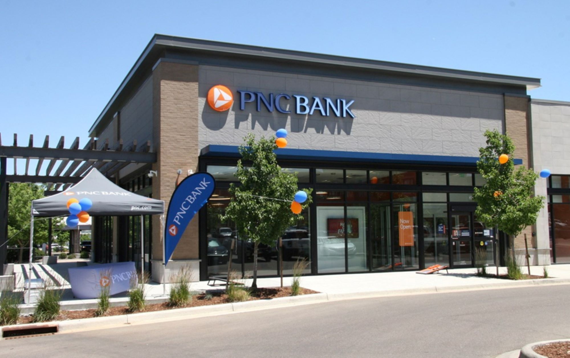
The Role of Brand Equity in Modern Banking
As we move further into the digital age, the physical name on a brick-and-mortar building becomes less central than the digital brand experience. PNC has recognized this by investing heavily in its “Virtual Wallet” and other digital tools, ensuring that the brand translates seamlessly from a physical sign to a mobile app.
The story of “what PNC was called before” is ultimately a story of growth through consolidation. By honoring its roots while relentlessly pursuing a unified identity, PNC has built one of the most valuable brand equities in the world of finance. Whether it was the industrial steel mills of the West or the quiet trust of the East, the components that formed PNC have been forged into a brand that is far greater than the sum of its original parts. As the bank continues to expand, the PNC name stands as a testament to the power of strategic rebranding and the enduring value of a clear, consistent corporate identity.
aViewFromTheCave is a participant in the Amazon Services LLC Associates Program, an affiliate advertising program designed to provide a means for sites to earn advertising fees by advertising and linking to Amazon.com. Amazon, the Amazon logo, AmazonSupply, and the AmazonSupply logo are trademarks of Amazon.com, Inc. or its affiliates. As an Amazon Associate we earn affiliate commissions from qualifying purchases.