
In the world of corporate identity and brand strategy, few assets are as instantly recognizable as the Mystery Machine. While automotive enthusiasts have spent decades debating the mechanical origins of the world’s most famous van—asking “What van is the Mystery Machine?”—from a strategic branding perspective, the specific make and model are secondary. Whether it is a 1960s Ford Econoline, a Chevrolet G-Series, or a Dodge A100 is less relevant than what the vehicle represents: a masterclass in visual storytelling and a cornerstone of the Scooby-Doo franchise’s multi-billion dollar brand equity.
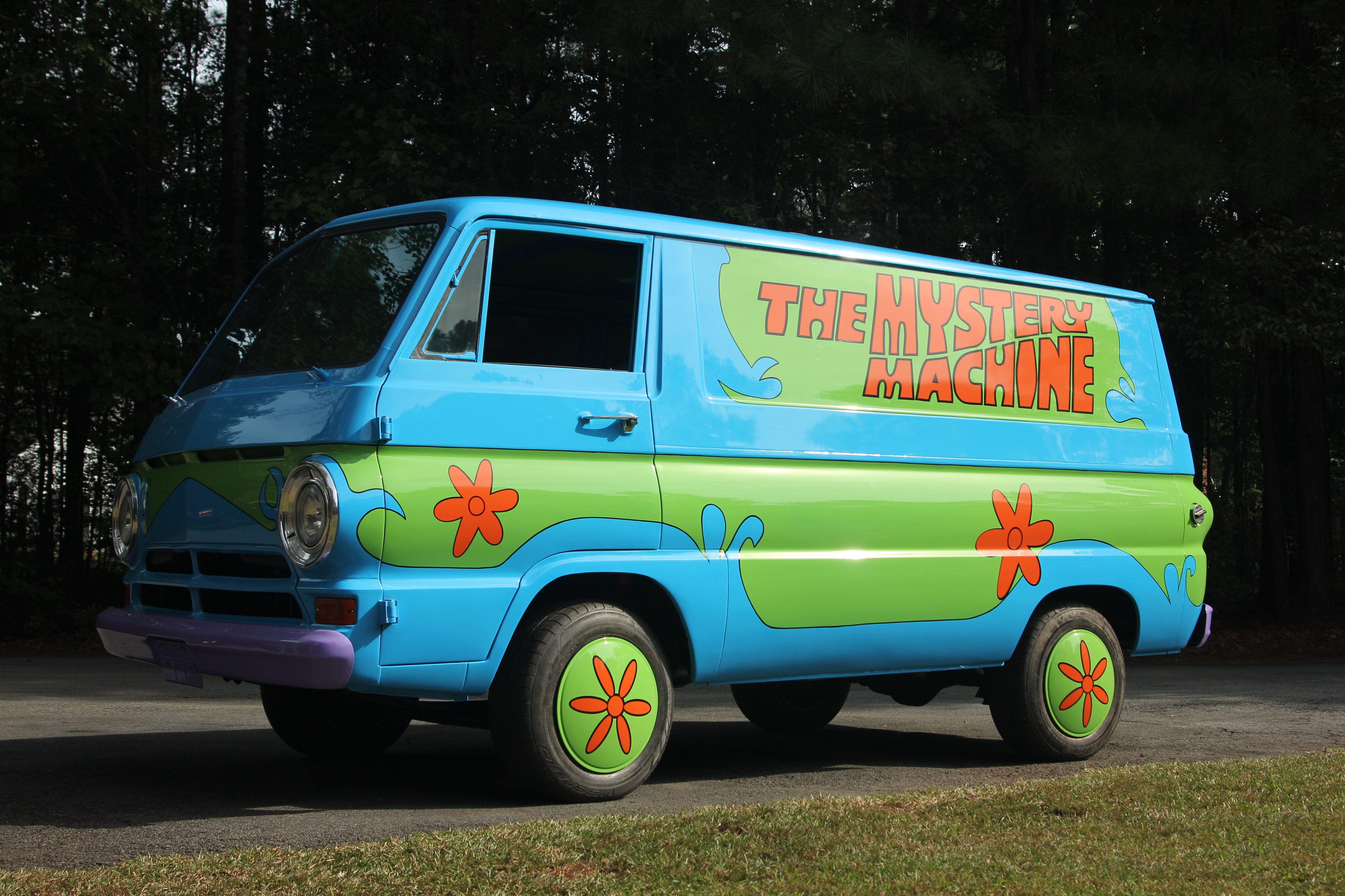
The Mystery Machine is not merely a mode of transport for a group of “meddling kids”; it is a mobile billboard, a cultural touchstone, and a textbook example of how a singular design can anchor an entire intellectual property (IP). By examining the Mystery Machine through the lens of brand strategy, we can uncover how visual consistency, color psychology, and lifestyle marketing have turned a fictional van into one of the most valuable brand assets in entertainment history.
The Visual DNA: Designing a Brand Icon
The Mystery Machine’s power lies in its immediate legibility. In branding, “distinctive brand assets” are elements like logos, colors, or taglines that trigger a brand’s name in the consumer’s mind. The Mystery Machine functions as a 3D extension of the Scooby-Doo logo.
Color Psychology and the 1960s Aesthetic
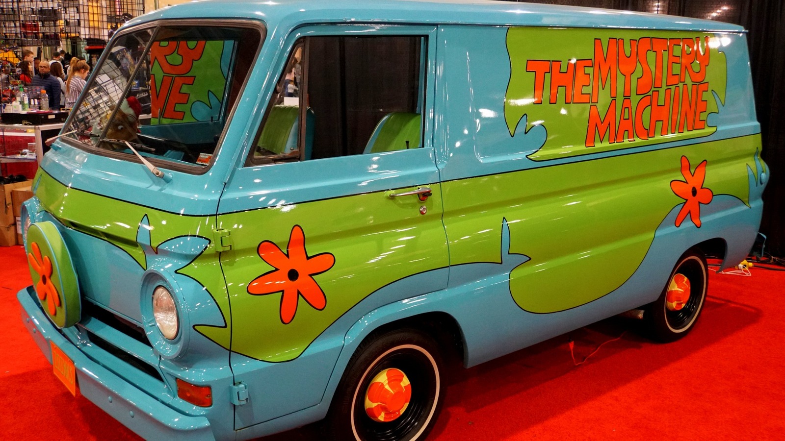
The choice of teal, lime green, and orange was not accidental. In the late 1960s, these colors represented the burgeoning counter-culture movement, but they were curated in a way that felt safe, vibrant, and energetic for a television audience. From a branding standpoint, this color palette creates “high-contrast recognition.” Even if you were to remove the words “The Mystery Machine” and the flower motifs, the specific combination of teal and lime would still evoke the Scooby-Doo brand. This is the ultimate goal of visual identity: to own a color space so completely that the brand is present even in its absence.
The Power of Distinctive Visual Identity (DVI)
In brand strategy, DVI refers to the unique visual characteristics that set a brand apart from its competitors. While other cartoons of the era featured vehicles, none possessed the personality of the Mystery Machine. Its “Flower Power” decals and psychedelic font were strategically designed to appeal to the “Youth Quake” of the 60s and 70s. By adopting the aesthetic of the “Hippie Van,” the brand positioned itself as rebellious yet wholesome—a sophisticated branding tightrope that allowed the show to bridge the gap between children and young adult audiences.
Beyond the Paint Job: The Mystery Machine as Brand Equity
Brand equity is the commercial value that derives from consumer perception of the brand name of a particular product, rather than from the product itself. For Warner Bros. and the Hanna-Barbera legacy, the Mystery Machine is a high-yield asset that generates revenue far beyond the television screen.
From Television Screen to Merchandise Empire
The Mystery Machine is one of the most licensed vehicles in the history of toy manufacturing. From Hot Wheels and LEGO sets to high-end collectibles, the van serves as a “hero product” that anchors entire toy lines. In retail branding, having a physical object that encapsulates the “vibe” of the brand is essential for shelf presence. The Mystery Machine’s silhouette is so iconic that it allows for instant product categorization. Parents and children alike recognize the green and blue shape instantly, reducing the “cognitive load” required to make a purchasing decision.
Strategic Consistency Across Decades of Reboots
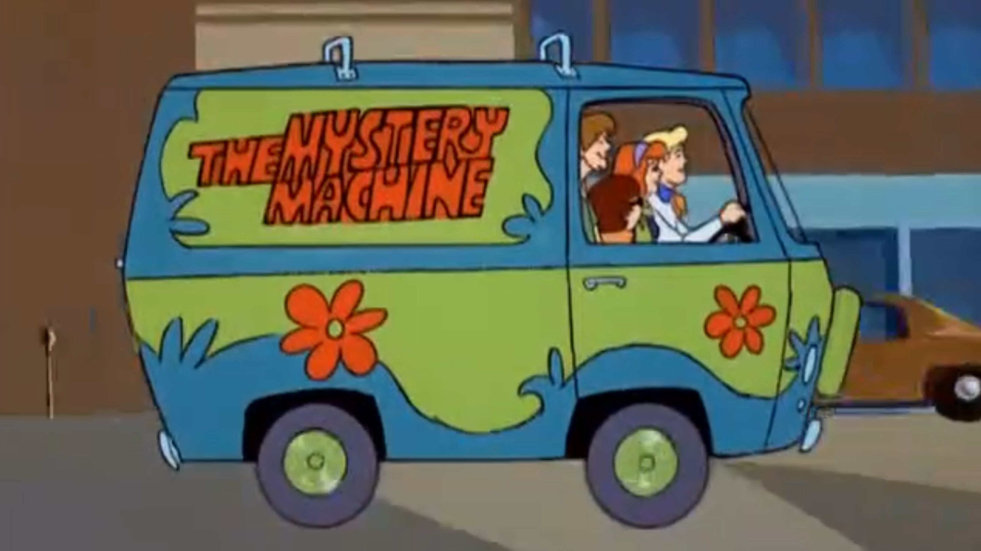
Since its debut in 1969, Scooby-Doo has undergone dozens of iterations, from classic animation to live-action films and modern 3D reboots. While the character designs for Fred, Daphne, Velma, Shaggy, and Scooby have occasionally shifted to meet modern tastes, the Mystery Machine remains largely untouched. This is a deliberate brand strategy known as “Core Asset Preservation.” By keeping the van’s design consistent, the brand owners ensure that there is always a visual anchor for older generations to latch onto, even as the content is refreshed for new audiences. It serves as the “connective tissue” across fifty years of brand evolution.
The “Van Life” Influence: Rebranding Adventure for New Generations
The Mystery Machine did not just reflect its time; it influenced the way we brand the concept of “adventure.” Today, the “Van Life” movement—a multi-million dollar lifestyle industry—owes a debt to the Mystery Machine’s branding of mobile independence.
Leveraging Nostalgia in Modern Marketing
In recent years, the Mystery Machine has been used in “experiential branding” campaigns. For example, Airbnb and Warner Bros. have collaborated to create real-life versions of the Mystery Machine that fans can stay in. This is a sophisticated marketing tactic that moves a brand from a passive experience (watching a show) to an active one (living the brand). By allowing fans to step inside the “brand,” the owners create a deep emotional connection that fosters lifelong brand loyalty.
Cross-Generational Appeal through Cultural Touchstones
A successful brand must be able to “age up” with its audience while remaining accessible to newcomers. The Mystery Machine achieves this through “Retro-Branding.” To a Gen X-er, the van is a nostalgic reminder of Saturday morning cartoons. To a Gen Z-er, it is an ironic, “aesthetic” icon of vintage cool. This dual-track brand positioning is rare and incredibly valuable, as it allows for a wider demographic reach without the need for multiple marketing campaigns.
Case Study: The Real-Life Impact of Iconic Vehicle Branding
To understand why the Mystery Machine is such a potent brand symbol, it is helpful to compare it to other cinematic vehicles and analyze how it contributes to the overall “corporate identity” of the Scooby-Doo franchise.
The Mystery Machine vs. Other Cinematic Vehicles
When we look at the Batmobile, the DeLorean from Back to the Future, or the Ecto-1 from Ghostbusters, we see vehicles that are “Tech-Heavy.” They are defined by their gadgets and functions. The Mystery Machine, however, is “Identity-Heavy.” It is defined by its exterior graphics and the “culture” of the people inside. From a brand strategy perspective, this makes it more versatile. The Batmobile changes with every movie to stay “cool,” but the Mystery Machine stays the same because its value is in its familiarity. It is a “Comfort Brand” asset.
The Financial Worth of IP-Driven Design
The specific answer to “what van is the Mystery Machine” is often a “mismatch” of several 60s-era vans. This ambiguity is actually a branding advantage. Because it isn’t strictly a Ford or a Chevy, the IP owner (Warner Bros.) has total control over the design without being beholden to a specific automotive manufacturer’s trademarks. This “Generic-to-Iconic” pipeline allows the brand to own the design 100%. In the world of intellectual property, owning the design entirely—rather than licensing a real-life car model—is a much more profitable long-term strategy.
Conclusion: The Van as the Ultimate Brand Ambassador
When we ask “What van is the Mystery Machine?”, we aren’t just asking about engines and chassis; we are asking about the foundation of a cultural phenomenon. The Mystery Machine is a masterstroke of brand strategy that demonstrates how visual identity can transcend its original medium to become a global symbol of mystery, teamwork, and nostalgia.
By utilizing high-contrast color palettes, maintaining rigorous visual consistency across decades, and leveraging the emotional power of “hero objects,” the creators of the Mystery Machine built more than just a cartoon car. They built an evergreen brand ambassador. In an era where brands struggle to maintain consumer attention for more than a few seconds, the Mystery Machine stands as a reminder that a well-designed, strategically managed brand asset can drive a franchise for over half a century, proving that sometimes, the best way to move a brand forward is in a bright teal van with orange flowers on the side.
aViewFromTheCave is a participant in the Amazon Services LLC Associates Program, an affiliate advertising program designed to provide a means for sites to earn advertising fees by advertising and linking to Amazon.com. Amazon, the Amazon logo, AmazonSupply, and the AmazonSupply logo are trademarks of Amazon.com, Inc. or its affiliates. As an Amazon Associate we earn affiliate commissions from qualifying purchases.