
In the world of visual communication, a color is rarely just a color; it is a psychological trigger, a cultural shorthand, and a cornerstone of corporate identity. When designers and brand strategists ask, “What two colors make turquoise?” they are looking for more than a simple lesson in color theory. They are exploring the intersection of two powerful primary and secondary drivers: the stability of blue and the vitality of green.
Turquoise is a sophisticated mid-to-light blue-green that occupies a unique space in the color spectrum. For brands, selecting this hue is a deliberate move to project clarity, refreshment, and professional poise. This article explores how the fusion of blue and green creates a versatile branding tool, the psychology behind its components, and how modern organizations leverage this specific color mix to dominate their markets.
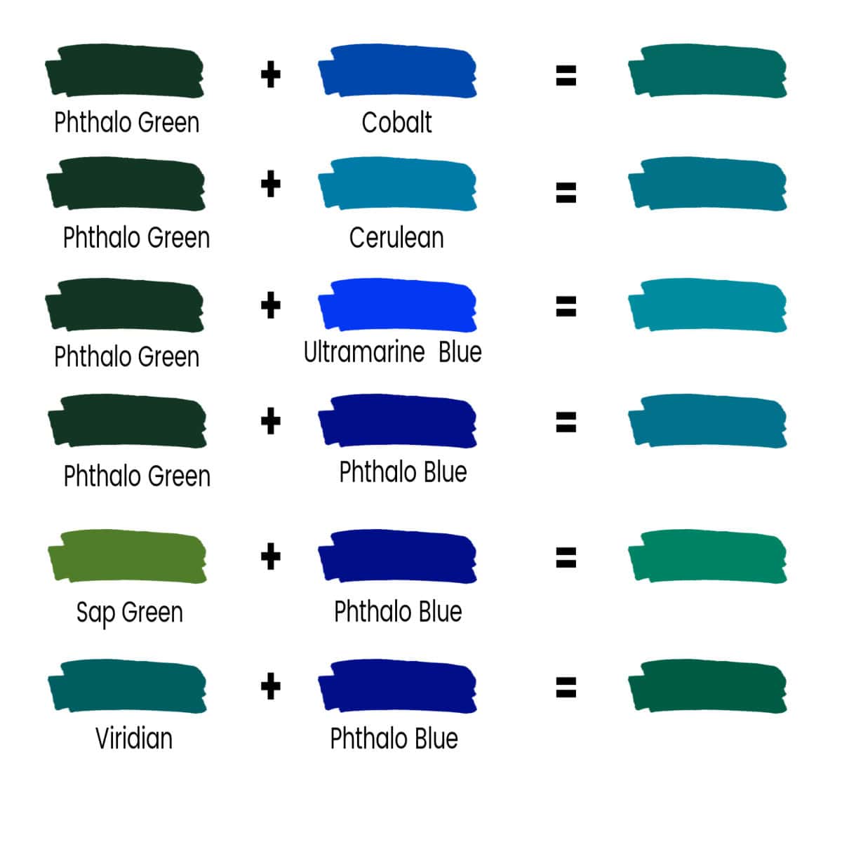
The Alchemy of Turquoise: Understanding the Core Components
To understand why turquoise is so effective in brand strategy, one must first deconstruct it. At its most basic level, turquoise is achieved by mixing blue and green. However, in the realm of professional branding, this “mix” is a precise calculation that balances the emotional weight of two distinct visual pillars.
Blue and Green: The Foundation of Calm and Growth
The “two colors” that make turquoise carry significant psychological baggage. Blue is globally recognized as the color of trust, reliability, and intelligence. It is the color of the sky and the sea—vast, constant, and calming. Green, conversely, is the color of nature, growth, and renewal. It represents harmony and health.
When a brand chooses turquoise, it is attempting to capture the “trust” of blue and the “vitality” of green simultaneously. This makes it an ideal choice for companies that want to appear established yet innovative. For example, a financial technology (FinTech) firm might use a blue-heavy turquoise to signal security while maintaining a fresh, modern edge that traditional dark-blue banks lack.
The Digital Ratio: Achieving Consistency in HEX and CMYK
In the digital age, “mixing” turquoise isn’t done with a palette knife but with code. For a brand to remain consistent across mobile apps, websites, and physical packaging, the ratio of blue to green must be mathematically defined.
In the RGB (Red, Green, Blue) color model used for digital screens, turquoise is typically achieved by having low levels of red and high, often nearly equal, levels of green and blue. A classic Turquoise HEX code like #40E0D0 represents a balance that leans slightly toward green for warmth or blue for coolness. For brand strategists, defining these specific coordinates is the first step in ensuring that the brand’s “personality” remains uniform whether it is viewed on an iPhone screen or a printed billboard.
The Psychology of Turquoise in Global Branding
The strategic reason to use the blue-green blend of turquoise lies in its unique emotional resonance. It is a color that stands out without being aggressive, making it a powerful tool for brands looking to carve out a niche in crowded marketplaces.
Communication and Clarity: Why Tech and Health Choose Turquoise
Turquoise is often associated with the throat chakra in various cultures, symbolizing communication and self-expression. In a corporate context, this translates to clarity. This is why we see turquoise frequently utilized in the technology and healthcare sectors. It suggests a brand that is transparent, easy to talk to, and technologically advanced.
Software companies often use turquoise to indicate user-friendliness. Unlike a harsh “tech blue” which can feel cold and institutional, the green influence in turquoise adds a layer of approachability. It tells the consumer: “This technology is powerful, but it is also intuitive and human-centric.”
Emotional Resonance: Balancing Sophistication with Approachability
One of the most difficult balances to strike in brand strategy is being perceived as “premium” but not “unreachable.” Turquoise excels here. It has an inherent luminosity that feels high-end—reminiscent of precious gemstones—yet it retains a refreshing quality that feels welcoming.
Because it is a “cool” color, it lowers the heart rate and creates a sense of serenity. For brands in the wellness, travel, or lifestyle industries, turquoise serves as a visual invitation to relax. It promises an experience that is both sophisticated and revitalizing, bridging the gap between luxury and lifestyle.
Strategic Implementation: Building a Visual Identity Around Turquoise

Identifying the two colors that make turquoise is only the beginning. The real work for a brand strategist lies in how that turquoise is implemented within a broader visual identity system.
Complementary Color Palettes for High-Impact Marketing
A brand that relies solely on turquoise risks looking flat. To truly leverage the color’s potential, strategists must pair it with “accent” colors that highlight its blue or green undertones.
- Turquoise and Gold: Often used by luxury brands to emphasize the “gemstone” quality of the color, suggesting wealth and exclusivity.
- Turquoise and Coral/Orange: Since orange is the complement of blue on the color wheel, pairing turquoise with warm coral tones creates a high-energy, vibrant contrast that is popular in digital marketing and “call-to-action” buttons.
- Turquoise and Grey/White: This creates a clean, minimalist aesthetic favored by modern startups and medical brands to emphasize hygiene and efficiency.
Accessibility and Inclusivity in Digital Design
When designing a brand identity, accessibility is a non-negotiable factor. Turquoise, while beautiful, can be tricky regarding contrast ratios. Professional brand designers must ensure that the specific shade of turquoise used provides enough contrast against white or black backgrounds to be legible for users with visual impairments.
In the context of UI/UX (User Experience) design, turquoise is often used for “active” states—buttons that have been clicked or links that are live—because its brightness naturally draws the eye without the “danger” associated with red or the “standardization” of pure blue.
Case Studies: Brands That Mastered the Turquoise Spectrum
To see the strategic application of turquoise in action, one only needs to look at global leaders who have turned this specific blend of blue and green into a multi-billion dollar asset.
Tiffany & Co.: The Gold Standard of Brand Recognition
Perhaps no brand is more synonymous with a color than Tiffany & Co. is with “Tiffany Blue.” While technically a very light, bright robin’s egg blue, it sits firmly in the turquoise family. This specific shade was selected to evoke a sense of high quality and uniqueness.
The strategy was so successful that the color itself is trademarked (Pantone 1837, named after the year the company was founded). For Tiffany, the “two colors” that make their turquoise signify more than just a mix; they represent a “dream in a box.” The color is used sparingly on packaging to ensure that the sight of a turquoise box immediately triggers an emotional response of excitement and prestige.
Siemens and the Evolution of Industrial Trust
Siemens, the German multinational conglomerate, utilizes a teal-leaning turquoise in its branding. In this industrial context, the green-blue mix serves a different purpose. It moves away from the “oceanic” feel of light turquoise and toward a “petroleum” or “electronic” feel.
For Siemens, this color represents the intersection of engineering (blue) and sustainability/future-growth (green). It differentiates them from competitors who might use standard navy blue, positioning Siemens as a forward-thinking, eco-conscious leader in technology and infrastructure.
Future-Proofing Your Brand with Dynamic Color Strategies
As we look toward the future of marketing, the use of turquoise is evolving. It is no longer just about choosing a static color for a logo; it is about how that color adapts to new media and shifting consumer values.
Sustainability and the “Green-Blue” Movement
As “Green Branding” becomes more scrutinized due to “greenwashing” concerns, many brands are shifting toward turquoise and teal. These colors suggest environmental consciousness (green) but backed by scientific reliability and corporate stability (blue).
This “Green-Blue” movement is particularly prevalent in the renewable energy sector and circular economy startups. By blending the two colors, these brands communicate that they are both eco-friendly and commercially viable. They are not just “green” (which can sometimes be perceived as grassroots or unorganized) and not just “blue” (which can be perceived as corporate and stagnant).

Conclusion: The Strategic Power of the Blend
The answer to “what two colors make turquoise” is deceptively simple: blue and green. However, for a brand, the implications are profound. This color represents a strategic middle ground—a hue that captures the best of two worlds. It offers the reliability of the corporate world and the freshness of the natural world.
By mastering the balance between these two components, brand strategists can create a visual identity that is memorable, emotionally resonant, and versatile across all platforms. Whether it is the luxurious allure of a jewelry box or the crisp interface of a new app, turquoise remains a premier choice for brands that want to communicate clarity, innovation, and timeless sophistication.
aViewFromTheCave is a participant in the Amazon Services LLC Associates Program, an affiliate advertising program designed to provide a means for sites to earn advertising fees by advertising and linking to Amazon.com. Amazon, the Amazon logo, AmazonSupply, and the AmazonSupply logo are trademarks of Amazon.com, Inc. or its affiliates. As an Amazon Associate we earn affiliate commissions from qualifying purchases.