The question of what two colors combine to create navy blue might seem like a simple elementary school art class inquiry. However, within the sophisticated world of Brand strategy and visual identity, the precise creation and understanding of color palettes, including nuances like navy blue, are anything but elementary. This deep dive explores the foundational color mixing that yields navy blue, but critically, it elevates this knowledge to its strategic implications for brands aiming to evoke specific emotions, build recognition, and cultivate a powerful, memorable identity.
The Alchemy of Hue: Deconstructing Navy Blue
At its most fundamental level, the creation of navy blue is a classic exercise in subtractive color mixing, a principle central to how pigments interact. Understanding this basic science is the first step in appreciating its subsequent strategic applications in branding.
Primary and Secondary Pigment Interactions
In traditional pigment mixing, the primary colors are typically considered red, yellow, and blue. When discussing the creation of secondary colors, we often focus on how pairs of primaries combine. However, navy blue is not a direct result of mixing two primary colors in the traditional sense. Instead, it’s a derivative, a darker, richer iteration of a more primary hue.
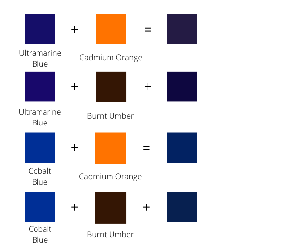
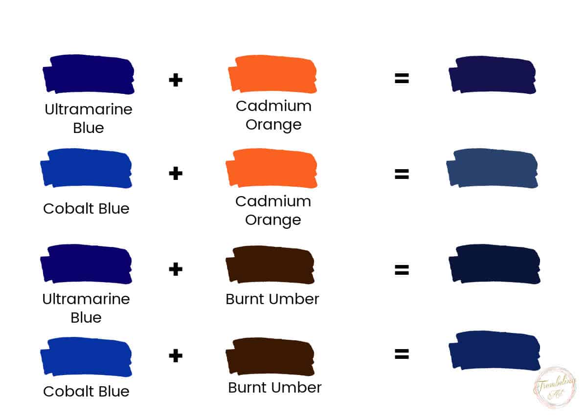
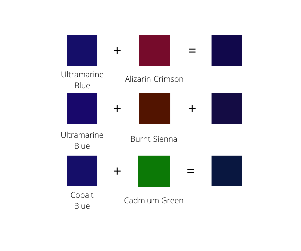
The most common and straightforward method to achieve navy blue is by mixing blue with black. The proportion of each color is crucial. A pure, vibrant blue, when darkened with black, transforms into the deep, sophisticated shade we recognize as navy. The intensity of the initial blue will significantly influence the final navy. A lighter, brighter blue will require more black to achieve a deep navy, while a naturally darker blue will need a subtler hand with the black.
Another popular and artistically nuanced method involves mixing blue with a touch of red or purple. This approach creates a navy blue with a cooler, more complex undertone. Adding red to blue results in a purplish-blue, which, when further deepened, can lean towards a sophisticated navy. Similarly, mixing blue with purple can produce a rich, almost iridescent navy, especially if the purple itself has a significant blue component. This method often results in a navy that feels less stark and more nuanced than one created with black, offering a subtle psychological difference that can be leveraged in branding.
The Role of Saturation and Value
Beyond the foundational colors, the concepts of saturation and value are paramount in understanding and precisely replicating navy blue. Saturation refers to the intensity or purity of a color. A highly saturated blue is vivid and strong, while a desaturated blue can appear muted or grayish. Value, on the other hand, refers to the lightness or darkness of a color. Black is the ultimate in low value, while white is the highest.
To create navy blue, we are inherently manipulating the value of blue. Adding black reduces the value, making the blue darker. However, the saturation of the original blue also plays a role. A highly saturated blue, when darkened, maintains its richness. If a desaturated blue is used, the resulting navy might appear dull or muddy, lacking the depth and impact that makes navy blue such a powerful branding color. Brands must consider not just the base colors but also their purity and intended darkness to achieve the exact desired emotional resonance.
Navy Blue: A Color of Authority and Trust in Branding
The psychological impact of navy blue is profound and deeply ingrained in human perception. This makes it an exceptionally valuable asset in the toolkit of any brand strategist. Its ability to convey a sense of reliability, professionalism, and understated luxury is unparalleled.
Evoking Trust and Stability
Navy blue is consistently associated with stability, dependability, and authority. This is partly due to its historical connections to formal attire, such as military uniforms and business suits, which inherently project seriousness and trustworthiness. For brands, this translates into a powerful message of reliability. Think of financial institutions, law firms, or established technology companies that frequently employ navy blue in their branding. They are not merely choosing a pleasing color; they are strategically communicating their inherent trustworthiness and commitment to their clients. This subconscious association helps build a foundational layer of confidence in potential customers.
Conveying Professionalism and Sophistication
Beyond trust, navy blue exudes a sense of professionalism and understated sophistication. It’s a color that doesn’t shout for attention but rather commands respect through its inherent elegance. Unlike brighter blues which can feel more casual or approachable, navy blue possesses a gravitas that positions a brand as serious, competent, and high-quality. This makes it ideal for luxury brands, educational institutions, and corporate entities that want to be perceived as leaders in their respective fields. The subtle complexity of navy blue, especially when achieved through nuanced mixing techniques (like adding a touch of red or purple), can further enhance this perception of refinement and discernment.
The Subtlety of Nuance: Beyond the Obvious Mix
While the basic mixing of blue and black or blue and red/purple yields navy blue, the precise shade chosen for a brand’s identity is a result of meticulous refinement. Slight variations in the hue, saturation, and value can significantly alter the overall feeling. A navy with a hint more red might feel warmer and more approachable, while a navy with a touch more green undertone can appear more grounded and traditional.
Brand designers spend considerable time exploring the spectrum of navy blues, often creating custom palettes. They might use specific color codes (like Hex codes or RGB values) to ensure perfect consistency across all brand touchpoints, from digital interfaces to printed materials. This precision is not just about aesthetics; it’s about ensuring that the intended message of authority, trust, and sophistication is consistently communicated, reinforcing the brand’s identity with every interaction.
Strategic Applications of Navy Blue in Brand Identity
Understanding the psychology and foundational creation of navy blue is only the first layer. The true power lies in its strategic deployment within a comprehensive brand identity system.
Logo Design and Visual Identity
The logo is often the most recognizable element of a brand’s identity, and the choice of color is paramount. Navy blue, due to its inherent qualities of trust and professionalism, is a frequent and highly effective choice for logos. It’s a color that can be applied across various industries without appearing out of place, from the serious world of finance to the cutting-edge realm of technology. Its versatility allows it to be paired with other colors to create contrast and visual interest. For instance, pairing navy blue with a bright accent color like gold or yellow can create a sense of premium quality and innovation, while pairing it with white or light gray reinforces its clean and professional image.
Website and Digital Presence
In the digital realm, where first impressions are made in milliseconds, color plays a critical role in user experience and brand perception. Navy blue is an excellent choice for website backgrounds or key design elements. It provides a sophisticated and calming backdrop that can enhance readability and reduce eye strain, especially for extended viewing periods. Its association with trust makes it ideal for e-commerce sites, financial portals, and SaaS platforms where users need to feel secure and confident. When combined with clear typography and intuitive navigation, a navy blue digital presence can effectively communicate professionalism, reliability, and ease of use.
Marketing Collateral and Packaging
From brochures and business cards to product packaging and advertisements, navy blue offers a consistent thread of professionalism. In marketing collateral, it can lend an air of authority and credibility to information, making it more persuasive. For product packaging, navy blue can signify premium quality and exclusivity, elevating the perceived value of the product within. Brands that target discerning consumers often utilize navy blue to convey a sense of luxury and attention to detail, hinting that the product itself embodies these same qualities.
Building Brand Equity Through Color Consistency
The true strategic advantage of using navy blue lies in consistent application. When a brand consistently uses a specific shade of navy blue across all its touchpoints, it builds strong brand recognition and reinforces its core values. Over time, consumers will begin to associate that particular shade of blue with the brand’s attributes – its reliability, its sophistication, its authority. This deepens brand equity and fosters a stronger emotional connection with the target audience. This level of recognition and association is the hallmark of a successful and enduring brand identity.
The Nuances of Navy Blue in a Global Brand Context
As brands expand their reach globally, understanding how colors are perceived across different cultures becomes increasingly important. While navy blue generally carries positive connotations of trust and authority in Western cultures, its interpretation can vary, requiring careful consideration.
Cultural Perceptions of Blue and Its Shades
Across many cultures, blue is associated with the sky and the sea, often symbolizing calm, peace, and serenity. This fundamental positive association provides a strong foundation for navy blue’s adoption. However, the specific shade and its context can influence its meaning. In some Eastern cultures, darker blues can sometimes be associated with mourning or sadness, a stark contrast to their typical perception in the West. Therefore, brands operating in diverse global markets must conduct thorough cultural research to ensure their chosen shade of navy blue resonates positively and avoids unintended negative interpretations.
Navigating Color Symbolism in International Branding
When developing a global brand strategy, it’s crucial to avoid a one-size-fits-all approach to color. A shade of navy blue that perfectly embodies authority and trust in one region might need subtle adjustments for another. This might involve slightly altering the hue, for example, by introducing a touch more green to lean towards a teal-like navy that is perceived as more calming and less severe in certain cultures. Alternatively, the brand might choose to use navy blue primarily as an accent color, relying on more universally accepted colors for its core identity elements, while strategically deploying navy blue in specific markets where its symbolism is well-understood and appreciated.
The Role of Context and Combination
The meaning of any color is also heavily influenced by the colors it’s paired with and the context in which it appears. A sophisticated navy blue paired with gold in a luxury brand’s collateral will evoke a different sentiment than the same navy blue paired with stark white in a legal document. Brands must consider the entire visual language they are creating. When entering new markets, it may be beneficial to test different color combinations and contextual applications of navy blue to gauge local reception. This iterative process ensures that the brand’s visual communication remains impactful and relevant across diverse audiences.
In conclusion, while the simple answer to “what two colors make navy blue” lies in the alchemy of pigment mixing, its true significance within the realm of Brand strategy is far more complex and impactful. It’s about understanding the psychology, the nuances of creation, and the strategic deployment of this powerful hue to build trust, convey sophistication, and forge lasting connections with audiences worldwide. The meticulous consideration of navy blue, from its foundational mix to its global interpretation, is a testament to the intricate and influential role of color in shaping a brand’s identity and its success.
aViewFromTheCave is a participant in the Amazon Services LLC Associates Program, an affiliate advertising program designed to provide a means for sites to earn advertising fees by advertising and linking to Amazon.com. Amazon, the Amazon logo, AmazonSupply, and the AmazonSupply logo are trademarks of Amazon.com, Inc. or its affiliates. As an Amazon Associate we earn affiliate commissions from qualifying purchases.