
In the contemporary landscape of identity and design, tattoos have evolved from counter-cultural symbols into a sophisticated medium for personal branding and visual communication. For the professional seeking to curate a permanent visual signature, understanding the diverse styles of tattoos is akin to choosing a corporate color palette or a brand’s typography. Each style carries its own historical weight, psychological impact, and aesthetic philosophy. When we ask, “what styles of tattoos are there,” we are essentially exploring the different visual languages available for articulating a unique personal brand.
The Intersection of Personal Branding and Permanent Design
Personal branding is the intentional effort to create and influence public perception of an individual by positioning them as an authority in their industry or simply defining their unique character. In this context, body art functions as the ultimate logo—a permanent, unchangeable declaration of values, aesthetics, and history.
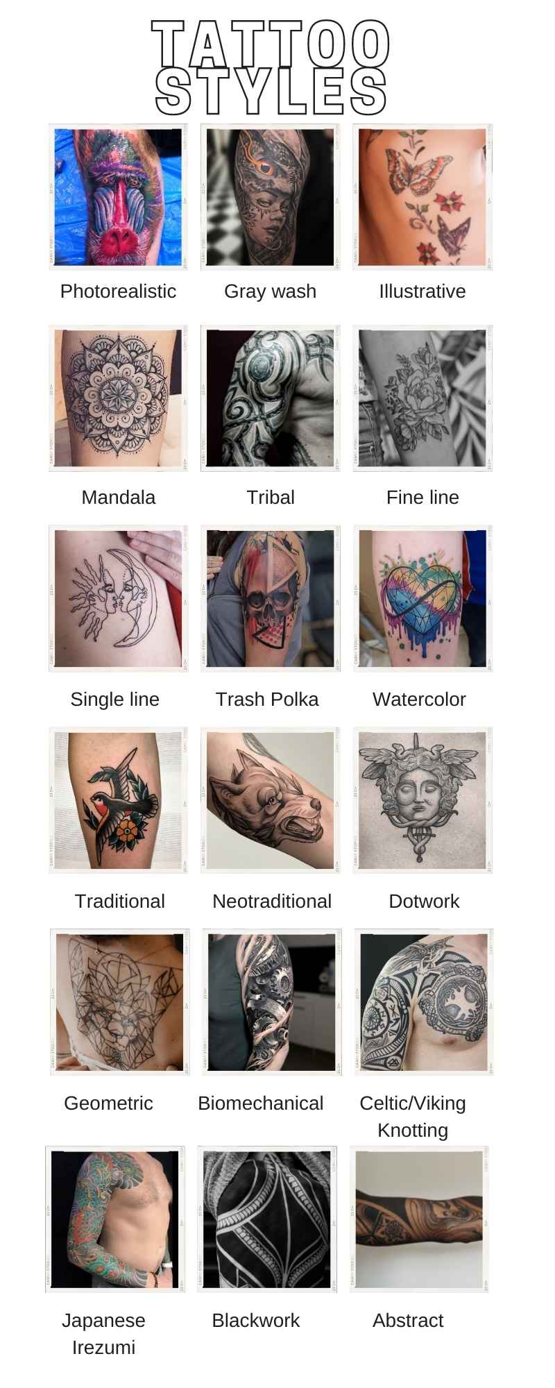
Choosing a tattoo style is a strategic design decision. Just as a high-end tech firm might opt for a minimalist, sans-serif font to convey modernity, or a heritage law firm might use a serif font to project stability, the style of a tattoo communicates a specific narrative to the world. The style determines how the “brand” of the person is perceived: as a bold disruptor, a meticulous detail-oriented professional, or a keeper of tradition.
Heritage Styles: The Legacy Brands of Tattooing
Much like the foundational principles of graphic design, certain tattoo styles serve as the “legacy brands” of the industry. These styles have stood the test of time, offering a sense of permanence and reliability that newer, trendier styles may lack.
American Traditional (Old School)
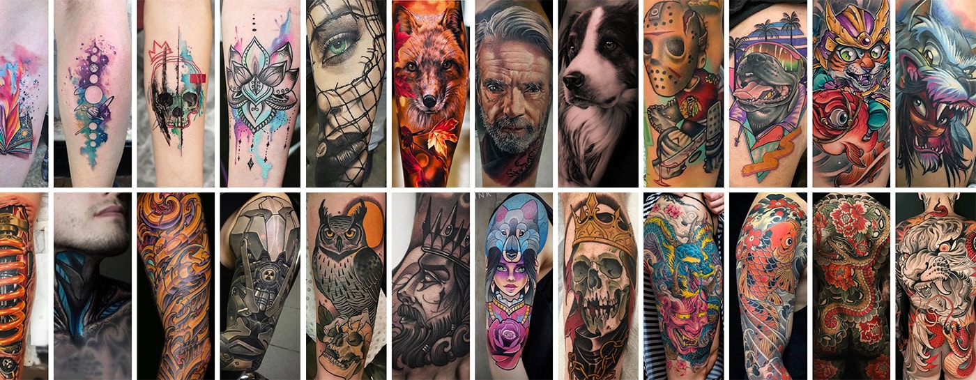
American Traditional is characterized by bold black outlines, a limited primary color palette (typically red, yellow, green, and blue), and iconic imagery like eagles, anchors, and roses. From a branding perspective, this style represents “legacy” and “authenticity.” It is the visual equivalent of a classic 1950s logo—uncomplicated, high-impact, and immediately recognizable. It suggests a personality that values tradition, resilience, and clear communication.
Japanese (Irezumi)
Irezumi is a deeply symbolic style that often covers large areas of the body with intricate narratives involving dragons, koi fish, and folklore heroes. In the world of brand strategy, Irezumi represents “storytelling” and “depth.” The fluidity of the designs, which are meant to flow with the musculature of the body, mirrors a brand that is adaptable yet deeply rooted in a complex heritage. It is a choice for those whose personal brand is defined by a long-term vision and a commitment to craft.
Neo-Traditional
Neo-Traditional takes the core tenets of the American Traditional style—bold lines and clear visibility—and expands the artistic horizon. It introduces a broader color palette, varying line weights, and more decorative, illustrative elements. This style is the “rebranded classic.” It appeals to individuals who respect the foundations of the past but want to showcase a modern, creative edge. It balances authority with contemporary flair.
Modernist and Minimalist Aesthetics
As digital design has moved toward “flat” and “minimalist” aesthetics, so too has the world of tattooing. These styles are the preferred choice for those whose personal branding leans toward the professional, the understated, and the precise.
Fine Line and Minimalist
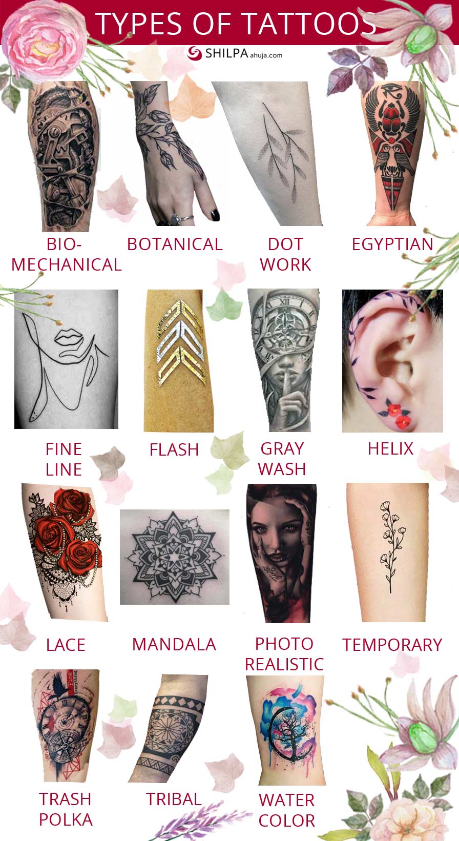
Fine line tattooing utilizes small needle groupings to create incredibly thin, delicate lines. This style is often used for small, discreet designs that prioritize “clarity” and “subtlety.” In a professional branding context, minimalism conveys a “less is more” philosophy. It suggests an individual who is precise, detail-oriented, and sophisticated. It is the tattoo equivalent of a sleek, modern app interface: clean, functional, and devoid of unnecessary clutter.
Geometric and Blackwork
Geometric tattoos focus on mathematical patterns, symmetry, and architectural shapes. Blackwork, on the other hand, involves large areas of solid black ink and intricate patterns. Together, these styles represent “structure” and “logic.” For a brand identity, geometric patterns suggest a mindset that is analytical, organized, and visionary. Blackwork adds a layer of “boldness” and “conviction,” signifying a personality that is not afraid of making high-contrast, definitive statements.
Dotwork
Dotwork, or pointillism, uses thousands of tiny dots to create shading and depth. This style requires immense patience and technical skill from the artist. From a brand perspective, dotwork symbolizes “patience” and “complexity.” It shows an appreciation for the process and the small details that make up a larger whole. It is a sophisticated choice for those who want their personal brand to be seen as multi-faceted and meticulously crafted.
The Narrative and the Real: Visual Storytelling
Some tattoo styles prioritize the representation of reality or the expression of emotion through fluid, artistic strokes. These styles are about the “human” element of the brand.
Realism and Hyper-Realism
Realism aims to replicate photographs on the skin, whether they are portraits of people, animals, or objects. This style is perhaps the most technically demanding, requiring a mastery of light, shadow, and texture. A realism tattoo is a statement of “excellence” and “high-fidelity.” It suggests a brand that is transparent, authentic, and focused on high-quality output. It is the visual manifestation of “what you see is what you get,” executed at the highest possible level.
Watercolor
Watercolor tattoos mimic the appearance of a painting, with soft edges, color splashes, and a lack of traditional black outlines. This style represents “creativity,” “fluidity,” and “innovation.” In branding, watercolor elements are often used to break the mold and suggest a more organic, human-centric approach. For an individual, a watercolor tattoo indicates a personality that is expressive, unconventional, and comfortable with ambiguity.
Trash Polka
Originating in Germany, Trash Polka is a chaotic yet structured mix of surrealist, commercial, and photo-realistic elements, typically using only black and red ink. It is a highly disruptive style. From a strategic standpoint, Trash Polka is the “rebel brand.” It is for the person whose identity is built on challenging the status quo, merging disparate ideas into a cohesive (if jarring) whole, and commanding attention through visual tension.
Strategic Selection: Aligning Style with Personal Brand Values
Understanding “what styles of tattoos are there” is only the first step. The second step is alignment. In corporate branding, every visual choice must align with the brand’s core values. The same applies to body art as a form of personal branding.
When selecting a style, one must consider the “brand personality” they wish to project. A CEO of a tech startup might lean toward geometric or minimalist styles to reflect a future-forward, data-driven mindset. A creative director might choose Neo-Traditional or Watercolor to showcase an appreciation for art history and expressive freedom. A consultant in a high-stakes field might opt for American Traditional to project an image of steadfastness and reliability.
Furthermore, the “placement” of these styles acts as a distribution channel. Visible tattoos (arms, hands, neck) are “public-facing” brand assets that invite immediate engagement and provide a quick summary of the individual’s identity. Hidden tattoos are “internal” brand assets—reminders of personal milestones or philosophies that are shared only when the individual chooses to “open their portfolio.”
The Longevity of the Visual Asset
In any brand strategy, longevity is key. A brand that changes its logo every six months lacks stability. Because tattoos are permanent, the choice of style must account for how the “brand” will age.
Fine line tattoos, while trendy and modern, may require more frequent “brand refreshes” (touch-ups) as the ink spreads over time. Traditional and Japanese styles, with their bold outlines and heavy saturation, are built for “long-term market presence,” maintaining their integrity for decades. Choosing a style is therefore not just an aesthetic choice, but a life-long commitment to a specific visual identity.
Ultimately, the diverse world of tattoo styles offers a rich vocabulary for personal expression. Whether one chooses the bold clarity of the Old School, the intricate narrative of Irezumi, or the sterile precision of Minimalism, the style becomes an integral part of the individual’s corporate and personal identity. By viewing these styles through the lens of brand strategy and design, we see them for what they truly are: sophisticated tools for defining who we are and how we want the world to perceive us.
aViewFromTheCave is a participant in the Amazon Services LLC Associates Program, an affiliate advertising program designed to provide a means for sites to earn advertising fees by advertising and linking to Amazon.com. Amazon, the Amazon logo, AmazonSupply, and the AmazonSupply logo are trademarks of Amazon.com, Inc. or its affiliates. As an Amazon Associate we earn affiliate commissions from qualifying purchases.