
In the realm of brand strategy and corporate identity, the physical environment serves as a silent but powerful communicator of a company’s values, professionalism, and attention to detail. When a business chooses to display high-resolution photography, core value statements, or architectural renderings in its headquarters, the execution must be flawless. An 18×24 print is a common “medium-large” standard for corporate displays, providing enough surface area to command attention without overwhelming a modular office space. However, a print alone is rarely sufficient to convey a premium brand image. To elevate the visual asset, a mat is essential.
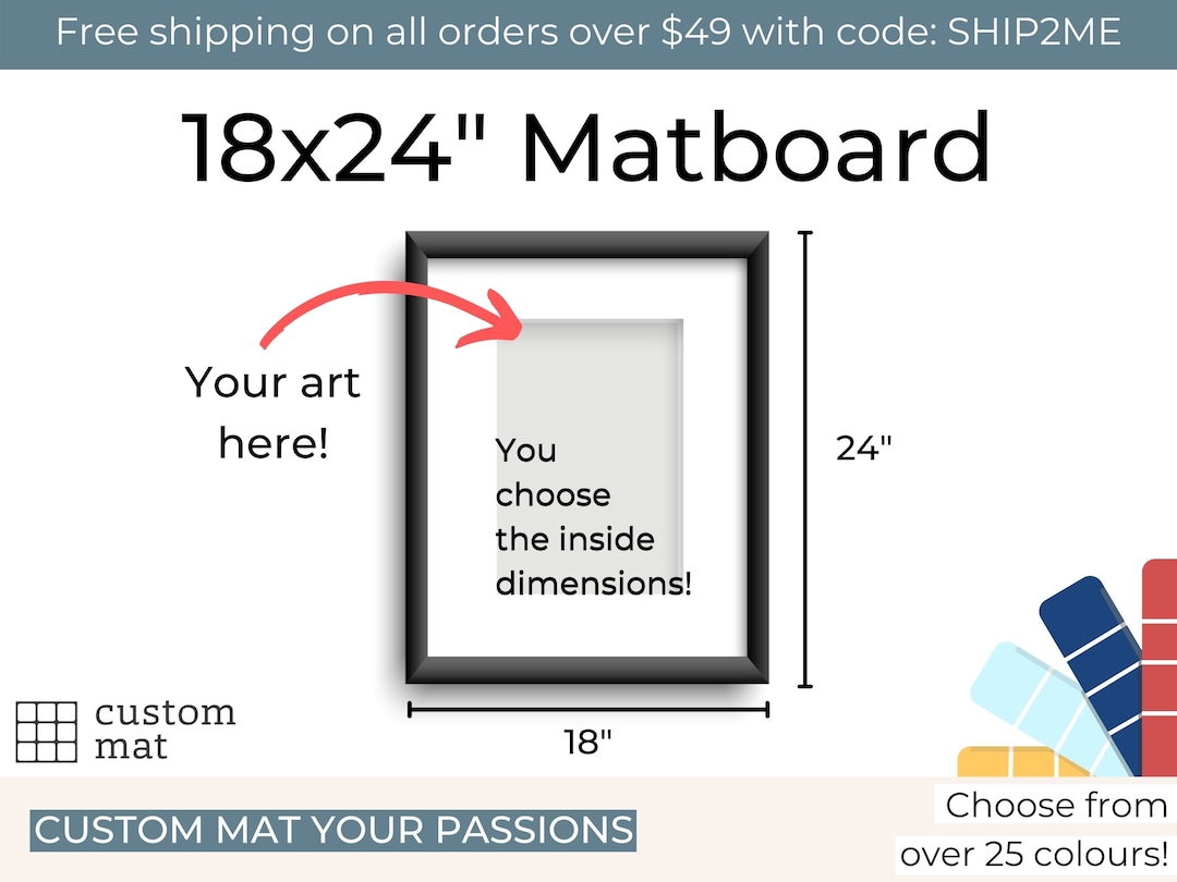
Choosing the correct frame size for an 18×24 print with a mat is not merely a task of measurements; it is a design decision that impacts the visual weight and perceived value of the brand’s physical presence.
The Strategic Importance of Professional Framing in Brand Identity
Before diving into the technical specifications of frame sizing, it is crucial to understand why matting and framing matter from a branding perspective. A brand is a promise of quality, and that promise is often judged by the physical touchpoints a client encounters.
A bare 18×24 print tacked to a wall or placed in a frame without a mat can appear clinical, unfinished, or budget-conscious. In contrast, a matted print creates “breathing room” around the artwork, focusing the viewer’s eye and signaling that the content within the frame is of high importance. In corporate environments, this technique is used to signify authority, heritage, and meticulousness.
Creating Visual Authority
When a brand uses a wide mat—shifting an 18×24 print into a larger frame—it increases the “visual footprint” of the piece. This is a common strategy in luxury branding and high-end law or financial firms. By expanding the total dimensions of the display, the brand occupies more physical space, which psychologically correlates with market presence and stability.
Enhancing Brand Consistency
For organizations with multiple locations, standardizing the frame and mat size for 18×24 prints ensures a cohesive brand experience. Whether a client walks into a satellite office in London or the headquarters in New York, the uniform presentation of brand assets—framed exactly the same way—reinforces brand reliability.
Calculating the Perfect Dimensions: 18×24 Print Specifications
The most critical technical step is determining the final frame size based on the desired mat width. For an 18×24 print, there are two industry-standard configurations that professionals use to achieve a balanced, high-end look.
The Standard Approach: The 22×28 Frame
The most common frame size for an 18×24 print with a mat is 22×28 inches. This allows for a 2-inch mat border on all sides.
- The Math: 18″ (width) + 2″ (left mat) + 2″ (right mat) = 22″. 24″ (height) + 2″ (top mat) + 2″ (bottom mat) = 28″.
- Brand Application: This configuration is ideal for modern, streamlined brands. A 2-inch mat provides enough separation from the frame to prevent the image from looking “cramped,” but it remains compact enough for hallways, cubicle-adjacent walls, and smaller meeting rooms. It suggests efficiency and contemporary design.
The Premium Approach: The 24×30 Frame
For a more prestigious or “gallery-style” presentation, the 24×30 inch frame is the professional choice. This accommodates a 3-inch mat border around the 18×24 print.
- The Math: 18″ + 3″ + 3″ = 24″. 24″ + 3″ + 3″ = 30″.
- Brand Application: A 3-inch mat is the hallmark of luxury. This size is typically reserved for executive suites, boardrooms, and main lobby areas. The extra matting creates a dramatic “window” effect, elevating the 18×24 print to a piece of high-status decor. If the print features a brand’s founding story or a high-impact marketing campaign image, the 24×30 frame ensures it receives the reverence it deserves.

Custom Proportions and “Weighted” Bottoms
In high-level brand design, some strategists opt for a “weighted bottom” mat. This involves having equal mat widths on the top and sides (e.g., 2.5 inches) while the bottom mat is slightly thicker (e.g., 3.5 inches). This is a classical framing technique that compensates for an optical illusion where the bottom mat can appear narrower than the top if they are equal. Using this technique shows a sophisticated understanding of design aesthetics, reflecting a brand that values tradition and precision.
Materials and Finishes: Aligning Physical Assets with Brand Values
The frame size is the skeleton of the presentation, but the materials and finishes are the “skin” that communicates the brand’s personality. For an 18×24 print, the weight of the frame must be proportionate to the size to ensure structural integrity and visual balance.
Metal Frames for Tech and Innovation
For brands in the technology, software, or modern manufacturing sectors, sleek aluminum frames in matte black, silver, or brushed titanium are preferred. These materials signify innovation, speed, and minimalism. When paired with a 22×28 frame and a crisp white mat, the 18×24 print looks like a window into the future.
Wood Frames for Heritage and Trust
Financial institutions, architectural firms, and heritage brands often lean toward solid wood frames.
- Oak or Maple: Suggests transparency, growth, and modern sustainability.
- Walnut or Mahogany: Suggests longevity, deep-rooted history, and exclusive luxury.
For these brands, a 24×30 frame with a deep-profile wood finish adds a sense of permanence to the 18×24 print, reinforcing the idea that the brand is built to last.
The Role of Color Psychology in Matting
While white and off-white are the standards for corporate matting, some brands utilize the mat as a subtle way to incorporate corporate colors. A “double mat” technique can be used here, where a thin sliver (1/4 inch) of a brand-specific color (like a navy blue or forest green) is visible beneath a primary white mat. This creates a sophisticated, bespoke look that ties the framed piece directly into the corporate identity system without being garish.
Implementation Strategies for Brand Environments
Deciding on an 18×24 print size and its corresponding frame is only the beginning. The way these units are deployed across a physical environment dictates how the brand story is told.
The Power of the Triptych
A common brand strategy is to use three 18×24 prints side-by-side. If each is placed in a 24×30 frame, the total horizontal span exceeds six feet. This creates a powerful visual focal point in a reception area. Using three related images—such as “Our Mission,” “Our Vision,” and “Our Values”—in uniform framing creates a narrative flow that is impossible for visitors to miss.
Scaling for Impact
While the 18×24 print is a “workhorse” size, brand managers must consider the viewing distance.
- Close-range viewing (hallways): Use the 22×28 frame. It feels personal and accessible.
- Long-range viewing (large lobbies): Use the 24×30 frame. It ensures the artwork doesn’t get “lost” on a large wall.
Practical Considerations: Glass and Mounting
For a brand to maintain its professional appearance, the technical execution of the framing must prevent common issues like “rippling” or glare.
- Dry Mounting: For 18×24 prints, dry mounting to a foam core backing is recommended. This ensures the print remains perfectly flat within the mat and frame, preventing the wavy appearance that can plague cheaper DIY framing.
- Non-Reflective Glass: In high-traffic brand environments with overhead fluorescent or LED lighting, “Museum Glass” or anti-reflective acrylic is essential. If a client can only see their own reflection instead of the brand message, the framing has failed its strategic purpose.

Conclusion: The ROI of Proper Framing
Investing in the correct frame size for an 18×24 print—choosing between the streamlined 22×28 or the prestigious 24×30—is an investment in the brand’s visual equity. In the corporate world, there is no such thing as “just a picture on the wall.” Every element, from the width of the mat to the finish of the frame, contributes to the perception of the business.
By applying the principles of brand strategy to the simple task of framing, organizations can transform standard 18×24 prints into powerful assets that communicate quality, consistency, and professional excellence. Whether you are outfitting a single executive office or scaling a visual identity across a global portfolio, the mat and frame are the final, crucial steps in bringing a brand’s digital vision into the physical world.
aViewFromTheCave is a participant in the Amazon Services LLC Associates Program, an affiliate advertising program designed to provide a means for sites to earn advertising fees by advertising and linking to Amazon.com. Amazon, the Amazon logo, AmazonSupply, and the AmazonSupply logo are trademarks of Amazon.com, Inc. or its affiliates. As an Amazon Associate we earn affiliate commissions from qualifying purchases.