In the world of visual communication, the dimensions of a canvas are never arbitrary. Whether you are designing a high-end corporate brochure, a digital lead magnet, or a formal brand proposal, the physical and digital boundaries of your work dictate how your audience perceives your message. One of the most ubiquitous dimensions in the North American market is the 8.5×11 inch format, commonly known as “US Letter.”
To answer the fundamental question: The ratio of 8.5×11 is 1:1.2941 (or approximately 17:22).
While this might seem like a dry mathematical fact, for brand strategists and designers, this ratio represents the “Golden Standard” of professional documentation. Understanding this ratio is not just about fitting text onto a page; it is about mastering the space where brand identity meets consumer interaction. In this exploration, we will delve into the mathematical underpinnings of the 8.5×11 ratio, its strategic importance in brand design, and how to maintain visual consistency across a global marketplace.

Understanding the Ratio: The Math Behind the US Letter Standard
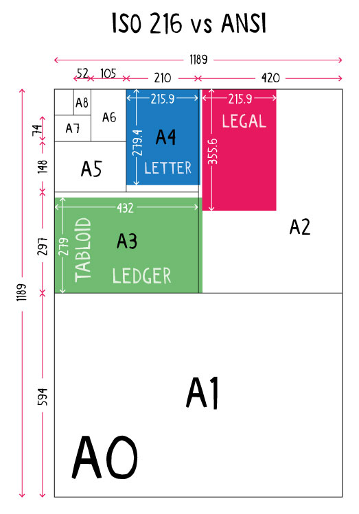
The 8.5×11 inch paper size is the cornerstone of business communication in the United States, Canada, and parts of Mexico. To calculate the aspect ratio, we divide the height by the width (11 ÷ 8.5), which results in 1.2941. Unlike the international ISO 216 standard (the A4 size), which relies on the “square root of two” (1:1.414), the US Letter ratio is rooted in historical paper-making traditions rather than purely mathematical scalability.
Calculating the 1:1.29 Aspect Ratio
For a brand designer, the ratio of 1:1.29 creates a specific “visual weight.” It is shorter and wider than its international counterpart, the A4. This subtle difference significantly impacts layout strategy. When designing for an 8.5×11 canvas, the designer has more horizontal space to work with in portrait orientation, which can accommodate wider typography or more expansive margins. This ratio dictates the “safe zones” for logos and the optimal line length for readability, ensuring that the brand’s voice is not just heard, but easily digested by the reader.
US Letter vs. International A4: A Global Branding Challenge
For a global brand, the 8.5×11 ratio presents a unique challenge: the “Ratio Gap.” Because most of the world uses A4 (8.27×11.69 inches), a brand identity system created solely on the 1:1.29 ratio will look distorted or poorly cropped when printed in Europe or Asia. Strategic branding requires a flexible design system. A high-level brand style guide must account for these two dominant ratios, ensuring that marketing collateral—whether it is a PDF case study or a printed invoice—maintains its aesthetic integrity regardless of the geographic location of the printer.
Designing for Impact: Why the 8.5×11 Ratio Defines Visual Hierarchy
In brand strategy, the medium is often the message. The 8.5×11 ratio carries a psychological connotation of “officialdom” and “professionalism.” Because this size has been the standard for business correspondence for decades, audiences subconsciously associate these dimensions with authority.
The Psychology of Familiarity in Document Design
When a potential client opens a digital proposal or receives a physical folder, their brain is already attuned to the 8.5×11 format. This familiarity lowers the cognitive load, allowing the reader to focus entirely on the brand’s value proposition rather than the format itself. By adhering to this ratio, a brand signals that it respects industry standards and understands the professional environment. Conversely, straying from this ratio without a strategic reason can make a brand appear disorganized or amateurish.
Maximizing Real Estate for Branding Elements
The 1:1.29 ratio offers a unique “Goldilocks zone” for visual hierarchy. It is large enough to allow for bold, impactful imagery and white space, yet small enough to feel personal and manageable. In brand design, “white space” is not empty space; it is a tool used to emphasize the logo, the call to action, and the core message. The width of the 8.5×11 page allows for multi-column layouts that can organize complex information into digestible “brand bites,” making it an ideal canvas for corporate annual reports and sophisticated marketing whitepapers.
Digital vs. Physical: Maintaining Brand Consistency Across Formats
As brands move toward a “digital-first” mentality, the 8.5×11 ratio remains surprisingly relevant. Even in an era of infinite scrolling, the concept of the “page” persists through PDFs and digital brochures. Maintaining the integrity of the 1:1.29 ratio across both physical and digital touchpoints is a hallmark of a mature brand identity.
Translating 8.5×11 to High-Resolution Digital Displays
When designing brand assets for digital distribution, the 8.5×11 ratio must be converted into pixels. At a standard high-resolution print quality of 300 DPI (dots per inch), an 8.5×11 document translates to 2550 x 3300 pixels. For brand managers, ensuring that digital assets are created at these dimensions prevents pixelation and blurry logos when the end-user decides to print a digital asset. A brand’s perceived value drops the moment a customer sees a pixelated logo on a printed page, making the technical understanding of this ratio a vital component of brand quality control.
Ensuring Color Accuracy from Screen to Print
A major pitfall in brand management is the discrepancy between how a brand looks on a backlit screen versus a matte 8.5×11 sheet of paper. The ratio stays the same, but the medium changes. Professional brand guidelines must specify how the visual identity should be adjusted for the “Letter” format. This includes defining “bleed” areas—the extra 0.125 inches added to the 8.5×11 dimensions to ensure that colors and images extend to the very edge of the page after trimming. Mastering the bleed and the margin within the 1:1.29 ratio is what separates a DIY brand from a world-class corporate identity.
Strategic Implementation: Using the US Letter Ratio in Marketing Collateral
The 8.5×11 ratio is more than just a size for letters; it is a strategic tool for various forms of marketing collateral. From lead magnets to internal brand books, how you utilize this specific aspect ratio can define the success of your communication strategy.
Designing Professional Media Kits and Whitepapers
In B2B branding, the whitepaper is a powerful tool for establishing thought leadership. Because these documents are often printed or viewed in a full-screen PDF viewer, the 8.5×11 ratio is the industry expectation. A well-designed whitepaper uses this ratio to create a “rhythm” of information. By utilizing a grid system based on the 1:1.29 ratio, designers can place testimonials, infographics, and brand stories in a way that feels balanced and authoritative. The ratio becomes a silent partner in the storytelling process, guiding the reader’s eye through the narrative of the brand.
The Future of the Letter Ratio in a Paperless Corporate World
Is the 8.5×11 ratio becoming obsolete in a digital-first world? On the contrary, it is becoming more specialized. As we move toward paperless offices, the 8.5×11 ratio is transitioning into a “premium” format. When something is designed for these dimensions, it implies it is worth printing—and therefore, worth keeping. Brands that continue to master this ratio for their most important assets—such as certificates, high-end catalogs, and executive summaries—position themselves as purveyors of lasting value in a sea of ephemeral digital content.
Conclusion: The Strategic Power of 1:1.29
The question “What ratio is 8.5×11?” finds its answer not just in numbers, but in the standard of excellence it represents for modern brands. The 1:1.29 ratio is a foundational element of visual communication in the North American market. It influences how we design, how we communicate, and how we are perceived by our clients and competitors.
By understanding the math, respecting the psychology of the format, and maintaining consistency across digital and physical platforms, brand leaders can ensure that every touchpoint—no matter how standard the size—is an opportunity to reinforce their corporate identity. In the meticulous world of branding, no detail is too small, and no dimension is too standard to be ignored. The 8.5×11 ratio is the canvas upon which the most successful brand stories are written.
aViewFromTheCave is a participant in the Amazon Services LLC Associates Program, an affiliate advertising program designed to provide a means for sites to earn advertising fees by advertising and linking to Amazon.com. Amazon, the Amazon logo, AmazonSupply, and the AmazonSupply logo are trademarks of Amazon.com, Inc. or its affiliates. As an Amazon Associate we earn affiliate commissions from qualifying purchases.