
In the world of visual communication, the question of which primary colors make yellow is not a simple matter of elementary school art class. For brand strategists, graphic designers, and corporate identity experts, the answer depends entirely on the medium being used: light or pigment. This distinction lies at the heart of the two most critical color models in branding: the Additive (RGB) and Subtractive (CMYK) systems.
Understanding the technical composition of yellow is more than a scientific curiosity; it is a fundamental requirement for maintaining brand consistency across a fragmented digital and physical landscape. When a brand chooses yellow as its signature hue—think of the iconic arches of McDonald’s, the bold utilitarianism of CAT, or the high-speed luxury of Ferrari—it is making a strategic decision that must be translated across pixels, ink, and physical materials with surgical precision.
The Paradox of Primaries: Redefining Yellow for Modern Branding
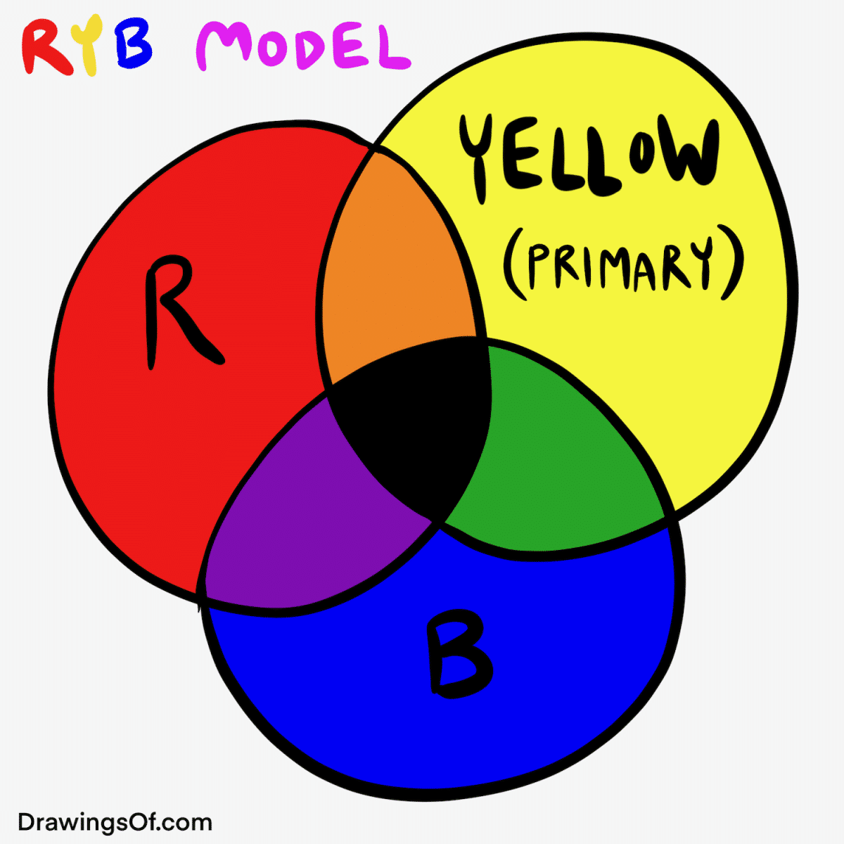
To understand how yellow is constructed, we must first dismantle the traditional “RYB” (Red, Yellow, Blue) model taught in early education. While the RYB model is useful for mixing oil paints, it is largely obsolete in the professional worlds of digital design and commercial printing. In the modern brand landscape, the definition of a “primary color” shifts based on whether you are working with light or physical matter.
The Subtractive Model: Yellow as a Foundation
In the world of print—known as the Subtractive Model—yellow is not made from other colors; it is a primary color. In the CMYK (Cyan, Magenta, Yellow, and Key/Black) system, yellow is one of the four fundamental building blocks used to create the entire spectrum of visible colors on paper, plastic, and fabric.
When a brand’s identity is manifested through business cards, billboards, or packaging, yellow acts as a primary ink. It absorbs (subtracts) certain wavelengths of light and reflects others back to our eyes. Because it is a primary in this context, you cannot mix other inks to create a pure, vibrant yellow. If a printer runs out of yellow ink, the branding process halts. This status as a primary color gives yellow a unique position in manufacturing and logistics; it is a “raw material” of the brand’s visual output.
The Additive Model: The Intersection of Red and Green
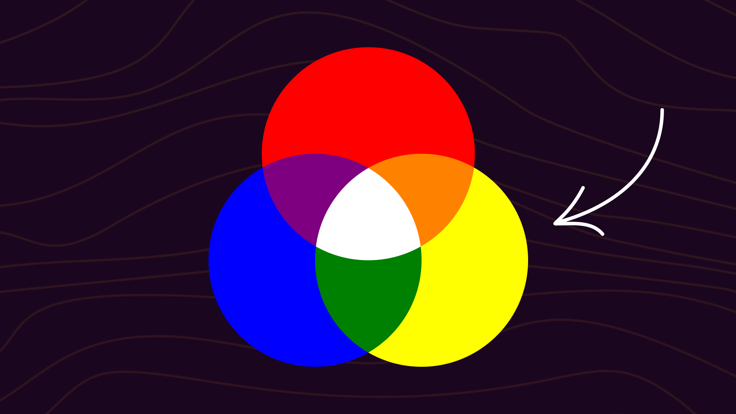
The most counterintuitive aspect of color theory for many brand managers is the Additive Model (RGB), which governs every digital screen, from the smartphone in your pocket to the LED billboard in Times Square. In the digital realm, yellow is a secondary color.
On a screen, yellow is created by mixing two other primary colors: Red and Green. By projecting full-intensity red light and full-intensity green light together, the human eye perceives the result as yellow. This “Additive” process occurs because the light is added together to reach a brighter state. This technical reality is crucial for web designers. When coding a brand’s color palette in CSS or selecting a Hex code, understanding that yellow lives at the intersection of red and green allows for more nuanced control over screen-based aesthetics and accessibility.
The Psychology of Yellow: Why Brands Choose the “Brightest” Hue
The technical construction of yellow is the “how,” but for brand strategy, the “why” is even more significant. Yellow is the most visible color in the spectrum and the first color the human eye notices. It commands attention without the inherent aggression of red, making it a powerful tool for brands that want to project clarity, optimism, and energy.
Optimism and Accessibility
In the psychology of brand identity, yellow is frequently associated with the sun, warmth, and happiness. Brands like Nikon and National Geographic use yellow to signify a sense of enlightenment and discovery. From a strategic standpoint, yellow is often used to “light up” a brand’s presence in a crowded marketplace.
However, yellow’s high visibility comes with a challenge: legibility. Because yellow is so bright, it often lacks the contrast necessary for text-heavy digital interfaces. This is where a brand’s design system must account for the color’s technical composition. Often, a brand will “deepen” its yellow by adding a hint of magenta (in print) or reducing the green intensity (in digital) to create a “Goldenrod” or “Amber” that maintains visibility while improving the user experience for those with visual impairments.
The Urgency of Caution
Beyond optimism, yellow carries a secondary psychological weight: caution. It is the international color for road signs and hazard warnings. Brand identities in the logistics, construction, and safety sectors—such as UPS, Caterpillar (CAT), and Stanley Tools—leverage this association to project durability and reliability. They aren’t just selling products; they are selling the “standard” of safety and professional-grade utility. The specific “Construction Yellow” used by these brands is a carefully guarded corporate asset, often patented or trademarked to ensure no competitor can dilute the brand’s visual authority.
Technical Execution: Ensuring Consistency Across Touchpoints
A major pitfall in brand management is the “Color Gap”—the phenomenon where a logo looks brilliant on a MacBook Pro screen but appears dull or greenish on a printed shipping box. This occurs because of the transition between the Red+Green digital yellow and the Pure Yellow print ink.
The Role of the Pantone Matching System (PMS)
To bridge the gap between digital and print, professional brands utilize the Pantone Matching System. Pantone provides a universal language for color. Instead of relying on a printer to mix CMYK values, a brand might specify “Pantone 123 C.” This ensures that whether the logo is being printed in a factory in China or a local shop in London, the yellow remains identical.
Strategically, selecting a Pantone yellow is one of the most important steps in creating a Brand Style Guide. This document serves as the “source of truth,” listing the exact RGB, CMYK, Hex, and Pantone values. Without this technical rigor, a brand’s yellow can quickly drift into “lime” (too much green) or “orange” (too much red), eroding brand equity and consumer trust over time.
Designing for Dark Mode and Digital Diversity
In the modern era, brands must also consider how their yellow behaves in “Dark Mode.” Since yellow is created by red and green light on a screen, it has an inherently high luminance. Against a black or dark gray background, yellow can become vibrate-y or “neon,” which may clash with a professional corporate identity.
Forward-thinking brands now develop “Adaptive Palettes.” They might use a vibrant Red+Green yellow for their primary logo but switch to a slightly desaturated, more “golden” version for mobile app icons to reduce eye strain. This level of detail shows a brand’s commitment to both its identity and the comfort of its digital users.
Yellow as a Strategic Competitive Advantage
In a sea of blue and red corporate logos—the most common colors in the Fortune 500—yellow offers a distinct competitive advantage. It is a “high-risk, high-reward” color.
Differentiation in Saturated Markets
When a brand chooses yellow, it is often a deliberate attempt to disrupt a category. Consider the telecommunications or fintech sectors, which are dominated by “trustworthy” blues. A brand that enters this space with a bold yellow identity immediately signals that it is a challenger, an innovator, or a more accessible alternative.
The strategic “ownership” of yellow requires a brand to be bold. Because yellow is difficult to print perfectly and can be overwhelming if overused, many brands shy away from it. This leaves the “Yellow Space” open for brands that are confident in their identity and have the technical infrastructure to manage the color’s complexity.
Case Study: The “Golden Arches” and Color Memory
McDonald’s provides perhaps the most famous case study in the strategic use of yellow. The “Golden Arches” are not just a shape; they are a specific frequency of light and ink. By pairing yellow with red, McDonald’s leverages the “Ketchup and Mustard” theory—a psychological trigger that stimulates appetite and suggests speed.
The brand’s yellow is meticulously maintained. If you see a McDonald’s sign from a mile away, your brain recognizes the brand before it can even resolve the “M” shape. This is the power of a color that is correctly mixed and consistently applied. The red and green light of the digital sign and the yellow ink of the fry box work in harmony to create a singular, unified brand experience.
Conclusion: The Mastery of Light and Pigment
Understanding what primary colors make yellow is the first step in mastering the visual language of a brand. Whether it is the additive fusion of red and green on a screen or its status as a foundational primary in print, yellow is a complex and powerful tool.
For the brand strategist, yellow represents the ultimate balance between science and emotion. It requires a deep technical understanding of color models to ensure that the “optimism” of the brand isn’t lost in translation between a digital ad and a physical product. In an increasingly visual economy, the brands that master their primaries are the ones that will truly shine in the eyes of the consumer.
aViewFromTheCave is a participant in the Amazon Services LLC Associates Program, an affiliate advertising program designed to provide a means for sites to earn advertising fees by advertising and linking to Amazon.com. Amazon, the Amazon logo, AmazonSupply, and the AmazonSupply logo are trademarks of Amazon.com, Inc. or its affiliates. As an Amazon Associate we earn affiliate commissions from qualifying purchases.