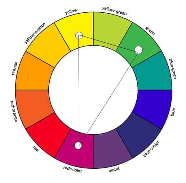
In the competitive landscape of modern commerce, visual identity is often the first—and sometimes only—point of contact between a brand and its audience. While many entrepreneurs and marketing executives focus on the literal meaning of their logos or the catchiness of their slogans, the foundational science of color theory remains one of the most underutilized levers in brand strategy. To answer the fundamental question—what is yellow’s complementary color?—one must look to the opposite side of the traditional color wheel: Purple (or Violet).
However, for a brand strategist, the answer is not merely a fact of art history; it is a strategic blueprint. The pairing of yellow and purple represents one of the most high-contrast, visually stimulating combinations available in the design toolkit. When deployed correctly, this complementary relationship can define a brand’s energy, signal luxury, and ensure that a corporate identity cuts through the digital and physical noise of the marketplace.
Understanding the Visual Power of Yellow and Purple in Branding
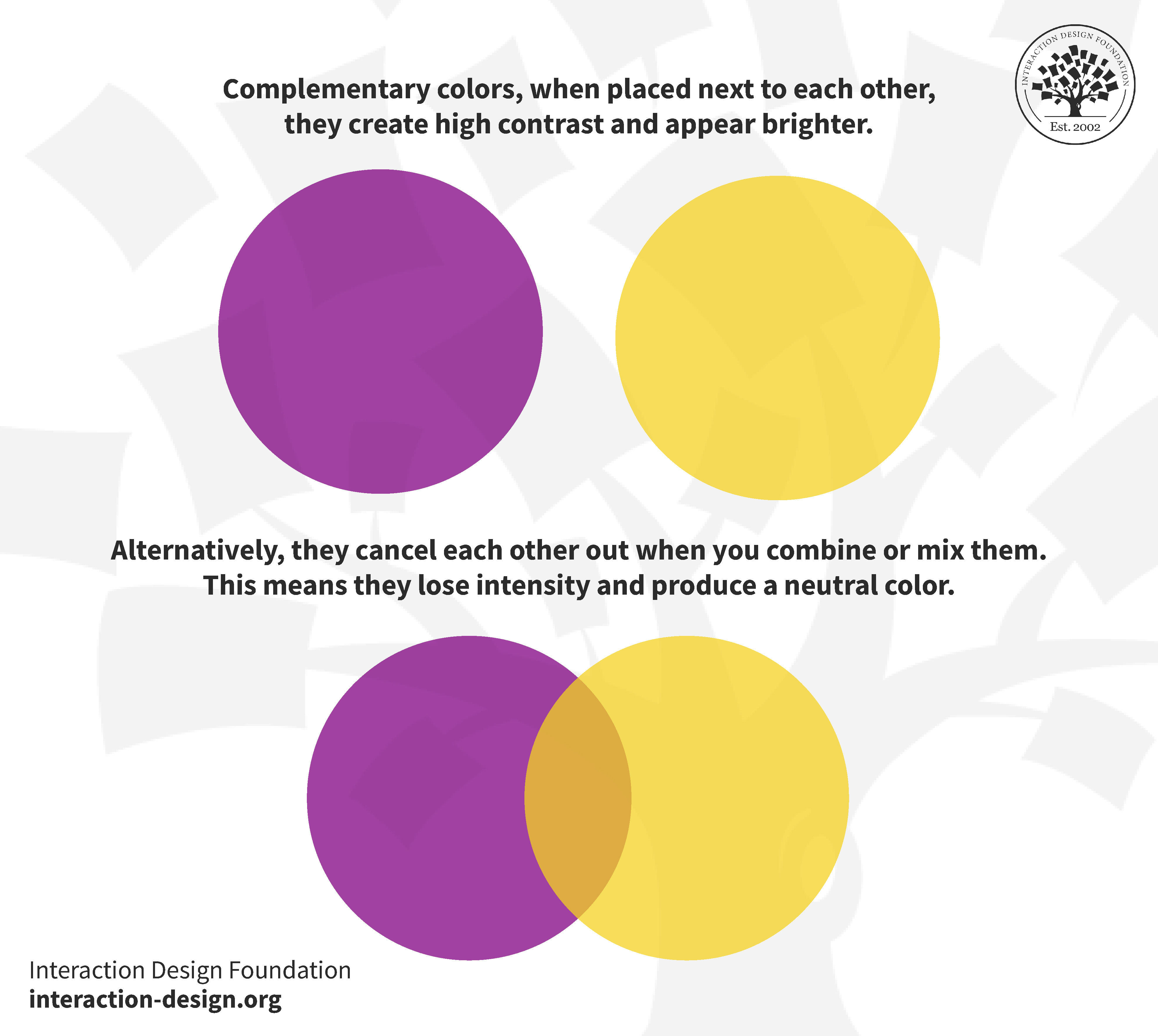
The concept of complementary colors is rooted in how the human eye and brain process light. Complementary colors are pairs which, when combined or mixed, cancel each other out by producing a grayscale color like white or black. When placed side-by-side, however, they create the strongest possible contrast for those particular two colors.
The Science of Visual Contrast and Color Theory
The relationship between yellow and purple is unique because it represents the highest contrast in terms of “value” (lightness vs. darkness) among all complementary pairs. Yellow is inherently the brightest color on the spectrum, carrying the highest luminosity. Purple, conversely, is one of the darkest.
When a brand utilizes this pair, it creates a “simultaneous contrast” effect. This phenomenon causes the yellow to appear even brighter and the purple to appear even deeper. For a brand looking to command attention in a crowded retail environment or on a cluttered mobile interface, this inherent optical vibration is an invaluable asset.
Why Purple is the Perfect Counterpart to Yellow
In branding, every color choice must be intentional. Yellow is often associated with optimism, clarity, and speed. However, yellow can also be overwhelming or perceived as “cheap” if used in isolation. Purple provides the necessary psychological and visual weight to ground yellow. By pairing yellow with its complementary purple, a brand can maintain its high-energy appeal while adding an undercurrent of sophistication and stability. This balance is critical for brands that want to be perceived as both innovative and established.
Strategic Implementation: Using Complementary Schemes for Brand Recognition
A successful brand identity is not just about choosing two colors; it is about the strategic ratio and application of those colors across various touchpoints. The yellow-purple duo offers a versatility that ranges from playful and energetic to regal and authoritative.
High Visibility and Action-Oriented Design
In the world of User Experience (UX) and User Interface (UI) design, the yellow-purple complementary scheme is frequently used to drive conversions. Because yellow naturally draws the eye first, it is often utilized for Call-to-Action (CTA) buttons or critical alerts. When these yellow elements are placed against a purple background, the “pop” is maximized.
Strategic branding utilizes this to guide the consumer’s journey. If a brand’s primary identity is purple—signaling creativity or luxury—the use of yellow as a secondary, complementary accent can effectively direct the customer’s attention to “Buy Now” or “Sign Up” features without clashing with the overall brand aesthetic.
Balancing Vibrancy with Sophistication
One of the risks of using high-contrast complementary colors is that they can become “loud” or visually exhausting. To mitigate this, brand strategists often use the “Split-Complementary” method or adjust the saturation and value. Instead of a neon yellow and a bright grape purple, a luxury brand might opt for a muted mustard yellow and a deep, royal plum. This retains the biological harmony of the complementary relationship while tailoring the “mood” to fit a more premium market segment.
Color Psychology: The Emotional Impact of Yellow-Purple Pairings
Colors speak a language that bypasses logical reasoning and moves straight to emotional response. Understanding the psychological nuances of yellow and its complement is essential for crafting a brand story that resonates.
Yellow: Optimism, Clarity, and Attention
Yellow is the color of the sun, symbolizing life, energy, and intellect. In a branding context, it is used by companies that want to project a friendly, accessible, and fast-paced image. It stimulates the logical side of the brain and encourages mental clarity. For startups and tech firms, yellow can signal a “eureka” moment or a new way of thinking. However, because it is so stimulating, it requires a “cool” anchor to prevent consumer fatigue.
Purple: Luxury, Creativity, and Authority
Purple has a long historical association with royalty and wealth, largely due to the rarity and cost of the dye in ancient times. In modern brand strategy, purple is used to denote quality, mystery, and imaginative thinking. It is the color of the “visionary.” When a brand pairs purple with yellow, it effectively communicates: “We are the bright, optimistic future (Yellow), backed by deep-rooted wisdom and premium quality (Purple).” This dual-messaging is potent for professional services, educational institutions, and creative agencies.
Case Studies: World-Class Brands Winning with Complementary Contrasts
To see the efficacy of the yellow-purple relationship, one only needs to look at global leaders who have built billion-dollar identities on this foundation.
Sports Branding: The Los Angeles Lakers
Perhaps the most famous example of the yellow-purple (often referred to as “Gold and Purple”) pairing is the Los Angeles Lakers. The choice is deliberate. The yellow/gold projects the “Showtime” energy, success, and the bright lights of Hollywood. The purple adds a layer of “royalty”—fitting for a franchise with a history of championship “kings.” The contrast ensures that the team’s branding is instantly recognizable even from the furthest seat in an arena or on a low-resolution mobile screen.
Tech and Logistics: FedEx and Hallmark
While FedEx is primarily known for its orange and purple (a variation of the complementary theme), the use of purple as a foundational corporate color allows it to stand out against the primary blues and reds of its competitors.
Hallmark, a brand centered on emotional connection and “gold-standard” quality, frequently utilizes yellow-gold accents against purple backgrounds in its branding and retail displays. The purple evokes the sentimentality and “specialness” of the occasion, while the yellow/gold highlights the brand’s crown logo, symbolizing its leadership in the industry.
Practical Tips for Integrating Complementary Colors into Your Brand Strategy
If you are looking to refresh a corporate identity or launch a new brand using yellow and its complementary purple, consider the following strategic guidelines.
The 60-30-10 Rule in Design
To prevent a brand from looking like a sports jersey (unless that is the goal), apply the 60-30-10 rule. Use one color as the dominant base (60%), a second as the secondary (30%), and the final 10%—the “complement”—as an accent. For example, a sleek, modern brand might use a deep purple for 60% of its website, a neutral white for 30%, and hits of vibrant yellow for the final 10% to highlight key information.
Digital Accessibility and Contrast Ratios
From a digital brand strategy perspective, accessibility is no longer optional. When using yellow and purple, designers must be mindful of the Web Content Accessibility Guidelines (WCAG). Yellow text on a white background is nearly impossible to read, but yellow text on a purple background offers high legibility.
However, one must be careful with thin fonts or small icons. Always test the contrast ratio of your chosen yellow and purple shades to ensure they meet the 4.5:1 ratio required for standard text. A brand that is accessible is a brand that is inclusive, which is a core pillar of modern brand equity.

Conclusion: The Harmony of Opposites
What is yellow’s complementary color? On a surface level, it is purple. On a strategic level, it is the balance between energy and authority, between visibility and depth. In the realm of brand strategy, leveraging the relationship between yellow and its complement is about more than just aesthetics—it is about psychological positioning. By understanding how these colors interact, brands can create visual identities that are not only beautiful but are also scientifically engineered to capture attention, evoke emotion, and build lasting recognition in the minds of consumers.
aViewFromTheCave is a participant in the Amazon Services LLC Associates Program, an affiliate advertising program designed to provide a means for sites to earn advertising fees by advertising and linking to Amazon.com. Amazon, the Amazon logo, AmazonSupply, and the AmazonSupply logo are trademarks of Amazon.com, Inc. or its affiliates. As an Amazon Associate we earn affiliate commissions from qualifying purchases.