
In the competitive landscape of visual communication, color is rarely a mere aesthetic choice. It is a silent ambassador, a psychological trigger, and a fundamental pillar of brand strategy. Among the sophisticated palettes currently dominating modern corporate identity, one hue has emerged as a powerhouse of versatility and emotional resonance: Willow.
To understand what willow color is from a branding perspective, one must look beyond its botanical origins. While it draws its name from the silver-green leaves of the willow tree, in the context of brand design, it represents a specific intersection of organic reliability and muted sophistication. It is a desaturated, medium-to-light green with significant grey and earthy undertones. In an era where consumers are increasingly wary of “loud” marketing and over-saturated digital experiences, Willow offers a strategic retreat—a visual breath of fresh air that signals stability, sustainability, and high-end curation.

The Anatomy of Willow: Defining the Visual Identity
From a technical standpoint, Willow is not a single point on the color wheel but a family of shades that bridge the gap between sage and moss. It typically occupies a space characterized by low chroma and high value, making it soft on the eyes and exceptionally functional as a secondary or primary brand color.
The Color Theory of Desaturation
In brand strategy, the saturation of a color dictates the “volume” of the message. Bright, neon greens are used for high-energy tech startups or impulse-buy consumer goods. Conversely, Willow’s desaturated nature speaks to a different demographic. By muting the green with grey, the color loses its youthful “zest” and gains a sense of “wisdom.” This makes it an ideal choice for brands that want to communicate experience, longevity, and a grounded philosophy.
Willow vs. Its Contemporaries
It is often confused with Sage or Olive, but the distinction is vital for brand consistency. Sage tends to be cooler, leaning more toward the blue-grey spectrum, while Olive is heavier on the yellow and brown tones, often associated with more rugged or military aesthetics. Willow sits perfectly in the middle—it is neutral-to-warm, maintaining a softness that feels approachable rather than utilitarian. This balance allows it to function effectively across diverse mediums, from matte-finish product packaging to high-resolution digital interfaces.
Psychological Resonance: Why Brands Choose Willow
The selection of a brand’s color palette is a form of perceptual engineering. Every hue triggers a subconscious reaction based on evolutionary biology and cultural conditioning. Willow color taps into several powerful psychological archetypes that can be leveraged to build brand equity.
The Promise of Growth and Stability
Green is universally recognized as the color of life, growth, and renewal. However, deep emeralds can sometimes feel overly traditional or “heavy,” while lime greens can feel fleeting. Willow provides a sense of sustainable growth. It suggests a brand that is established and flourishing but not aggressive. For financial consulting firms or wellness brands, this color reassures the client that they are in a safe, nurturing environment where progress is steady and measured.
The “Quiet Luxury” Aesthetic
In recent years, the concept of “quiet luxury” has migrated from fashion into general corporate branding. This movement prioritizes subtlety over logos and minimalism over flashiness. Willow is the quintessential quiet luxury color. It doesn’t demand attention with high-contrast vibrancy; instead, it invites the viewer to lean in. Brands that use Willow often target a sophisticated consumer base that values quality, craftsmanship, and understated elegance.
Emotional Neutrality and Calm
In a digital world characterized by “doomscrolling” and sensory overload, brands that provide a sense of calm often win the highest levels of customer loyalty. Willow has a low physiological impact on the human eye, meaning it is easy to process and pleasant to look at for extended periods. This makes it a strategic asset for app interfaces, long-form content platforms, and service-based brands that want to reduce user anxiety.
Integrating Willow into Brand Architecture
Knowing what willow color is constitutes only half of the strategy; the real value lies in how a brand integrates it into its broader visual language. Because it is a “muted” tone, it functions as a versatile chameleon, capable of shifting the brand’s mood depending on its supporting palette.
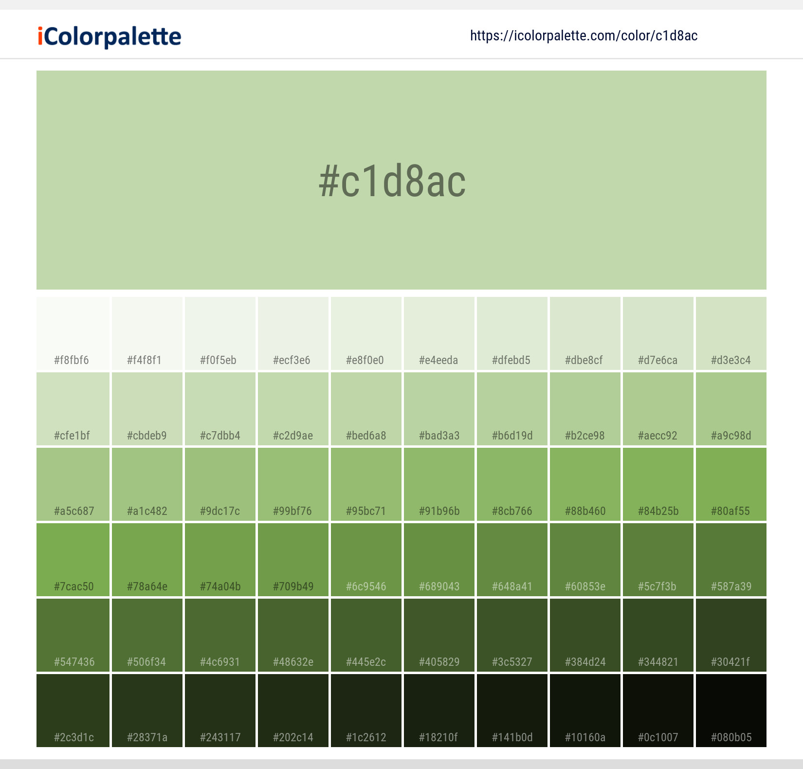
Creating High-Value Pairings
The success of a Willow-based identity often depends on the colors that surround it.
- Willow and Cream/Ivory: This pairing is a staple for luxury skincare and organic food brands. It creates an aura of purity, health, and premium quality.
- Willow and Charcoal/Slate: When paired with dark, cool neutrals, Willow becomes professional and authoritative. This is a common choice for architectural firms and high-end real estate brands.
- Willow and Terracotta/Ochre: This combination leans into the “Earth Tone” trend, appealing to the eco-conscious consumer. It feels warm, artisanal, and “human-centric.”
Digital Application and Accessibility
From a design perspective, Willow presents unique opportunities for UI/UX. As a background color, it is far less harsh than pure white, reducing eye strain. However, brand strategists must be careful with typography. Because Willow is a mid-tone, white text may lack sufficient contrast for accessibility standards (WCAG). Professional brand guides often pair Willow with deep charcoals or dark wood-toned blacks for text to ensure legibility while maintaining the organic aesthetic.
Physical Branding and Textures
Willow truly shines when applied to physical materials. Because it is an “earthy” color, it resonates deeply when used on textured paper, linen-bound books, or matte-finished containers. For a brand, the tactile experience of a Willow-colored box can reinforce the message of sustainability and premium craftsmanship far more effectively than a glossy, brightly colored alternative.
Case Studies: The Strategic Impact of Nature-Inspired Tones
While many brands are currently pivoting toward muted greens, observing how certain sectors utilize Willow-adjacent tones provides a masterclass in brand positioning.
The Wellness Revolution
In the wellness and mental health space, the shift away from clinical whites and blues toward Willow greens has been transformative. Startups in the meditation and therapy space use these tones to signal that they are a “third space”—neither a sterile doctor’s office nor a chaotic home environment. The color serves as a visual bridge to the outdoors, tapping into the “biophilia” effect, which suggests that humans have an innate tendency to seek connections with nature.
Sustainable Tech and Ethical Consumerism
As technology companies face increasing scrutiny regarding their environmental impact, many have rebranded to include Willow in their palettes. By moving away from “Cold Tech Blue,” these companies are attempting to soften their corporate image. The use of Willow suggests that the technology is in harmony with the environment rather than at odds with it. It shifts the brand narrative from “Disruptive” to “Restorative.”
Mastering the Willow Palette: Best Practices for Strategists
For a brand manager or designer looking to adopt Willow, several strategic considerations must be addressed to ensure the color performs as intended across all touchpoints.
1. Consistency Across Mediums
Willow is a subtle color, which means it is prone to shifting under different lighting conditions or printing processes. A Willow green that looks perfect on a calibrated monitor may look muddy or brownish when printed on uncoated paper stock. It is essential to define specific Pantone (PMS) matches for print and HEX/RGB values for digital to maintain brand integrity.
2. Guarding Against “Drabness”
The primary risk of a muted palette is that it can occasionally appear dull or uninspiring if not balanced correctly. To avoid this, brand strategists often introduce a “pop” or an accent color. A Willow-dominant brand might use a soft gold or a vibrant coral as an accent to draw the eye to call-to-action buttons or important brand information, ensuring the identity remains dynamic.
3. Cultural Sensitivity
While green is generally viewed positively in Western cultures, its connotations can vary globally. In some cultures, certain greens can be associated with infidelity or specific political movements. Before launching an international brand identity centered on Willow, thorough market research is required to ensure the “calm and organic” message translates accurately across borders.

The Future of Willow in Corporate Identity
As we look toward the future of design, the “Willow” movement represents a broader trend toward authenticity and mindfulness. Consumers are no longer impressed by the loudest brand; they are impressed by the most thoughtful one.
Willow color is more than just a trend; it is a response to the current socio-economic climate. It represents a desire for longevity, a respect for the natural world, and a commitment to quality over quantity. By incorporating Willow into a brand strategy, companies can communicate a sophisticated, grounded, and trustworthy identity that resonates with the modern, conscious consumer. It is a color that doesn’t just represent a brand—it represents a lifestyle and a set of values that prioritize the enduring over the ephemeral.
aViewFromTheCave is a participant in the Amazon Services LLC Associates Program, an affiliate advertising program designed to provide a means for sites to earn advertising fees by advertising and linking to Amazon.com. Amazon, the Amazon logo, AmazonSupply, and the AmazonSupply logo are trademarks of Amazon.com, Inc. or its affiliates. As an Amazon Associate we earn affiliate commissions from qualifying purchases.