
In the world of global communication, few entities possess a visual identity as enduring, recognizable, and strategically curated as the Papacy. While a casual observer might simply ask, “What is the papal hat called?” a brand strategist looks at the same object and sees a masterclass in symbolic identity. The headwear of the Pope—ranging from the humble zucchetto to the ornate mitre—is not merely religious regalia; it represents a sophisticated system of brand architecture that has communicated authority, humility, and continuity for nearly two millennia.
To understand the nomenclature of papal headwear is to understand the “corporate identity” of the Vatican. Every garment serves as a touchpoint, reinforcing a narrative that transcends language barriers and geographic borders. In the competitive landscape of global influence, the Papacy uses its visual assets to signal shifts in “management style” and institutional values.
The Visual Identity System: Naming the Papal Silhouette
When identifying what the papal hat is called, one must first recognize that the Pope utilizes a “wardrobe” of headwear, each serving a specific strategic function within the Church’s brand hierarchy. Unlike a modern CEO who might rely on a tailored suit, the Pope uses distinct headpieces to signal the nature of the occasion—whether it is a high-level “board meeting” (liturgical ceremony), a public relations event (an audience), or a moment of reflection.
The Zucchetto: The Minimalist Signature
The most frequently seen papal headpiece is the zucchetto. From a branding perspective, the zucchetto is the “minimalist logo” of the clerical hierarchy. It is a small, silk skullcap, and its power lies in its color-coded brand architecture.
In the Catholic Church’s identity system, color is the primary indicator of rank. While priests wear black and bishops wear violet, the white zucchetto is reserved exclusively for the Pope. This creates an immediate “visual equity.” In any crowd of thousands, the white zucchetto serves as a beacon, ensuring that the brand’s “lead executive” is instantly identifiable. The name itself derives from the Italian word zucca, meaning “gourd” or “head,” reflecting a functional design meant to provide warmth that evolved into a permanent fixture of the papal brand.
The Mitre: The Architecture of Authority
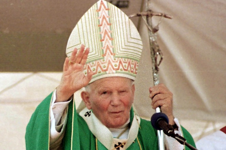
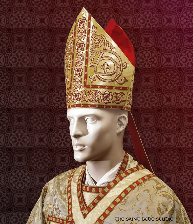
If the zucchetto is the daily logo, the mitre is the “hero asset” of the papal brand. This is the tall, folding cap with two peaks (the cornua) that the Pope wears during liturgical functions. The mitre represents the formal authority of the office.
In brand strategy, the mitre serves as a vertical extension of the Pope’s presence, physically elevating him during ceremonies to symbolize spiritual leadership. The design of the mitre—often adorned with gold thread, precious stones, and intricate embroidery—functions as a display of the institution’s historical “wealth” and cultural legacy. However, modern popes have used the mitre to pivot the brand’s positioning; for example, Pope Francis often opts for simpler, less ornate mitres to align his personal brand with the values of poverty and humility.
The Papal Tiara: The Retired Brand Asset
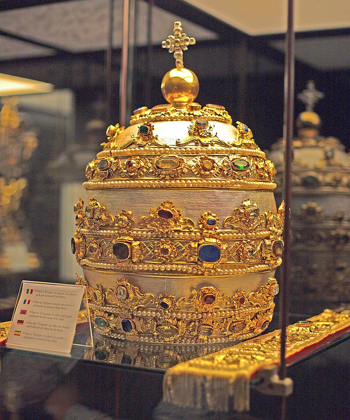
Historically, when people asked what the papal hat was called, the answer was often the Papal Tiara (the triregnum). This was a triple-layered, crown-like headpiece symbolizing the Pope’s triple power: father of kings, governor of the world, and vicar of Christ.
From a brand management standpoint, the retirement of the tiara is one of the most significant “rebranding” moves in history. In 1963, Pope Paul VI laid his tiara on the altar of St. Peter’s Basilica as a gesture of humility. By retiring this asset, the Papacy signaled a strategic shift away from temporal, political power toward a focus on pastoral service. While it remains a part of the Vatican’s heraldic “brand guidelines” (appearing on the flag and coat of arms), it is no longer a functional part of the wardrobe.
Strategic Iconography: How the “Hat” Communicates Value
In brand design, every element must serve a purpose. The headwear of the Pope is carefully selected to communicate specific values to a global audience. This is not merely about tradition; it is about the “semiotics of dress”—the study of how signs and symbols communicate meaning.
The Saturno: The Lifestyle Brand Extension
Outside of formal ceremonies, the Pope may wear the Saturno, a wide-brimmed felt hat named for its resemblance to the ringed planet. While less common today, the Saturno serves as a “lifestyle” accessory within the papal brand.
When a Pope wears the Saturno, he evokes the image of a pilgrim or a shepherd. This reinforces the “pastoral” brand pillar. It humanizes the figurehead, making the “brand” feel approachable and grounded. For instance, Pope Benedict XVI’s use of the red Saturno was seen by brand analysts as a nod to traditionalist fans of the brand, reviving a classic look that had fallen out of favor, thereby strengthening the “heritage” aspect of his papacy.
The Camauro: Seasonality and Heritage
The camauro is a red velvet cap trimmed with white ermine, historically worn by popes in the winter. Its return to the public eye under Benedict XVI sparked a global conversation about brand “traditionalism.”
In the corporate world, brands often release “heritage collections” to remind consumers of their long-standing history. The camauro functioned similarly. By wearing a garment associated with the Renaissance-era papacy, the office communicated a sense of timelessness. It reminded the “market” that the Papacy is not a fleeting trend but an institution that spans centuries.
Color Theory in Papal Branding
The color palette of papal headwear is strictly regulated. Red and white are the dominant tones. In branding, white represents purity, clarity, and divinity, while red (historically used for papal shoes and certain hats) represents the blood of martyrs and the fire of the Holy Spirit.
By maintaining a consistent color palette across centuries, the Vatican has achieved a level of “brand recognition” that modern corporations envy. The “Papal White” is as much a brand asset as “Tiffany Blue” or “Ferrari Red.” When the Pope steps onto a balcony, the white zucchetto ensures that the “product” (the papacy) is immediately recognized by the “consumer” (the faithful).
Case Studies in Rebranding: Benedict XVI vs. Francis
The choice of “hat” often serves as the most visible indicator of a change in brand direction. By comparing the visual strategies of the two most recent popes, we can see how headwear is used to manage public perception and institutional “tone of voice.”
Benedict XVI: The Heritage Rebrand
Pope Benedict XVI’s tenure was characterized by a “return to roots.” His brand strategy focused on the continuity of the Church’s intellectual and aesthetic history. Consequently, his choice of headwear included more ornate mitres and the revival of the camauro. This was a “prestige branding” strategy, emphasizing the majesty, beauty, and historical weight of the Catholic institution. For his “target audience”—those seeking stability and traditional values—this visual identity was highly effective.
Francis: The “Simplicity” Pivot
When Pope Francis was elected, he executed a radical “brand pivot.” On his first appearance, he declined the ornate mozzetta (a short cape) and chose a simple white cassock and a plain zucchetto. His mitres are famously understated, often made of simple fabrics with minimal ornamentation.
This is a “disruptive branding” strategy. By stripping away the layers of “luxury,” Francis repositioned the Papacy as an “organization for the poor.” The “hat” in this context became a tool for accessibility. He moved the brand away from “institutional majesty” toward “radical humility.” This shift was not just an aesthetic choice; it was a strategic move to regain trust and relevance in a modern, secular world that often views institutional wealth with skepticism.
Lessons for Modern Brand Strategy
What can modern brand managers and designers learn from the question, “What is the papal hat called?” The answer lies in the power of consistent, symbolic, and purposeful identity management.
1. Consistency Over Centuries
The Papacy demonstrates that a brand does not need to change its “logo” every five years to remain relevant. By keeping the core elements—like the zucchetto and the mitre—consistent, the Vatican has built immense “brand equity.” Longevity is a brand’s greatest asset, and tradition can be a powerful differentiator in a fast-paced “disposable” culture.
2. High-Context Symbolism
Every piece of papal headwear is “high-context.” It carries layers of meaning that can be “decoded” by those who know the brand history. For modern brands, this suggests that creating “Easter eggs” or deep layers of meaning within a brand’s visual identity can foster a deeper connection with a “super-fan” base (in this case, the faithful).
3. Visual Storytelling
The transition from the Tiara to the Zucchetto tells a story of an institution evolving from a kingdom to a global service organization. Brands should view their visual assets not just as “packaging,” but as tools for storytelling. Your “hat”—whatever your brand’s most visible asset may be—should tell the world who you are and what you stand for without you having to say a word.
Conclusion: The Hat as a Pillar of Identity
In conclusion, “what the papal hat is called” depends entirely on the strategic context of the moment. Whether it is the zucchetto for daily identity, the mitre for ceremonial authority, or the Saturno for pastoral approachability, each piece of headwear is a vital component of the most successful brand identity system in human history.
By masterfully blending tradition with strategic pivots, the Papacy uses its “wardrobe” to communicate a message of continuity, authority, and values. For any student of brand strategy, the papal “hats” are more than just historical artifacts; they are sophisticated tools of visual communication that prove the power of a well-defined and consistently executed identity. In the end, the white zucchetto is not just a cap—it is a symbol of a global brand that has mastered the art of being both timeless and timely.
aViewFromTheCave is a participant in the Amazon Services LLC Associates Program, an affiliate advertising program designed to provide a means for sites to earn advertising fees by advertising and linking to Amazon.com. Amazon, the Amazon logo, AmazonSupply, and the AmazonSupply logo are trademarks of Amazon.com, Inc. or its affiliates. As an Amazon Associate we earn affiliate commissions from qualifying purchases.