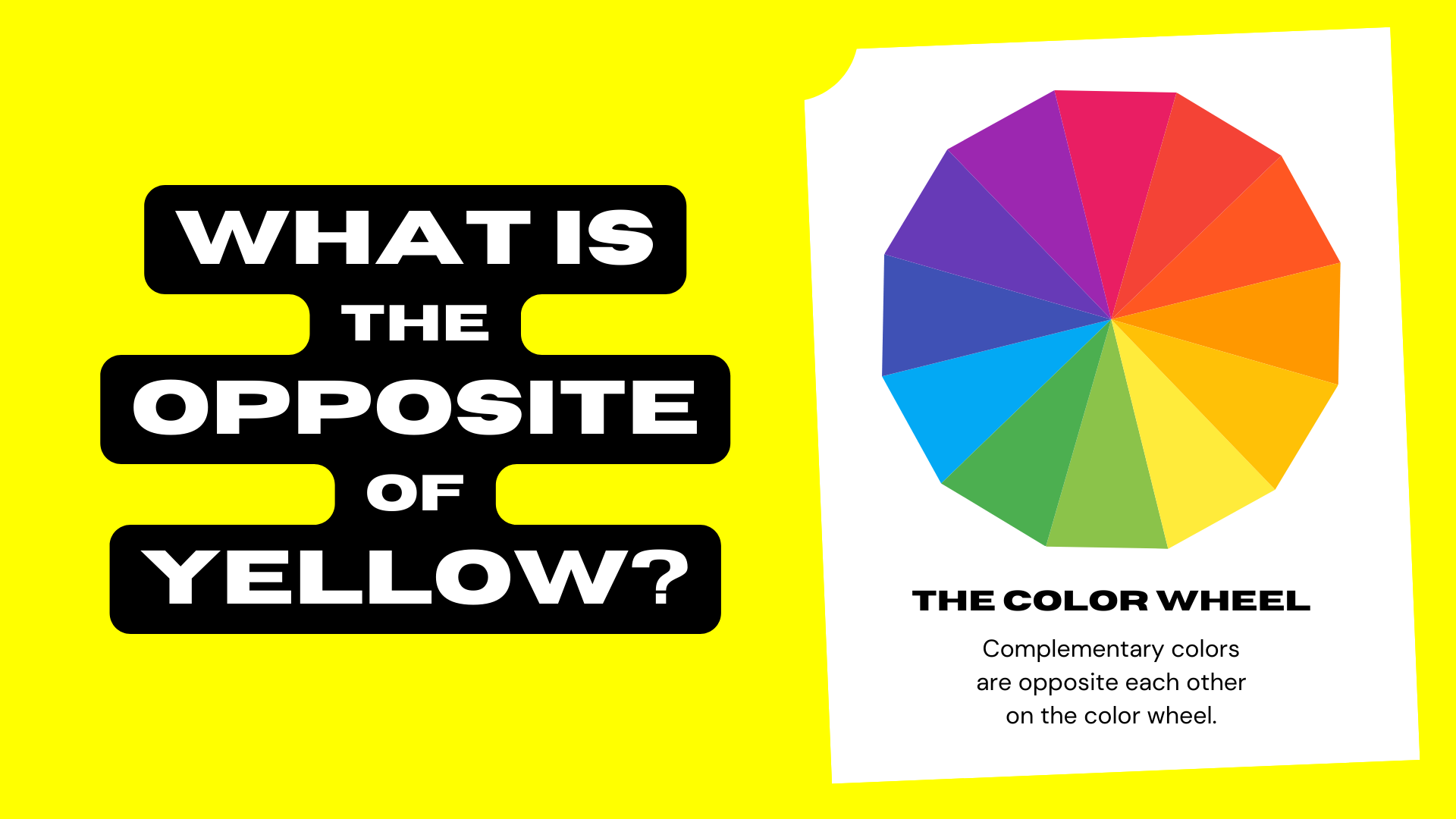
In the intricate world of branding and design, color is far more than mere ornamentation; it is a strategic language, a potent psychological trigger, and a fundamental pillar of brand identity. Understanding the nuances of color, particularly concepts like complementary colors, is not just an artistic pursuit but a critical business imperative. When we ask, “What is the opposite of yellow on the color wheel?”, we are not simply seeking a visual answer; we are unlocking insights into creating compelling visual narratives, achieving impactful brand differentiation, and influencing consumer perception at a foundational level.
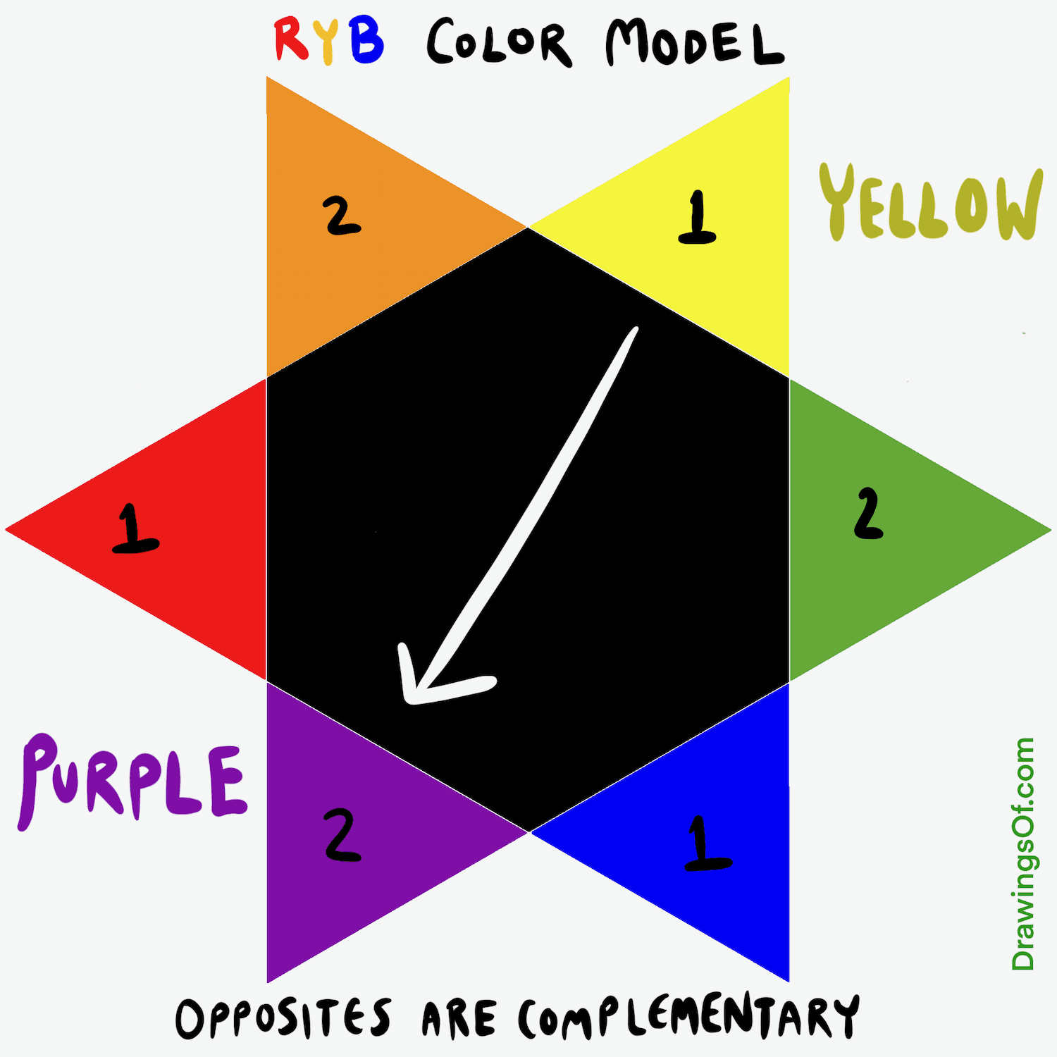
The answer to this question, rooted in classical color theory, is purple. On the traditional artist’s color wheel, yellow and purple sit directly across from each other, making them complementary colors. This relationship is profoundly significant for brands, offering a dynamic interplay of contrast, energy, and sophisticated visual appeal. For brand strategists, marketers, and designers, delving into this opposition reveals powerful tools for crafting memorable, resonant, and effective brand experiences.
The Foundational Role of Color in Branding and Design
Color is often the first element consumers perceive, long before they read a slogan or understand a product’s features. It sets the tone, evokes emotions, and can instantly communicate a brand’s personality and values. In a crowded marketplace, where differentiation is key, a meticulously crafted color strategy can be the decisive factor in capturing attention and fostering lasting connections.
Decoding the Color Wheel: A Brand Essential
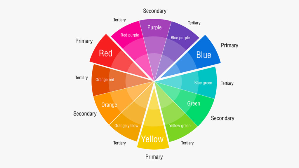
The color wheel is an indispensable tool in the designer’s arsenal, providing a systematic arrangement of hues that illustrates their relationships. It typically starts with the primary colors (red, blue, yellow), from which secondary colors (green, orange, purple) are mixed, and then tertiary colors are formed by mixing a primary and a secondary.
Complementary colors, like yellow and purple, are those positioned directly opposite each other on this wheel. Their inherent contrast creates a vibrant tension when used together, making each color appear brighter and more intense. This high contrast can be exceptionally effective for drawing attention, creating visual hierarchy, and ensuring a brand’s message stands out. For a brand aiming to be seen as energetic, innovative, or distinctive, leveraging complementary pairings is a powerful technique to achieve immediate visual impact. It allows for the creation of clear focal points and visual pathways, guiding the viewer’s eye through a design or marketing material precisely as intended. Understanding this fundamental principle is the first step towards harnessing the full power of color in any brand’s visual vocabulary.
Beyond Aesthetics: The Psychology of Color
The strategic use of color extends far beyond mere visual appeal; it delves deep into the realm of human psychology, influencing moods, perceptions, and even purchasing decisions. Each color carries a unique set of associations and evokes specific emotional responses, which brands can skillfully leverage to communicate their core essence and connect with their target audience on a subconscious level.
Yellow, for instance, is frequently associated with optimism, cheerfulness, energy, and warmth. It can convey innovation, playfulness, and approachability. However, in certain contexts, particularly when used excessively or incorrectly, it can also suggest caution or fleeting attention. Brands that embrace yellow often aim to project a friendly, accessible, and vibrant image, signaling enthusiasm and a positive outlook.
Purple, on the other hand, traditionally signifies royalty, luxury, wisdom, and creativity. It can evoke feelings of sophistication, mystique, and imagination. Darker shades of purple often lend an air of elegance and opulence, while lighter lavenders might suggest romance or spirituality. Brands using purple typically seek to position themselves as premium, inventive, or offering unique, high-value experiences.
When yellow and purple are combined, their psychological impacts can amplify or temper each other, creating a richer, more complex message. The bright energy of yellow can be grounded and given gravitas by the depth of purple, while purple’s regal nature can be made more approachable and contemporary by the vibrancy of yellow. A brand’s judicious choice of these colors, and the specific shades employed, can therefore transmit nuanced messages about its values, quality, and market position, significantly impacting how consumers perceive and interact with it.
Discovering Yellow’s Complement: The Power of Purple
The relationship between yellow and purple is a cornerstone of effective visual communication in branding. It’s not just about two colors sitting opposite each other; it’s about the inherent dynamic they create, a tension and harmony that can be harnessed for profound brand impact.
The Science Behind Complementary Colors
The concept of complementary colors is rooted in how the human eye perceives light and color. When you stare at a saturated yellow object and then look away, you might briefly see an afterimage of purple. This phenomenon occurs because the cones in your eyes that are stimulated by yellow light become fatigued, causing the opposing cones to overcompensate, producing the sensation of purple. This physiological response underscores the intrinsic connection between these two hues.
In design, complementary colors create the strongest possible contrast, making them incredibly effective for grabbing attention. When placed side by side, they make each other appear more vivid and vibrant than they would in isolation. This high contrast ratio is invaluable for ensuring legibility, establishing clear focal points, and creating visual excitement. For brands operating in competitive markets, leveraging this scientific principle means their logos, advertisements, and digital interfaces can cut through the noise, demanding immediate recognition and engagement. It’s a fundamental visual trick that translates directly into enhanced brand visibility and memorability.
The Dynamic Duo: Yellow and Purple in Branding
The pairing of yellow and purple offers a vast spectrum of possibilities for brand expression. Their inherent contrast makes them ideal for creating logos that pop, advertisements that demand attention, and packaging that stands out on shelves.
- Vibrancy and Energy: A brand aiming to project a youthful, energetic, or innovative image can heavily lean into the bright, cheerful aspects of yellow, using purple to provide sophisticated contrast or anchor points. Think of brands in the tech, entertainment, or children’s product sectors that need to convey dynamism and fun.
- Luxury with a Modern Edge: Conversely, a brand seeking to embody luxury, creativity, or exclusivity might foreground purple, utilizing yellow as an accent to inject warmth, optimism, or a touch of contemporary flair. This can be particularly effective for high-end fashion, beauty brands, or creative agencies that want to appear sophisticated yet approachable.
- Differentiation: In categories dominated by primary colors (like blue for finance or red for food), a yellow-purple palette can instantly differentiate a brand, making it memorable and unique. This unconventional pairing can signal a brand that dares to be different, offering novel solutions or experiences.
The strategic application lies in balancing these colors. Too much of one can overpower the other, or dilute the intended message. The skill is in finding the perfect ratio and shade combination that speaks volumes about the brand’s identity and resonates with its target audience.
Strategic Applications of Yellow and Purple in Brand Identity
Beyond theoretical understanding, the true power of complementary colors like yellow and purple lies in their practical application. Brands can meticulously orchestrate their use to forge distinct identities, guide consumer perception, and maintain visual cohesion across all touchpoints.
Creating Contrast and Visual Hierarchy
The most immediate benefit of the yellow-purple dynamic is its ability to generate high contrast, which is crucial for establishing visual hierarchy. In branding, hierarchy dictates which elements are most important and how the viewer’s eye should navigate a design.
- Logos: A yellow logo against a purple background, or vice-versa, will inherently stand out. This contrast can make a brand’s emblem more impactful and easily recognizable, whether on a website, a billboard, or a product label. Consider a bold yellow wordmark with subtle purple accents, or a predominantly purple design with a striking yellow icon.
- Marketing Materials: In advertisements, brochures, or social media graphics, using yellow for key headlines or call-to-action buttons against a purple-dominated layout can ensure that critical information immediately captures attention. This guides the viewer’s focus to the most important message, enhancing clarity and driving desired actions.
- User Interface (UI) Design: For digital products and websites, effective contrast improves readability and user experience. Yellow buttons or notifications on a purple interface can provide essential cues, making navigation intuitive and user interactions seamless, while simultaneously reinforcing the brand’s visual identity.
Evoking Specific Emotions and Perceptions
As discussed, both yellow and purple carry distinct psychological associations. When combined thoughtfully, they can create a rich tapestry of emotional resonance for a brand.
- Playful Innovation: A brand targeting a younger demographic or promoting creative solutions might use a vibrant, energetic yellow balanced with a lighter, whimsical purple. This combination speaks to fun, forward-thinking, and originality, ideal for tech startups, educational platforms, or entertainment brands.
- Regal Optimism: For a premium brand that wants to convey both luxury and an approachable, positive outlook, a deep, rich purple might be paired with a sophisticated, golden yellow. This blend can suggest exclusivity without being uninviting, perfect for high-end services, artisan products, or luxury travel.
- Mysterious Energy: A brand wishing to project an aura of intrigue, creativity, and dynamism could utilize a darker purple with bright, almost electric yellow accents. This can be effective for experiential marketing, niche fashion brands, or unique cultural events that aim to spark curiosity and excitement.
The key is to select the specific shades and their proportionate usage to fine-tune the emotional message, ensuring it aligns perfectly with the brand’s core values and target audience.
Case Studies: Brands Nailing the Yellow-Purple Dynamic
While less common than some other pairings, several brands have effectively leveraged shades of yellow and purple, even if not strictly in their core logo, to create powerful campaigns or product lines.
- Cadbury: Although their primary purple is iconic, Cadbury has, at various times, incorporated yellow in packaging or promotional materials, especially for certain product variations or seasonal campaigns, subtly introducing a sense of cheerfulness or lightheartedness against its regal purple backdrop.
- LA Lakers (NBA): A sports example, but highly relevant. Their iconic gold (a shade of yellow) and purple uniforms perfectly embody the high energy and championship legacy of the team. The gold symbolizes excellence and achievement, while the purple adds a touch of royalty and ambition. This pairing projects both power and excitement.
- Creative Industries: Many design studios, art galleries, and innovative tech companies often experiment with vibrant yellow and deep purple in their branding to signal creativity, distinctiveness, and a willingness to break conventions. These brands understand that an unexpected color palette can be a powerful statement of their unique identity.
These examples underscore that the successful application isn’t always about a 50/50 split in a logo, but rather a strategic understanding of how these colors, in varying proportions and contexts, can enhance a brand’s message and visual impact.
Mastering Color Palettes for Brand Cohesion
While the direct complementary pairing of yellow and purple is potent, a comprehensive brand strategy requires a broader understanding of how these colors fit into an entire palette. Cohesion across all brand touchpoints is paramount for building a strong, recognizable, and trustworthy identity.
Beyond the Primary Complement: Triadic and Analogous Schemes
A brand’s color palette often extends beyond just two complementary colors. Understanding other color harmonies can help build a richer, more nuanced visual identity while maintaining the impact of the primary complementary pair.
- Triadic Schemes: These involve three colors equally spaced on the color wheel. For yellow and purple, this might include a third color like red-orange or blue-green, creating a vibrant, balanced, and energetic palette. A triadic scheme can offer more versatility for different brand applications, allowing for a primary yellow-purple focus with a third accent color for variety.
- Analogous Schemes: These use colors that are next to each other on the color wheel. A yellow-based analogous scheme might include yellow-green and orange, conveying harmony and serenity. Purple could then be introduced as a strong complementary accent, providing a powerful visual break within an otherwise smooth progression of hues.
- Monochromatic Schemes: While not directly involving complements, a monochromatic palette (various shades, tints, and tones of a single color, e.g., different purples) can offer sophistication and subtlety. Yellow could then be used sparingly as a high-impact accent, making its presence even more forceful due to its rarity within the scheme.
The strategic integration of yellow and purple within these broader schemes allows for flexibility without sacrificing brand recognition. It provides a toolkit for designers to adapt the brand’s look to various platforms, campaigns, and cultural contexts, ensuring the core identity remains intact.
Consistency Across All Touchpoints
A strong brand identity is built on consistency. Once a brand’s primary color palette, including the strategic use of yellow and purple, is established, it must be applied uniformly across every conceivable touchpoint.
- Digital Presence: Websites, social media profiles, email campaigns, and digital advertisements must all adhere to the approved color scheme. This ensures a seamless user experience and instant brand recognition online.
- Physical Presence: Packaging, signage, retail interiors, uniforms, and print collateral (business cards, brochures) must faithfully reproduce the brand colors. Variations in color reproduction can dilute brand perception and professionalism.
- Marketing & Communications: Every piece of communication, from a press release header to a video animation, should reflect the brand’s chosen palette. Consistency reinforces the brand’s message and solidifies its visual identity in the minds of consumers.
Establishing clear brand guidelines that detail specific color codes (Pantone, CMYK, RGB, Hex) is crucial. These guidelines serve as the bible for all creative teams, ensuring that whether a design is produced in-house or by an external agency, the brand’s visual integrity remains uncompromised. This meticulous attention to color consistency builds trust, strengthens brand equity, and makes the brand instantly identifiable in a fragmented media landscape.
The Future of Color in a Dynamic Brand Landscape
The principles of color theory, including the power of complementary pairings like yellow and purple, are timeless. However, the application of these principles in branding is constantly evolving, driven by technological advancements, shifts in consumer behavior, and the increasing globalization of markets.
Adapting Color for Digital and Global Audiences
The digital realm introduces new considerations for color. Screen displays and device calibrations mean that colors can appear differently across various platforms. Brands must meticulously test their palettes to ensure they translate effectively from print to digital, maintaining visual integrity and brand consistency. Furthermore, the rise of dark mode interfaces requires brands to consider how their primary colors, and particularly their complementary accents like yellow, interact with darker backgrounds, potentially necessitating alternative versions of logos or UI elements.
Beyond technology, globalization demands cultural sensitivity in color choices. While yellow and purple generally have positive associations in Western cultures, their meanings can vary significantly in other parts of the world. Brands with global aspirations must research the cultural connotations of their chosen colors in each target market, adapting their palettes or messaging where necessary to avoid misinterpretations or unintended signals. This might involve adjusting the dominant shade or the ratio of yellow to purple to resonate more effectively with local audiences while still maintaining a cohesive global brand identity.
The Continuous Evolution of Brand Color Strategy
A brand’s color strategy is not a static decision but an ongoing process of refinement and adaptation. Market trends, competitive landscapes, and evolving brand narratives can all necessitate periodic reviews and updates to a brand’s color palette.
- Rebranding: Major rebranding efforts often involve a complete overhaul of the color scheme to signal a new direction, a refreshed mission, or a repositioning in the market. Even subtle shifts in the shades of yellow or purple can convey a modernized aesthetic.
- Seasonal Campaigns: Brands may introduce temporary color variations for seasonal promotions (e.g., brighter yellows for summer, deeper purples for winter holidays) or special product launches, using the core yellow-purple relationship as a foundation but allowing for creative expression.
- Data-Driven Decisions: The availability of analytics allows brands to track how different color combinations perform in digital ads, website conversions, or social media engagement. This data can inform future color choices, optimizing for impact and effectiveness.
Ultimately, understanding what is the opposite of yellow on the color wheel – purple – is more than a design trivia fact. It is a gateway to mastering a potent tool in brand strategy. By leveraging the inherent contrast and psychological depth of this complementary pairing, brands can create visually compelling, emotionally resonant, and strategically effective identities that capture attention, communicate value, and stand the test of time in an ever-evolving marketplace. The deliberate and informed use of color is not just an art; it is a science, a psychology, and a critical investment in a brand’s success.
aViewFromTheCave is a participant in the Amazon Services LLC Associates Program, an affiliate advertising program designed to provide a means for sites to earn advertising fees by advertising and linking to Amazon.com. Amazon, the Amazon logo, AmazonSupply, and the AmazonSupply logo are trademarks of Amazon.com, Inc. or its affiliates. As an Amazon Associate we earn affiliate commissions from qualifying purchases.