
The Nike logo, universally recognized as the “Swoosh,” is far more than a simple graphic; it is a potent symbol of movement, victory, and aspirational performance. In the competitive arena of global commerce, a logo serves as the visual cornerstone of a brand’s identity, a silent ambassador that communicates values, history, and promise at a glance. For Nike, the Swoosh has transcended its initial design to become one of the most iconic and valuable pieces of corporate identity in history, embodying the very essence of brand strategy and design efficacy. This exploration delves into the origins, design principles, strategic significance, and enduring legacy of the Nike Swoosh, dissecting why it remains a masterclass in brand building.

The Genesis of an Icon: From Sketch to Global Recognition
Every legendary brand identity begins with an idea, often humble in its inception, yet destined for extraordinary impact. The Nike Swoosh’s origin story is a testament to this, underscoring how foresight, intuition, and perhaps a touch of serendipity can shape the trajectory of a global enterprise.
The £35 Swoosh: A Bargain That Defined a Billion-Dollar Brand
In 1971, Phil Knight, co-founder of Blue Ribbon Sports (soon to be renamed Nike), sought a distinctive mark for his burgeoning athletic footwear company. His brief was simple: a logo that conveyed motion. He approached Carolyn Davidson, a graphic design student at Portland State University, with this request. For a modest fee of $35 (equivalent to approximately £35 at the time, given the exchange rate and historical context), Davidson presented several concepts. Among them was the design that would become the Swoosh. It was not an immediate favorite; Knight reportedly remarked, “I don’t love it, but maybe it will grow on me.” This lukewarm reception highlights a crucial lesson in branding: sometimes, the true power of a design only reveals itself through consistent application and strategic nurturing.
The initial payment to Davidson, while seemingly minuscule in retrospect, bought more than just a drawing; it purchased a future symbol that would come to represent billions in brand equity. Recognizing her foundational contribution, Nike later awarded Davidson a significant stock option package and a gold Swoosh ring, a gesture that underscored the company’s understanding of the immense value she had created. This narrative serves as a compelling case study in the power of investing, even minimally, in core brand assets and acknowledging the creative talent behind them.
Inspiration and Symbolism: Capturing Movement and Victory
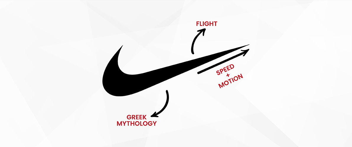
The design brief for the Nike logo emphasized movement, a core attribute for an athletic company. Davidson’s inspiration for the Swoosh derived from the wing of the Greek goddess Nike (Níke), the goddess of victory. This mythological connection imbued the logo with inherent symbolism of triumph, speed, and aspiration—qualities perfectly aligned with the brand’s mission to empower athletes. The curved, dynamic line suggests fluidity, momentum, and the arc of an athlete in motion, whether running, jumping, or flying towards a finish line.
The genius of the Swoosh lies in its ability to abstractly represent these concepts without literal depiction. It doesn’t show a shoe, an athlete, or even the goddess Nike herself, yet it evokes all these ideas. This abstract quality makes it incredibly versatile and allows it to transcend cultural and linguistic barriers, becoming a universal shorthand for excellence and achievement in sports. The symbolic depth, combined with its visual simplicity, laid the groundwork for its unparalleled success as a corporate identity element.
Design Principles and Enduring Power: The Anatomy of a Successful Logo
A truly effective logo adheres to fundamental design principles that ensure its longevity, versatility, and communicative power. The Nike Swoosh is a masterclass in applying these principles, which explains its continued relevance and impact decades after its creation.
Simplicity and Dynamism: A Paradoxical Harmony
One of the most striking features of the Swoosh is its profound simplicity. Composed of a single, flowing line, it avoids complex details, intricate textures, or multiple colors. This simplicity is its greatest strength. It makes the logo instantly recognizable, easily reproducible across various mediums, and memorable. In an increasingly cluttered visual landscape, a simple logo cuts through the noise, allowing for immediate recall and association with the brand.
Yet, within this simplicity lies inherent dynamism. The upward sweep and curved trajectory of the Swoosh convey a sense of speed and momentum. It’s not static; it feels like it’s perpetually moving forward, embodying the continuous pursuit of improvement and victory that defines athleticism. This harmonious blend of simplicity and dynamism ensures the logo is not only aesthetically pleasing but also profoundly expressive of the brand’s core values. It’s a design that feels both effortless and powerful, a rare feat in visual communication.
Adaptability Across Mediums: The Omnipresent Icon
A critical measure of a logo’s success is its adaptability. Can it maintain its integrity and impact whether it’s emblazoned on a billboard, embroidered on a shoe, printed on a small tag, or displayed digitally on a screen? The Nike Swoosh excels in this regard. Its clean lines and singular form allow it to be scaled up or down without loss of detail or recognition.
From the microscopic stitching on a performance garment to the colossal signage at an Olympic venue, the Swoosh remains unmistakably Nike. It can stand alone, paired with the “NIKE” wordmark, or subtly integrated into product designs. This versatility has been instrumental in Nike’s global marketing strategy, enabling consistent brand presence across an extraordinarily diverse range of products, campaigns, and retail environments. The logo’s robustness in various applications reinforces its power as a cohesive element of corporate identity, ensuring that Nike’s visual signature is ubiquitous and unwavering.

From Logo to Global Brand Ambassador: The Strategic Impact of the Swoosh
The journey of the Swoosh from a humble design to a global emblem of aspiration is a powerful narrative in brand strategy. It illustrates how a well-crafted visual identity, backed by consistent marketing and a compelling brand story, can become an invaluable asset that transcends mere representation.
The Power of Association: Beyond the Product
The Nike Swoosh has become synonymous not just with athletic shoes and apparel, but with a broader lifestyle, a mindset of perseverance, and the spirit of “Just Do It.” This profound level of association is a hallmark of superior brand strategy. Nike meticulously built this connection through decades of strategic marketing, athlete endorsements, and a consistent narrative celebrating human potential and achievement.
When consumers see the Swoosh, they don’t just see a sportswear company; they see Michael Jordan defying gravity, Serena Williams dominating the court, or a marathon runner pushing past their limits. The logo has absorbed and reflects the triumphs of countless athletes, transforming into a symbol of personal bests and collective victories. This associative power is incredibly valuable, fostering deep emotional connections with consumers and fostering unparalleled brand loyalty. It speaks to the effectiveness of integrating a visual identity into a comprehensive brand narrative that resonates on a human level.
Marketing and Brand Equity: The Untapped Value of an Icon
The Nike Swoosh is undeniably one of the most valuable brand assets in the world. Its equity is not merely financial; it resides in its ability to instantaneously communicate Nike’s brand promise, values, and global presence without a single word. This non-verbal communication is a cornerstone of effective marketing. The logo acts as a shortcut to the entire brand experience, reducing the cognitive load on consumers and building instant recognition and trust.
Through relentless and strategic marketing campaigns, Nike has elevated the Swoosh to a status where it can stand alone, often without the accompanying “NIKE” wordmark. This is the ultimate testament to a logo’s success: when it becomes so iconic that the name is no longer necessary. This brand equity allows Nike to command premium pricing, expand into new markets, and foster a cult-like following among its diverse customer base. The Swoosh isn’t just a design; it’s a generator of billions in revenue, a testament to the strategic foresight of investing in and nurturing a powerful corporate identity.
Lessons from the Swoosh: A Blueprint for Brand Identity
The Nike Swoosh offers invaluable lessons for any brand aspiring to create a lasting and impactful corporate identity. Its success is not accidental but a result of adhering to principles that can be universally applied, irrespective of industry or scale.
The Value of Simplicity and Memorability
The foremost lesson from the Swoosh is the enduring power of simplicity. In an age of increasing visual complexity, a clean, uncomplicated logo remains incredibly effective. It ensures immediate recognition, ease of recall, and minimizes potential for misinterpretation. Brands should strive for designs that are elegant in their conciseness, conveying core messages without clutter. A memorable logo is one that can be easily described, sketched, and recalled, becoming an indelible part of the consumer’s mental landscape.
Consistent Application and Evolution, Not Revolution
Another critical takeaway is the importance of consistent application over time. While logos can and do evolve, successful brands like Nike demonstrate the power of subtle refinement rather than radical overhauls. The core essence of the Swoosh has remained unchanged for over five decades. This consistency builds familiarity, trust, and reinforces brand identity across generations of consumers. Any evolution should be carefully considered, ensuring it enhances rather than detracts from the established brand equity. Disrupting a widely recognized symbol risks alienating an existing audience and eroding years of brand building.
Storytelling and Symbolism: Beyond Aesthetics
Finally, the Nike Swoosh teaches us that a logo is more than just an aesthetic element; it’s a vehicle for storytelling and symbolism. A logo that resonates often has a compelling narrative or a deeper meaning embedded within its design. Connecting the visual mark to the brand’s mission, values, or even a cultural narrative imbues it with greater depth and emotional resonance. For Nike, the link to the goddess of victory and the abstract representation of athletic movement transformed a simple curve into a powerful emblem of aspiration and achievement. Brands should strive to infuse their logos with meaning that extends beyond mere visual appeal, creating a symbol that truly embodies their purpose.
Conclusion: The Enduring Legacy of the Swoosh
The Nike Swoosh stands as an unparalleled example of effective brand strategy and design. From its unassuming beginnings as a $35 sketch, it has grown to become a global icon, a testament to the power of a well-conceived and consistently applied corporate identity. Its simplicity, dynamism, versatility, and deep symbolic resonance have allowed it to transcend product categories and cultural barriers, becoming a universal emblem of ambition, achievement, and the relentless pursuit of excellence. The story of the Swoosh is a compelling case study, offering invaluable insights for marketers, designers, and business leaders seeking to build brands that not only captivate the market but also leave an indelible mark on the collective consciousness. It proves that the most powerful brands are often built upon the simplest, yet most profoundly meaningful, visual identities.
aViewFromTheCave is a participant in the Amazon Services LLC Associates Program, an affiliate advertising program designed to provide a means for sites to earn advertising fees by advertising and linking to Amazon.com. Amazon, the Amazon logo, AmazonSupply, and the AmazonSupply logo are trademarks of Amazon.com, Inc. or its affiliates. As an Amazon Associate we earn affiliate commissions from qualifying purchases.